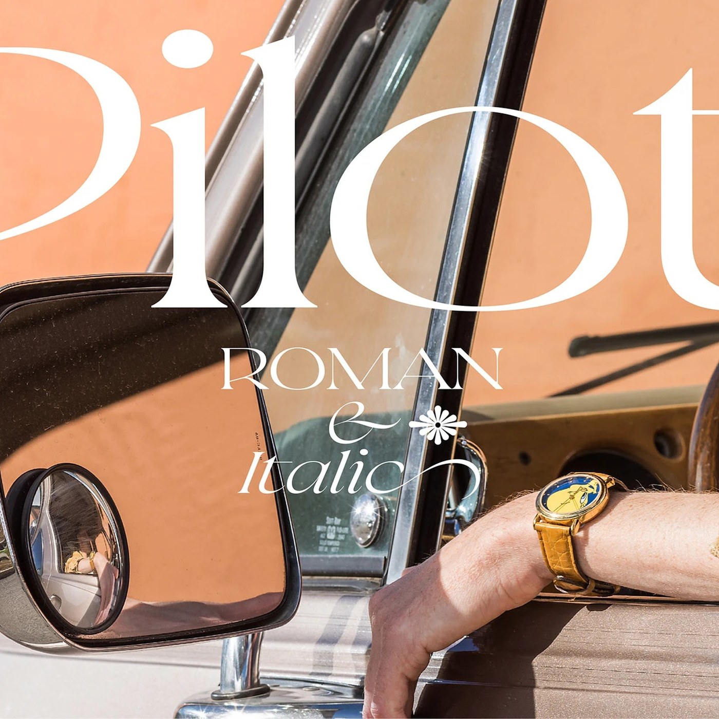
Typography: Pilot Typeface by Violaine & Jeremy
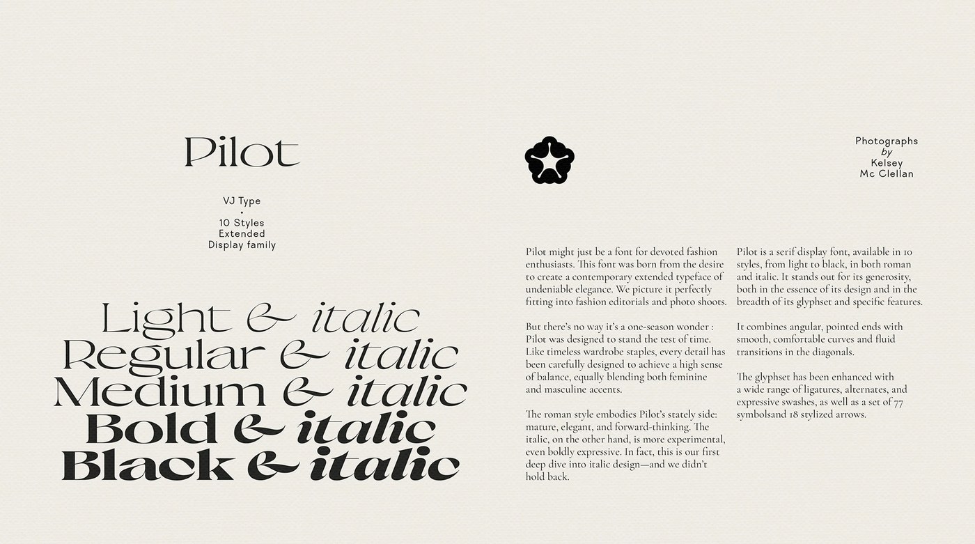
Violaine & Jeremy designed Pilot Typeface, an expressive display serif blending sharp angular tension with aeronautical precision.
Parisian creative duo Violaine & Jeremy has consistently pushed the boundaries of editorial display lettering, crafting typefaces that occupy a rare space between haute couture styling and rigorous typographic mechanics. Released through their independent type foundry Vj-Type, the Pilot family represents an ambitious formal inquiry into angular letterforms and calligraphic velocity. Developed in close collaboration with designers Antoine Brun, Liana Korios, and Julie Senné, the typeface channels the spirit of twentieth-century flight instruments and technical navigational charts while asserting a thoroughly contemporary editorial silhouette. The design balances theatrical display proportions with disciplined baseline metrics, ensuring each glyph commands substantial visual authority.
Stroke Architecture and Angular Calligraphic Tension
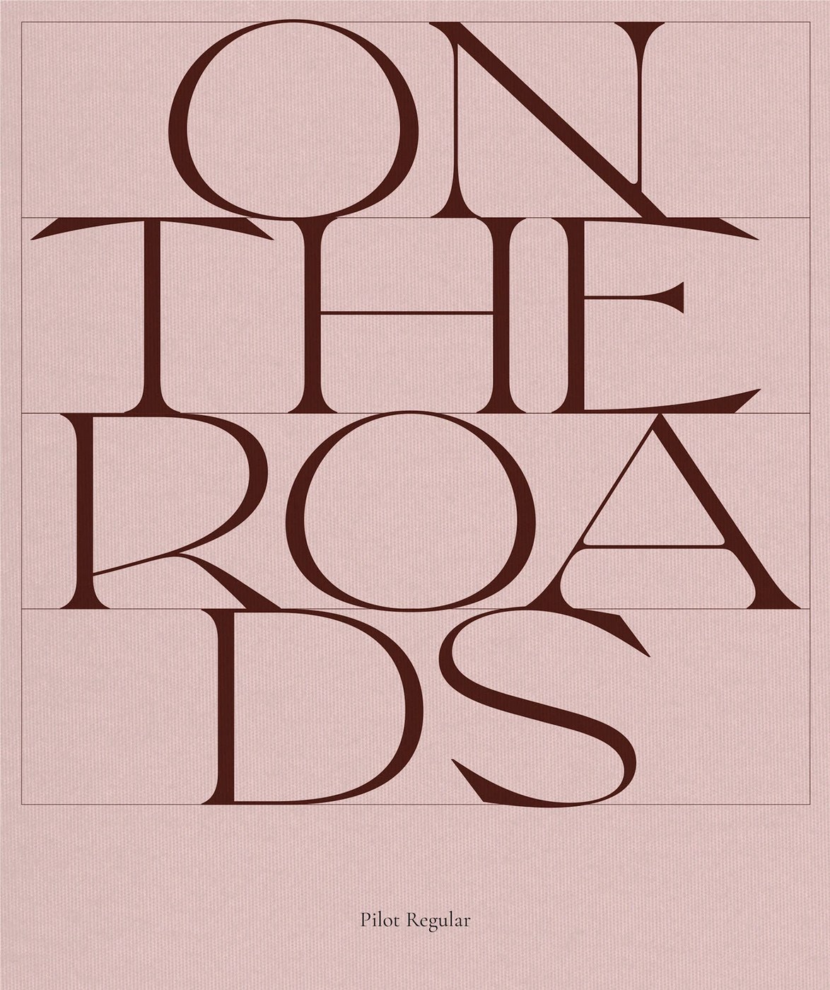
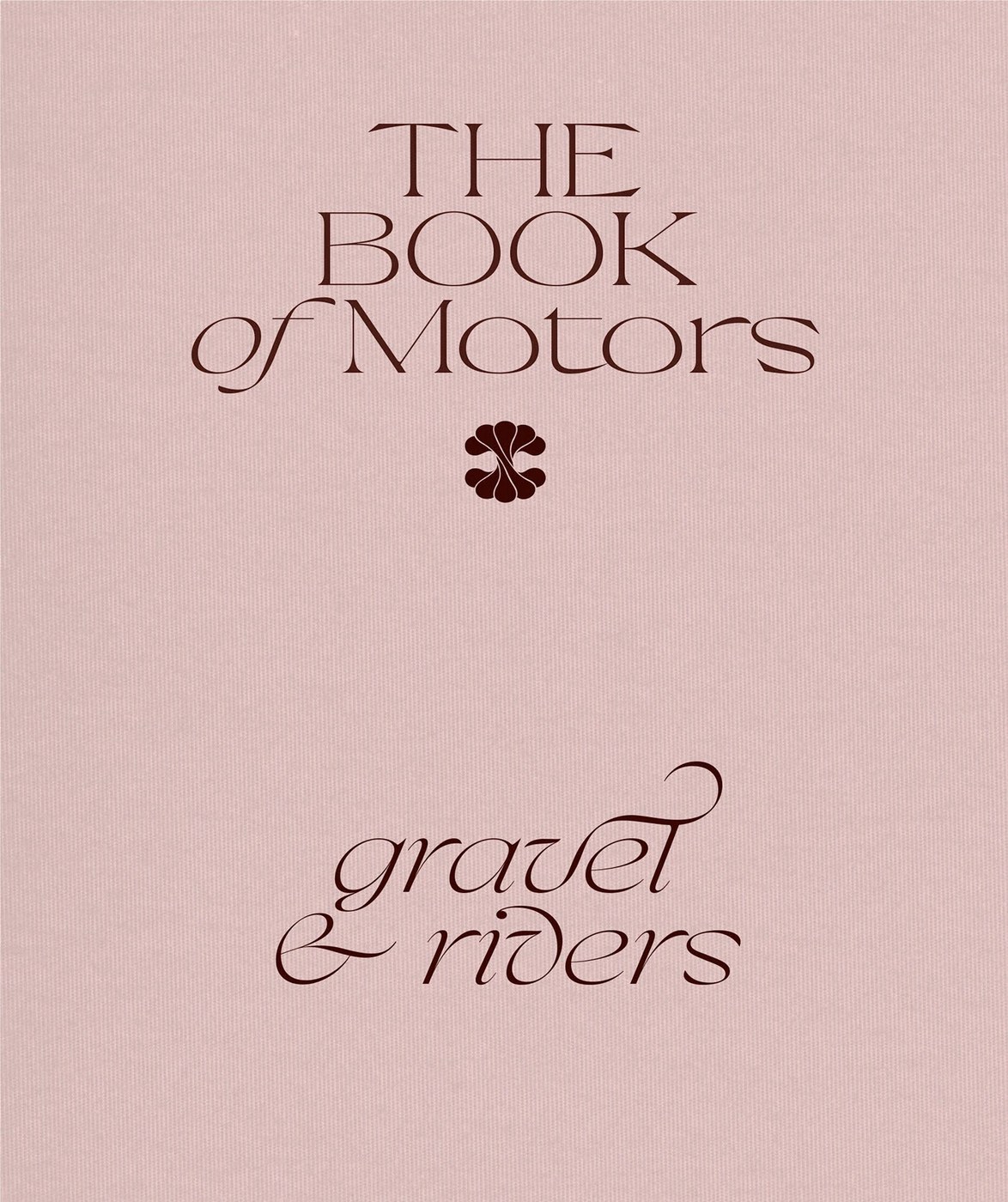
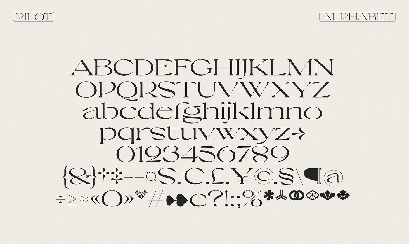
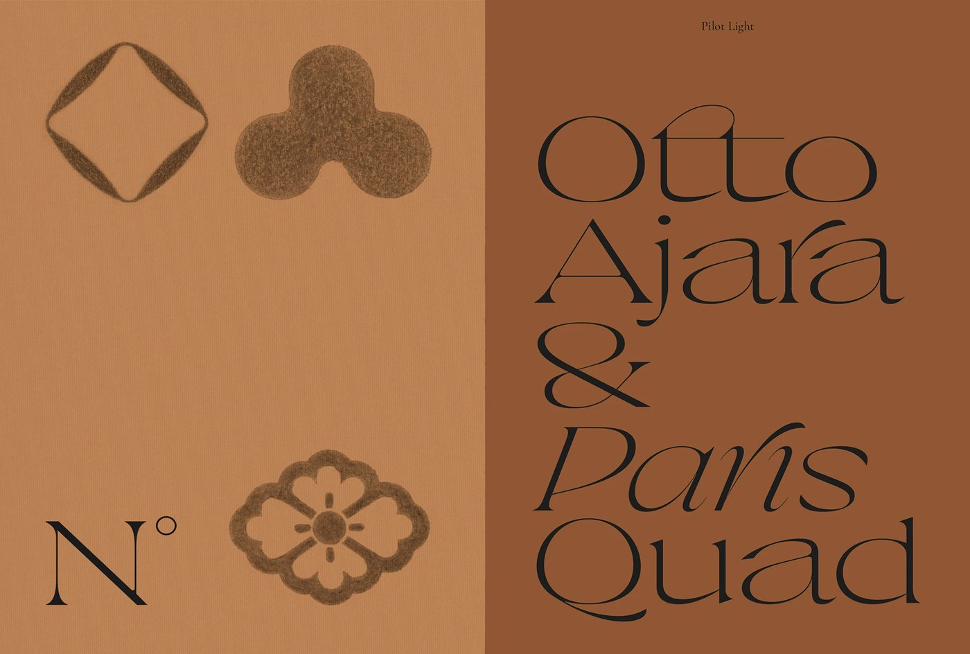
The core visual tension in Pilot stems from the aggressive contrast between razor-sharp bracketed serifs and broad, sculptural vertical stems. Diagonal strokes terminate in unyielding geometric wedges, echoing the aerodynamic surfaces of vintage aircraft wings. The lowercase letterforms feature compact counters and exaggerated apertures, injecting rhythmic cadence into headline settings and editorial pull quotes. Generous alternate glyphs and custom ligatures provide creative directors with expansive compositional flexibility, allowing characters to interlock and create striking typographic textures on the printed page. Whether deployed across high-fashion mastheads, cultural exhibition identities, or luxury publication covers, the letterforms establish unmistakable presence without sacrificing readability.
Aeronautical Telemetry and Specimen Photography
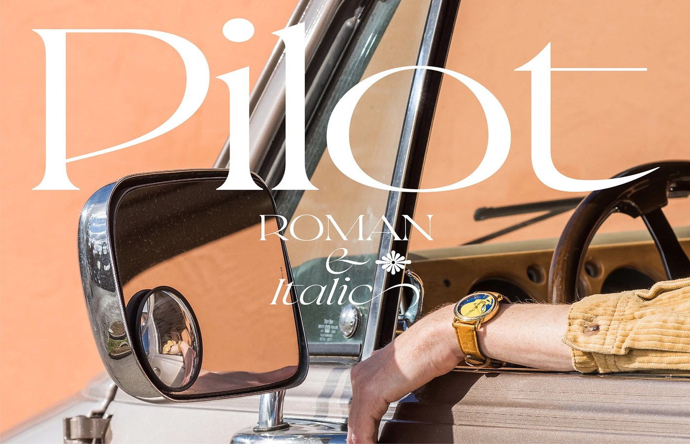
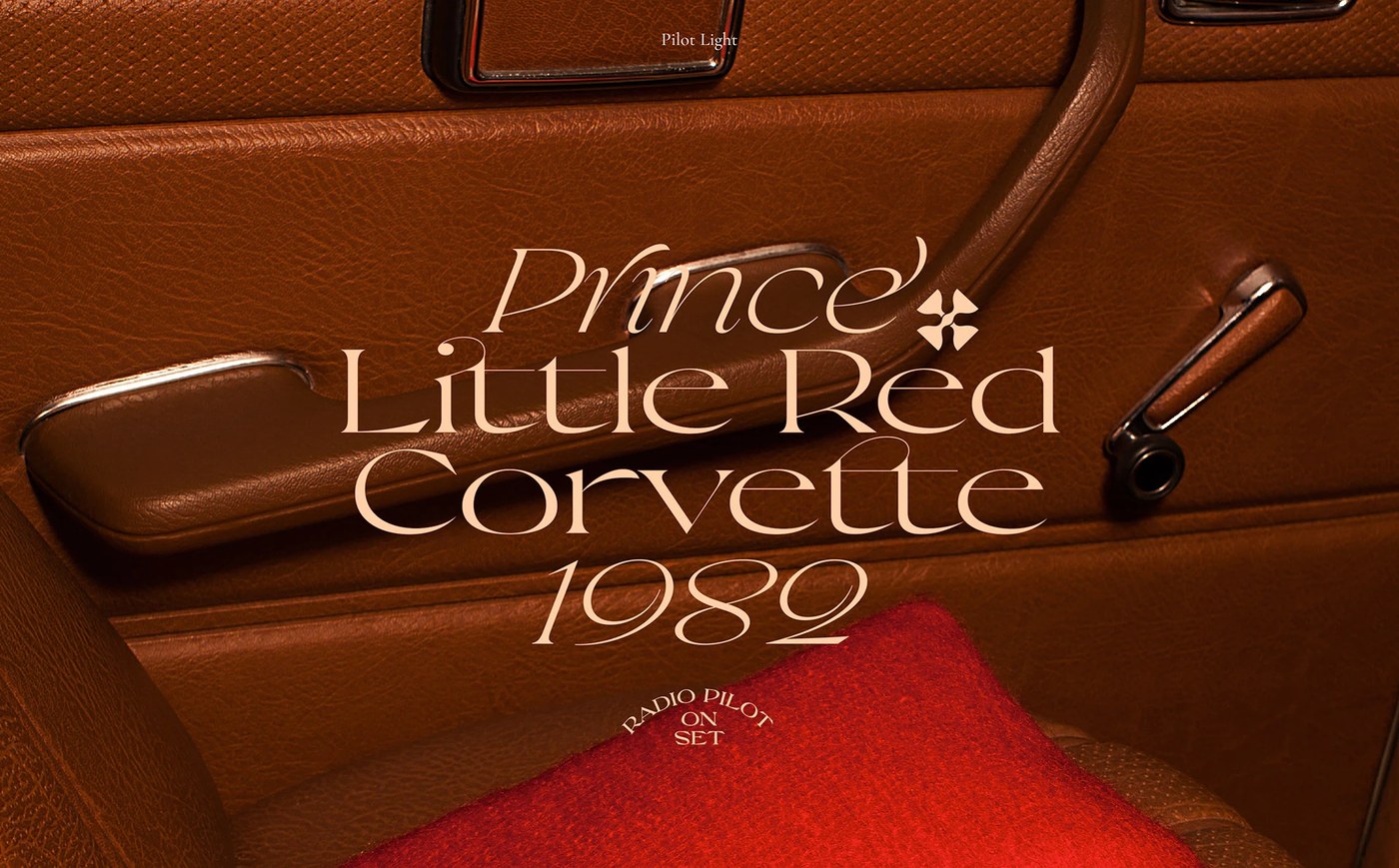
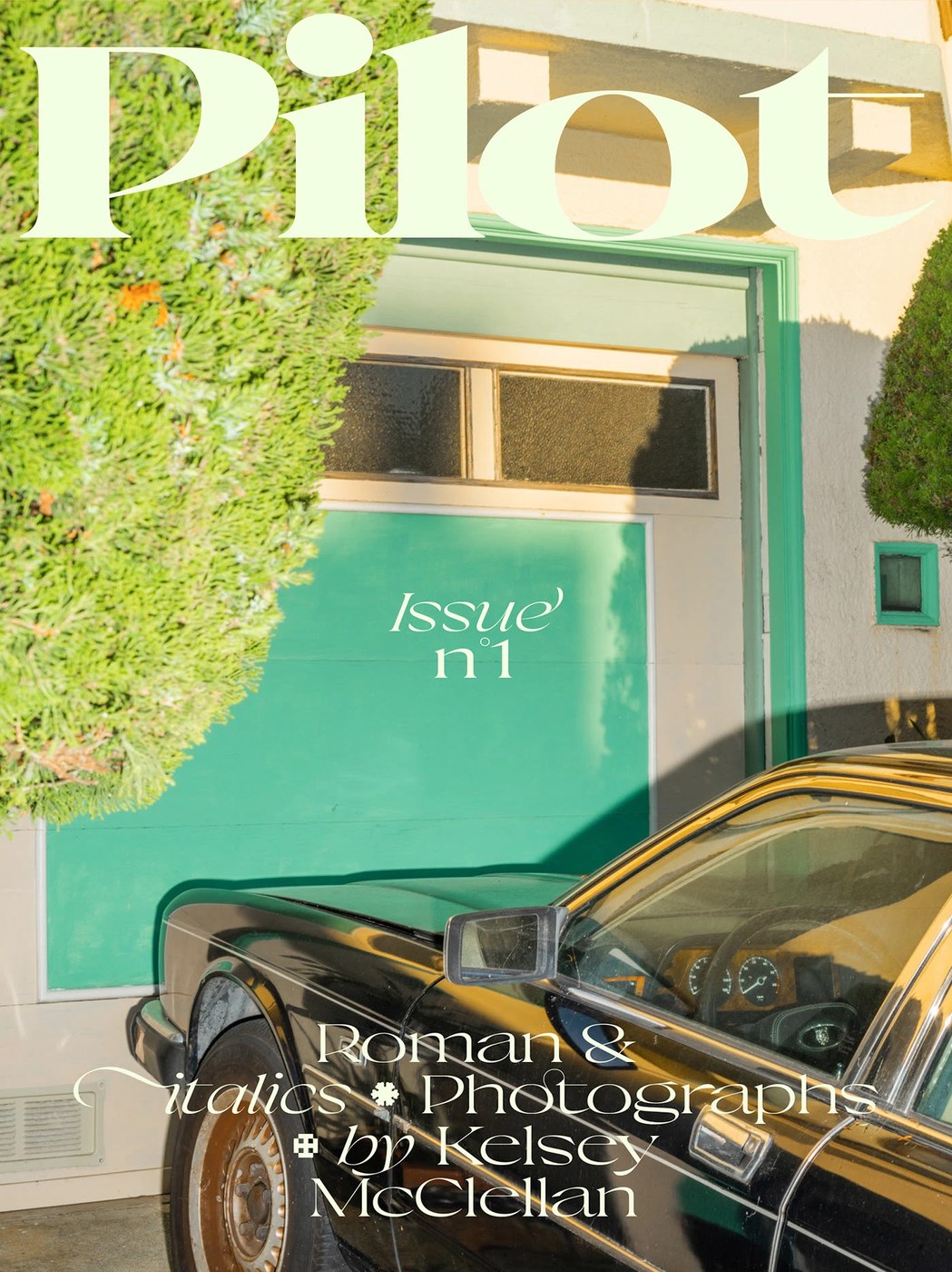
To document the release of Pilot, Violaine & Jeremy partnered with renowned photographer Kelsey McClellan, creating a series of vivid visual specimens that contextualize the typeface in tangible environments. The specimen photography pairs high-contrast monochrome type specimens with tactile materials, studio backdrops, and surreal culinary still lifes. This juxtaposition highlights the dual nature of Pilot: an instrument of strict typographic discipline and a playful, expressive canvas for editorial experimentation. Through precise optical weight calibration and distinctive character anatomy, Pilot affirms Vj-Type as a vital laboratory for progressive typography that honors historical craft while defining contemporary visual culture.
See the full project by Violaine & Jeremy on Behance.