TT Norms Pro: Type Design by TypeType Foundry
Explore the TT Norms Pro 4.100 type design by TypeType Foundry, featuring redrawn bold cuts, 104 styles, Arabic Naskh script, and UI icons.
Workhorse geometric sans-serifs rarely sit still for long. Even after becoming a signature voice for global brands like ASUS, Doordash, Intercom, CBSN, and DreamWorks, TypeType Foundry decided their flagship family needed a serious structural tune-up for version 4.100. They didn't just patch a few kerning pairs. The team went back to the drawing board and completely redrew the ExtraBold, Black, and ExtraBlack weights across every single width.
Inside the Redrawn Weights and Multi-Script Type Design
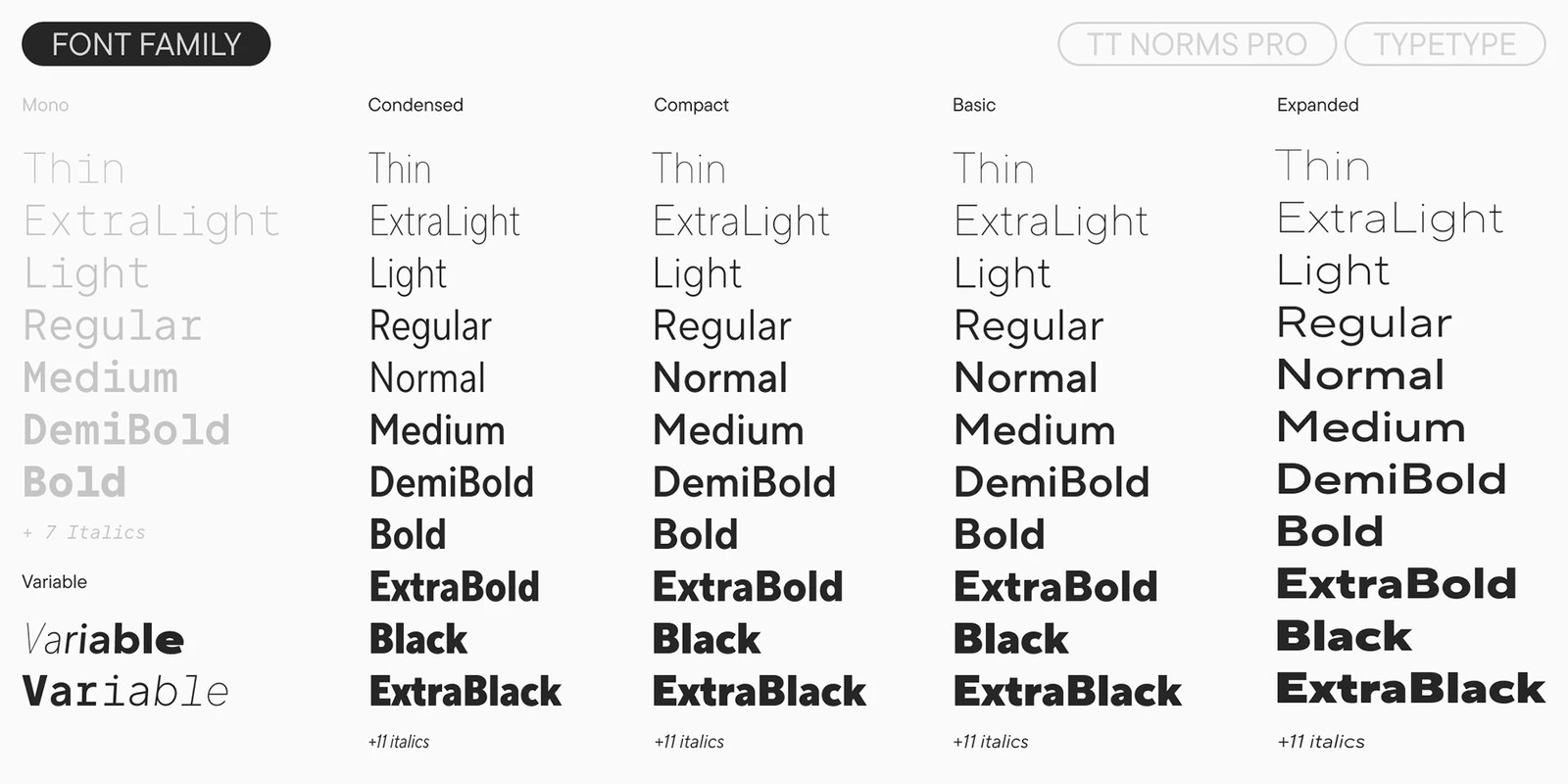
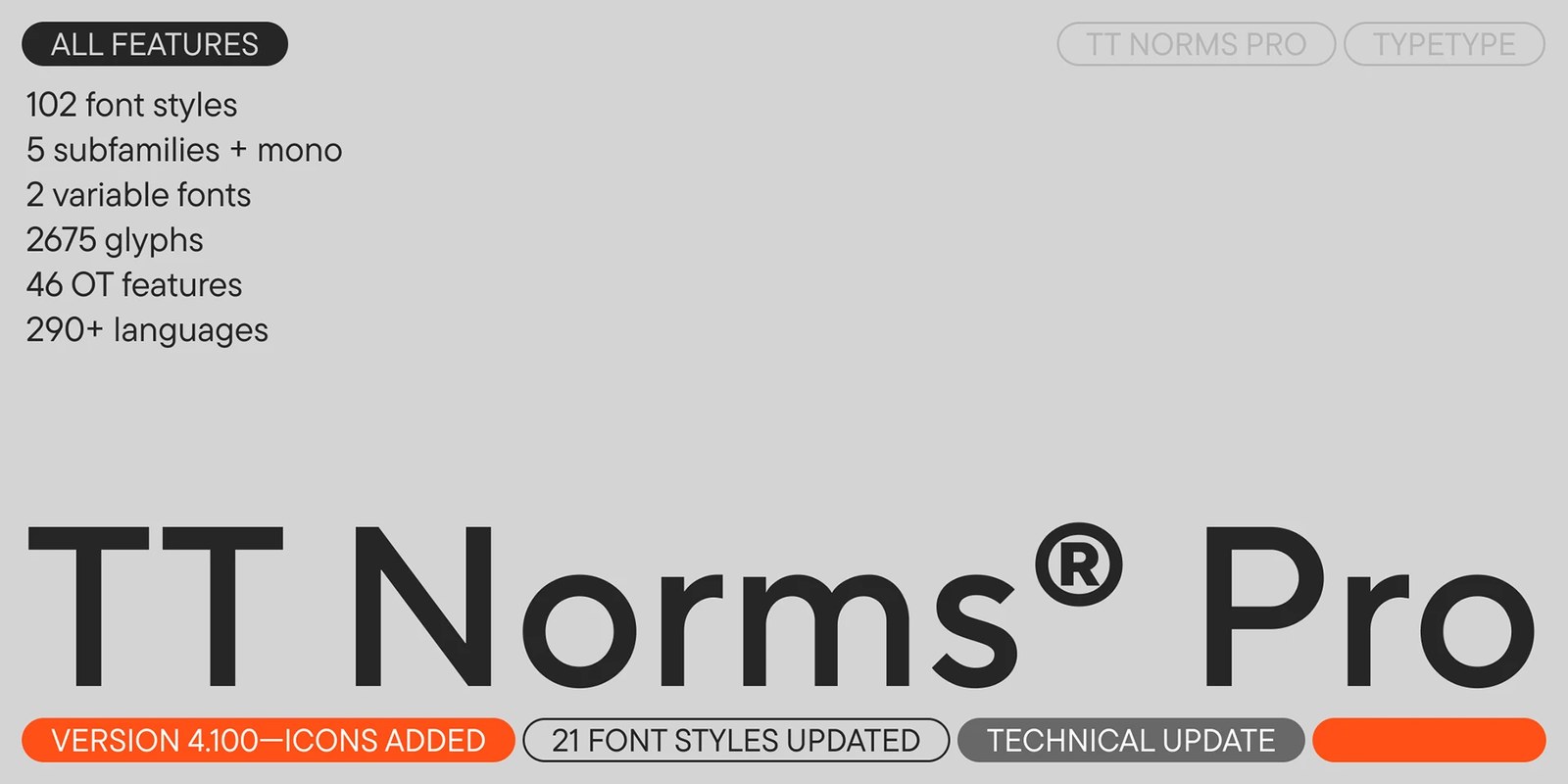
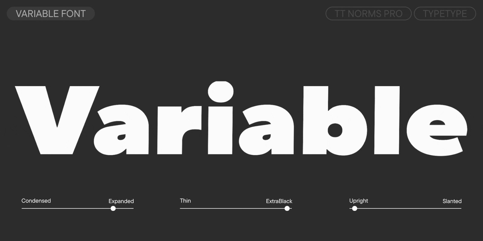
The heavy weights feel much calmer now. By adjusting the character terminals, tightening the internal rhythm, and recalibrating the ratio between horizontal and vertical strokes, the studio stripped out any clunky display quirks so the darkest cuts hold their composure in dense layouts. Everything is manually hinted and freshly kerned. Across the full superfamily, you get 104 styles spanning 44 uprights, 44 italics, and two variable fonts — TT Norms Pro Variable across three axes and TT Norms Pro Mono Variable across weight and slant. Four distinct proportional widths (Basic, Compact, Condensed, and Expanded) plus the monospaced cut pack over 2,564 glyphs per style, 46 OpenType features, 20 stylistic sets, and currency symbols including the dirham.
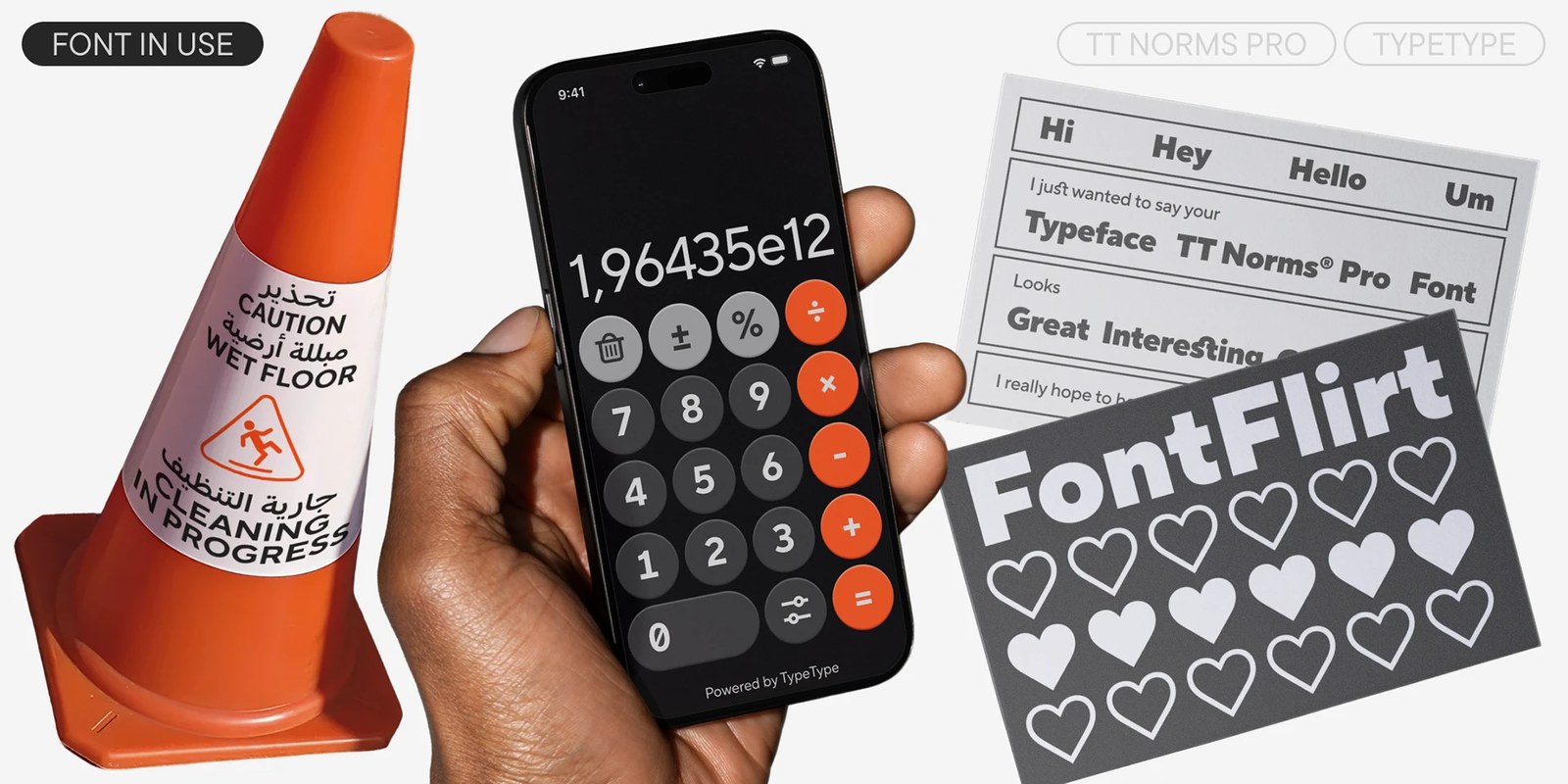
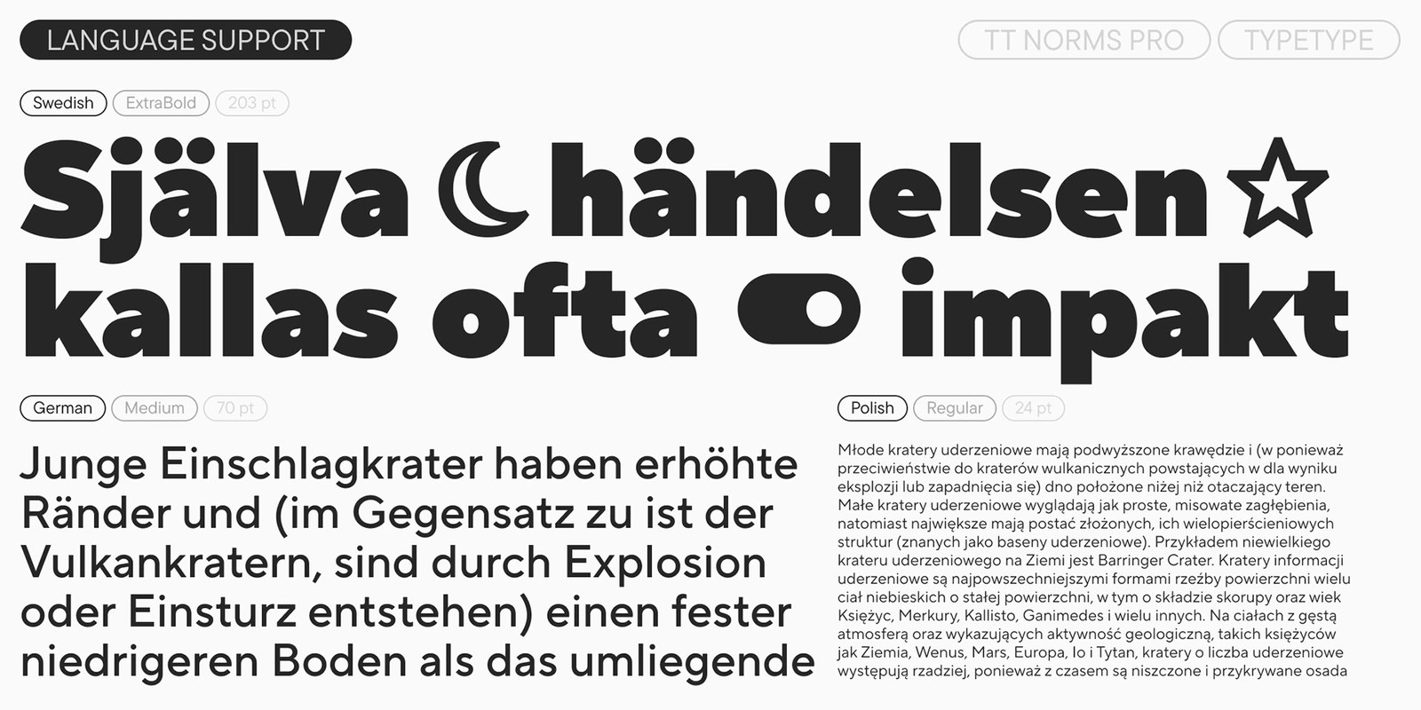
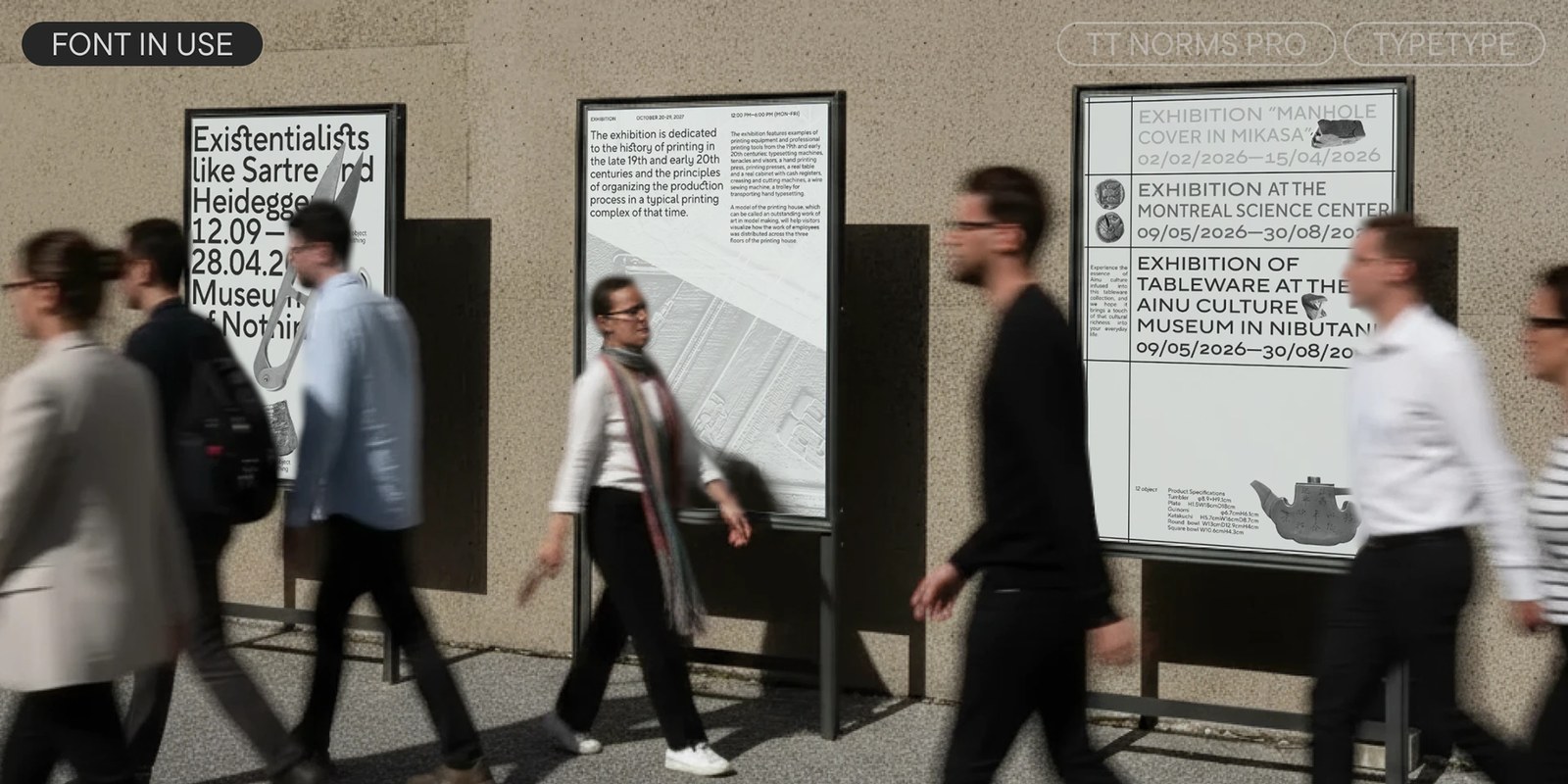
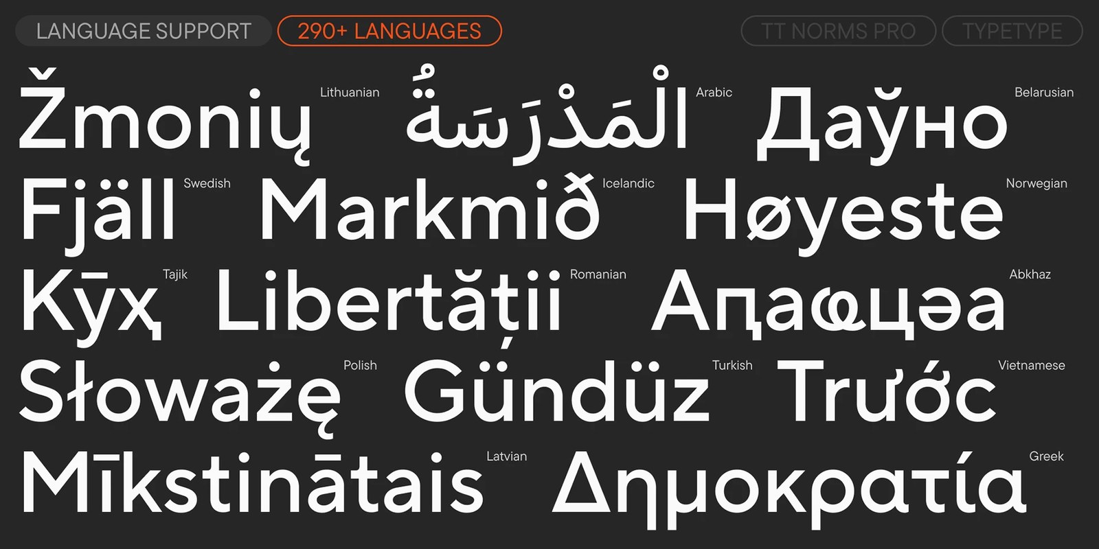
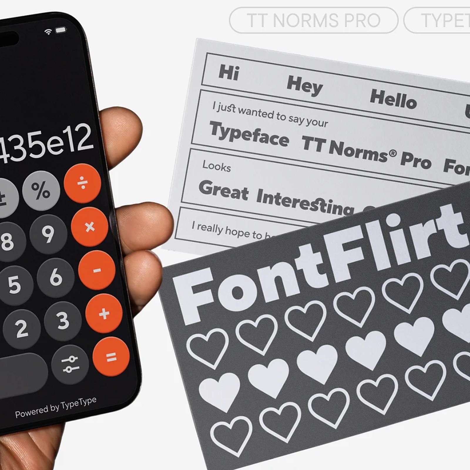
The type does the heavy lifting here. You can see that optical balance in the specimen sheet pairing 203 pt Swedish ExtraBold headlines and inline crescent-moon, star, and toggle icons right above 70 pt German Medium and tight 24 pt Polish Regular body columns set in InDesign. Those new interface icons match the exact cap height and stroke weight of the letterforms, making UI handoffs in Figma and Illustrator dead simple. Supporting more than 290 languages, the expansion also weaves in nine Arabic-script languages drawn with warm, rounded Naskh calligraphic proportions and smooth contextual ligatures. Whether it's tabular numerals on a dark-mode mobile calculator, bilingual Arabic warning wraps, or museum exhibition vitrines on the street, the proportions hold up effortlessly.
See the full project by TypeType Foundry on Behance.