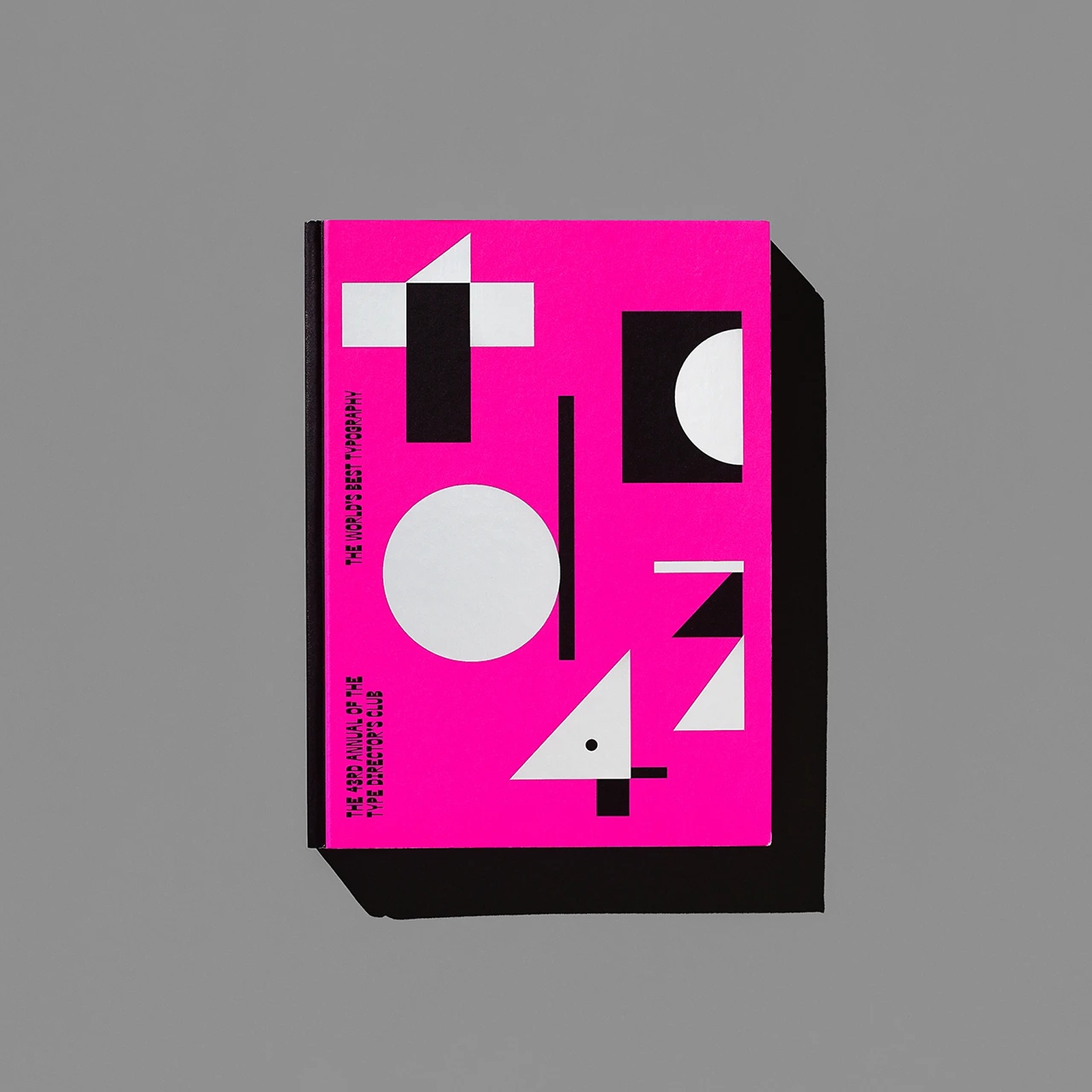
TDC 43rd Annual — Editorial Design by Tereza Bettinardi
Tereza Bettinardi crafts the editorial design for The 43rd Annual of the Type Directors Club, turning expanded counterforms into a bold book.
Designing an awards annual for the Type Directors Club of New York carries real weight. Since 1955, the competition has invited names like Paula Scher, Chip Kidd, Collins, and Triboro to shape its annual monograph. When the club tapped Tereza Bettinardi Studio in 2021 to build the identity and book for the 68th competition, published in 2022 by Verlag Hermann Schmidt as The World's Best Typography, she looked right inside the letters themselves. Working alongside Gabriela Gennari and Lucas D’Ascenção, Bettinardi built the entire system around expanded counterforms — the trapped negative spaces inside letterforms. Those inner shapes do all the talking.
Expanded Counterforms in Editorial Design
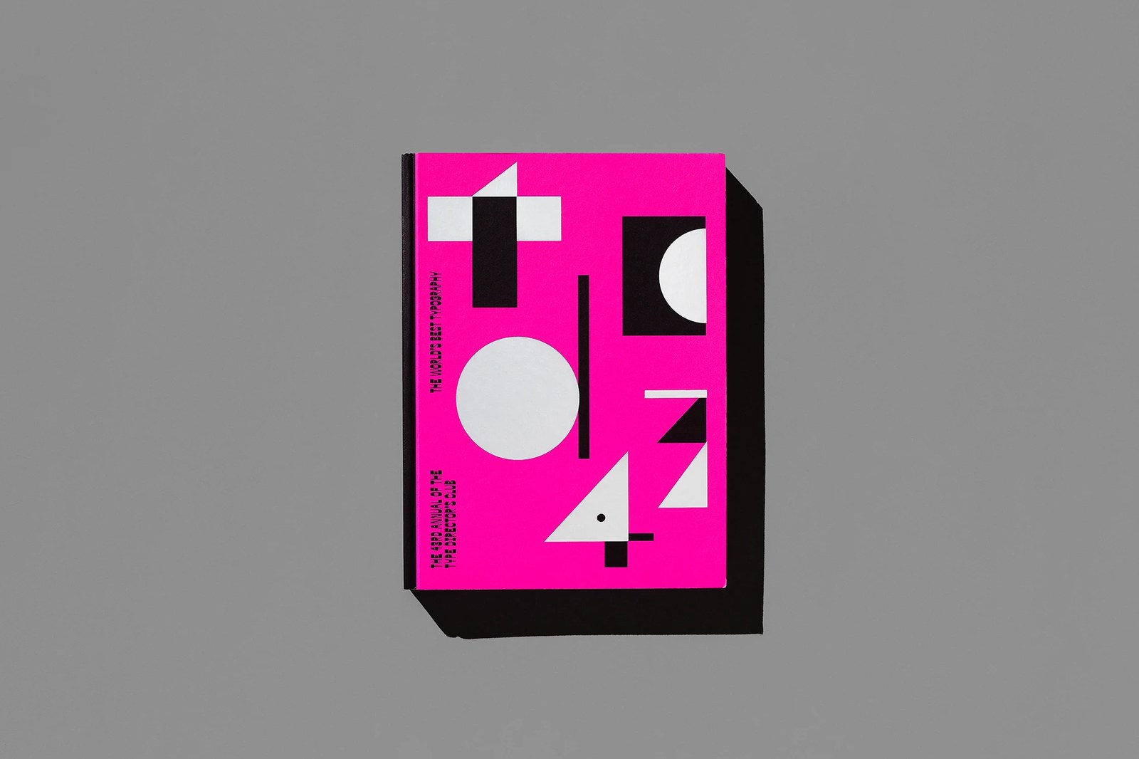
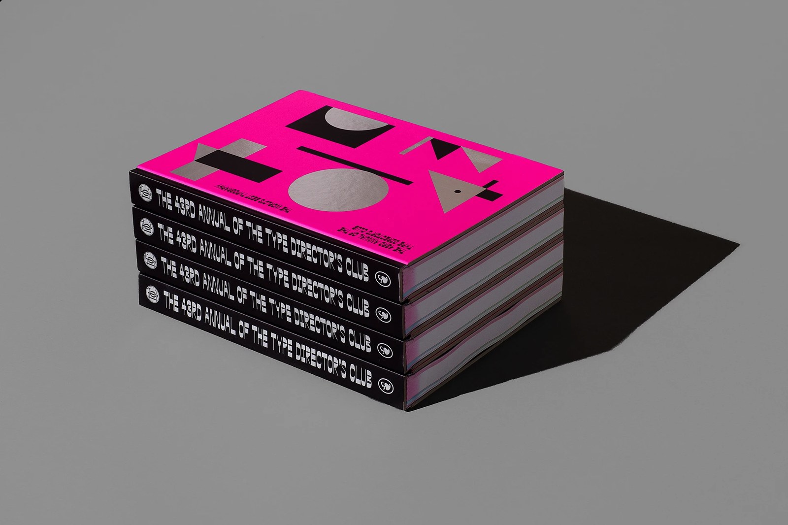
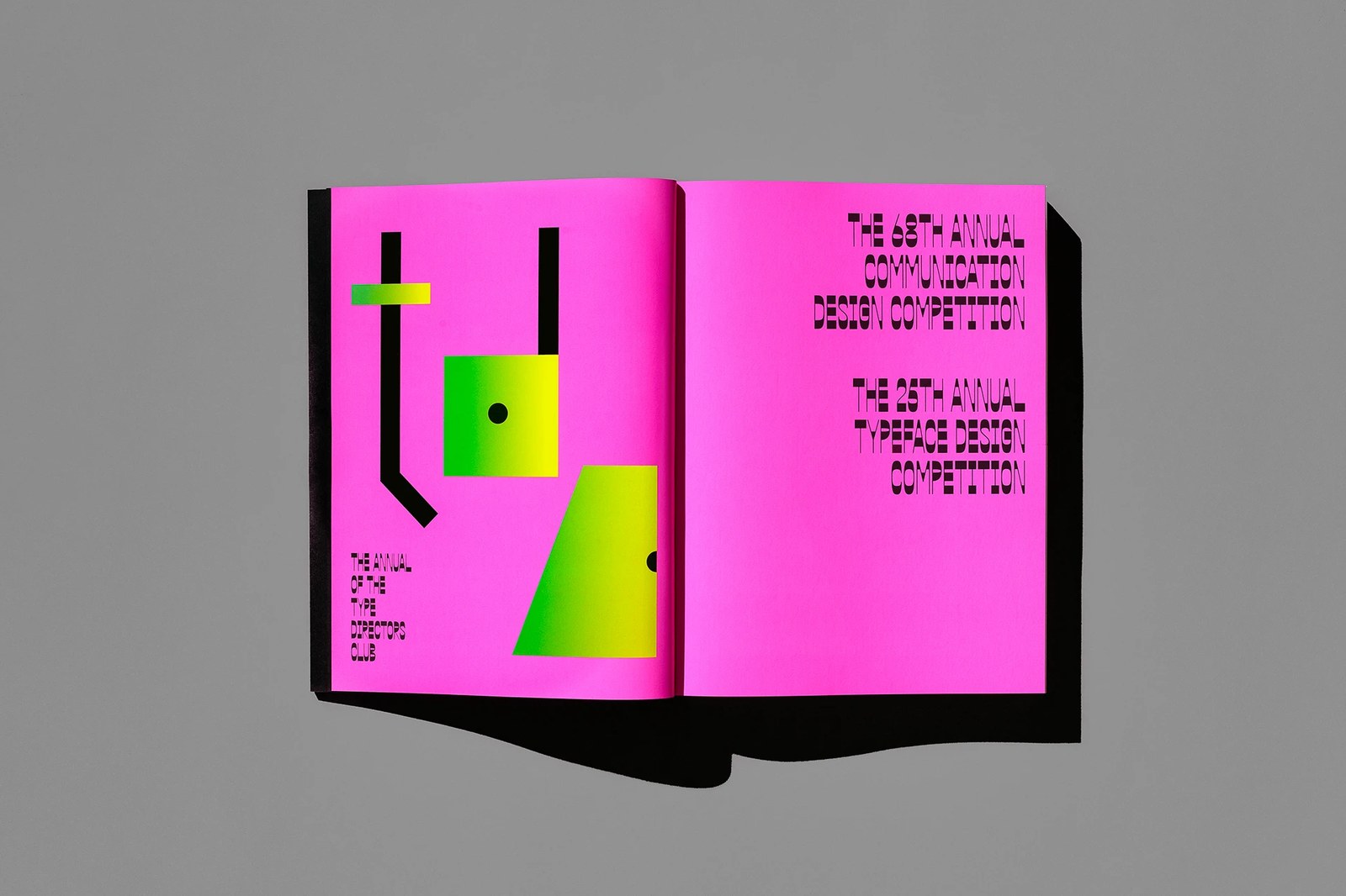
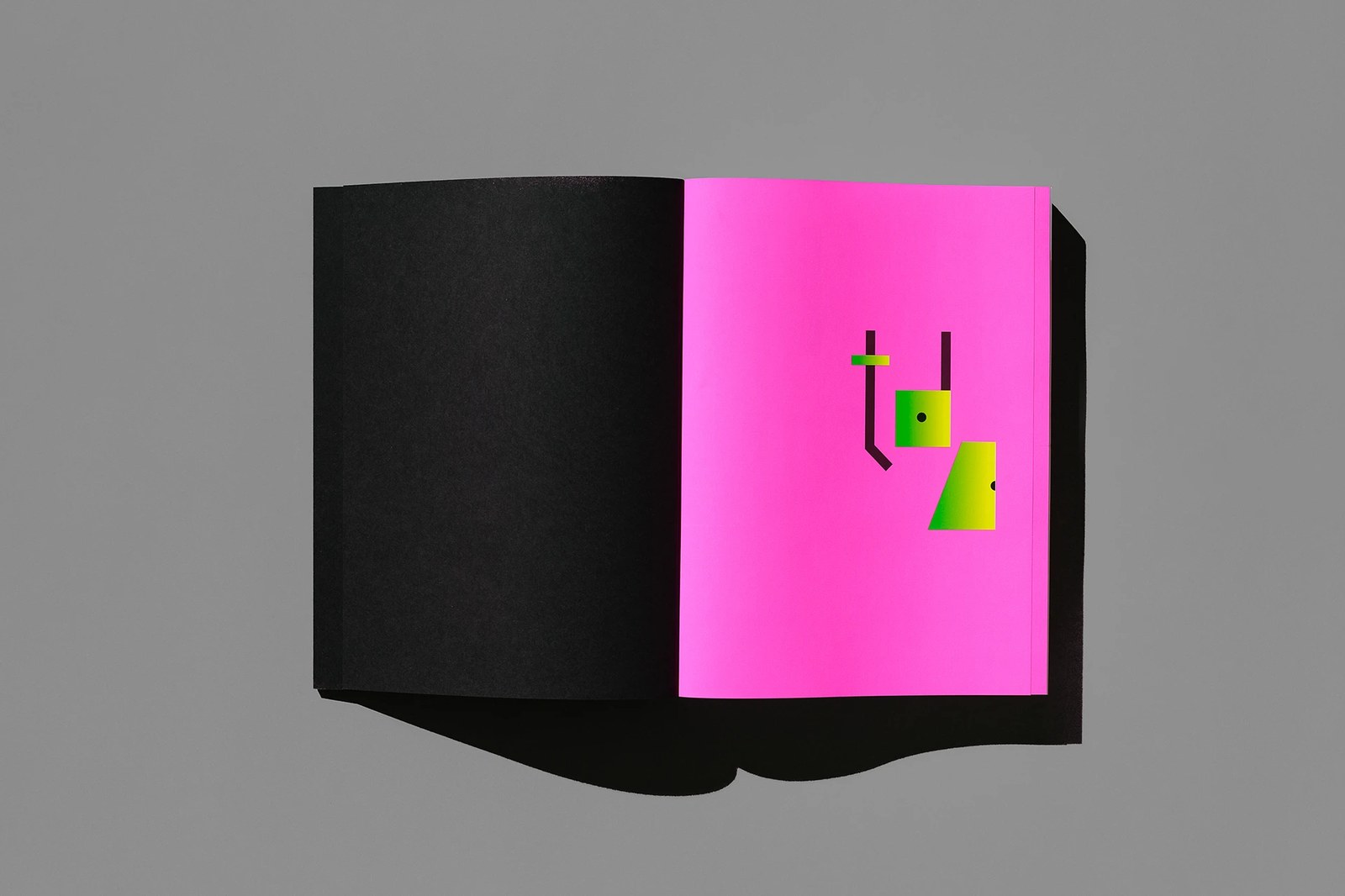
Pick up the hardcover and you feel that tension right away. Across the fluorescent pink front board, metallic silver foil and matte black geometric blocks trace the interior voids of the letters t d c and the numerals 43, while a black cloth spine stamped in crisp white condensed caps anchors the binding. Open the cover and the paper stock hits you first. A matte black endpaper faces an electric pink sheet where the lowercase tdc counterforms glow in acid-green and yellow gradients. On the title spread for the 68th Communication Design and 25th Typeface Design competitions, custom display headlines flip positive and negative space so solid black counterforms carve out every glyph.
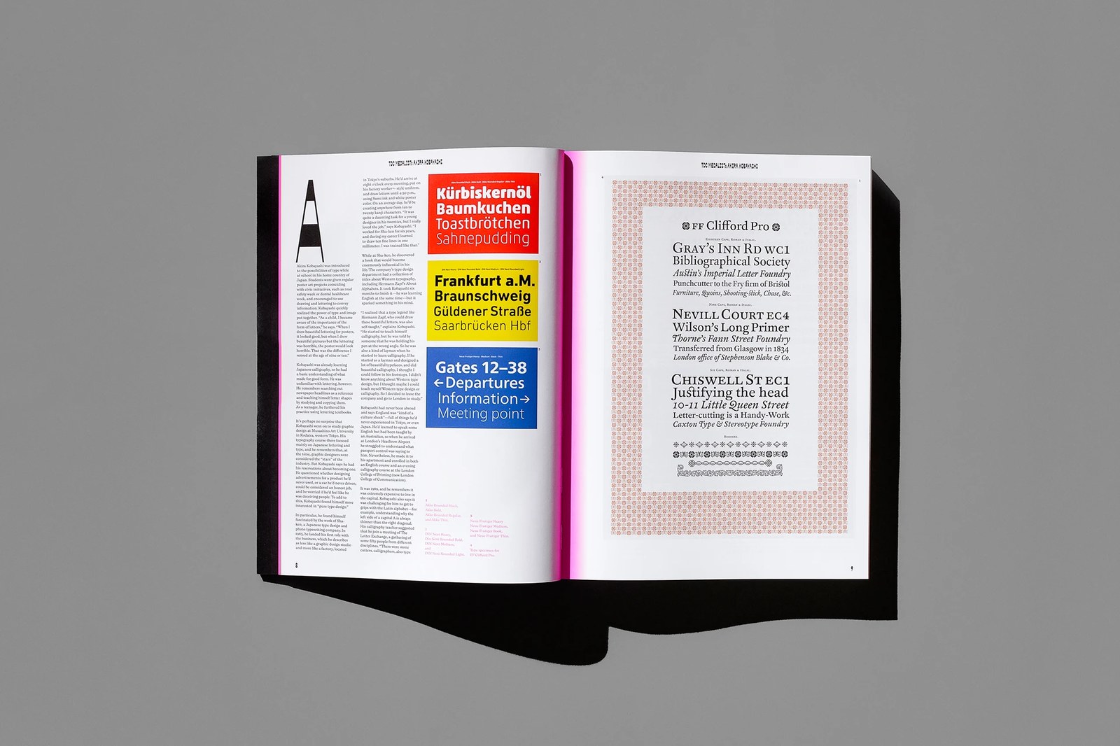
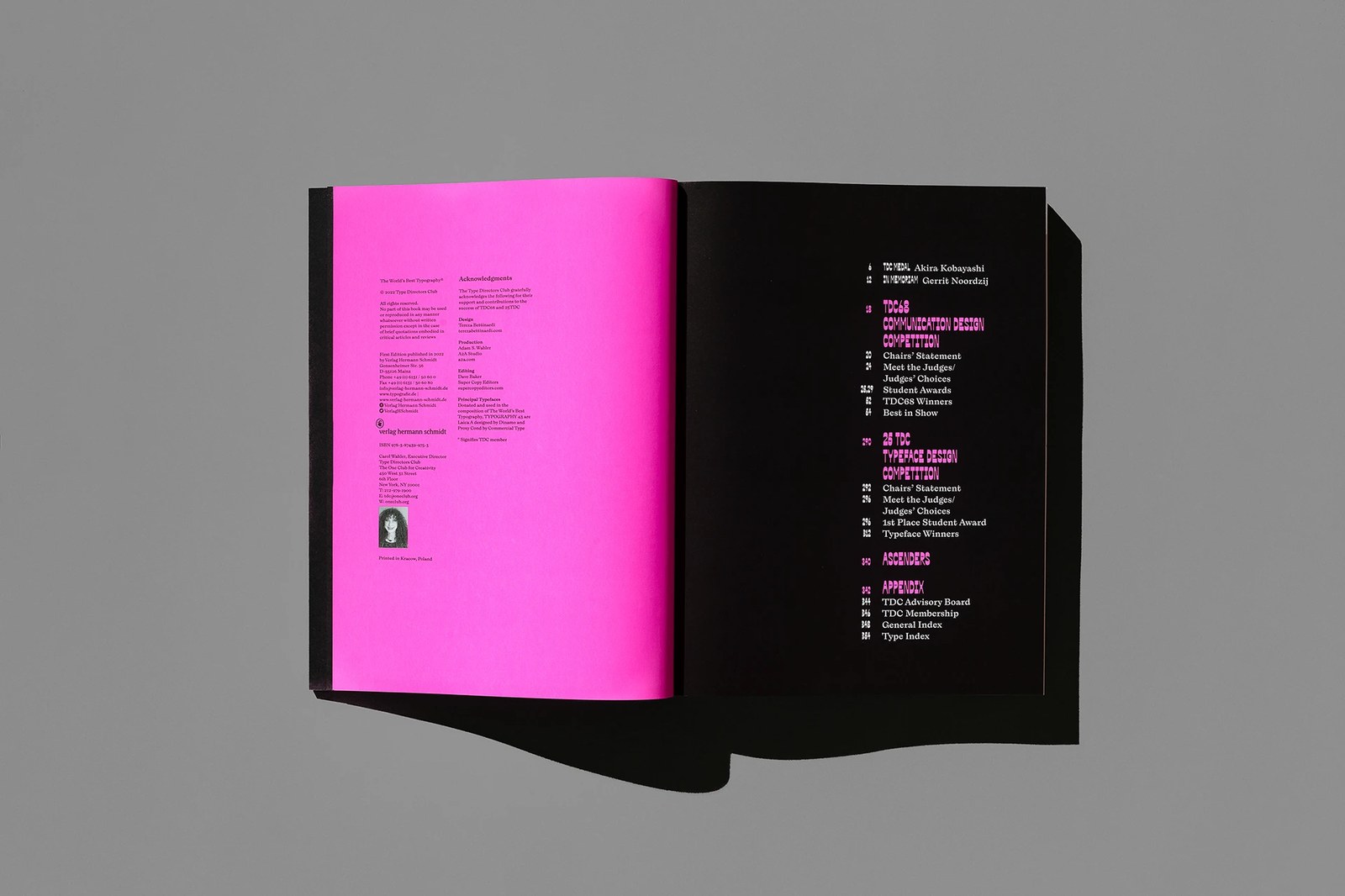
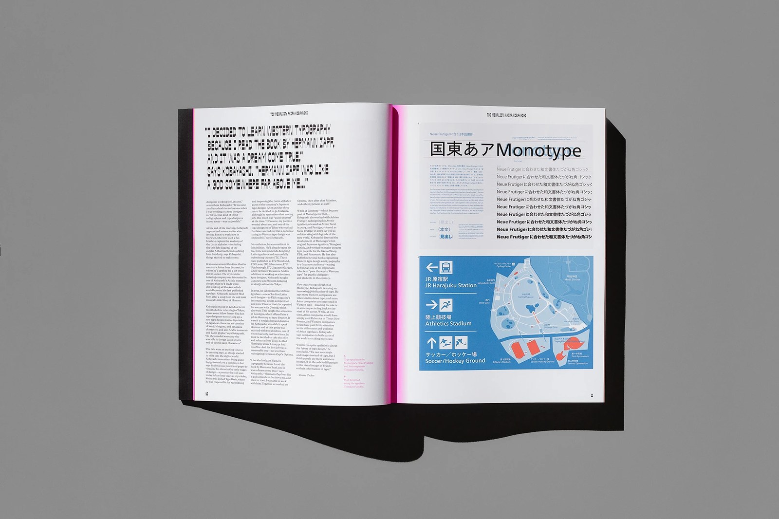
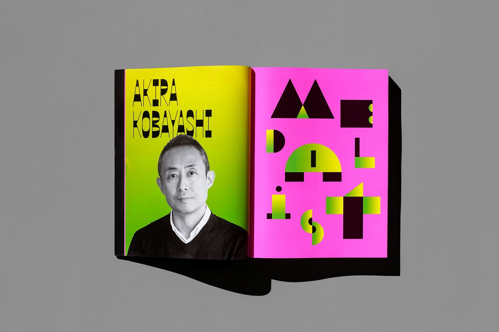
Nothing in the grid feels static. Set in InDesign and printed in Cracow, Poland, the colophon and table of contents pit a pink left page against a pitch-black right page, pairing Dinamo's sharp serif Laica A with Commercial Type's condensed Proxy Cond. That pacing shines in the opening tribute to TDC Medalist Akira Kobayashi. A monochrome portrait over an acid-yellow gradient faces a full-page MEDALIST geometric lockup, leading into Emma Tucker's three-column essay alongside red, yellow, and blue specimen cards for Akko Rounded, DIN Next, and Neue Frutiger, an ornamental FF Clifford Pro broadside, and a bilingual Tazugane Gothic map of JR Harajuku Station. It's a typographic index that reads like an exhibition.
See the full project by Tereza Bettinardi on Behance.