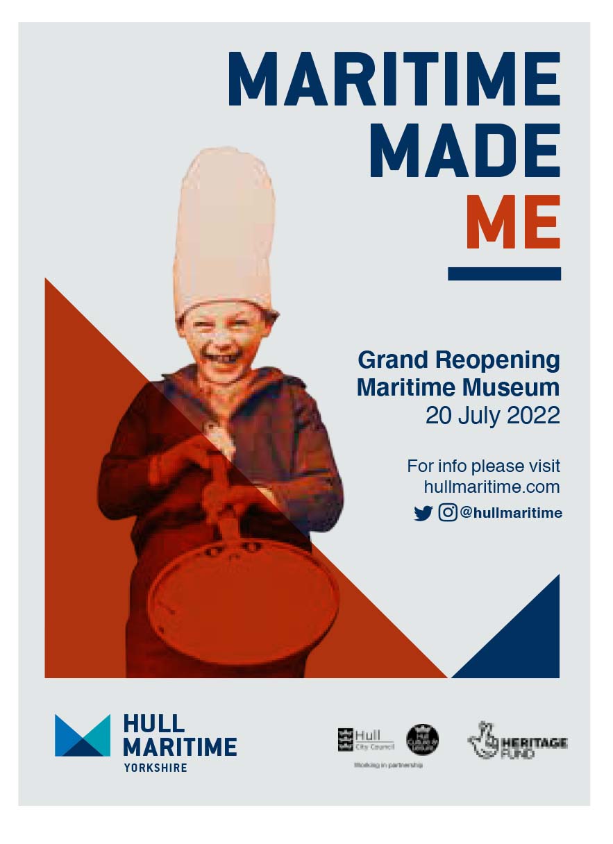
How Haley Sharpe Design crafted the branding and visitor experience for Hull Maritime Museum’s £20.4m revamp
Haley Sharpe Design created the branding and visitor experience for Hull Maritime Museum, which has reopened after a £20.4m revamp.
Hull City Council provided just over half that funding, while the National Lottery Heritage Fund contributed £7.7m and private donations accounted for nearly £1m.

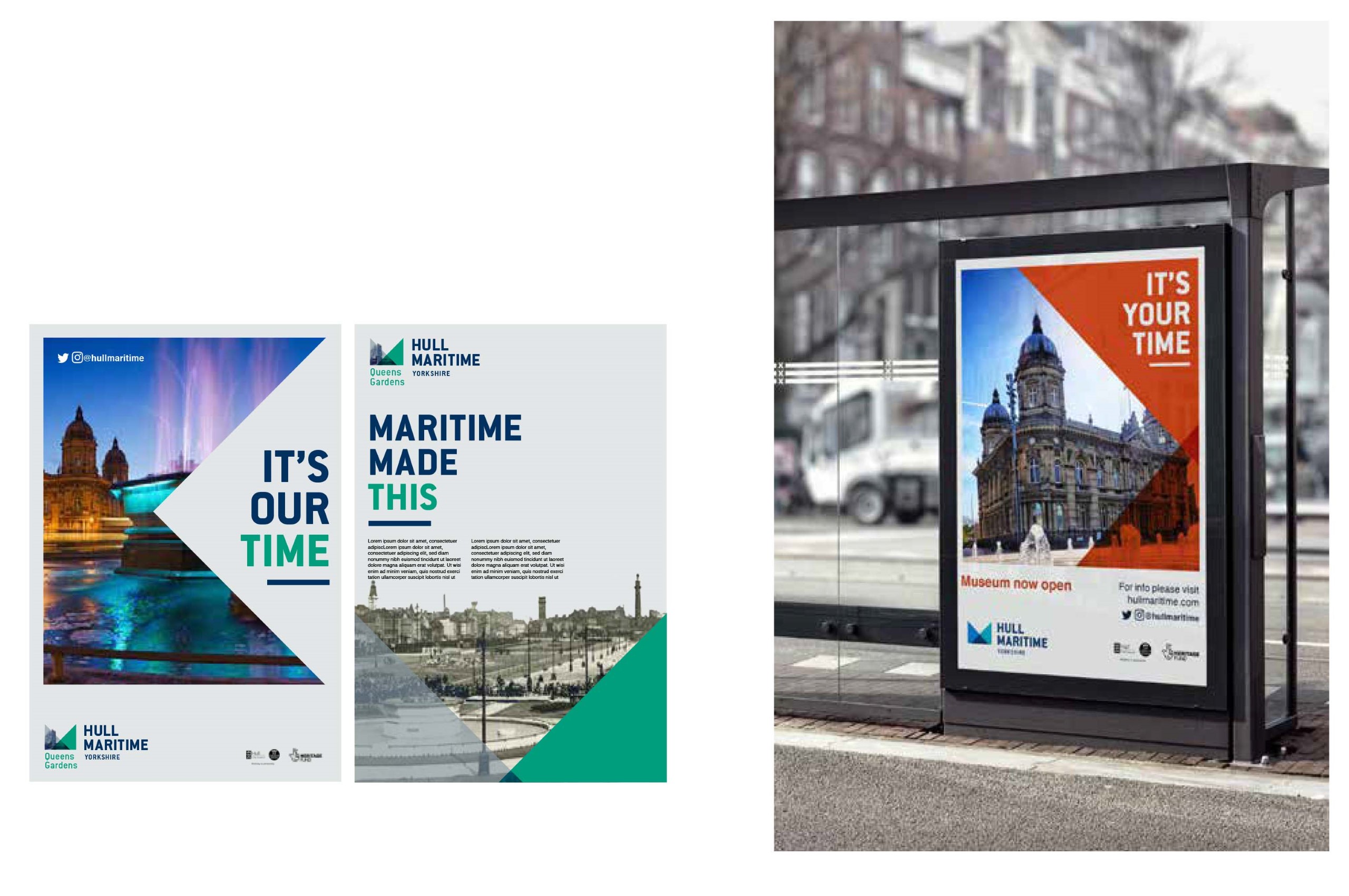
The new identity is part of a suite of brands that the agency created for Hull Maritime, a wider £70m regeneration programme intended to reconnect the Yorkshire city with its maritime heritage nearly a decade after Hull’s year as UK City of Culture.
Haley Sharpe’s branding work was informed by a feasibility study for the entire Hull Maritime project, conducted by marketing agency CreativeRace. ‘We took that study and created the strategy,’ including the sub-brands, says Deevyash Vadher, director of Haley Sharpe.
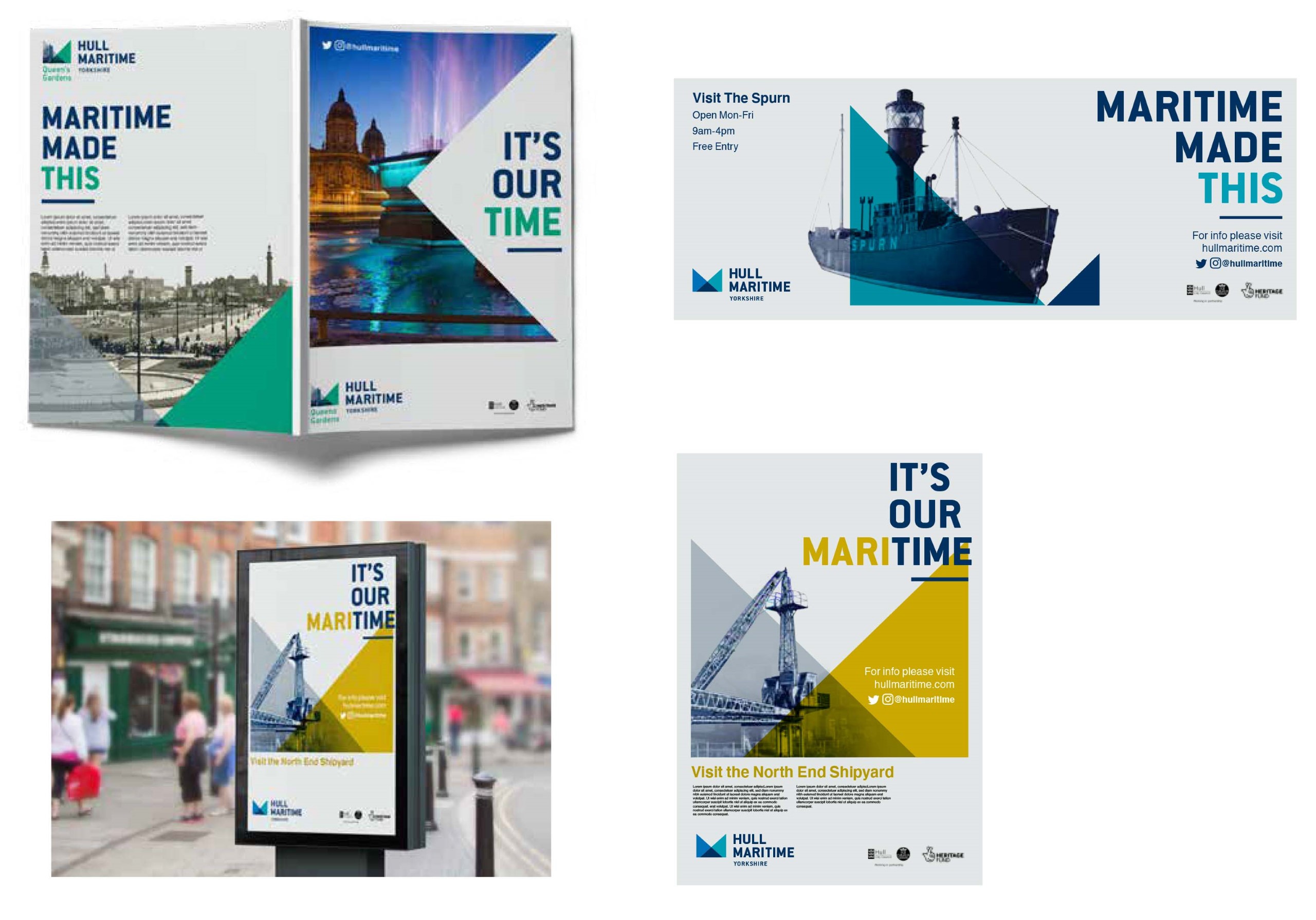
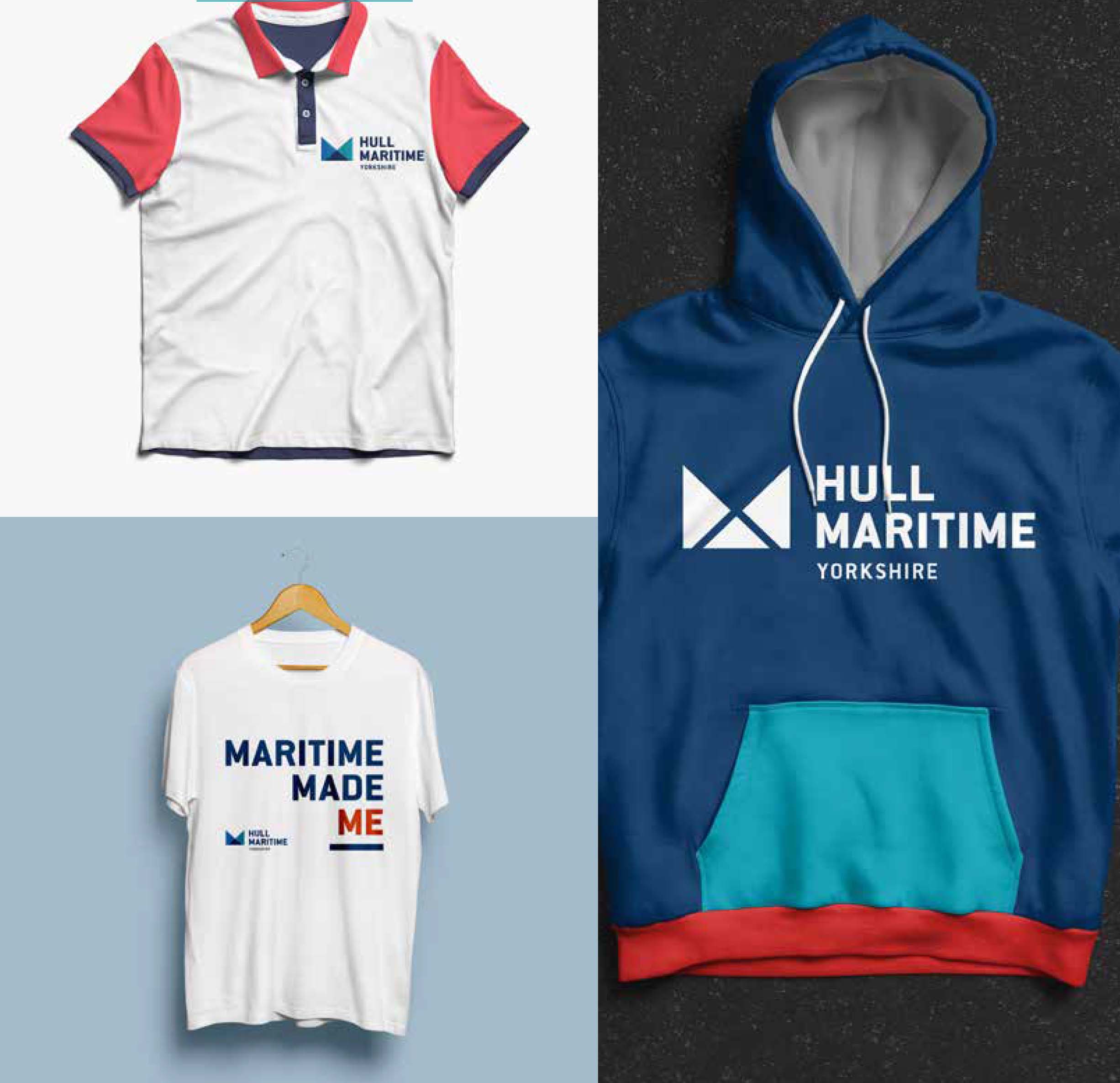
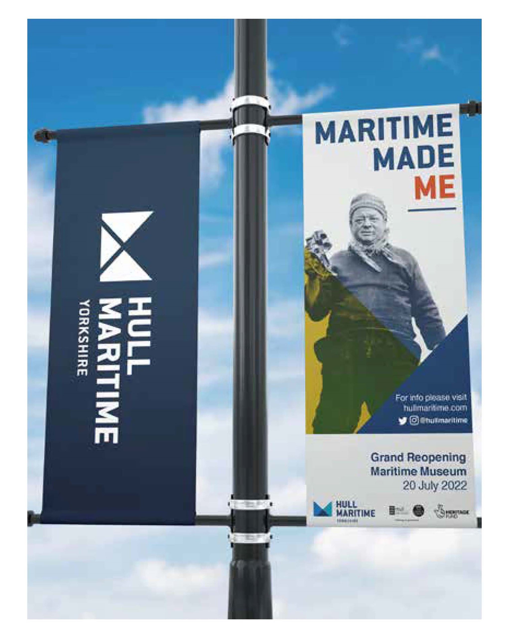
For the museum’s brand, the agency, whose HQ is in Leicester, stylised maritime shapes such as flags and sails. The triangle device, an iteration of the logo’s M, became a key part of the design language.
That was built into a flexible, layered toolkit, used in different colourways for the other sites that Hull Maritime is refurbishing or preserving. These include the North End Shipyard and the 1960s trawler the Arctic Corsair.
The wordmark is in Conduit. ‘We went for something bold, striking, solid and legible, with a stamp effect,’ Vadher says.
They chose Helvetica for the body text, also from the Monotype library, because the client wants to create future collateral in-house.
The museum is housed in the restored former Dock Offices, a Grade II listed building first opened in 1871, which has been reworked by Purcell Architecture.
The architects have doubled the museum’s public space, meaning 50 per cent more objects from the collection are on display, telling the city’s story of 800 years of maritime history. The new colour palette is historically accurate, featuring marine blues against white ceilings.
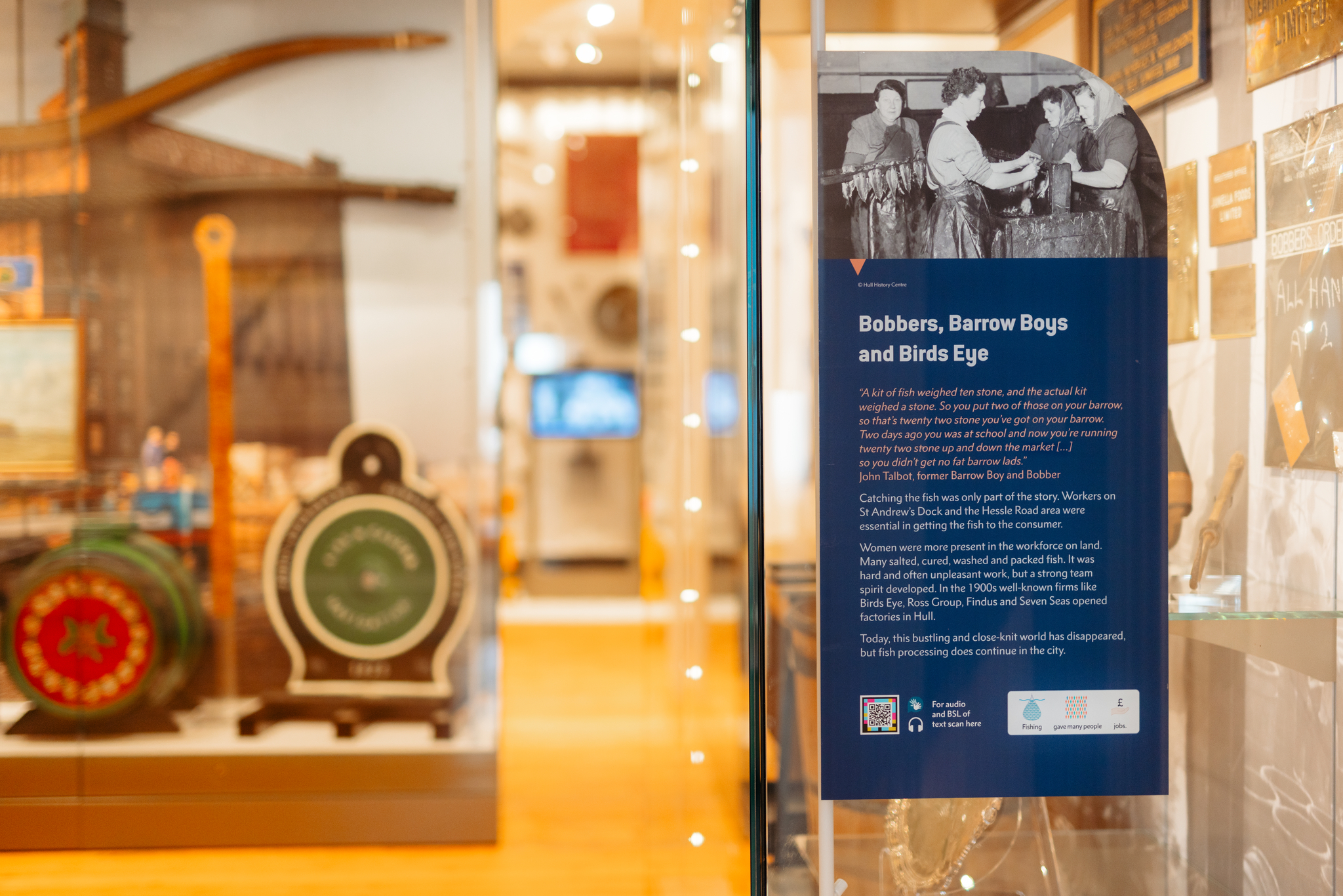
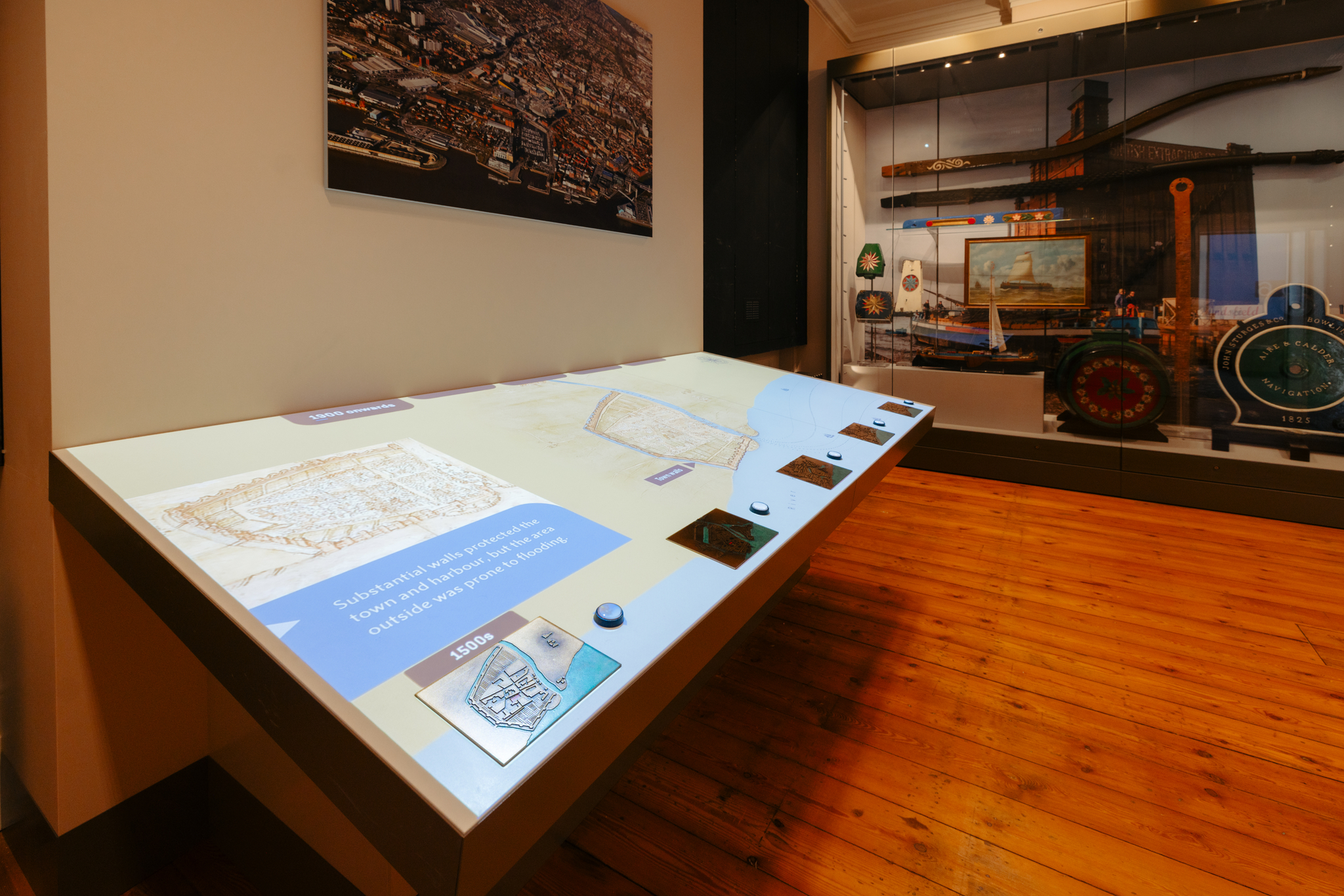
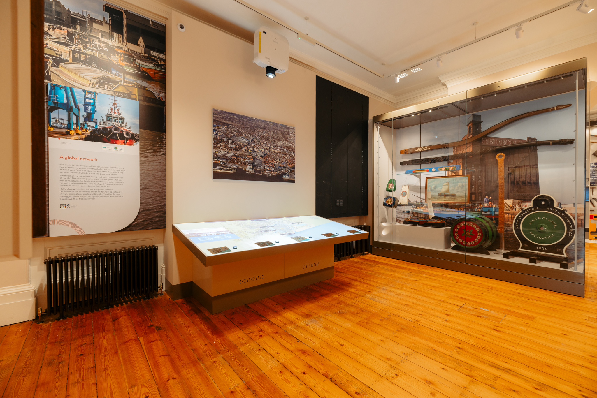
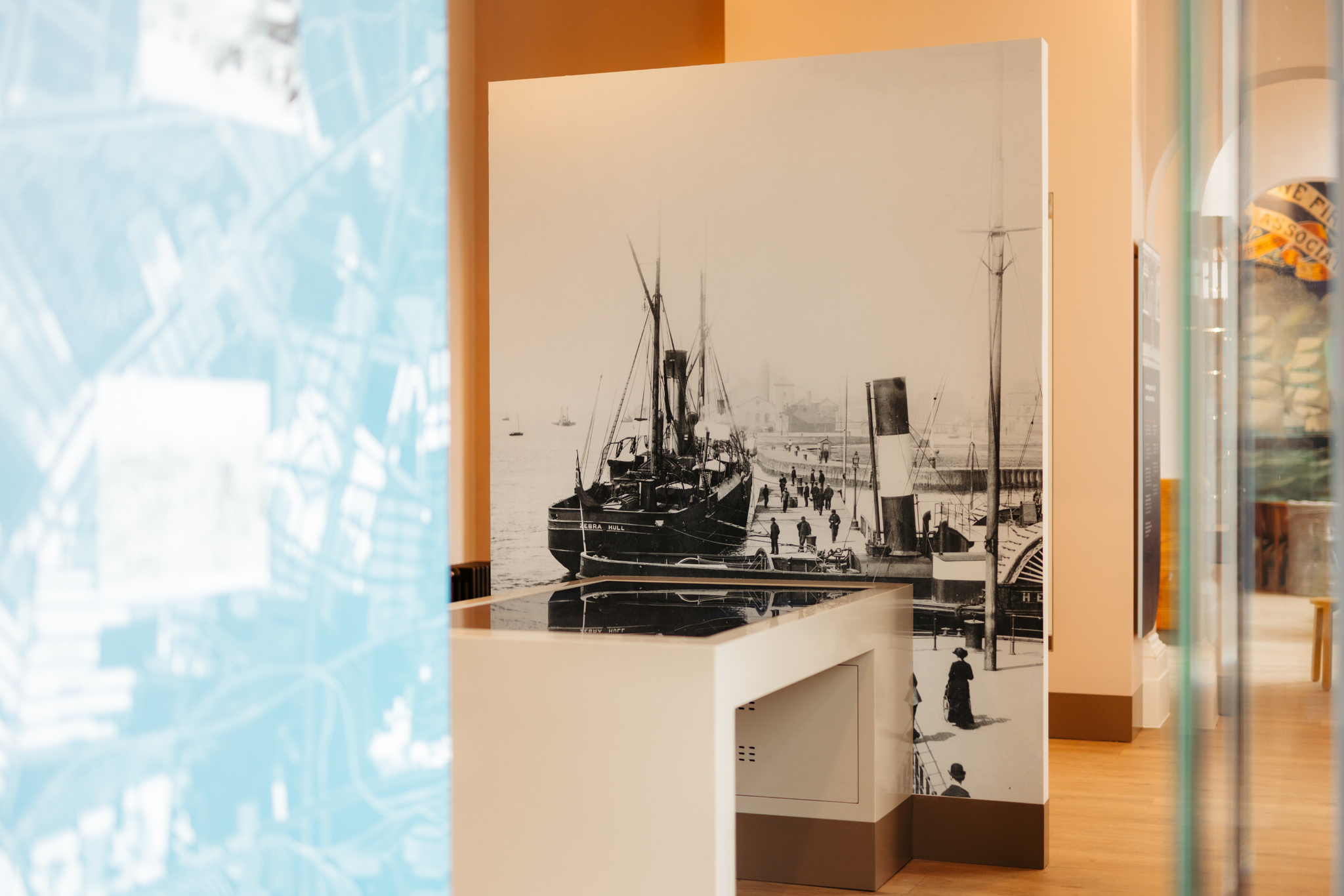
The museum’s curatorial team set the content themes, which were refined with Haley Sharpe into three overarching themes – Gateway to the World, Hidden Treasures, and The Place Called Hull – that were then broken down further.
The building is triangular, with corridors and unexpected nooks. The designers used these to make the visitor journey more free-flowing and exploratory.
As for the exhibition design, Vadher says that the museum ‘had been left behind a bit. It was more graphics and display cases, with a lot of words on the wall.’
The client wanted to bring the personalities behind the stories on display to life. ‘Humanising the story became the foundation of our interpretative approach,’ Vadher says. One example is the women – such as the Headscarf Revolutionaries – who campaigned for safer working conditions for trawlermen in the 1960s.
The exhibition design is intended to be immersive, with new display cases complemented by projections onto walls and floors, and soundscapes.
For Vadher, one immersive highlight is a ceiling projection in the Wharfage Gallery. Above a 40ft-long skeleton of a North Atlantic right whale is an animation comprising underwater scenes of life-size whales, sailing boats, and steamships.
Elsewhere, Scottish furniture maker Angus Ross has created bespoke pieces with a maritime flavour, such as reception desks, resting seats in some galleries, and the wooden elements of a spiral staircase.
Artist duo Heinrich & Palmer are working on a series of interventions around the Hull Maritime circuit, including bollard-style waymarking.
Haley Sharpe, which carried out interpretive planning and exhibition design for Phase 2 of Egypt’s Grand Egyptian Museum, has two more pending UK projects. These include the Football Museum of Wales and Wrexham Museum, which reopens later this year, as well as Watford Museum, due to open in a new location next year.