Packaging Design: Fish Tin Packaging by Deoné Rabé
Deoné Rabé crafts packaging design for collectible seafood cans. Illustrated paper labels bring fresh charm to classic tins.
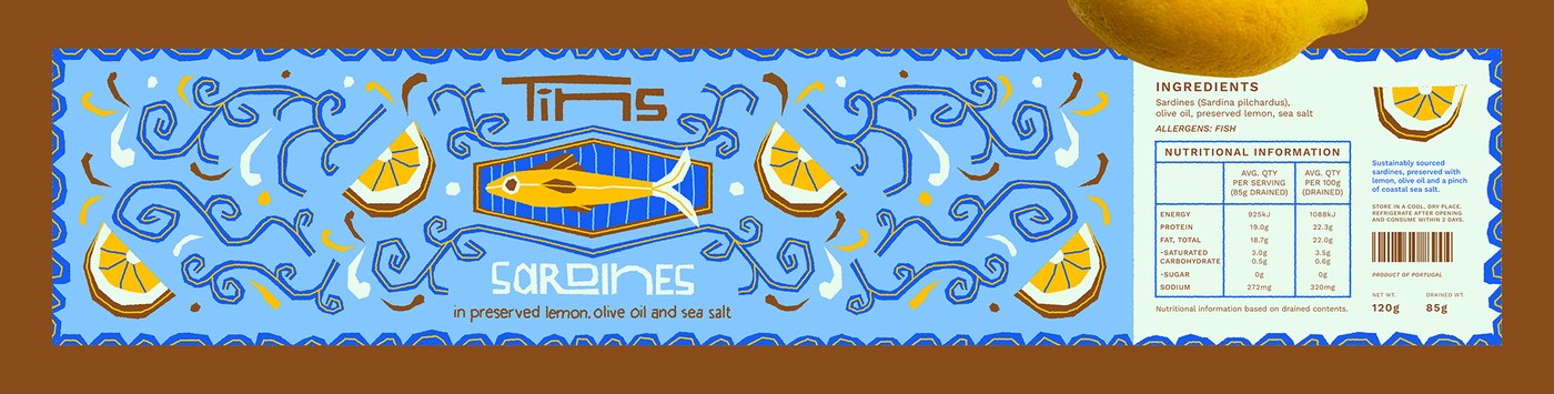
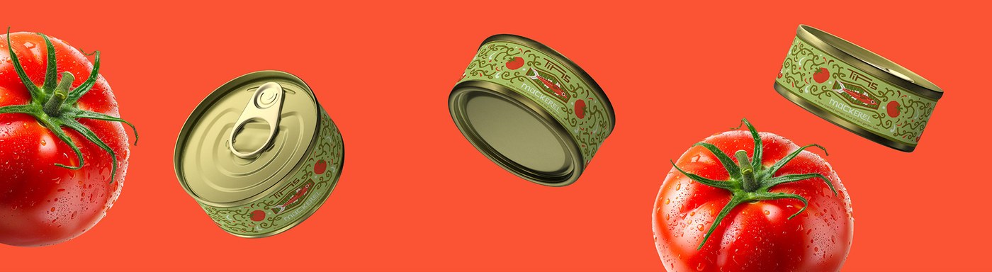
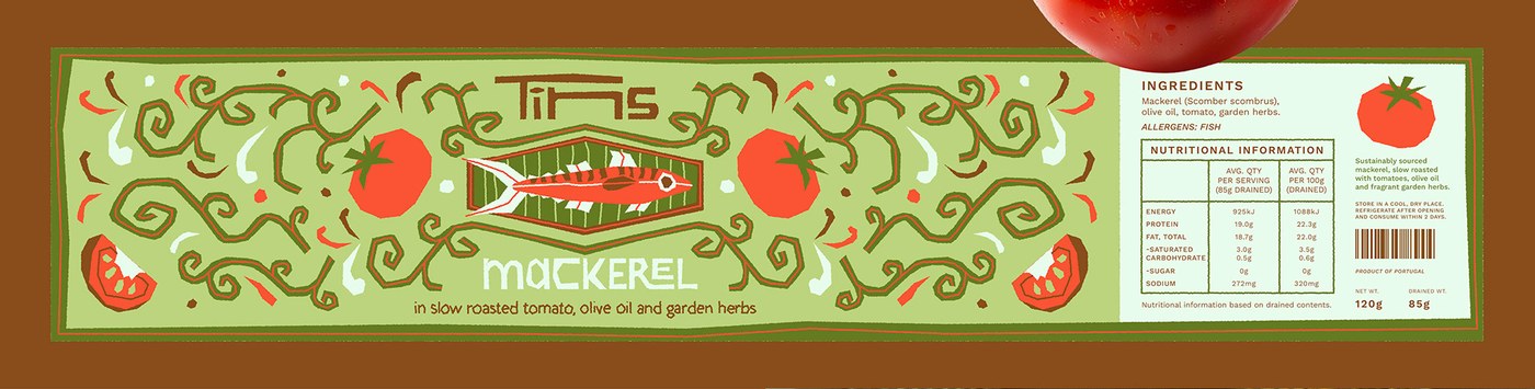
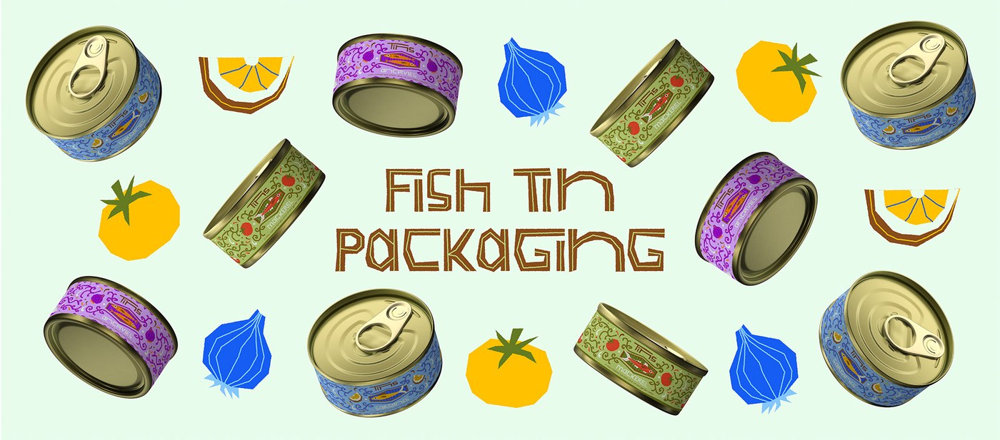
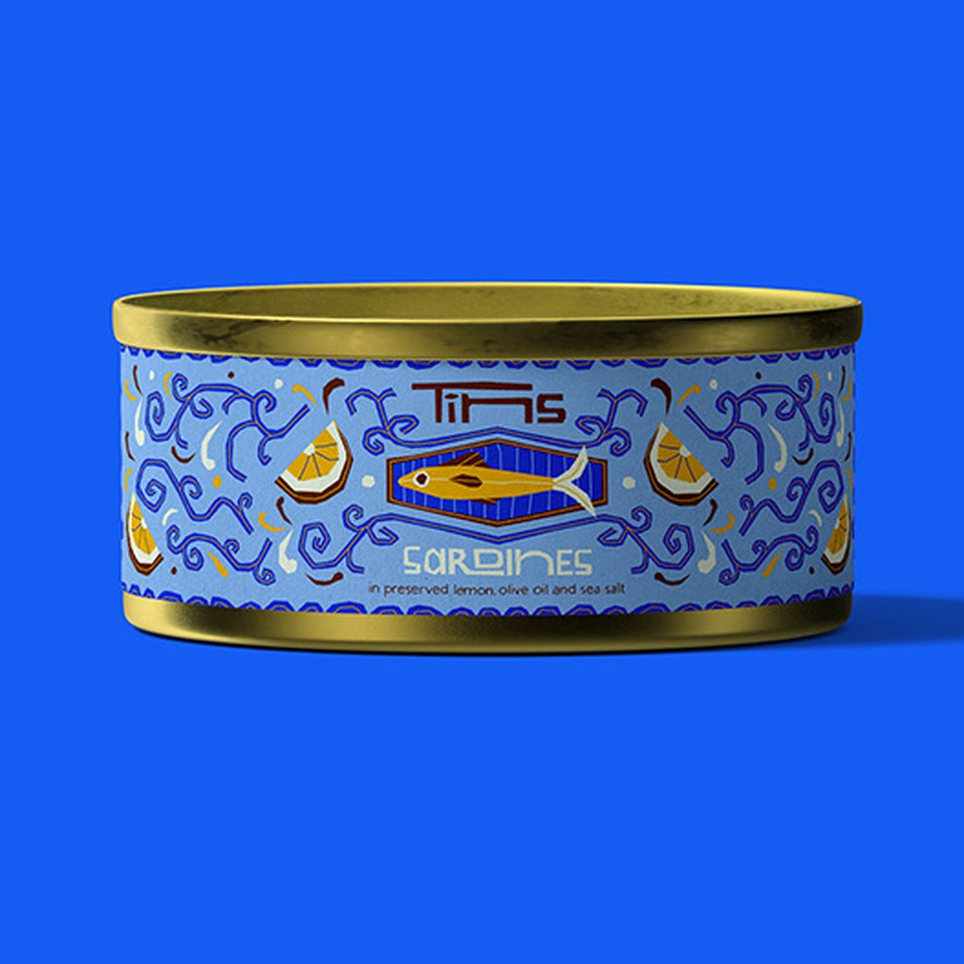
The Cape Town designer creates a fresh look for canned seafood. Each metal tin explores simple recipes with bold art. Sardines feature bright yellow lemon slices and sea blue waves. Mackerel pairs deep red garden tomatoes with soft green vines. Anchovies present rich purple onions and warm orange accents. These food drawings turn basic fish cans into artful objects. The project treats pantry goods with genuine care and craft. Hand-drawn shapes balance the maritime roots of the cannery. Every can feels like a collectible gift from the sea. The warm palette captures sunlit harbors and quiet docks.
Seafood Packaging Design and Craft
A tight grid anchors the artwork across each can. The brand logo uses thick block letters with clean charm. Diamond frames center each fish to build clear order. Fine vine lines curl outward to fill the label edges. Zigzag borders frame the top and bottom with lively rhythm. This packaging design guides the eye to the key flavor. Crisp type balances the detailed line art with calm order. Every letter sits with balanced weight on the soft background. Wide margins keep the fine scrolls from crowding the center. The layout reads clearly from across the grocery aisle.
The physical cans use round gold metal with pull tabs. Matte paper wraps the smooth metal body with care. The side panel uses small technical type for all ingredients. Nutrition tables follow standard Portuguese food rules. Warm gold tin pairs with cool paper to build tactile charm. Deoné Rabé connects seaside memory with modern shelf appeal. This packaging design shows how playful art lifts simple foods. The finished cans honor good flavor and timeless coastal life. Shoppers can keep the empty tins as small desk cups. Every detail honors the honest trade of the sea.
See the full project by Deoné Rabé on Behance.