Brand Identity: Chaos by Youssef Abdelhamid
Youssef Abdelhamid designs a tactile brand identity for Chaos coffee, pairing chubby Moresugar typography with linocut iconography.
Specialty coffee branding frequently defaults to austere Scandinavian minimalism or sterile clinical laboratories. For Chaos, a youth-oriented specialty coffee roaster conceived to celebrate spontaneity over corporate rigidity, Cairo-based graphic designer Youssef Abdelhamid established a comprehensive visual framework grounded in raw warmth and artisanal personality. Guided by the core manifesto “We don’t do perfect. We do real,” the identity translates the daily caffeine ritual into an approachable, tactile conversation across packaging substrates, cafe environments, and barista apparel.
Chubby Display Typography and Linocut Iconography in Brand Identity
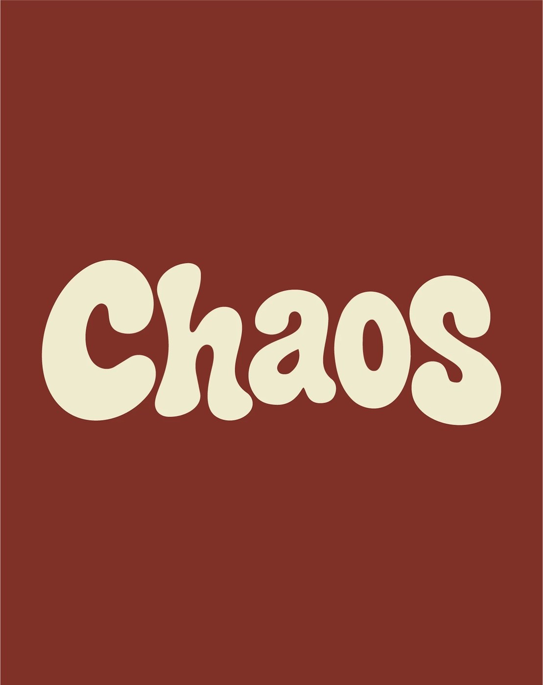
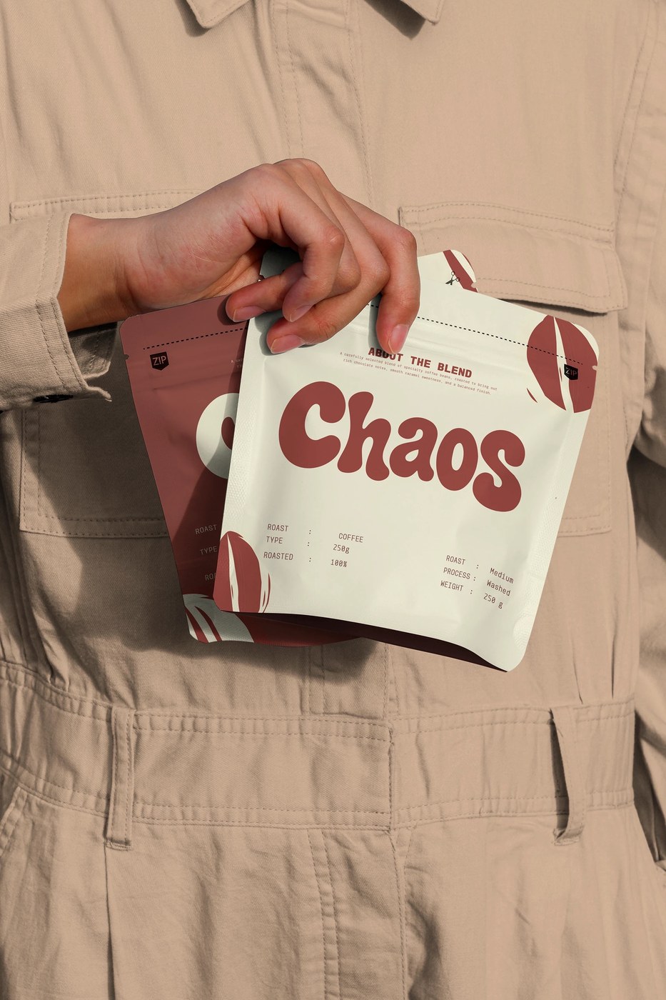
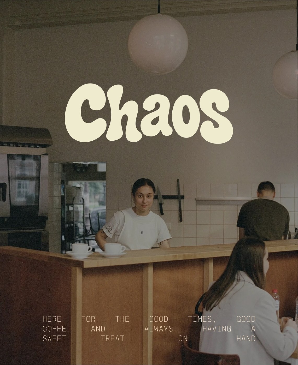
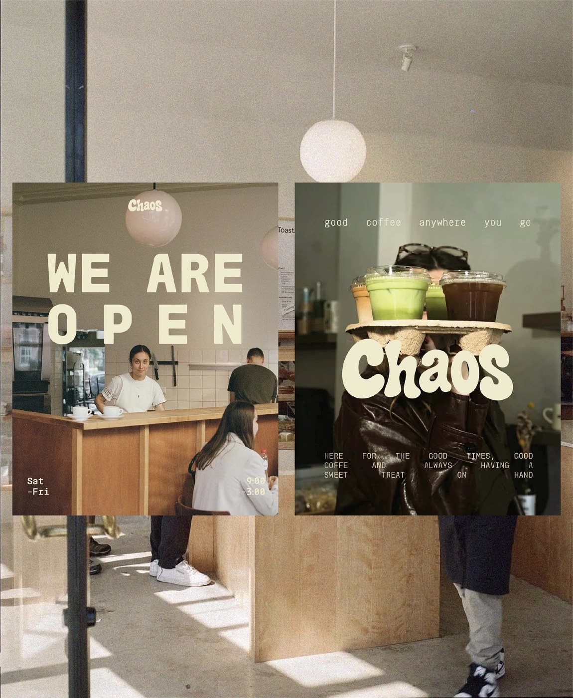
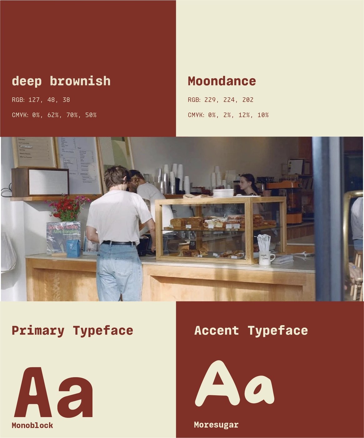
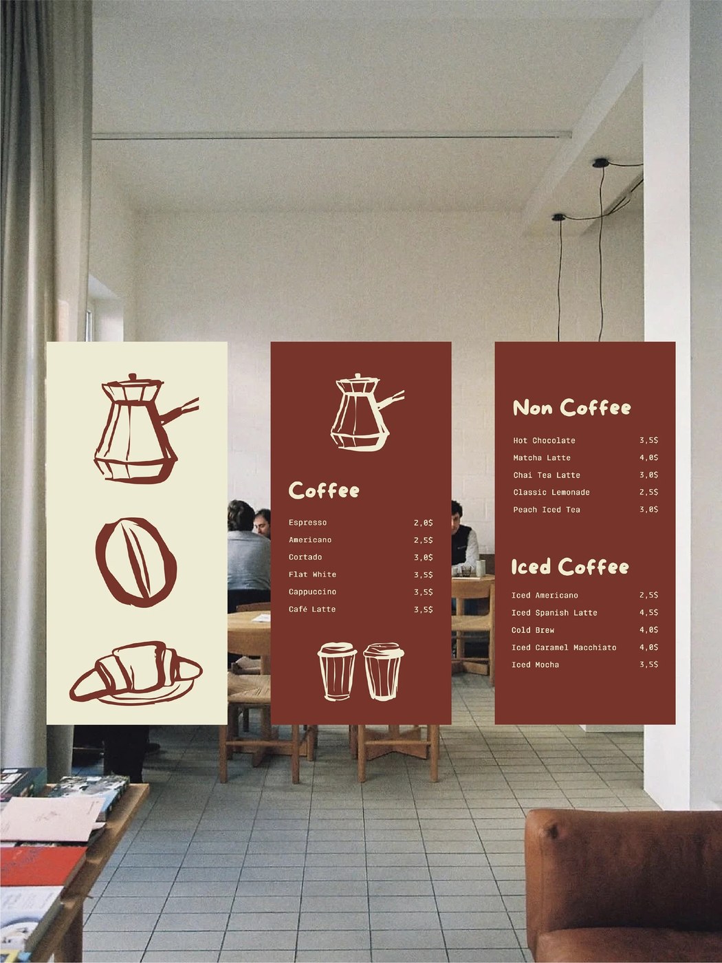
The visual system centers on an expressive, voluptuous display wordmark rendered in Moresugar. Featuring bulbous counters, exaggerated weight distribution, and soft curvilinear terminals, the logotype delivers immediate friendliness while defying conventional commercial restraint. Abdelhamid balances this animated headline presence with Monoblock, a geometric monospaced typeface utilized for roast telemetry, elevation metrics, tasting notes, and interior cafe menu boards. This typographic counterpoint establishes clear operational hierarchy, anchoring the expressive display letterforms with structured utilitarian clarity.
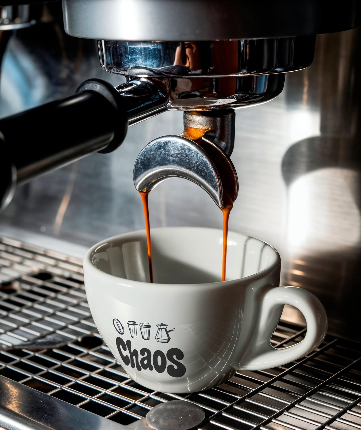
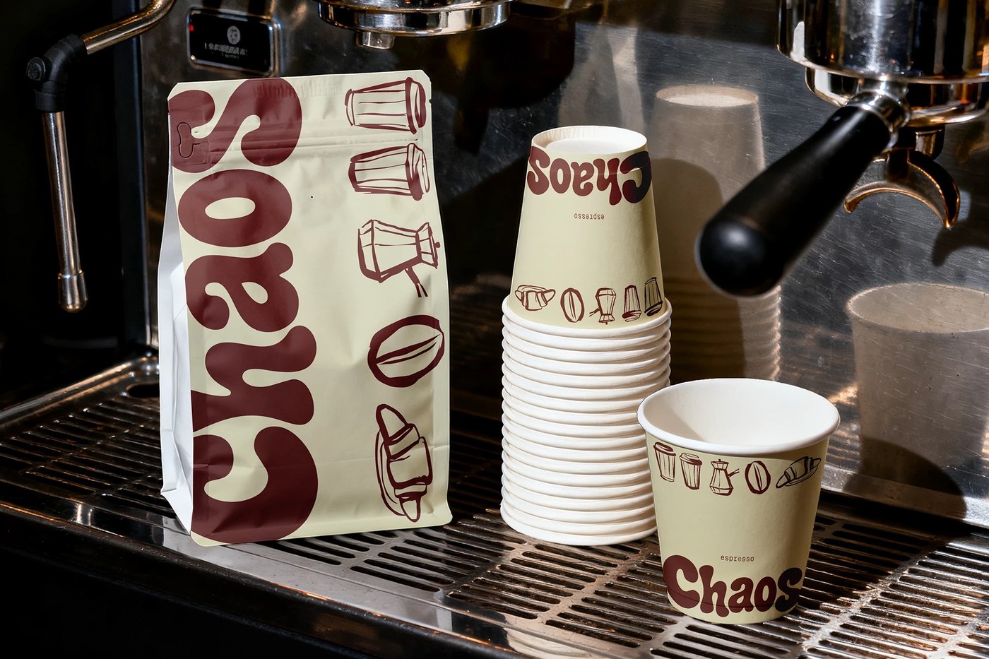
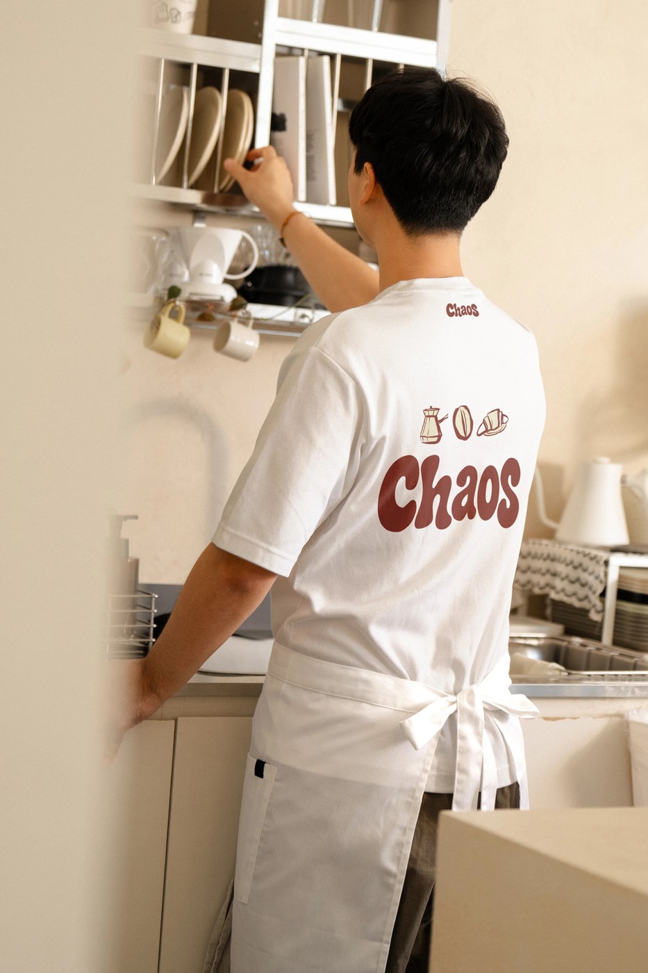
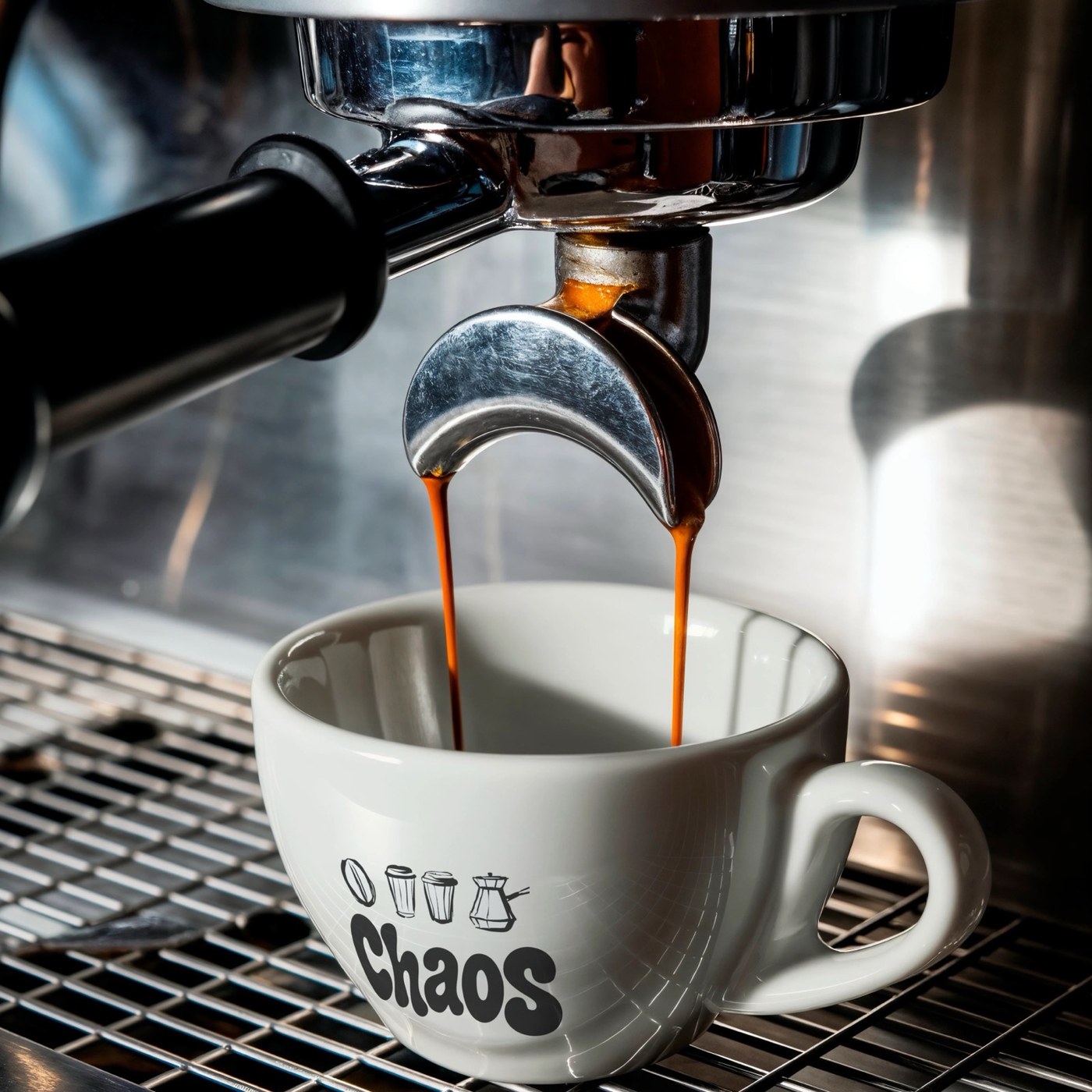
To complement the typography, Abdelhamid developed a suite of naive, monoline linocut icons representing essential coffee rituals: a traditional long-handled cezve, a split coffee bean, a breakfast croissant, and a to-go cup. These rough-hewn emblems appear alongside the wordmark on heavy ceramic espresso cups, paper packaging seals, and collateral, infusing the identity with hand-crafted individuality.
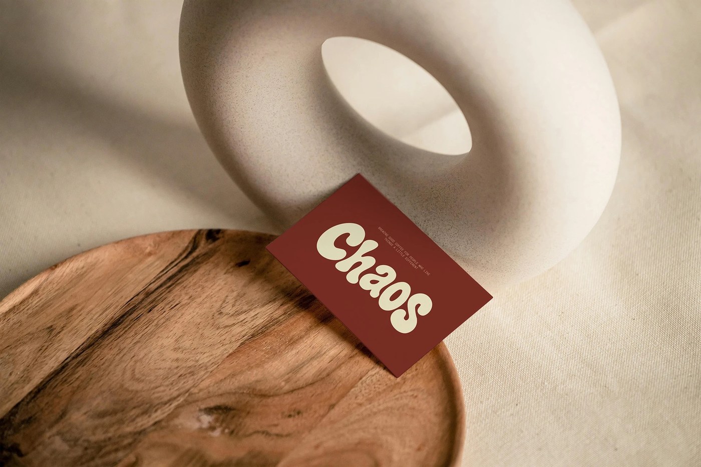
The chromatic palette reinforces the brand identity through an earthy, unpretentious duo: deep brownish terracotta and Moondance buttermilk cream. Rather than relying on synthetic brights, the palette draws direct inspiration from freshly roasted coffee beans and kiln-fired pottery. Tactile execution brings this system to life across diverse touchpoints: matte coffee pouches feature vertical typographic runs and technical bean profiles; white ceramic espresso cups feature the wordmark under double espresso pours; and textured business cards rest alongside sculptural ceramic forms. From screenprinted staff uniforms to outdoor takeaway cups and canvas tote bags, Chaos demonstrates how bold typographic character can redefine modern hospitality spaces.
See the complete project by Youssef Abdelhamid on Behance.