Brand Identity: PCK by Brand Brothers
Explore the new PCK brand identity by Brand Brothers. A bold monochrome monogram, geometric ligature, and structured symbol for legal IP.
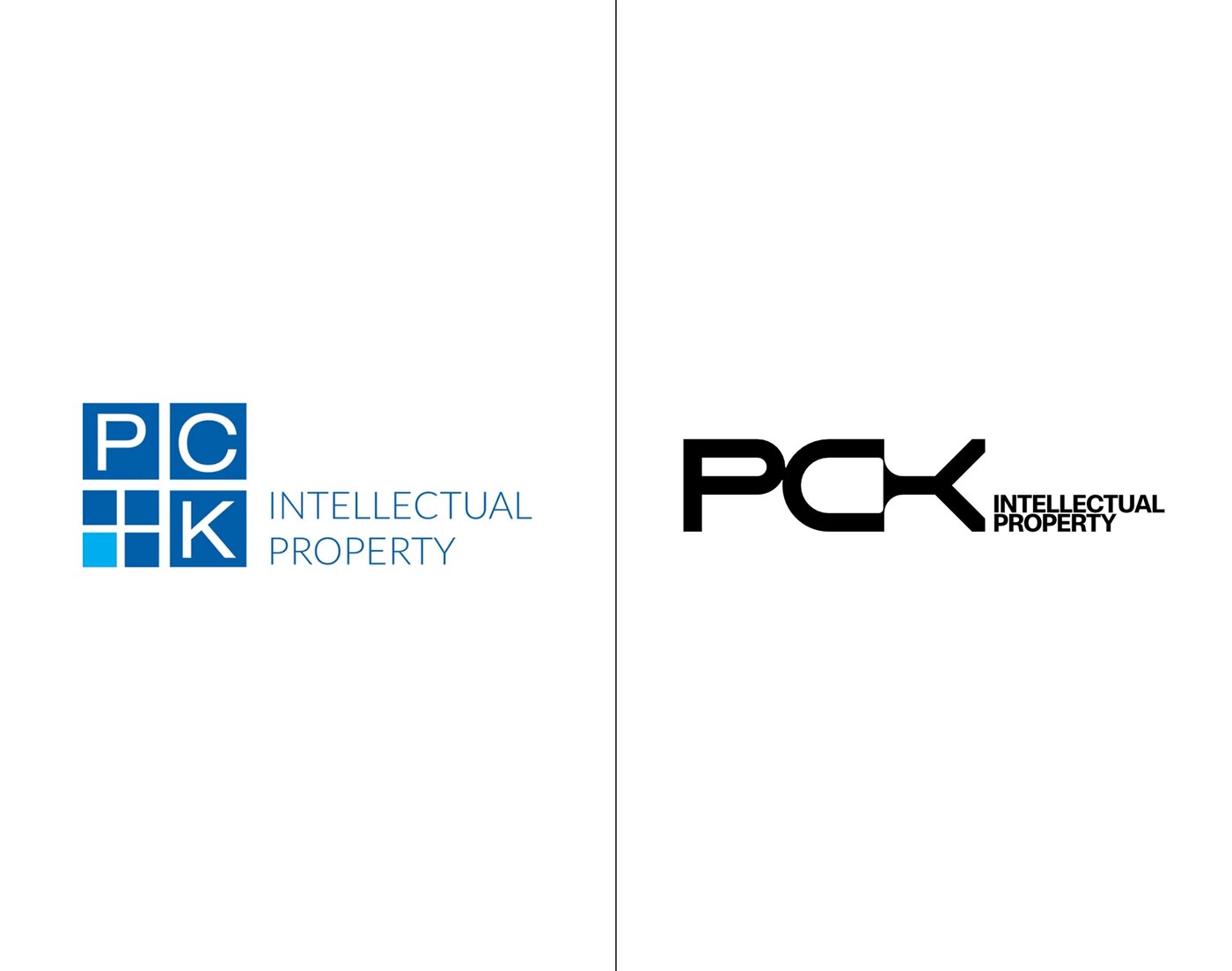
Brand Brothers took a clear path to build the brand identity for PCK Intellectual Property. Law firms often rely on safe blue tones and dull crests. The studio breaks away from those old rules. Instead, they position the team as a sharp, modern legal group. Based in Toronto with offices in Winnipeg and Washington, the firm guides clients through patents, trademarks, and court cases. The visual strategy centers on pure black and white tones. Stark contrasts replace old shields. Every shape signals clarity, balance, and direct purpose. This bold look gives the firm an immediate presence across print and digital media.
A Typographic Brand Identity Built for Legal Clarity
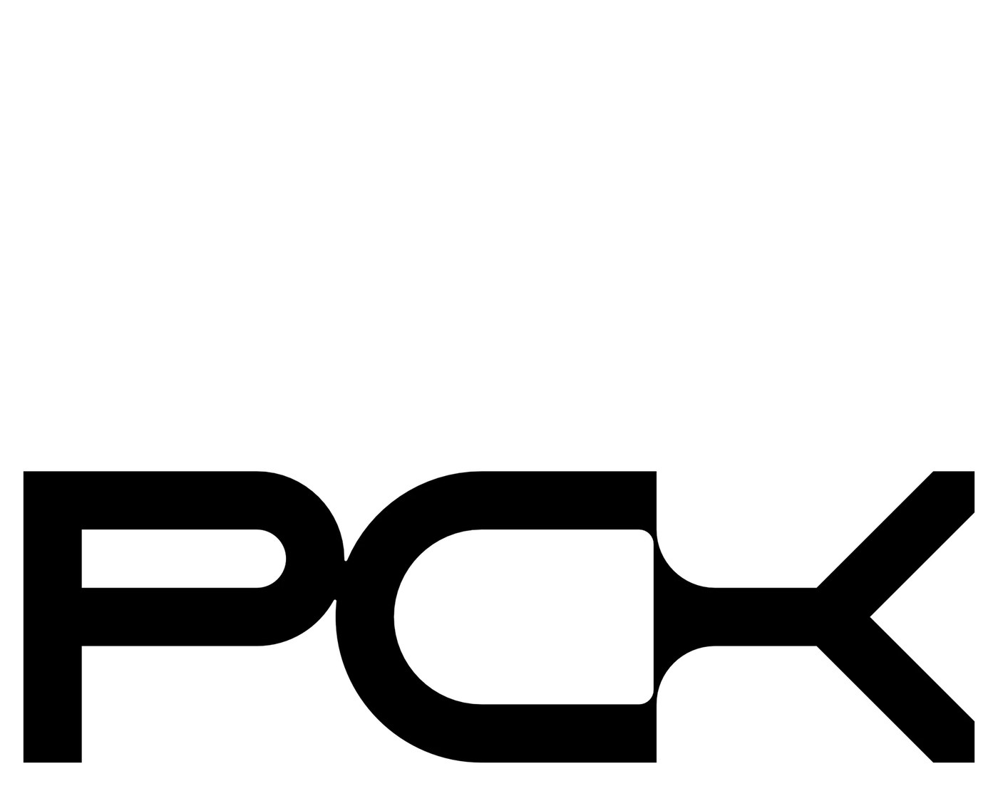
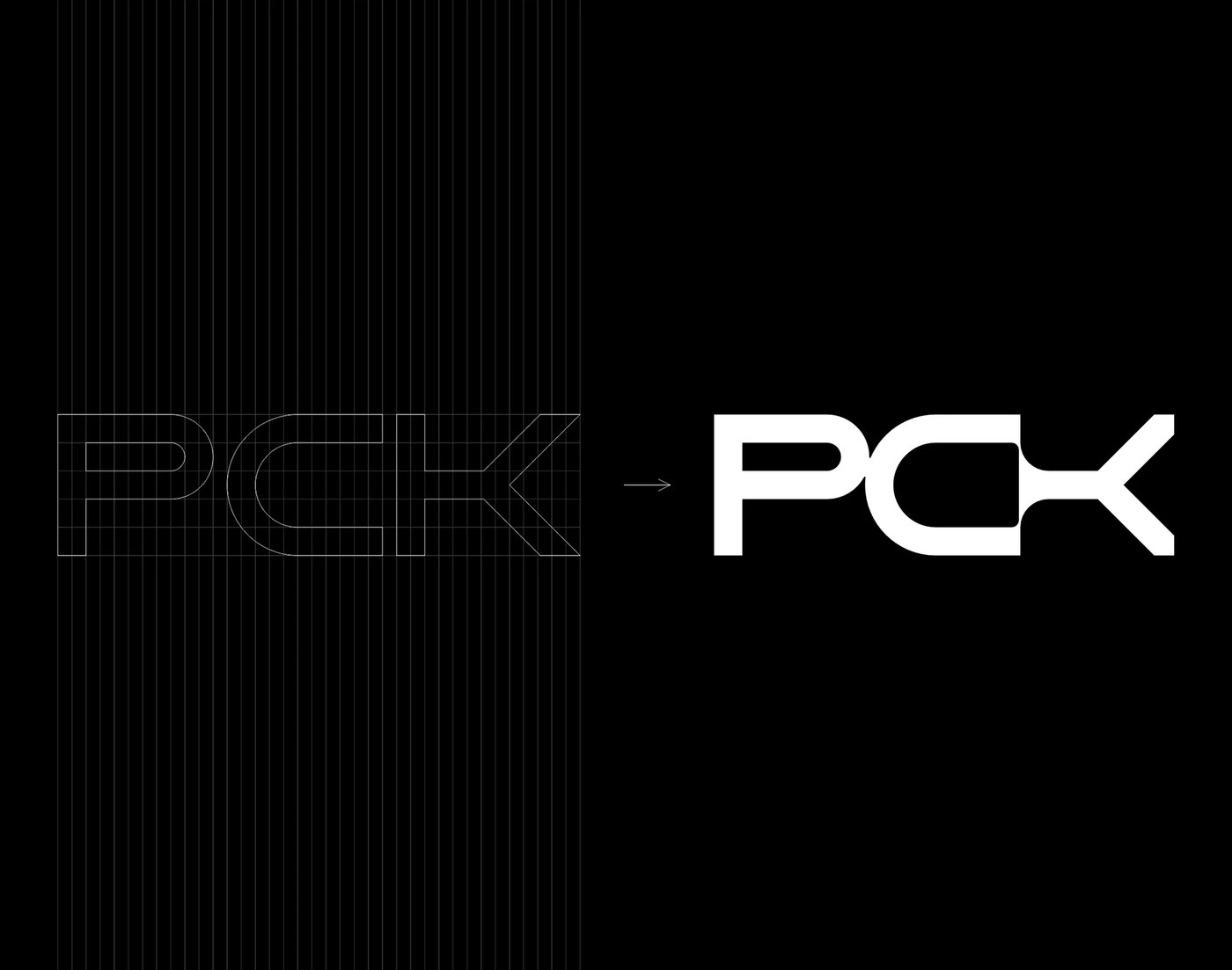
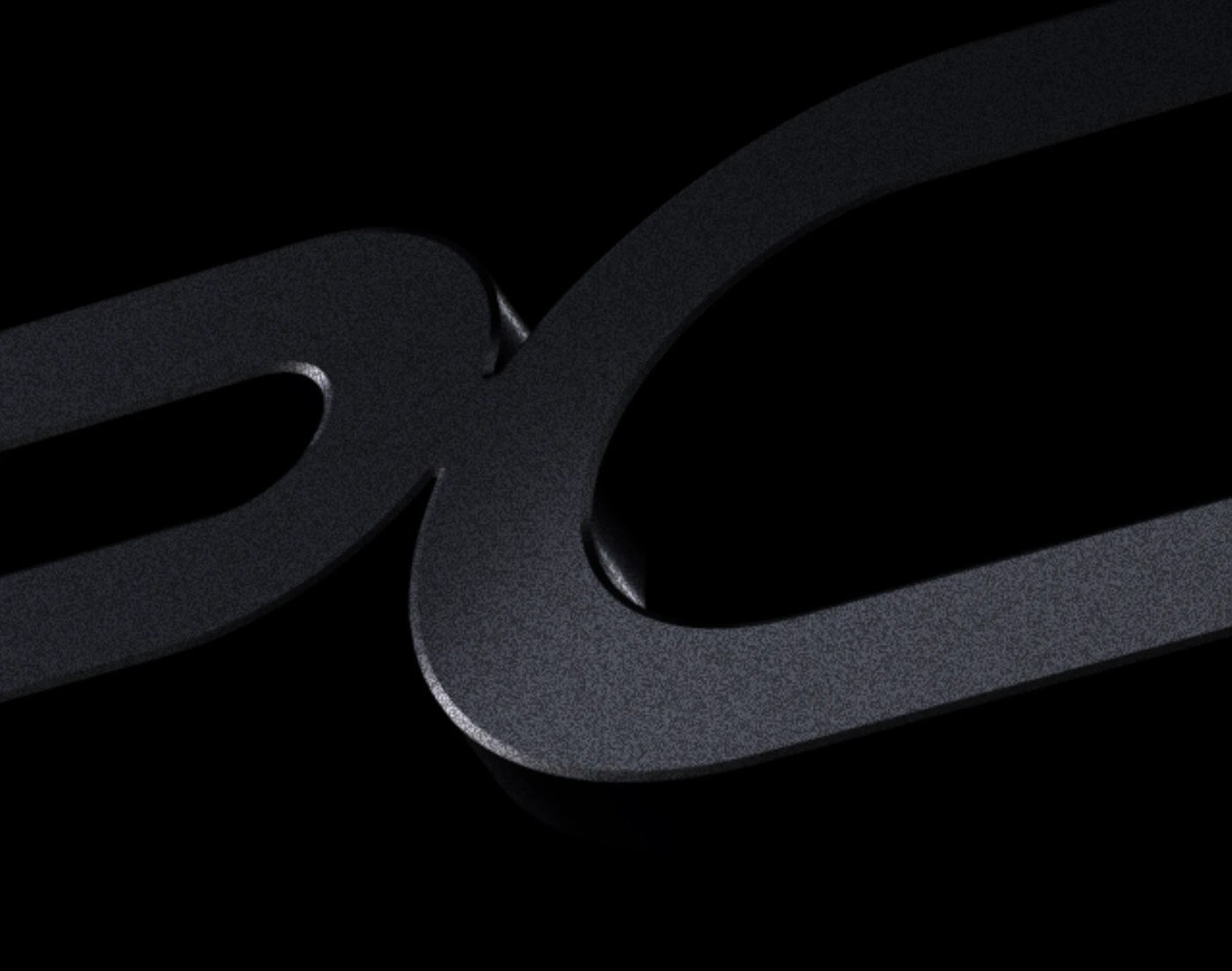
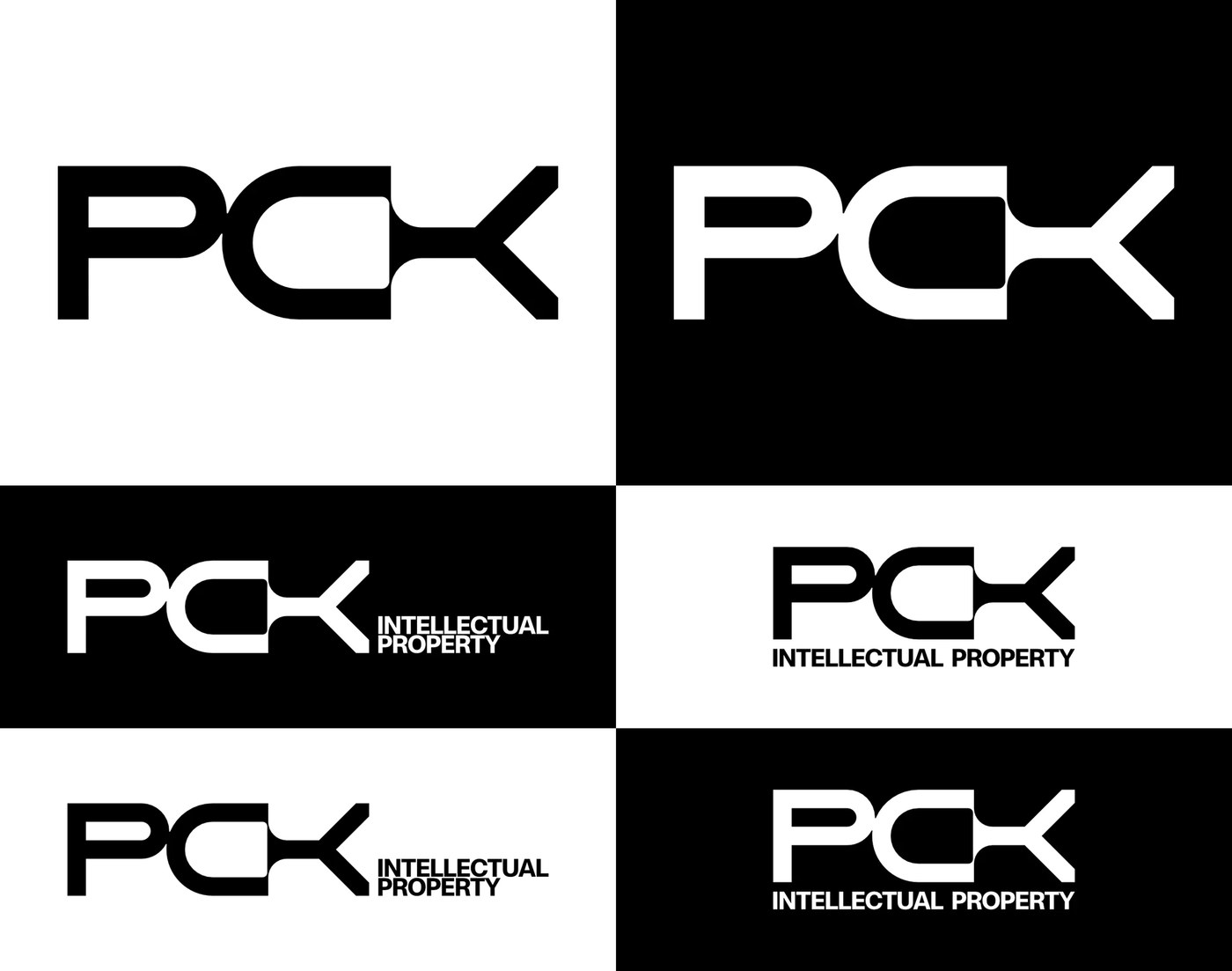
At the center of the system sits a custom monogram. Brand Brothers built the mark on a strict grid. The letters have a wide stance and a low base. This wide form gives the design a firm ground. The key detail lives at the link between the letters C and K. Here, the strokes join into one sharp shape. The tip points out in two paths. This custom shape hints at ongoing legal care and technical growth. In pure black, the letters stay clear at all sizes. Clean spacing sets the main mark apart from smaller text lines. The type moves with calm precision.
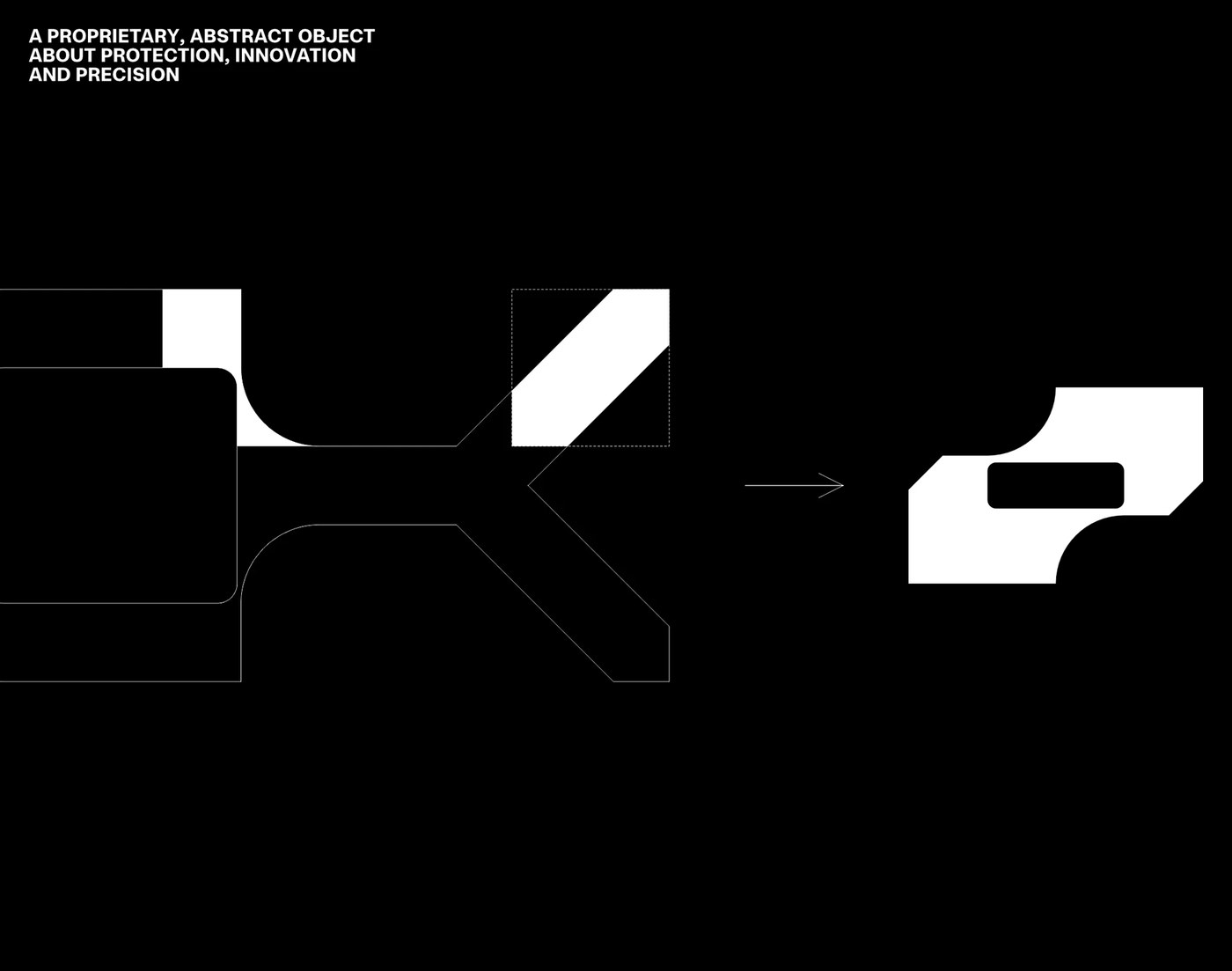
Past the main mark, the studio pulled a clean abstract symbol from the C-K join. This custom shape has soft curves and inner cutouts. It works as a bold brand icon on posters, books, and web pages. The team also remade the firm's website and client papers. The layout swaps thick blocks of text for open space, strong grids, and bold type. On physical cards and folders, rich black ink rests on thick paper stock. With this brand identity, Brand Brothers shows that law firms can welcome fresh graphic design. The system keeps client ideas safe while showing real craft.
See more from Brand Brothers on Behance.