Mestiza Studio built this play cafe brand like a game, fusing aesthetics to appeal to all ages
We’re always keeping up with what Mestiza Studio is doing – so we were pretty surprised to see that the last time we had proper natter to the team was in 2024, following their identity for the new Gurls Talk platform. Time has sped by and quite a lot has changed for the studio since then – for starters, it launched Mess earlier this year, a new publishing offshoot and independent press at the studio. A huge archival feat, its first edition, Lolita Danse, looks back at the Parisian performance collective active throughout the 80s and pulls from hundreds of previously unpublished books and documents to chart its creative impact.
The team have also been focussing on place branding and creative projects in the culinary world of late – if you’ve ever been lucky enough to pass London’s new canteen and bakery Cremer, you can experience the mark Mestiza’s left on its visual order “over a very good plate of food and coffee”, Monica says. One of these food oriented endeavours took the team all the way to Mexico City based café Canca: a location with a dedicated play space for children and a food spot designed for adults. When the cafe founders Ruben and Carolina reached out to the Mestiza they were seeking a design solution that considered adults and children alike – an identity that would capture the attention of two completely different audiences, simultaneously.
“The identity needed to speak to children without feeling childish, and to adults without feeling like a space designed exclusively for parents of young children. Finding a visual language and tone of voice where both could meet, without either having to compromise, became the guiding principle of the project,” shares Monica. A central question that framed the design of the logo was how to create a visual language that could communicate something more than legibility, for “children who may not yet be able to read,” lead designer Maia Loucif says.
The team approached the construction of the logo mark quite like they were in a playroom themselves. Treating it as a game, Maia set about stress testing a build of the brand’s name from a very limited set of forms in multiple variations – “I found myself returning to Fanette Mellier’s activity books introducing children to graphic design,” Maia shares. From this constructivist inspiration, the designer drew up reduced alphabets from simple geometric shapes, finding the “essence of each letter within them”, she says. The wordmark was all about capturing the meaning that can derive from our childhood experiments with building and moving physical forms.
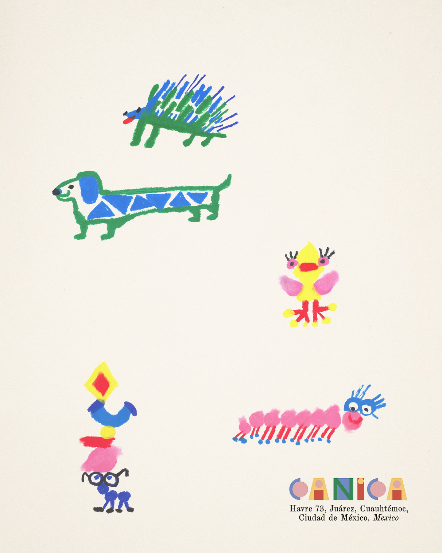
Worlds apart from the constructivist wordmark, however, sits a whole cast of characters created by Francesca Albergo, the team’s in-house illustrator. For these fluid and inky creations, drawn out by hand, the illustrator used the geometric shapes in the identity as her starting point but brought a whole new expressive dimension to form animals that feel “expressive, vibrant and full of personality”, Monica shares. The characters are placed across cafe menus, products, signage and other applications and aim to act as friendly faces kids could encounter throughout their experience of Canica, she says.
It’s precisely the contrast between a geometric logo and this tactile and joyous over spill of ink in the retracing of its shapes that makes Canca’s identity work so well. A balance of freedom with restraint, Francesca’s addition to its visual world “became a way of testing the identity itself”, Monica ends. “A good visual system should be robust enough to be interpreted, played with and extended by others.” From a paired down starting point to the arrival of its whimsical creatures, Francesca’s hand painted work feels like a more unexpected trajectory that only enriches the cafe’s visual world.