Florian Cornut’s Brand Identity for Live Current
Florian Cornut and Baptiste De Almeida craft a fluid brand identity for Chicago's Live Current using Neue Montreal type and merging spheres.
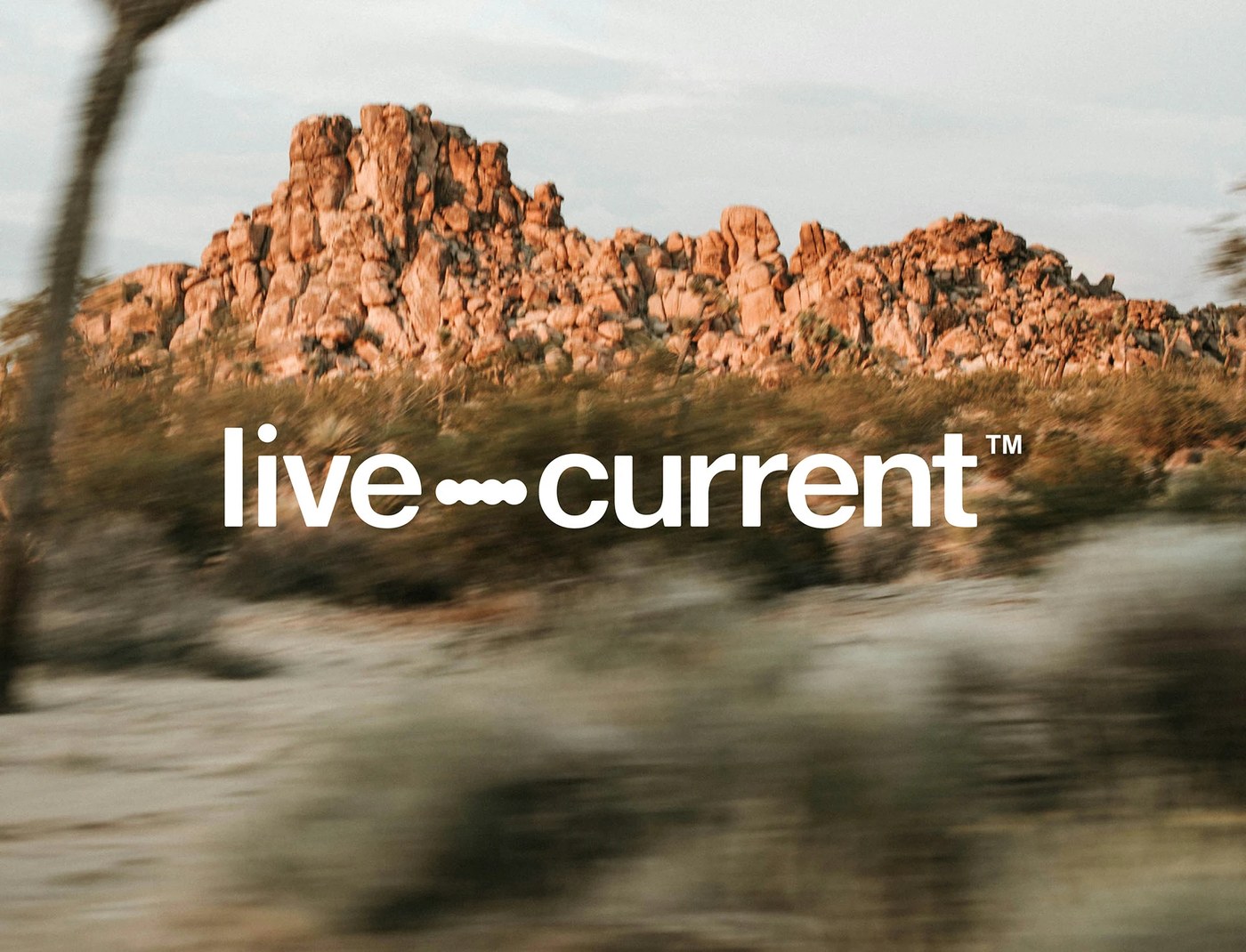
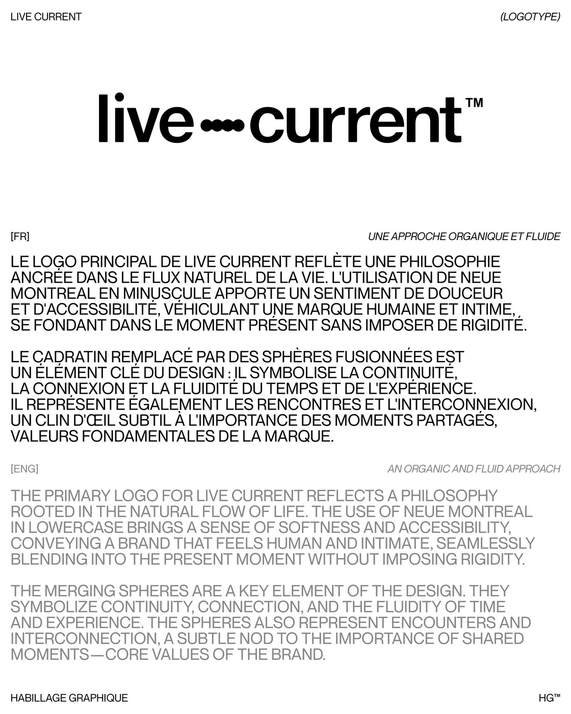
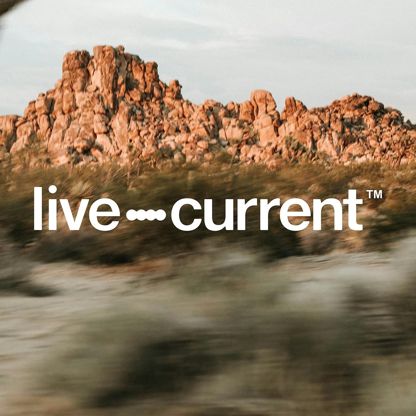
Most mindfulness brands lean on clichés. They reach for lotus icons or thin script fonts. Art director Florian Cornut of Habillage Graphique and graphic designer Baptiste De Almeida of Bureau47 took a sharper typographical route when developing the brand identity for Chicago's Live Current with partner Chris Brooks. The primary wordmark is set entirely in lowercase Neue Montreal from Pangram Pangram, giving the mark a warm, conversational posture that doesn't feel stiff or corporate. Between the words live and current, the designers replace a standard em-dash with four fused spheres that turn a punctuation mark into a symbol of shared encounters and continuous time.
Modular Symbols and Brand Identity Craft
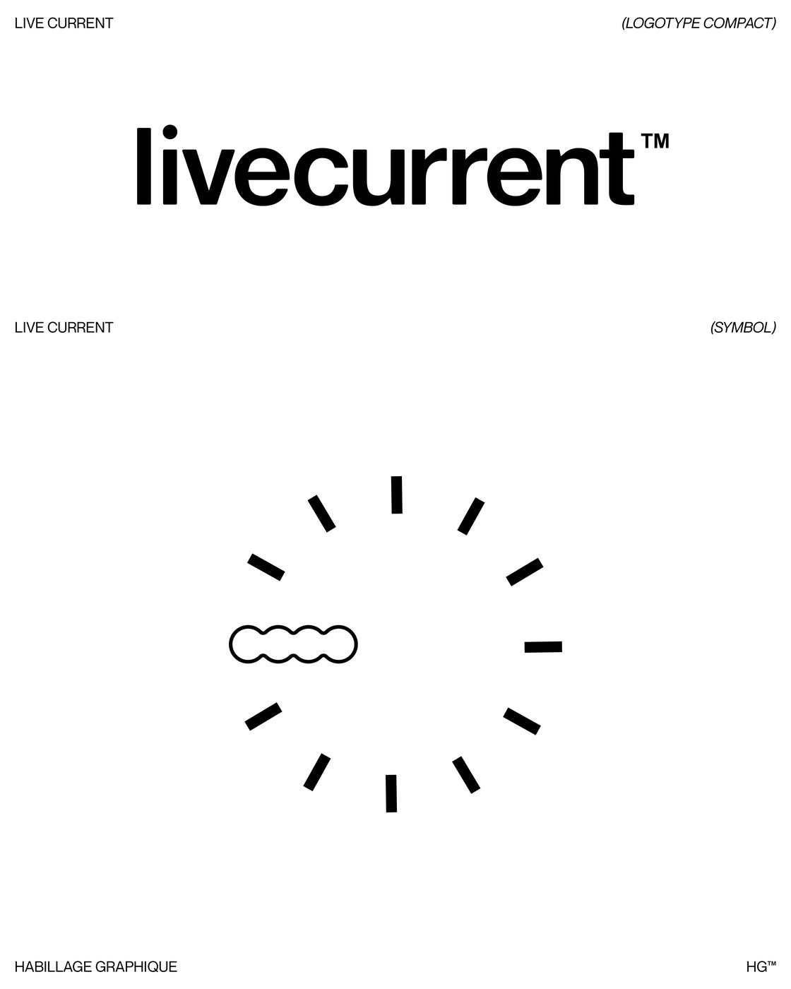
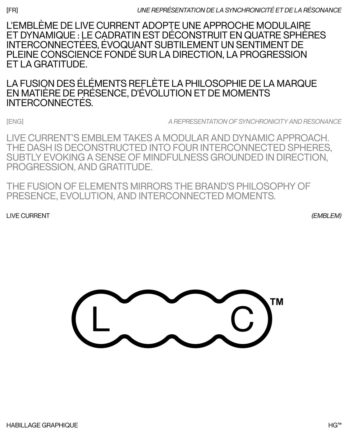
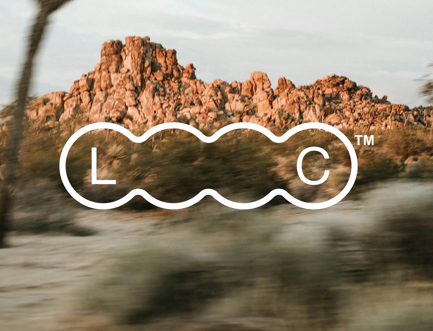
That four-sphere connector does the heavy lifting here. For secondary applications, Cornut and De Almeida expand the solid connector into a hollow, undulating four-sphere outline that frames uppercase L and C initials inside a single capsule emblem. It's a smart, economical move. On a companion system sheet, the studio pairs a tightly tracked one-word livecurrent compact logotype with a twelve-hour radial clock dial where the nine o'clock index tick is swapped out for the four-sphere contour. Each variation scales cleanly from small corner bug signatures to wide display lockups without losing its geometric rhythm.
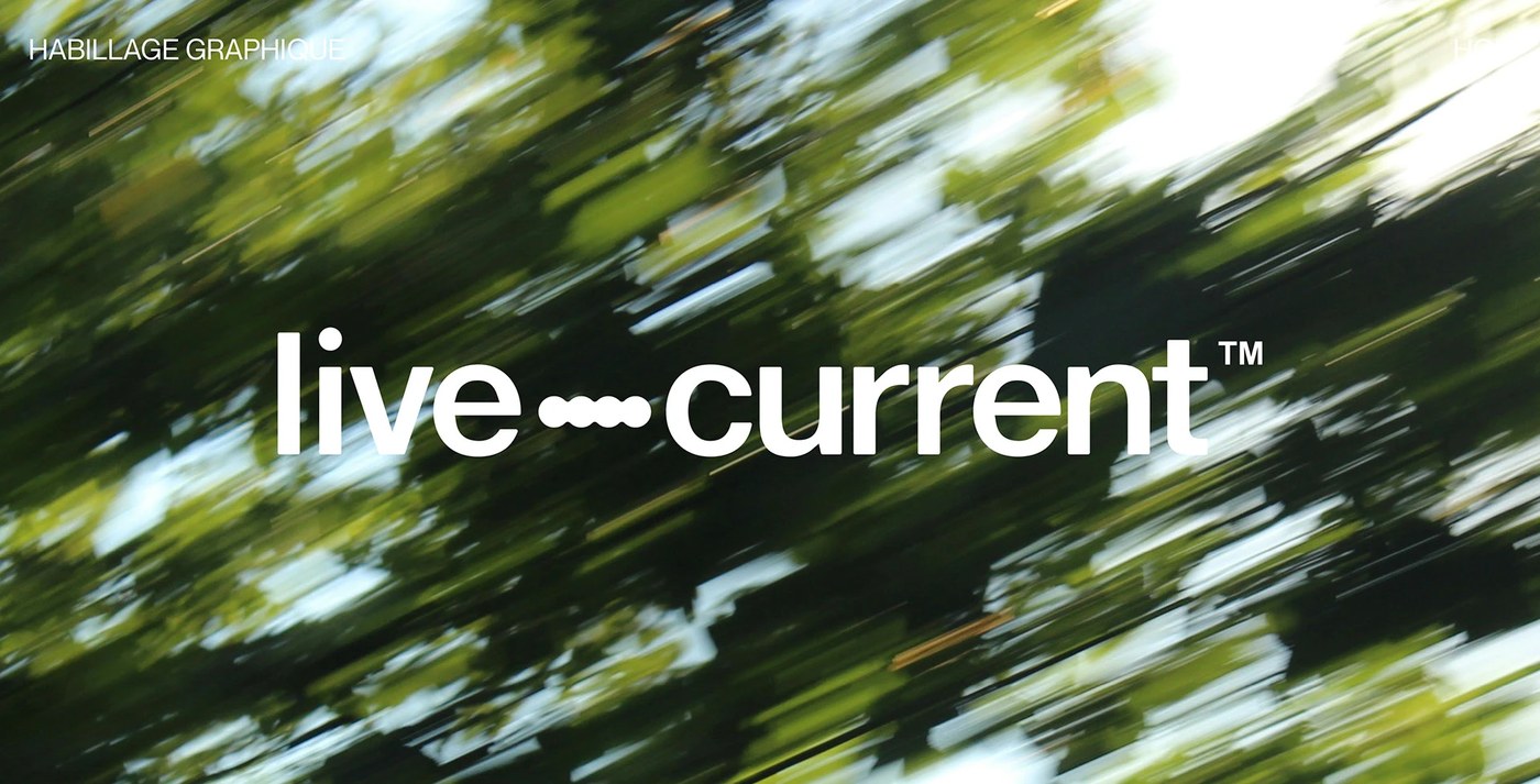
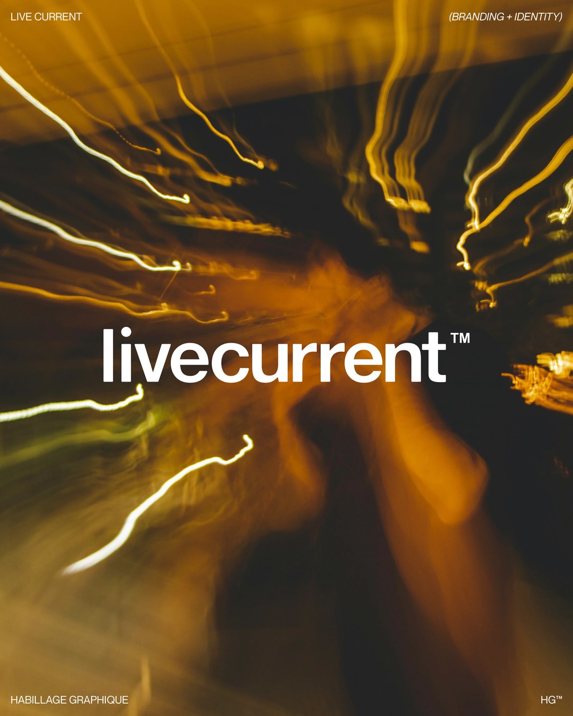
The presentation boards treat the rationale like editorial print specimens. On cool stone-grey #E8E8E6 sheets anchored by Habillage Graphique and HG corner marks, bilingual French and English text blocks pair jet-black uppercase Neue Montreal against medium-grey #7A7A78 translations. Nothing in the grid feels forced. When the brand identity moves onto photography, the static white wordmark and L-C emblem sit dead-center over motion-blurred frames — sunlit desert rock formations, streaking green forest canopies, and warm amber long-exposure light trails that make the stillness of the type feel grounded in the present moment.
See the full project by Florian Cornut on Behance.