Pentagram rebrands the world’s oldest concert hall
Marina Willer and her team have drawn on De Bijloke’s unique history, diverse programming and the enduring power of music itself
Muziekcentrum De Bijloke, the world’s oldest concert hall, has a long and storied history. Located in Ghent, Belgium, it was originally built as a medieval hospital in 1251, retaining this function for centuries until, in the 1980s, it underwent a major transformation to become a dedicated performance space. Several years later it finally opened as the venue we know today – a truly unique concert hall with programmes spanning classical, jazz, experimental and more.
In 2026, the team at De Bijloke decided it was time that the vibrant artistry the venue has long played host to was reflected in its branding. After searching for a suitable collaborator, they landed on Marina Willer of Pentagram to lead the project. Along with her team, she was briefed to create an identity that could effectively capture De Bijloke’s rich history and visionary programming.
The result is an identity rooted in the music, the craft and the culture that audiences encounter with each performance held at the venue. This is evident across the entire identity, but most notably in De Bijloke’s new logo, which takes the shape of an expressive graphic made up of a single criss-crossing line.
Inspired by American composer John Cage’s unconventional music notation methods, as well as experiments that the Pentagram designers carried out using an oscilloscope (an analogue tool that visualises audio signals), the logo balances fluidity with precision, much like De Bijloke’s programming.
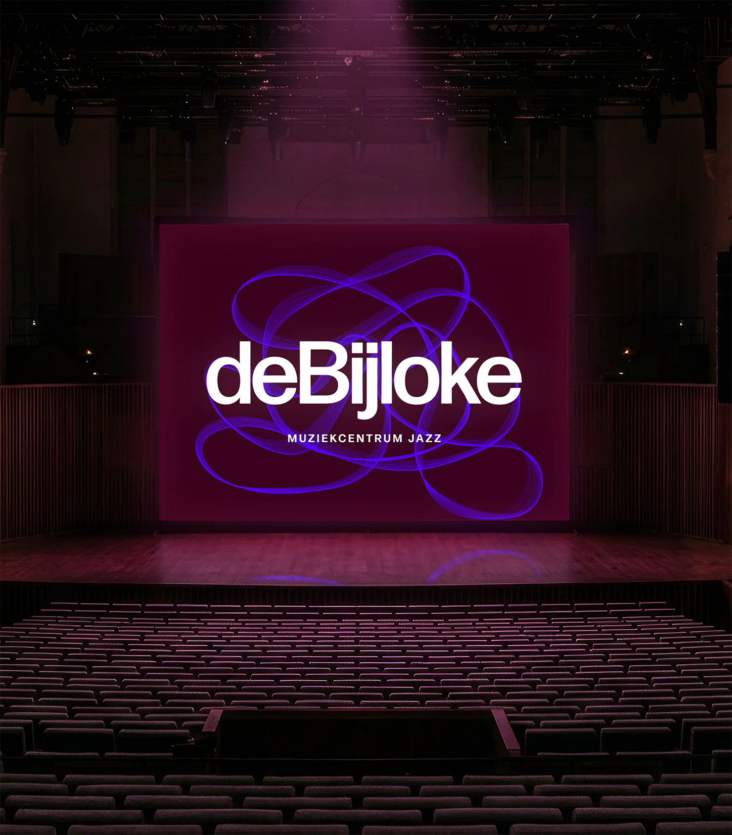
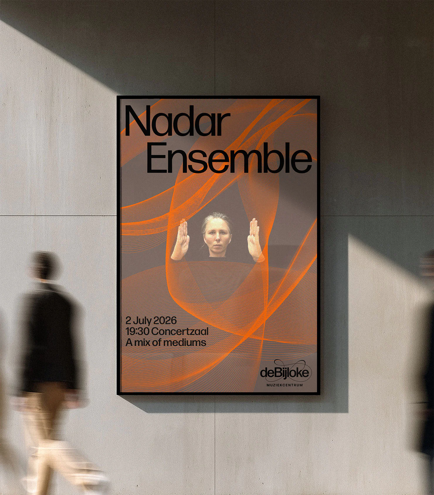
Chosen to contrast with the logo, the typography used throughout the identity is clean and legible, owing to Forma DJR’s simple letterforms. These create a strong juxtaposition with the expressive nature of the logo, but retain the potential for creative arrangements in headlines and key messaging. They also bring a decidedly modern feel to the overall visual style.
Complementary to this is the newly-devised colour palette, which is at once bold and moody. Inspired by the building’s various unique features, it also speaks once again to the broad curatorial approach of De Bijloke’s team, which is inclusive of many different compositions, sounds and influences.
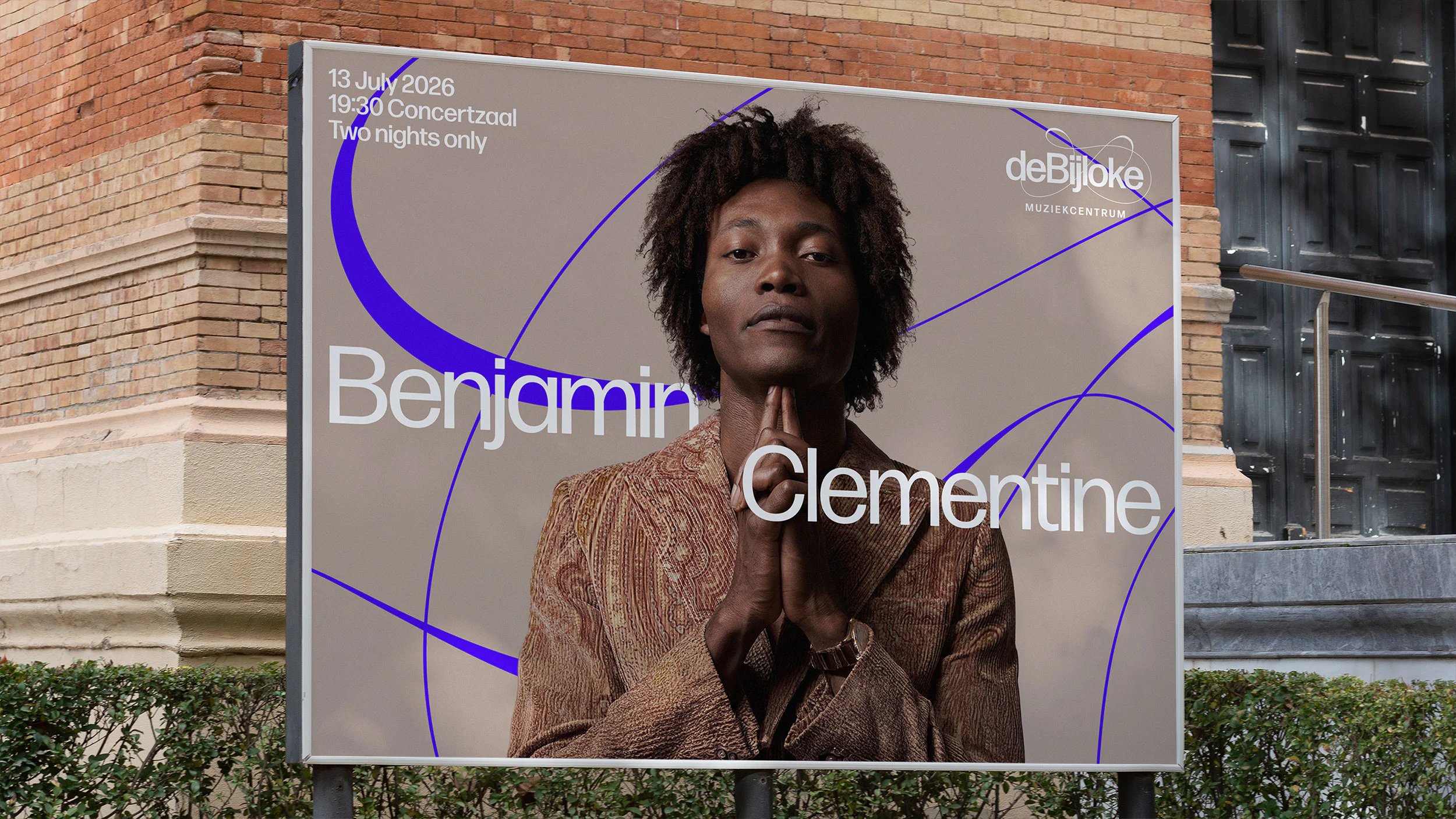
The finishing touch was to develop a series of graphic patterns that could support the other assets in the identity. Willer and her team came up with five in total, including Jazz and New Music, which draw on the aesthetics of the oscilloscope, as well as three for De Bijloke’s Family programme, which were designed to reflect the playful nature of its featured genres. These ever-changing forms can be adapted for motion, and exported for any format, offering endless possibilities.
As a whole, the new De Bijloke brand is a visual testament to the venue’s fascinating past, and exciting future, and is deeply rooted in themes of expression and transformation. From the reimagining of De Bijloke as a hospital-cum-concert hall, to the constantly shifting sounds of its performances, these influences are reflected in the designers’ work.