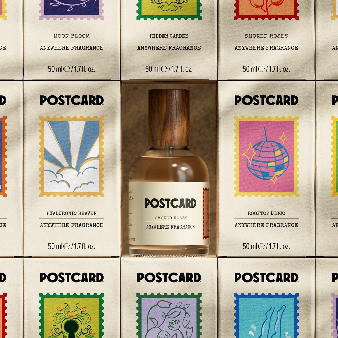
Inside Robot Food’s Packaging Design for Postcard
Robot Food rebrands Singapore's Oasis Beauty Kitchen into Postcard with stamp-illustrated packaging design and custom-molded cleansing bars.
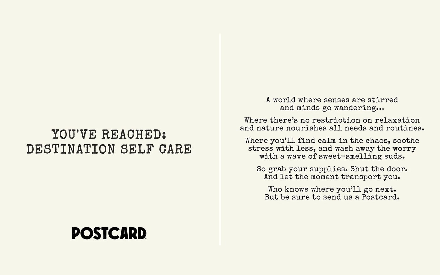
The brief was refreshingly blunt. When founder Hildra Grace approached Robot Food to take her sustainable Singapore beauty brand global, she asked for "less farmers market, more Sephora." Ten-step skincare routines and bathroom shelves crowded with plastic bottles have turned self-care into another daily chore. To strip away that clutter while nodding to the company's previous name, Oasis Beauty Kitchen, Senior Designer Craig and Senior Copywriter Lizzie renamed the line Postcard. It's a warm, immediate hook built around the feeling of escaping to a personal oasis. On the brand's divided manifesto cards, distressed typewriter serif copy sits beside a vertical postal rule, paired with a chunky, rounded geometric wordmark textured like a fresh rubber ink stamp on cream stock.
Postage Stamps and Tactile Packaging Design
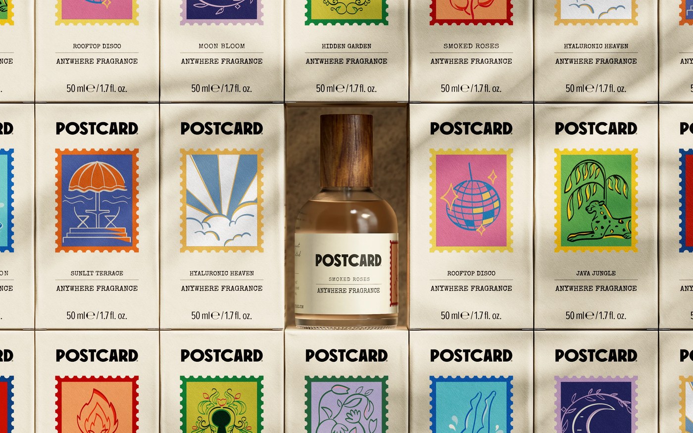
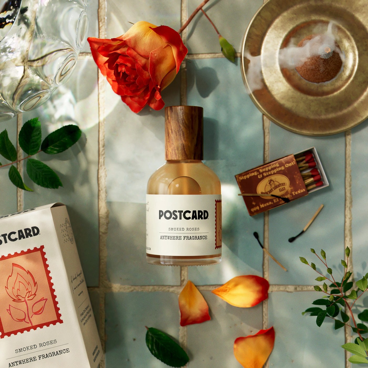
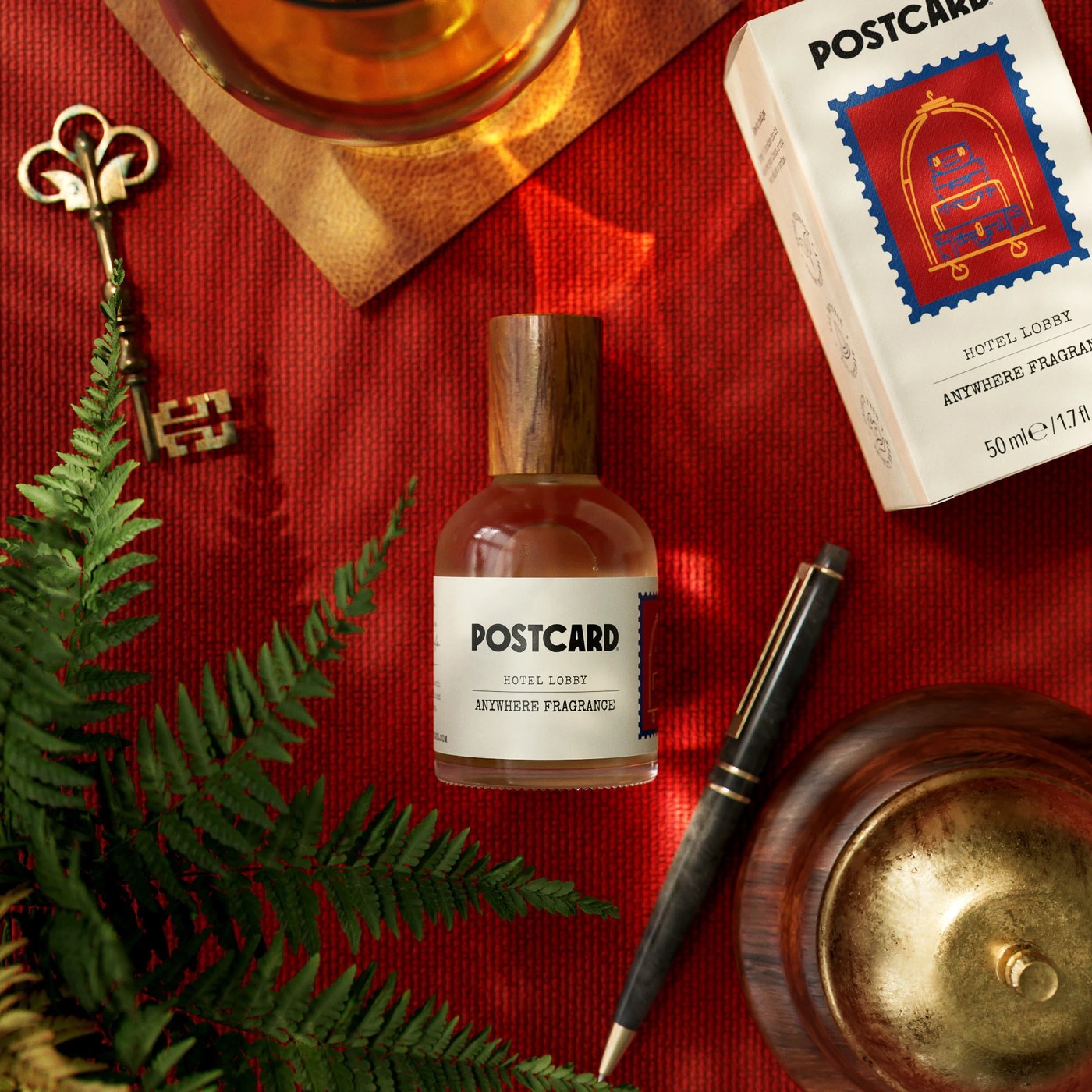
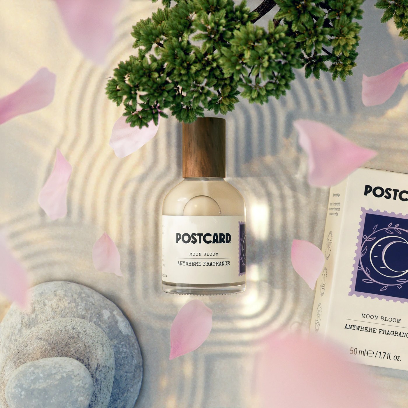
Every scent gets its own destination. Across the 50 ml Anywhere Fragrance range, the packaging design pairs cylindrical glass bottles and turned wood caps with textured off-white cartons anchored by perforated postage-stamp illustrations. Nothing on the shelf feels clinical. Smoked Roses frames a flame-shaped rose bud inside a crimson stamp border with wavy postmark cancellation lines printed along the side panel, while Hotel Lobby stacks vintage suitcases on a brass bellhop cart inside a royal-blue frame. Moon Bloom shifts the mood to an indigo crescent moon surrounded by botanical leaves, sitting alongside cartons for Sunlit Terrace, Hyaluronic Heaven, Rooftop Disco, and Java Jungle.
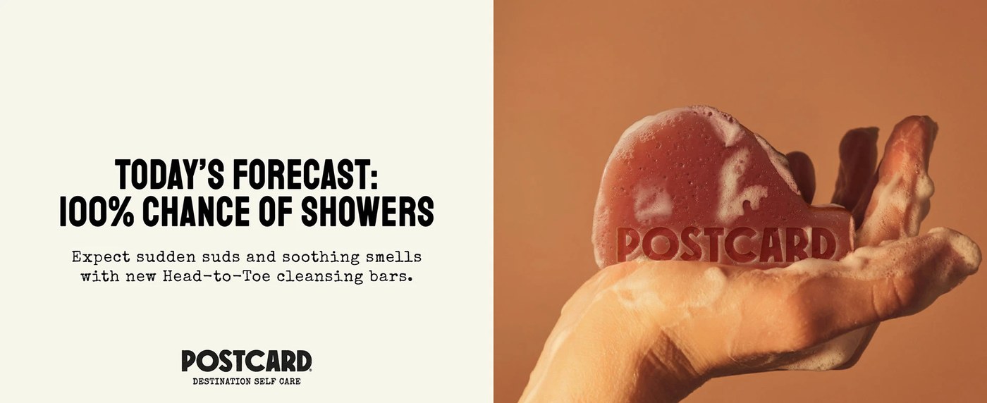
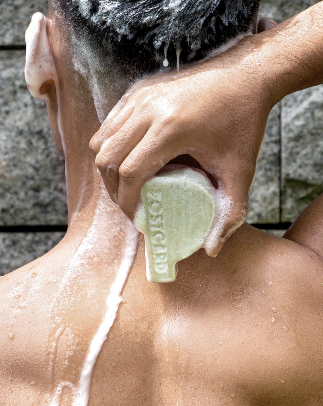
The typography keeps the travel narrative grounded without overdoing the nostalgia. On the wrap-around bottle labels, the heavy ink-stamped Postcard logo sits above a fine horizontal rule, where typewriter-style scent names meet tall condensed serifs reading Anywhere Fragrance. Even the soap skips the standard rectangular block. For the Head-to-Toe cleansing bars, Robot Food molded the terracotta and sage-green bars into an ergonomic, cloud-like curve with the wordmark deeply debossed along the lower edge — paired with punchy condensed headlines announcing a "100% chance of showers."
See the full project by Robot Food on Behance.