Welsh National Opera unveils rebellious rebrand
Design studio Bwtîc has created the dynamic new identity, which aims to capture opera’s “unpredictable subject matter, messages and points of view”
The Cardiff-based Welsh National Opera recently celebrated its 80th anniversary – an impressive milestone for a company built on an art form that, in the infamous words of Timothée Chalamet, “no one cares about anymore”. To mark the occasion, the WNO set out to prove the American actor wrong, and instead used his dismissive remarks as inspiration for a bold new identity, created in partnership with Welsh design studio Bwtîc.
Alive though it may be, Bwtîc’s creative director Paul Thomas admits that “opera has been playing it safe [in recent years]”, and that his team were excited at the prospect of reinvigorating the art form’s image. Bwtîc’s brief was to reassert WNO’s cultural authority, and position it as a contemporary, progressive and – crucially – proudly Welsh company.
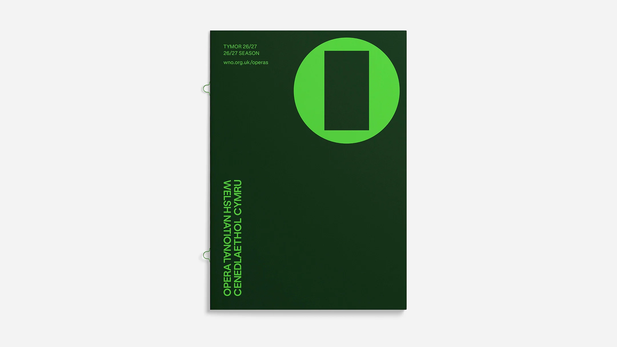
This pride undoubtedly stems from the company’s long and rich history, bringing Welsh opera to audiences all around the world, but it is also rooted in the Welsh language itself, which has experienced a significant resurgence in the last 50 years. Precious and poetic, it was of paramount importance to WNO that it be used to represent the company in the identity.
As such, Bwtîc’s new logotype for WNO is bilingual, with both English and Welsh text running parallel to each other in a vertical form. “In our new logotype, it is the eye of the reader that finds their own language first,” writes Thomas. “Dynamic and egalitarian, the wordmark is inherently bilingual, with opera as the consistent anchor and cornerstone.”
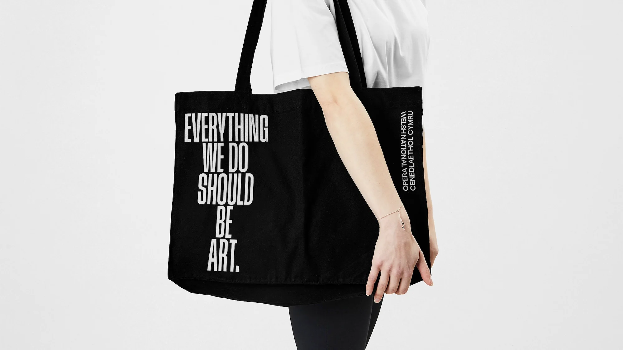
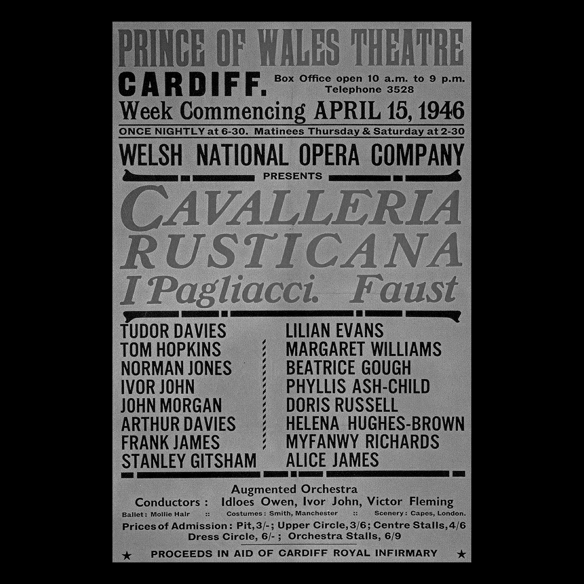
The type itself also shares its origins in the company’s heritage, with the design team drawing inspiration from a 1946 poster promoting WNO’s first-ever production. Appearing as an upper-case, condensed sans-serif, Bwtîc looked to Swiss foundry Grilli Type for a contemporary take on the original typeface. They landed on GT Standard as the ideal counterpart, which they say “retains its directness and authority whilst expanding it into a flexible system capable of carrying the full range of WNO’s voice”.
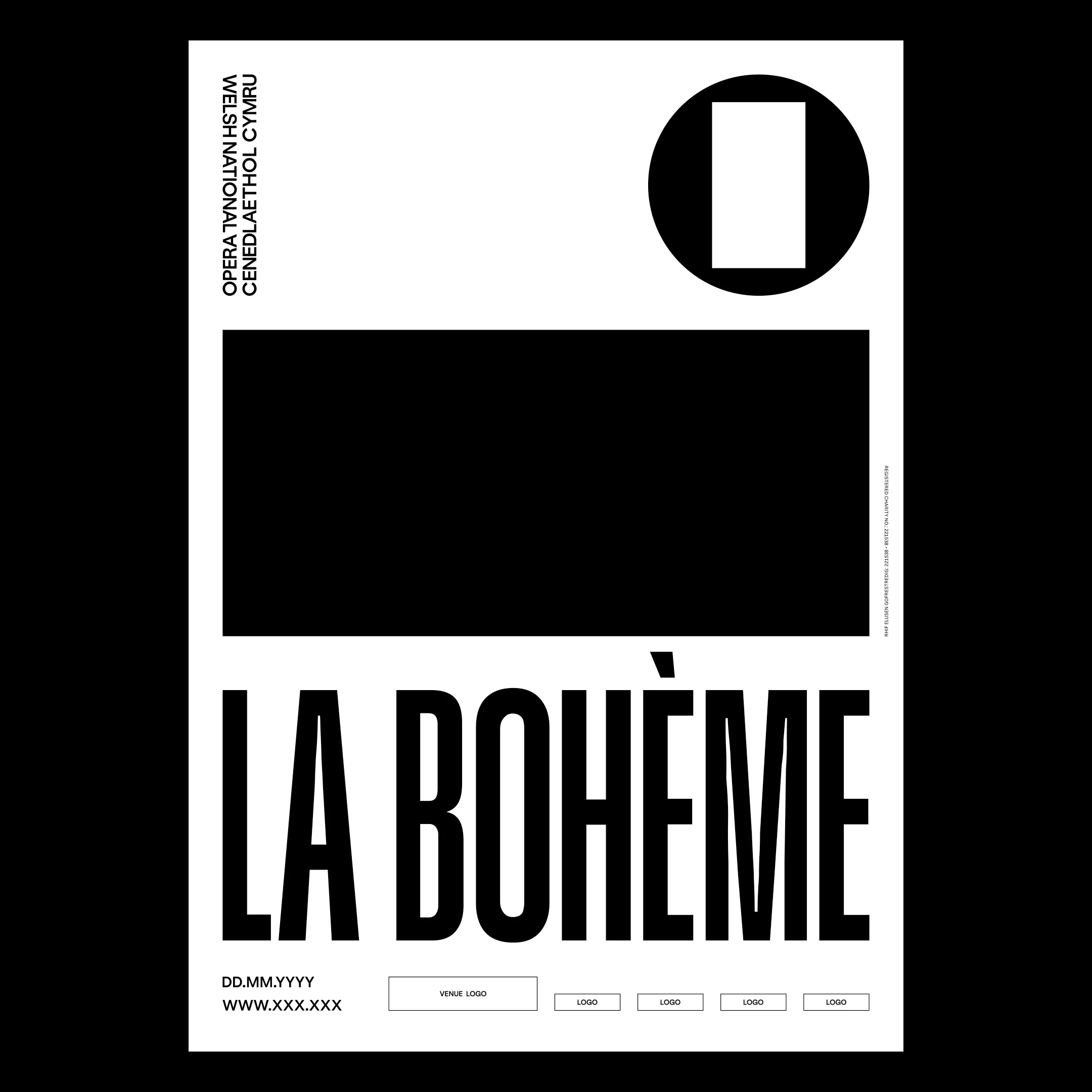
In response to WNO’s mission to reflect opera’s enduring capacity for storytelling, the team at Bwtîc also designed a clever framing device for the company’s online and offline content – including live shows.
Called the ‘O Frame’, it consists of a black outer circle that represents the medium of opera, and then a series of shifting shapes within that can flex to fit different productions. Ever-changing, this central element speaks to opera’s ability to capture and communicate “unpredictable subject matter, messages and points of view”.
“[It was] born from the frustration that Opera is too often seen as one particular story told in one particular way,” explains Thomas.
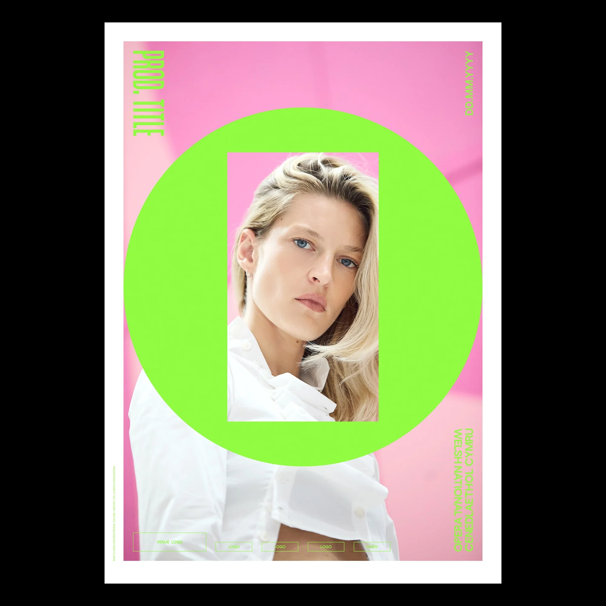
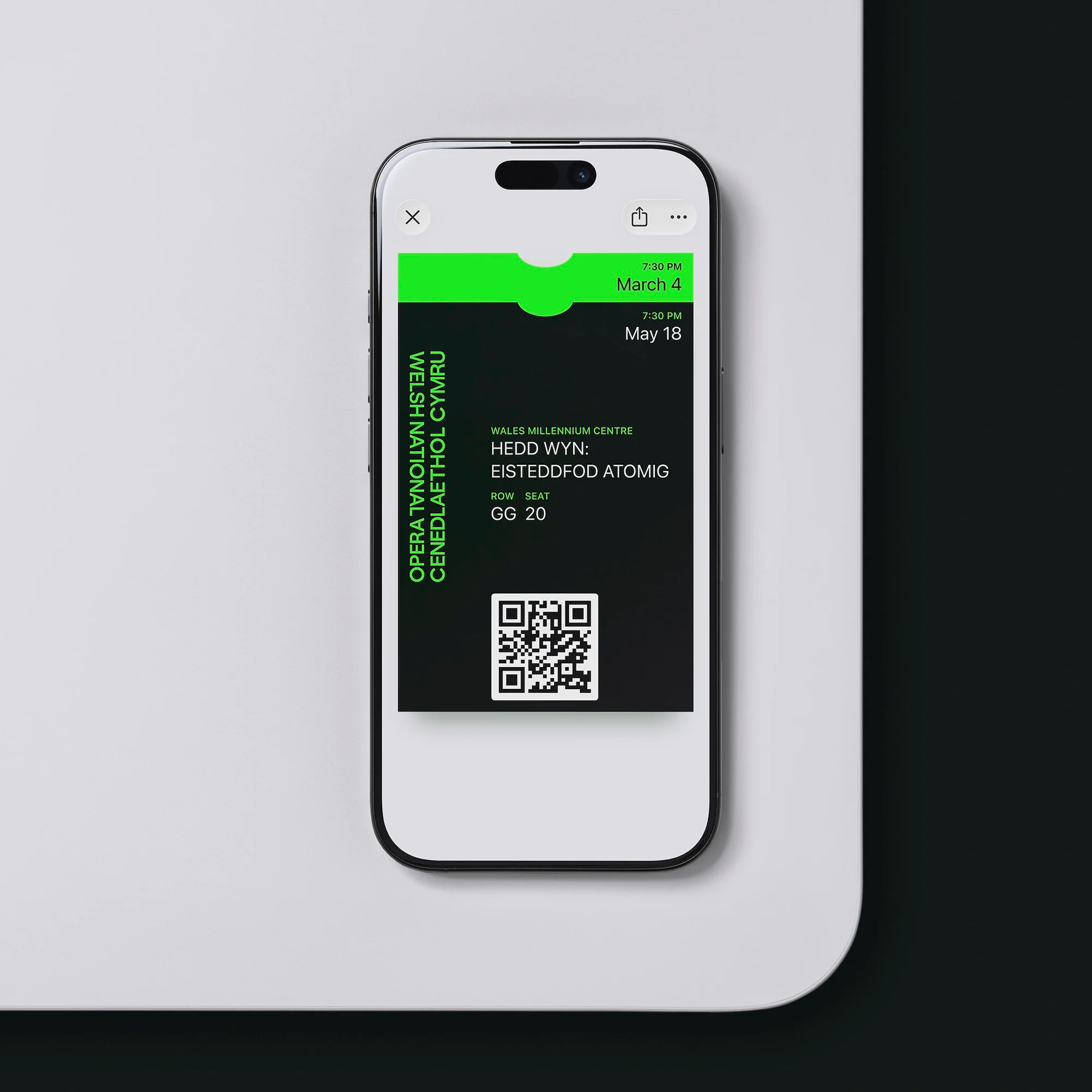
The final piece of the visual puzzle was WNO’s colour palette, which has been updated to mirror the company’s forward-facing approach. Largely monochromatic, it features vibrant pops of pink and green that bring life to the identity, and complement the contemporary style of photography on display across the company’s website, social media and OOH advertising.
Reflecting on opera’s unique position within the cultural landscape, and her company’s ambitions for the future, Adele Thomas, co-CEO of WNO explains: “Much has been written about the demise of British opera in recent years. I am here to posit the opposite: that the cultural climate has never been better set up for opera to thrive, and that opera is, in fact, the dynamic art form of our age.”