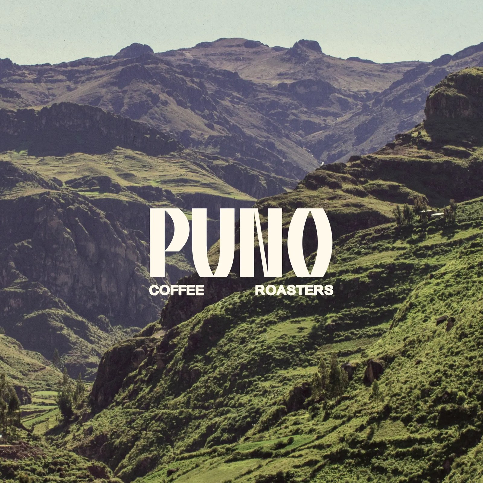
Branding: PUNO Coffee by CreativeWise
CreativeWise built the PUNO Coffee identity on a stepped pyramid from the Andes. Bold type, earthy color, one system from bag to bottle.
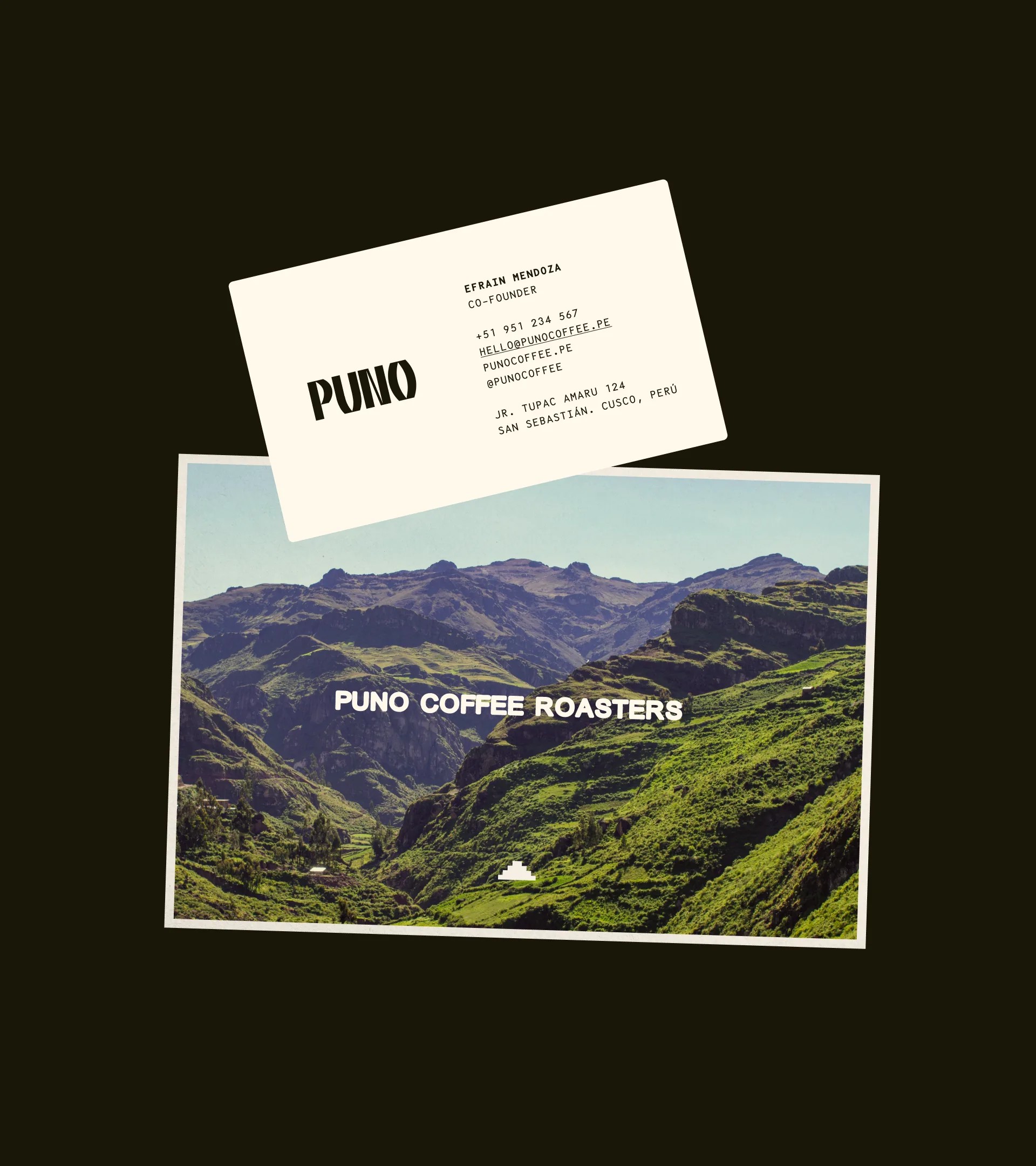
Most coffee identities pick one: the romance of origin or the rigor of a system. PUNO Coffee gets both. The stepped pyramid mark does triple duty as icon, pattern, and shelf signal, and it changes color per product instead of asking one palette to carry the whole range. The hero shot states the intent plainly: the PUNO Coffee wordmark laid over a green terraced valley in the Sandía region, origin and identity in a single frame. The palette stays grounded through cream, dark olive, terracotta, and black, with a lavender that keeps the black bags from going moody. The whole-bean range reads loud; the cold brew side stays quiet and precise. Nothing here is decorative for its own sake, and every surface carries the origin story forward.
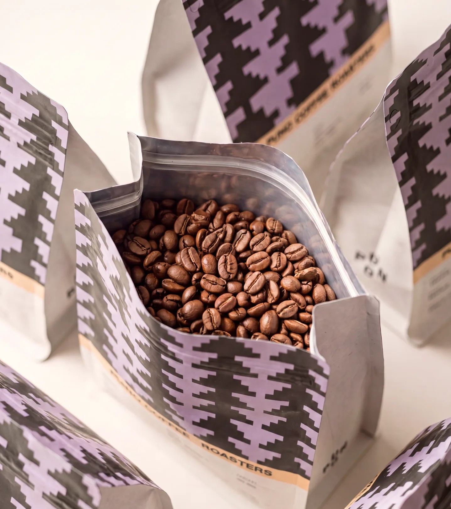
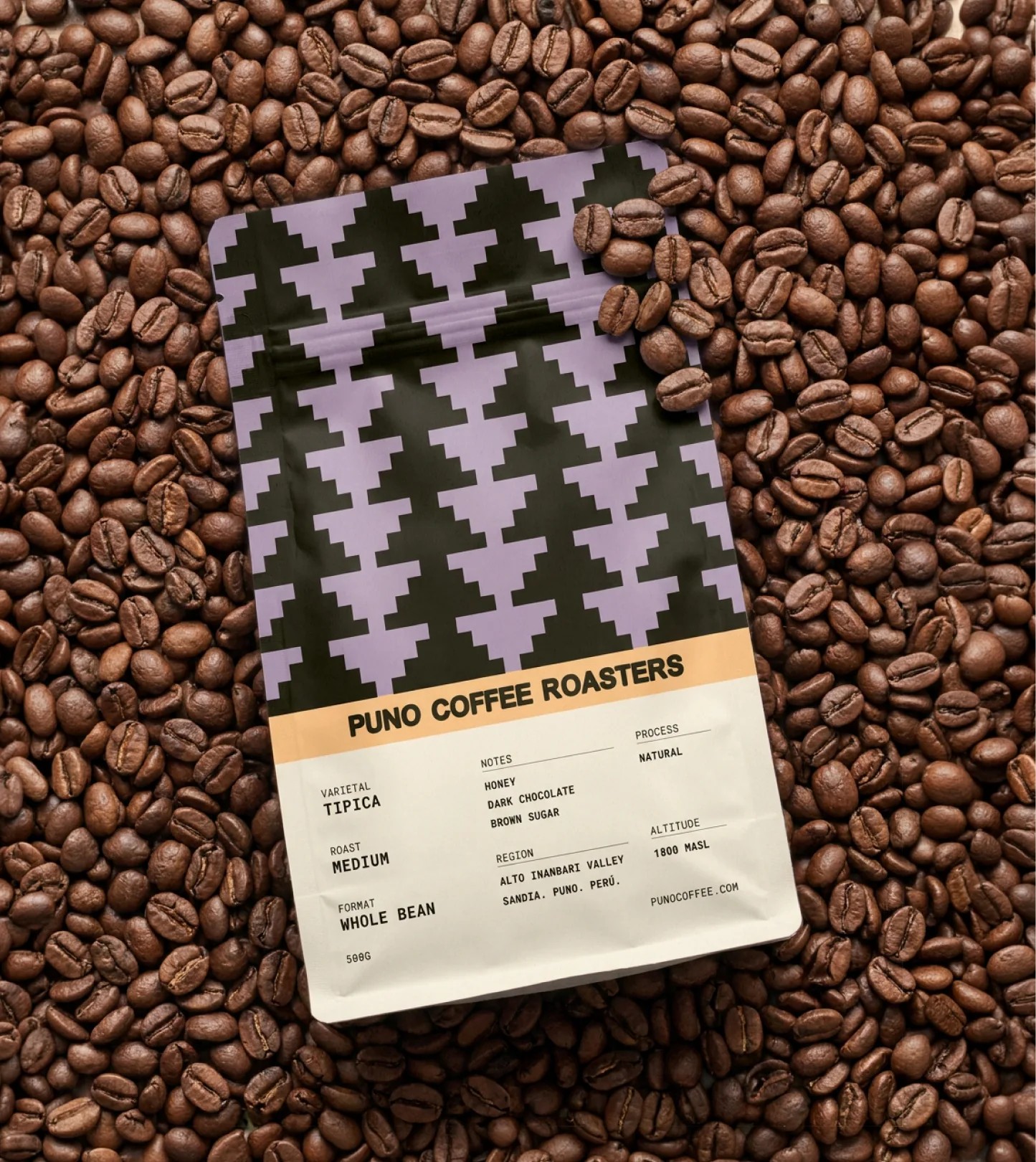
PUNO Coffee: identity built from the Sandía region
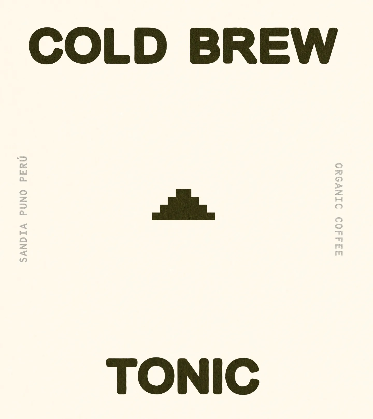
Typography does the heavy lifting. The tall condensed PUNO Coffee wordmark anchors every application, with COFFEE ROASTERS set small beneath or running vertically along the label edge. The cold brew line gets its own typographic moment: COLD BREW / TONIC set large in dark olive on cream, the pyramid mark centered, and SANDIA PUNO PERÚ plus ORGANIC COFFEE running vertically at the edges like fine print that refuses to whisper. On the whole-bean bags, monospaced specification text sits beside the pattern: Tipica varietal, medium roast, natural process, tasting notes of honey, dark chocolate, and brown sugar, grown at 1800 masl. It reads like a technical sheet and looks like a brand. Even the bottle turns the wordmark ninety degrees to follow the glass, a small decision that makes the shelf row feel considered.
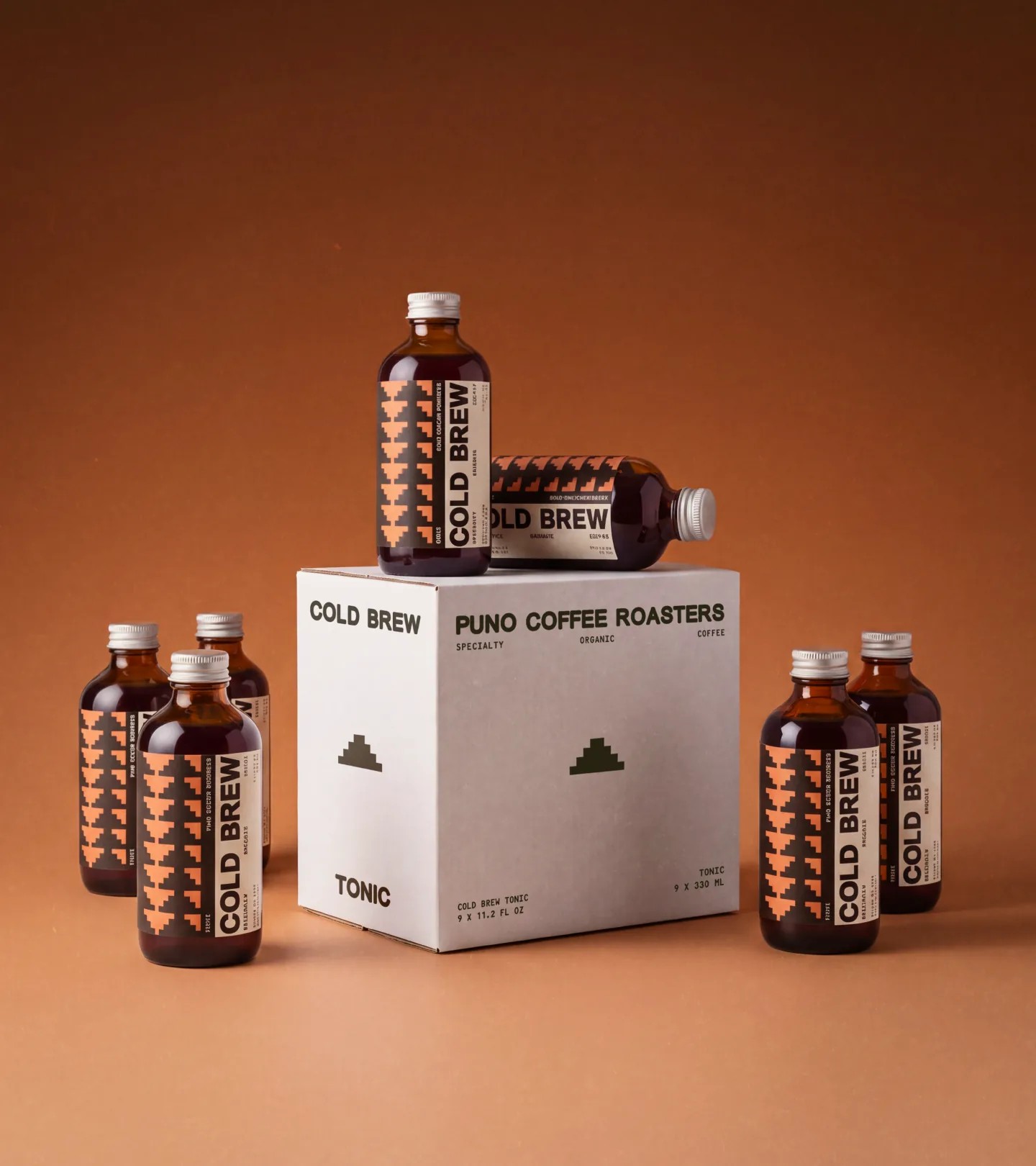
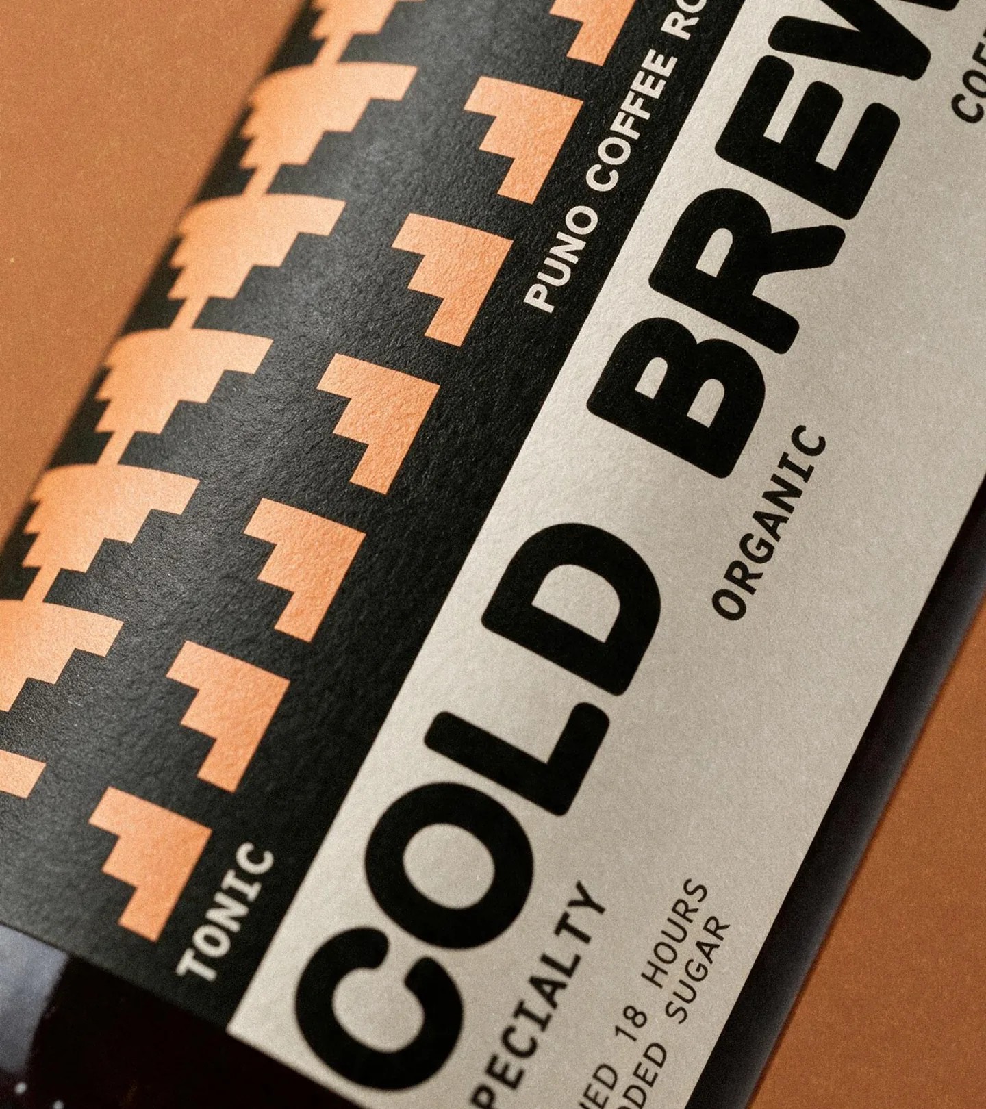
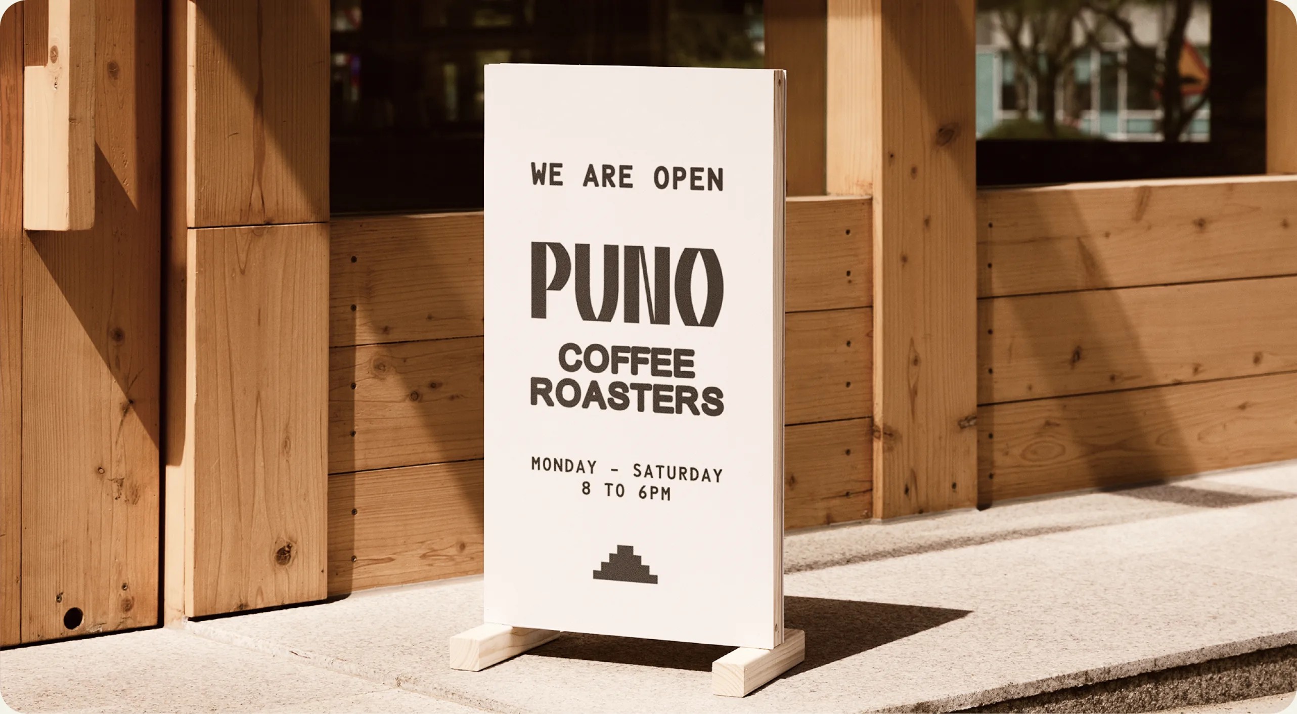
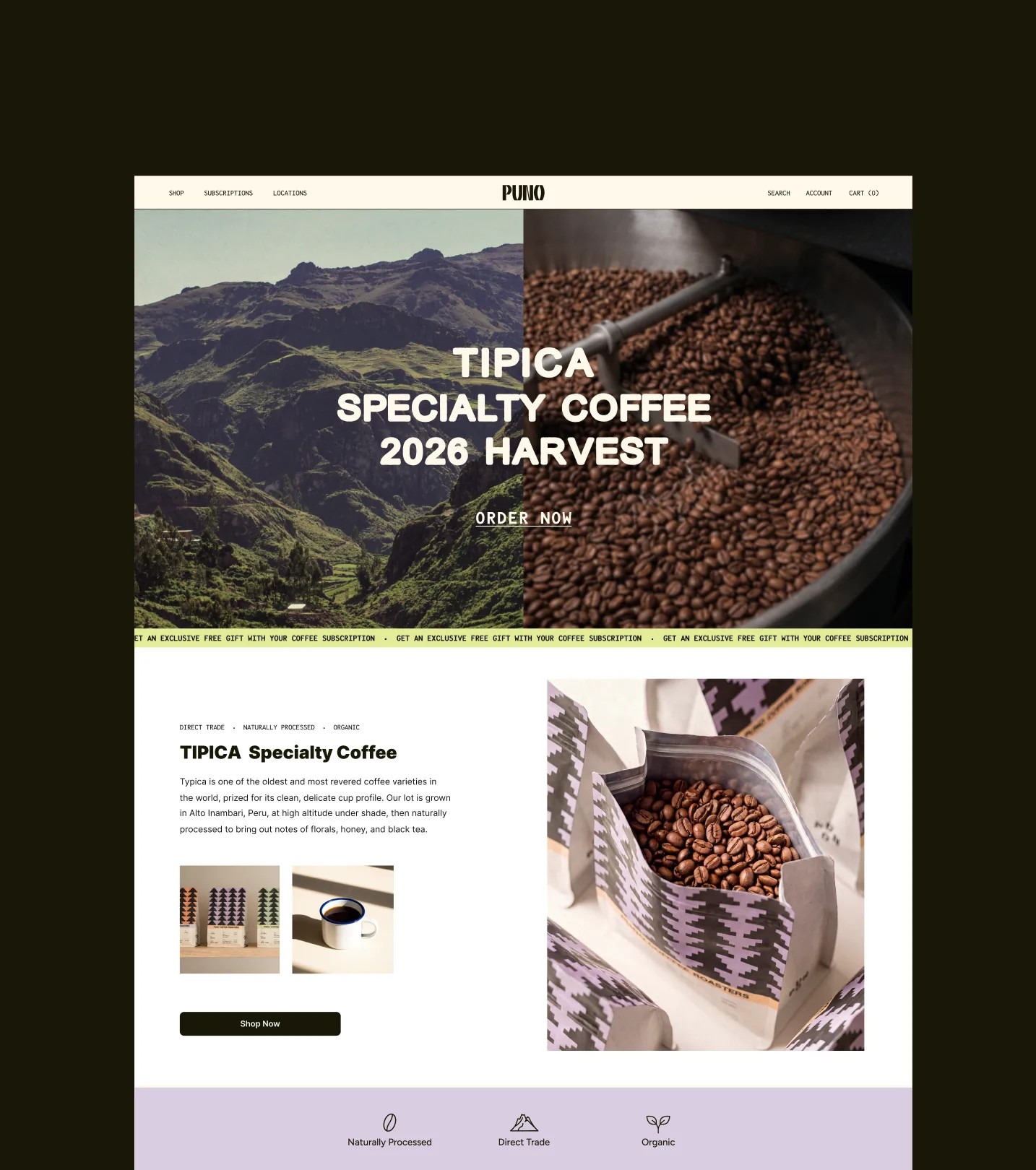
The system extends with discipline. Whole-bean bags wear the stepped pattern in lavender on black, each carrying a full spec label; cold brew bottles take peach-and-black pyramid labels with a recipe printed as specification: brewed 18 hours, no added sugar, specialty, organic. A white-and-blue enamel mug, a clean business card, an A-frame board for the shopfront ("WE ARE OPEN" through the week), and a sharp e-commerce site complete the world. The physical coffee shop blends tradition and minimalism, the same balance the identity strikes. Bold shapes, earthy color, and type that always knows its place: this is a brand built from the ground it grows on.
See more from CreativeWise on their site.