Branding Design: Vif Visual Identity by Brand Brothers
Brand Brothers built a sharp branding design for French dining spot Vif. The visual system blends bold custom type with bright red marks.
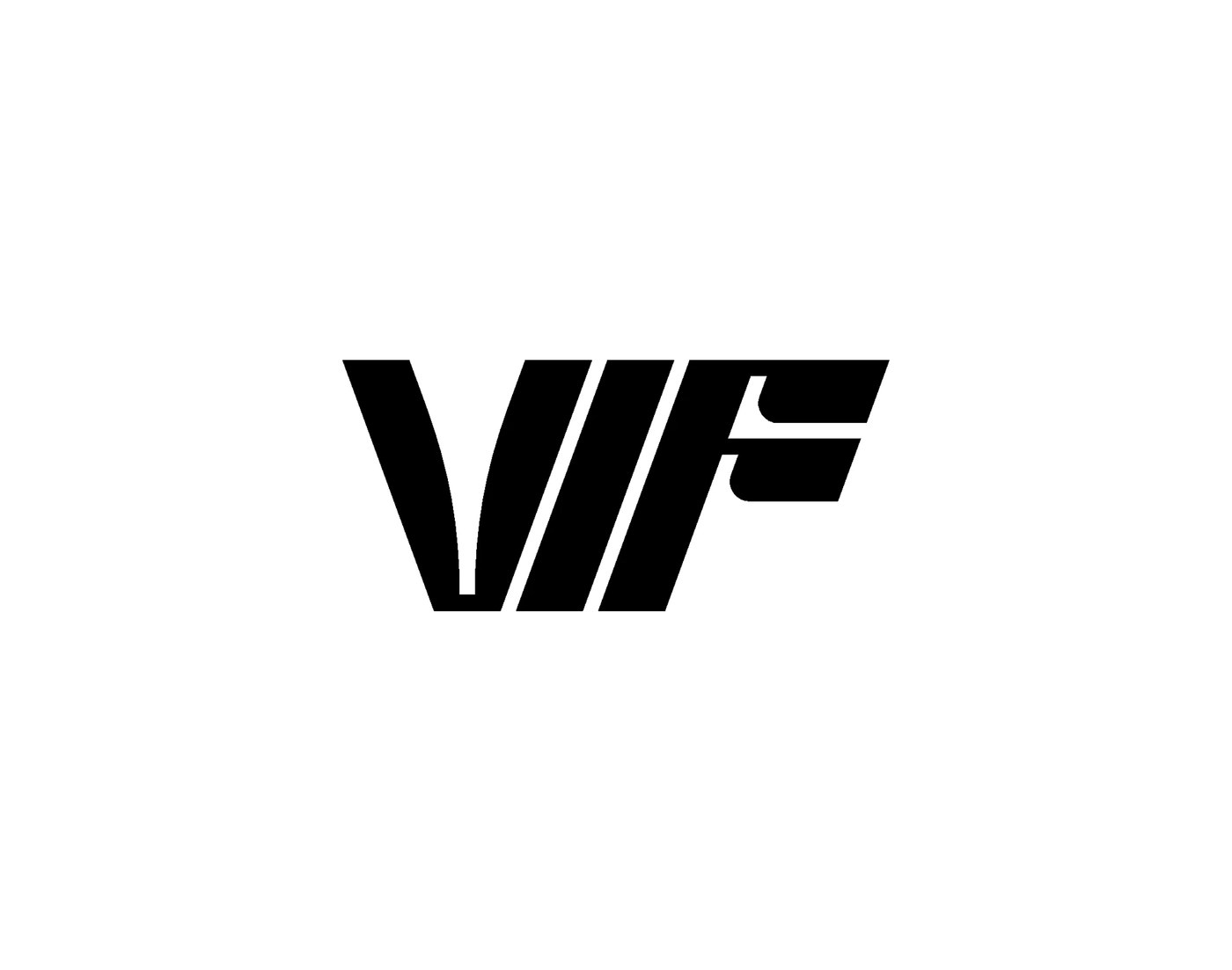
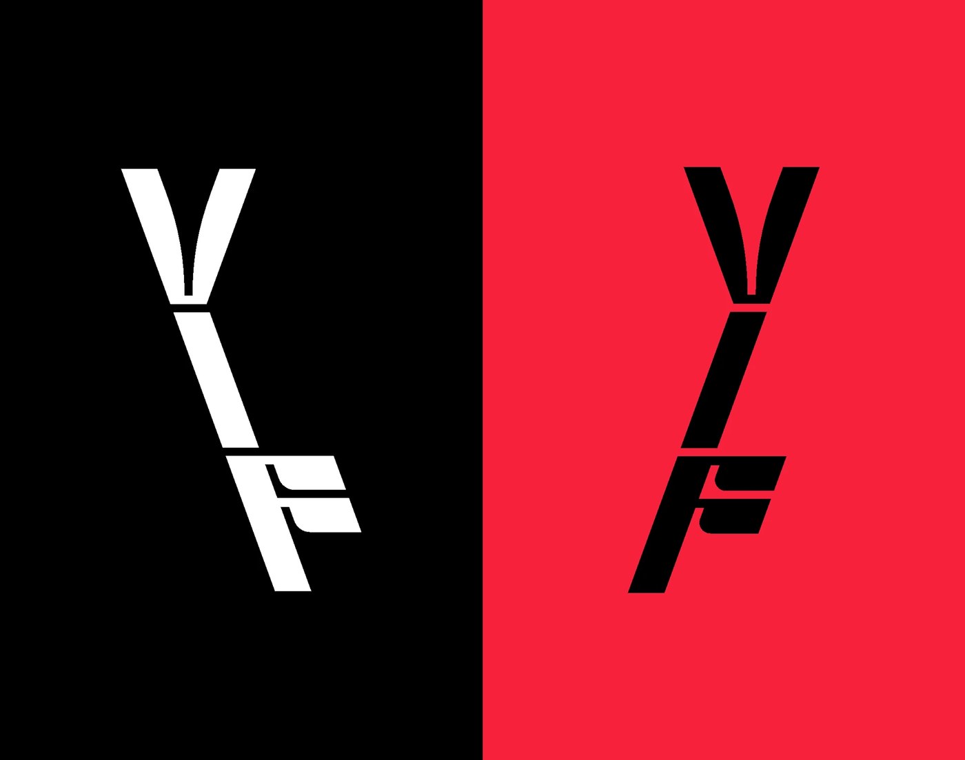
Chef Geoffrey Gotfryd opened a new dining room in Paris. The spot serves fresh food cooked over an open grill. The team built a raw visual world for the brand. A modular mark forms the base of this branding design. The logo shifts across three clean shapes. It plays with the letters V, I, and F. Sharp lines cut across pure circles in the mark. This mix gives the type a strong visual pace. The letters stay clear on small cards and large walls. The system adapts with ease to print and digital needs. It brings bold craft to modern street food spaces.
Modular Type and Sharp Branding Design
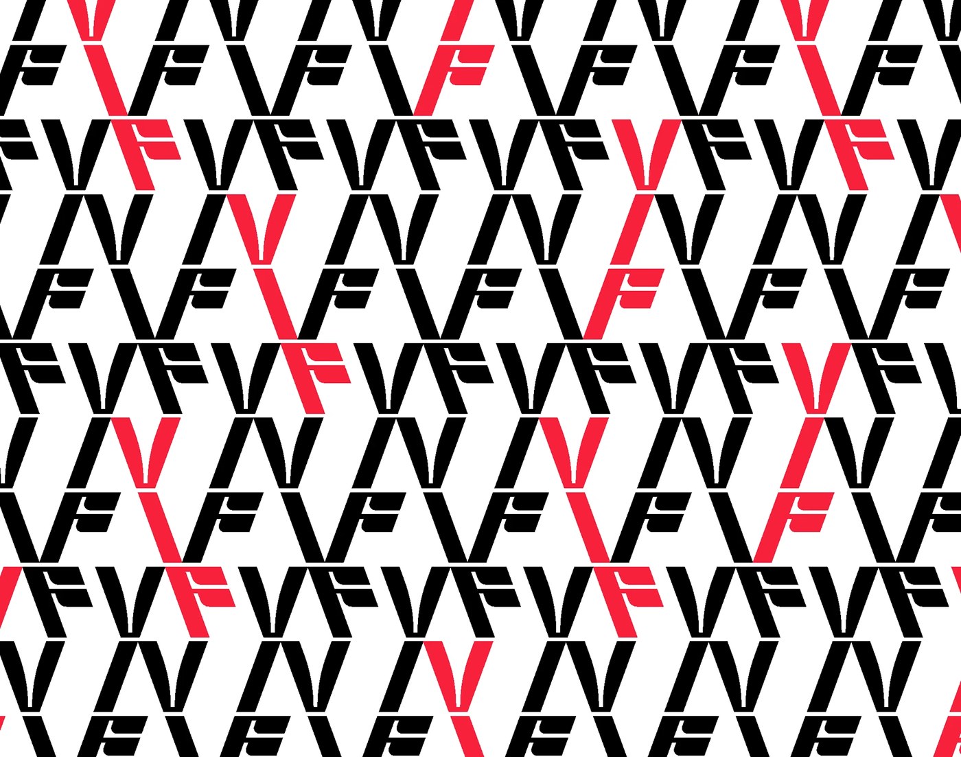
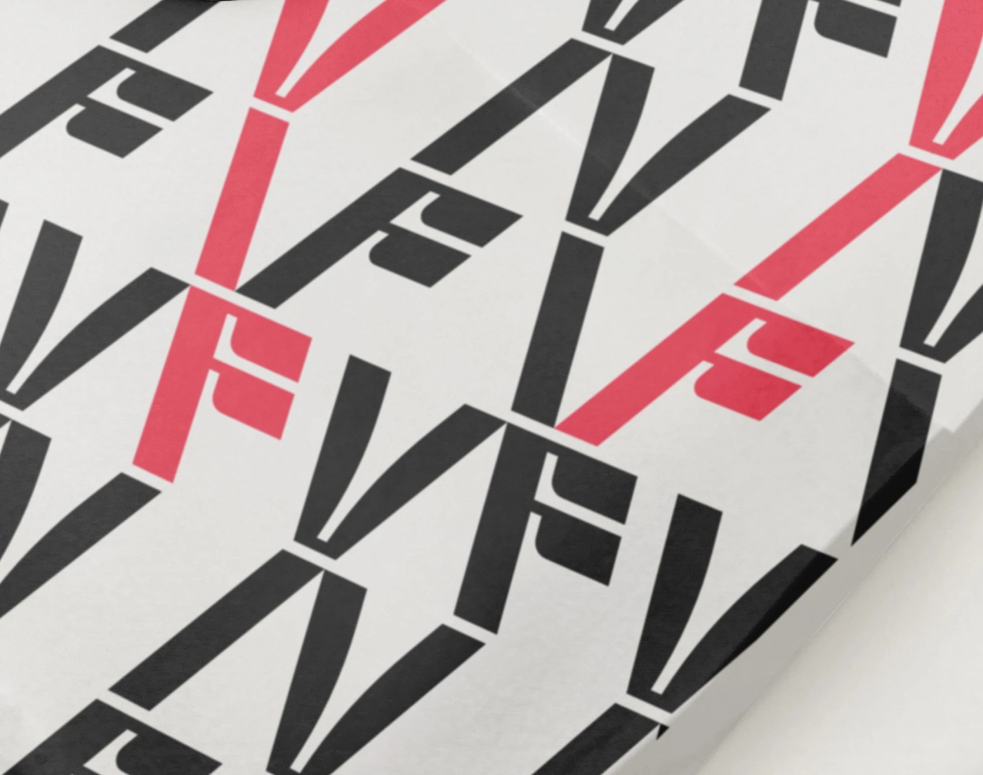
The modular mark sets the pace for the dining room. Wheatpaste prints line the walls in neat rows. Three bold print styles repeat across the space. High contrast shapes create clear graphic tension. Large display type sits next to slim menu cards. Bold lines lead the eye across the shop front. The iron street gate carries the same letter pattern. This unified look builds an iconic street identity. The dynamic branding design stands out on the busy street. Every wall helps tell the story of the food craft.
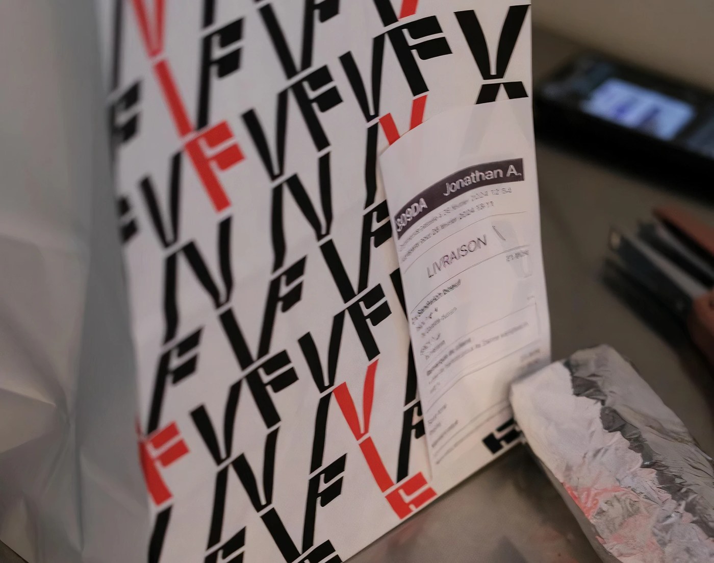
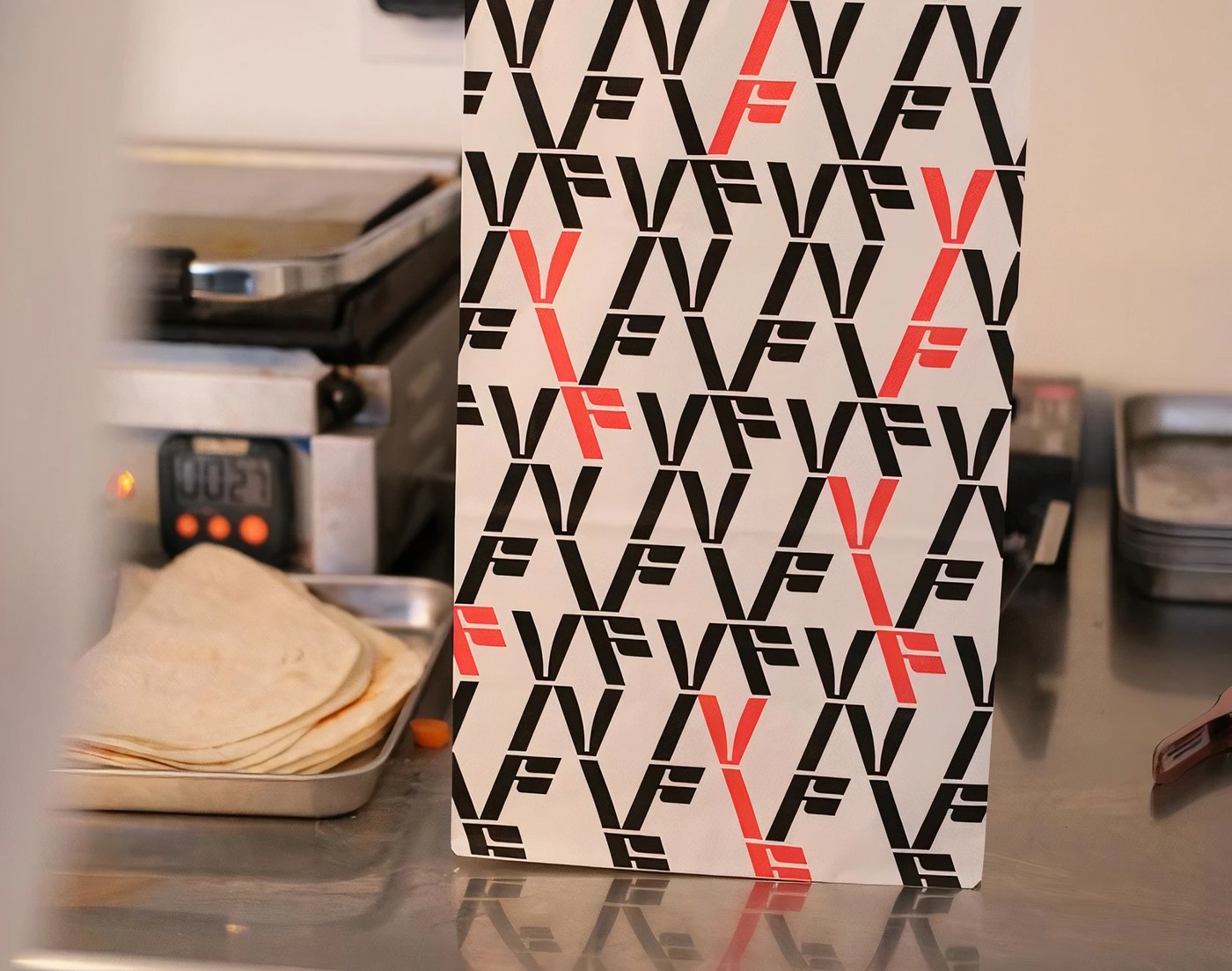
Strict color limits give the work its strong power. Pure black and clean white lead the main print suite. Vivid red tones add small pops of warmth. Takeaway boxes use strong greaseproof paper. Custom tape seals each hot sandwich bag. Raw brown paper bags show material truth. Durable cups complete the daily dining kit. Coarse print ink adds real grit to street posters. The identity pairs daily dining needs with clean graphic art. Each touchpoint shows the strength of clean branding design.
For more information make sure to check out Brand Brothers.