Best of the Week: Geometry and Grid-Based Systems
Our weekly design roundup highlights the best in grid systems, structural geometry, and tactile editorial packaging.
This week's selections reject soft layouts in favor of structured alignment, bold scale contrasts, and rigorous geometry across digital products, book revivals, and visual identities. Read on for our curated picks from the design industry's leading studios.
Diesta — significa.co
Streamlining complex insurance payment systems requires a meticulous approach to data visualization and user experience. significa.co achieves this with clean monospaced layout grids, high contrast color coding, and an extremely refined typographic hierarchy. View Project
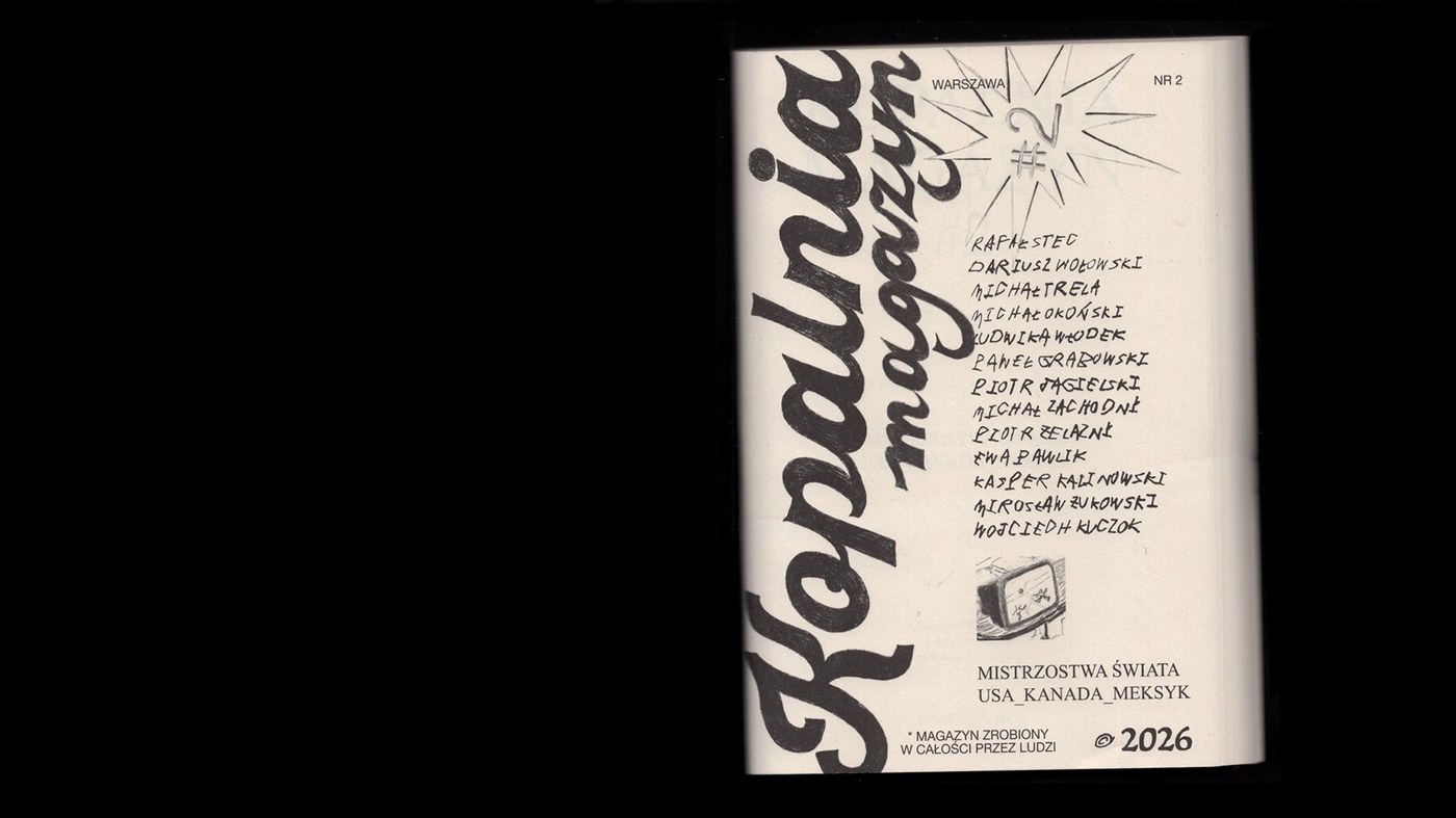
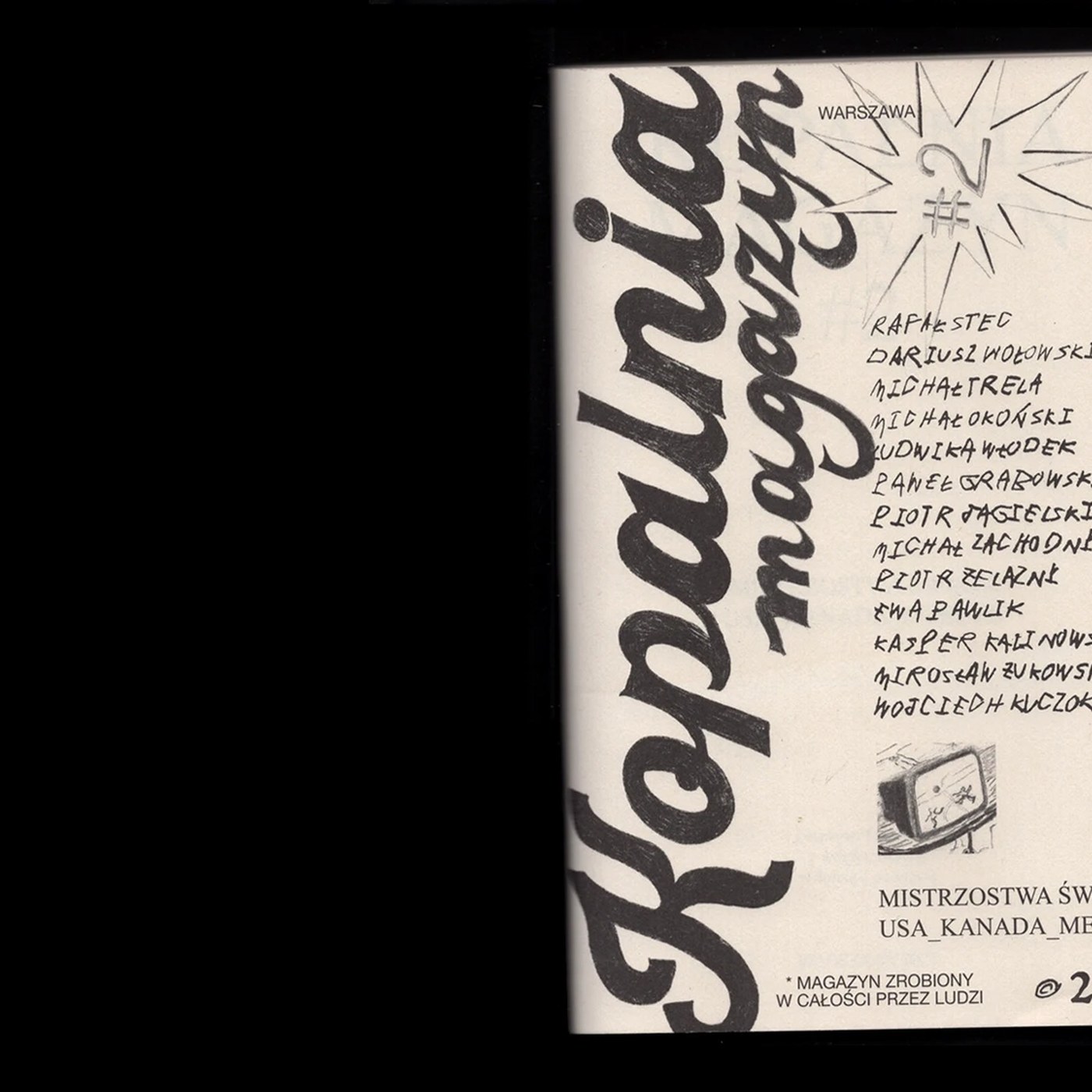
Kopalnia Magazine #2 — Ania Wieluńska
Reframing the World Cup through an editorial lens, this magazine uses custom typographic treatments for individual essays. The exposed thread binding, black-only printing, and rigorous grid alignments deliver a beautiful physical specimen. View Project
Freaky Lizard — Yevheniia Dutchak
This branding and packaging system brings a playful illustrative style together with custom-designed glass condiment bottles. The vibrant colors and consistent label architecture create a unified packaging ecosystem that stands out from typical generic designs. View Project
FLIGHTMODE — Heather Lynn & Billyclub
An exhibition identity and catalog that masterfully translate the abstract theme of solitude into a physical space. Using Pangram Pangram’s Cirka typeface, weightless logos, and airy layouts, the design captures a serene, atmospheric quality. View Project
Generative Type Experiments — Mariam Badawy
A striking exploration of contemporary bilingual typography that merges traditional Arabic calligraphic structures with generative coding patterns. The project highlights how algorithmic processes can generate expressive letterforms while maintaining strict structural grids. View Project
Bona Nova — Mateusz Machalski
A beautiful digital revival of Andrzej Heidrich's classic Polish typeface originally designed in 1971. The expanded family includes delicate display weights and alternate glyphs, all presented in a series of meticulously typeset design specimen posters. View Project
GRID Coffee Shop — Elizaveta Kharchenko
This brand identity system leverages minimalist grid layouts to structure menus, coffee bags, and environmental graphics. The stark black-and-white palettes combined with sharp sans-serif typefaces establish a bold, modern retail environment. View Project
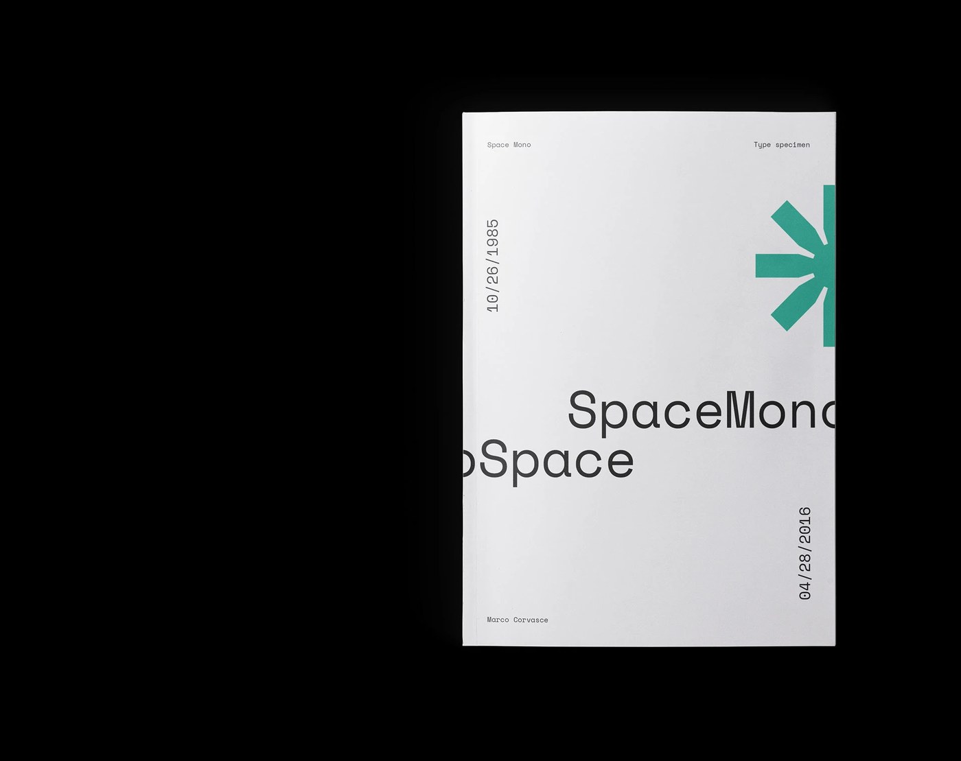
Space Mono Type Specimen — Marco Corvasce
A gorgeous editorial project that serves as a tribute to Colophon Foundry's Space Mono. The layout merges coding syntax aesthetics with Swiss typography grids, using high contrast and retro-futuristic styling to emphasize the font's unique personality. View Project
Teilansichten — Il-Ho Jung
A comparative editorial study exploring the partition histories of Germany and Korea. The book uses a split-page grid system and beautiful photographic pairings to highlight the historical resonances and structural parallels between both countries. View Project
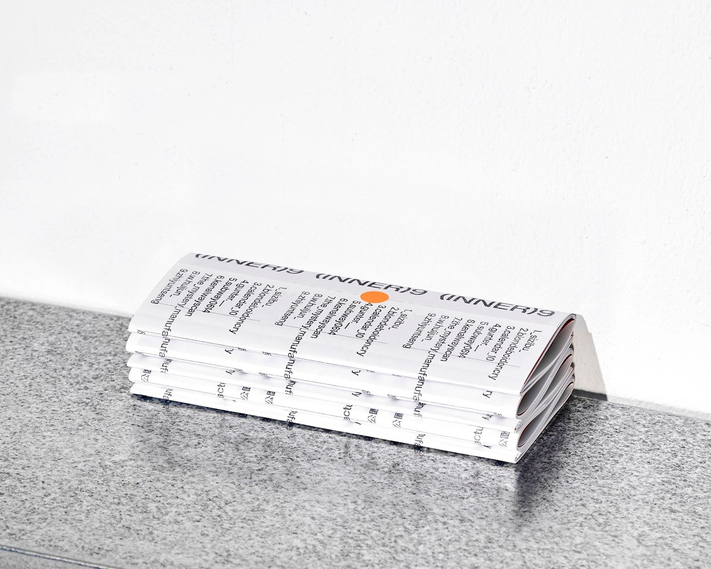
ZINE : (INNER)9 — CHENCHI CHEN
This zine showcases the work and conversations of nine visual artists, structured within a rigid typography grid system. By visualizing the grid layout on the cover itself, the design makes the underlying structural system a central part of the visual identity. View Project
Stay tuned for next week's roundup, where we will dive into minimalist digital products and high-tension packaging systems.