Brand Identity: TNB by John John Dias
John John Dias crafts a high-octane brand identity for event production firm TNB, pairing acid lime with backstage spotlight telemetry.
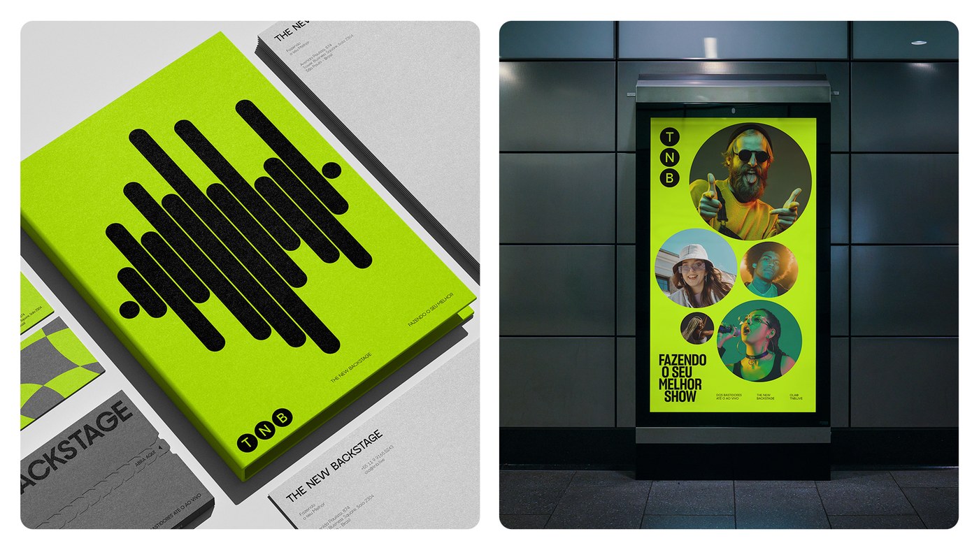
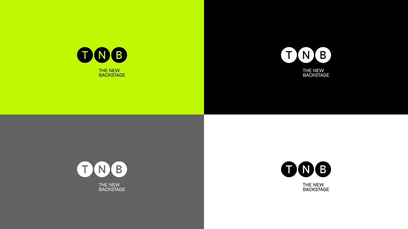
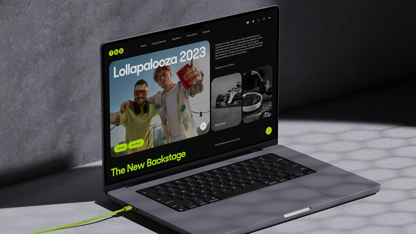
Managing the structural logistics and backstage operations for global mega-events demands absolute operational clarity. For TNB (The New Backstage), a Brazilian event consulting and production practice behind festivals like Rock in Rio, Lollapalooza, and Formula 1, designer John John Dias developed an energetic brand identity rooted in stagecraft geometry. At the foundation of the identity sits a dynamic mark composed of three circular spotlight apertures representing stage illumination. These circular dots expand dynamically into acoustic frequency waveforms, segmented linear ribbons, and modular framing windows, establishing a versatile visual grammar that translates the invisible mechanics of live production into bold graphic form.
Spotlight Geometry and High-Tension Contrast in Brand Identity
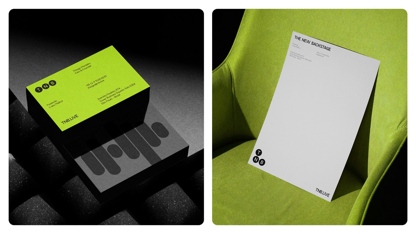
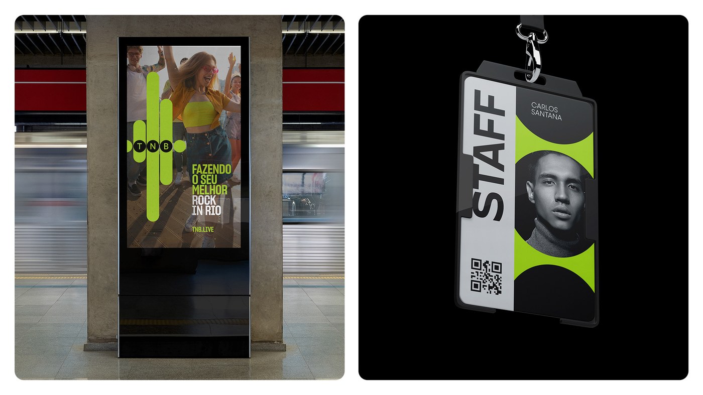
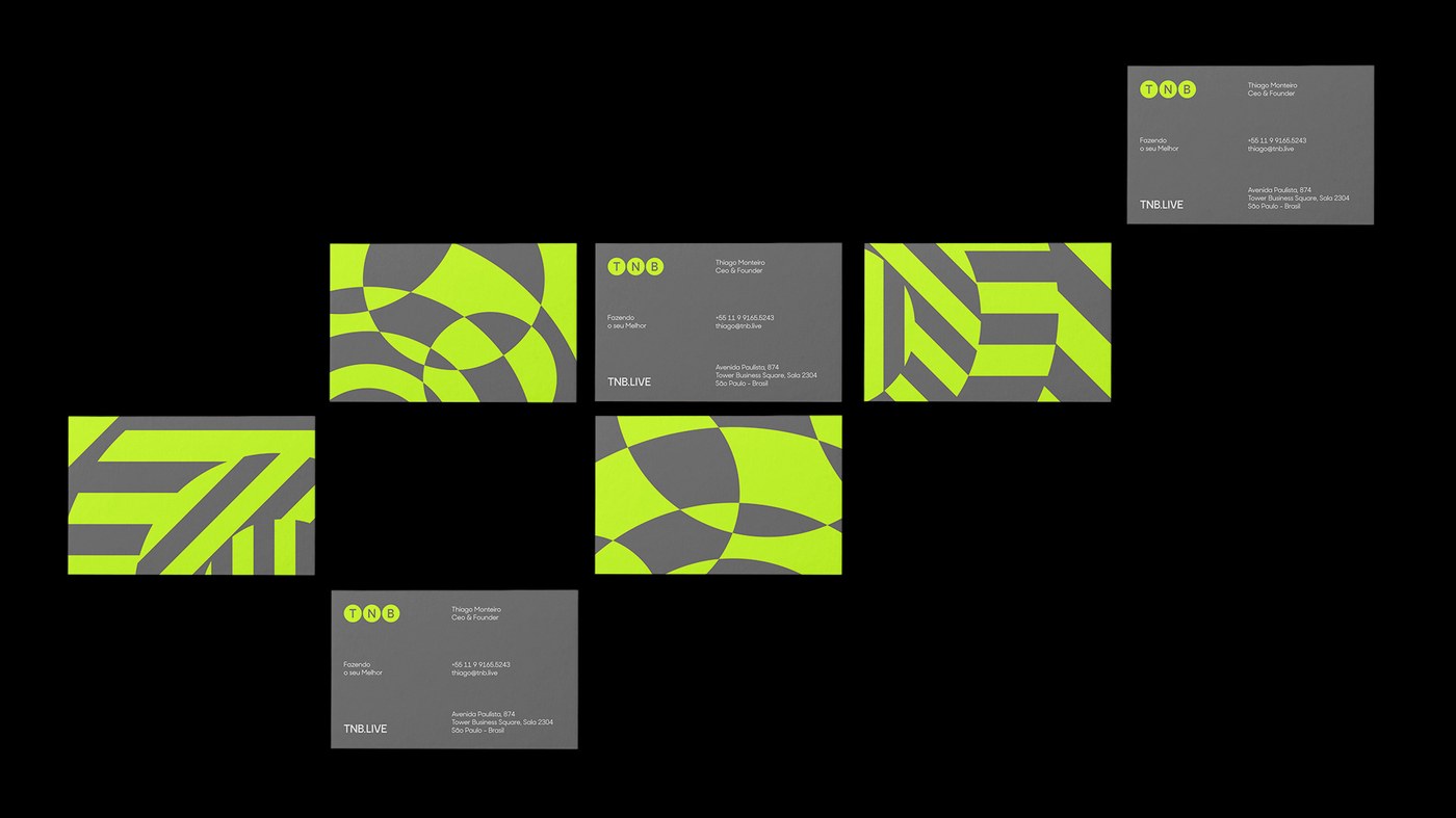
A strict chromatic discipline electrifies the brand identity across physical artifacts and digital interfaces. Dias anchored the system in deep Pantone Black C and architectural cool greys, punctuated by high-visibility hits of Pantone 2297 C acid lime. The print collateral demonstrates remarkable tactile craftsmanship: business cards feature hand-painted acid lime edges housed within charcoal card cases finished in gloss spot UV varnish. This material discipline carries into dense hardcover brand manuals bound in fluorescent lime cloth with screenprinted acoustic bars, alongside acrylic backstage staff credentials equipped with metal lanyard clasps, security QR telemetry, and circular portrait apertures.
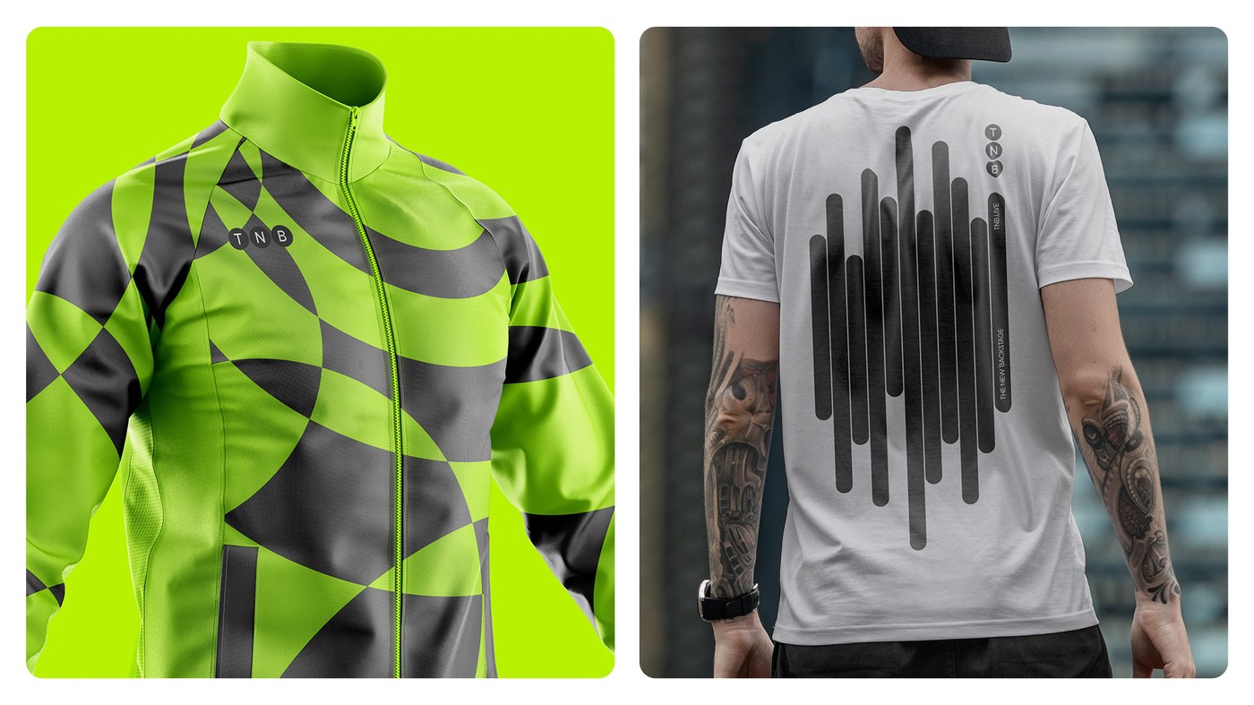
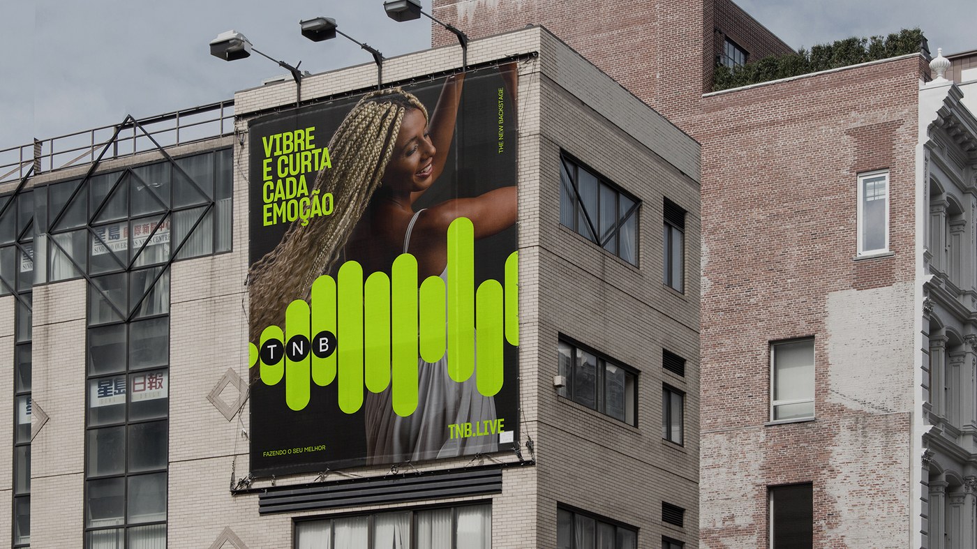
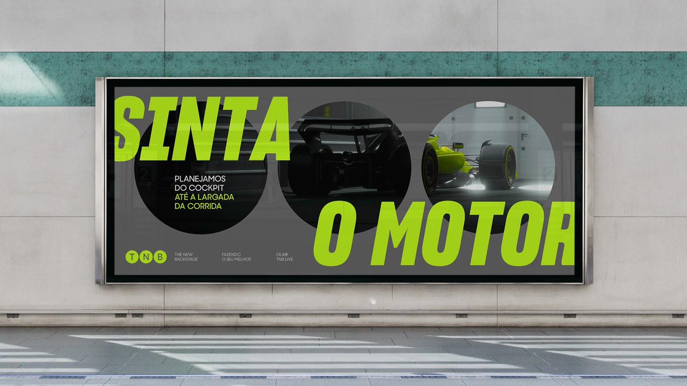
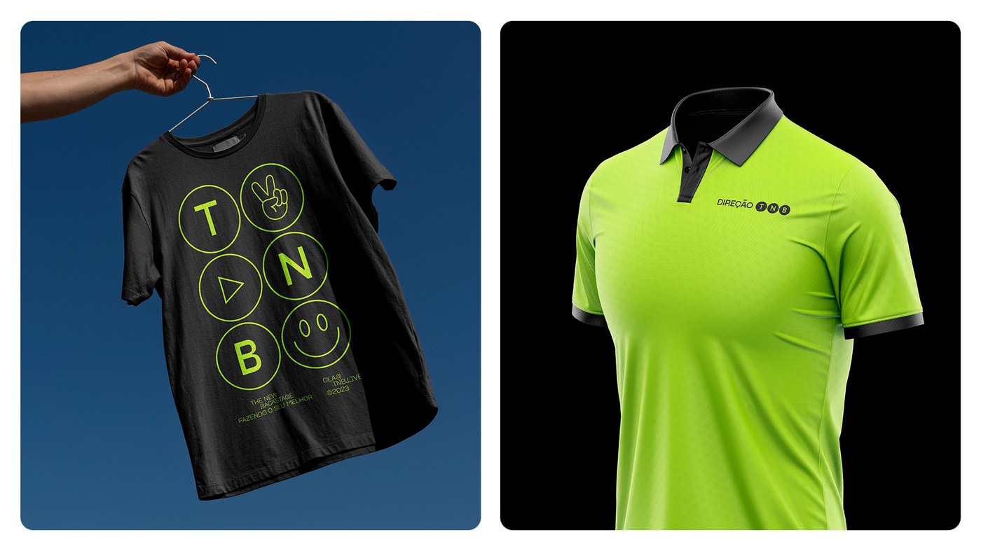
On the ground, the brand identity scales effortlessly into monumental environmental touchpoints and functional event crew workwear. Large-format illuminated building banners and transit station lightboxes frame Formula 1 racecars and festival crowds through the signature spotlight containers. Technical crew uniforms reinforce the operator ethos, spanning athletic zip-up track jackets with interlocking spotlight patterns, staff t-shirts displaying vertical spine waveforms, and high-visibility polo shirts with embroidered collar badges. By balancing industrial utility with kinetic stage presence, the comprehensive visual system captures the pulse of live entertainment while maintaining enterprise-grade production authority.
See the complete project by John John Dias on Behance.