Editorial Design: Lines Breaking by Underline Studio
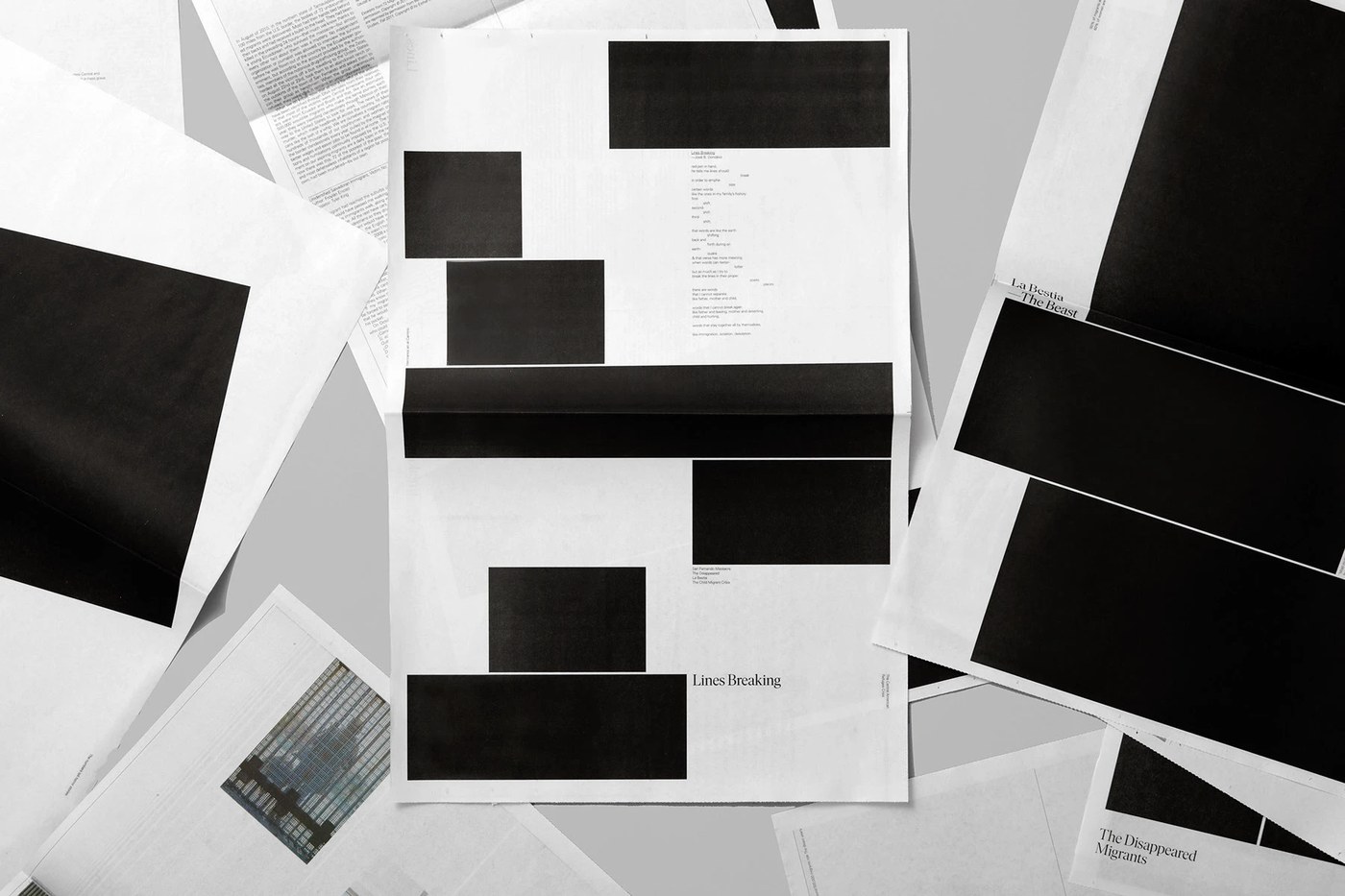
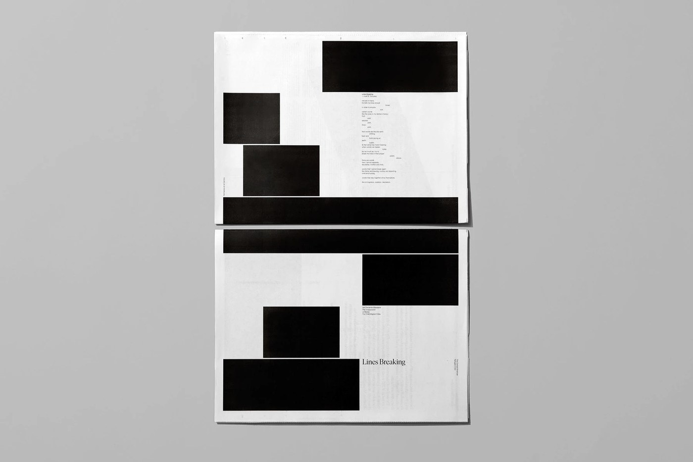
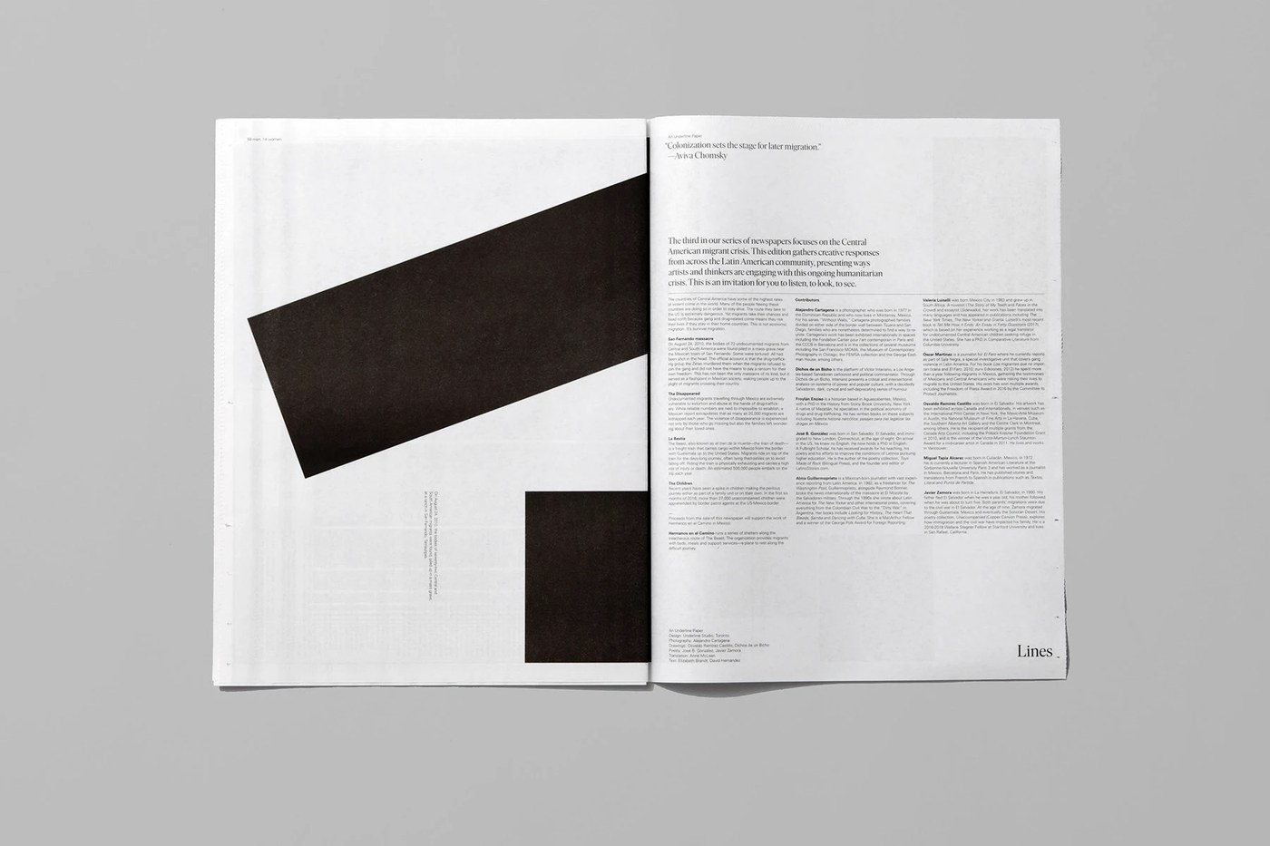
Underline Studio built an urgent editorial design for Lines Breaking. The broadsheet newspaper presents stories on raw newsprint.
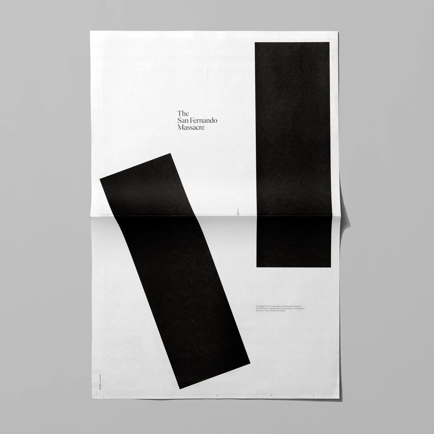
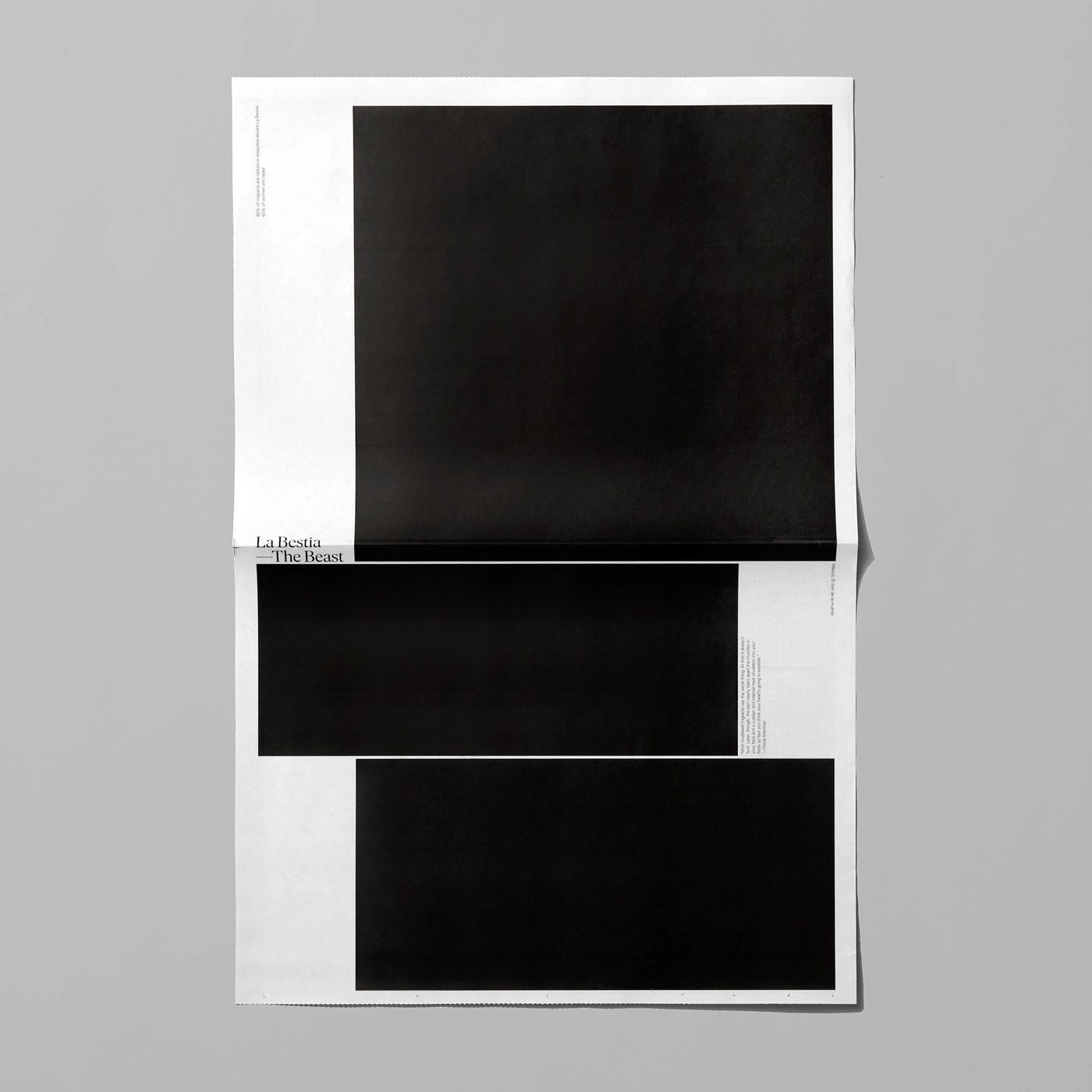
Underline Studio designed Lines Breaking as a large printed broadsheet. This issue is the third entry in their newspaper series. The paper focuses on the Central American migrant crisis. It shares work by artists and writers from across Latin America. The team shaped an editorial design that acts as a public record. Bold black headlines run across the large open pages. Stark photos show real journeys with deep feeling. Black ink on grey paper gives each page high contrast. The layout asks readers to slow down and look with care. Each spread gives space to voices that need to be heard.
Broadsheet Grid Systems and Editorial Design
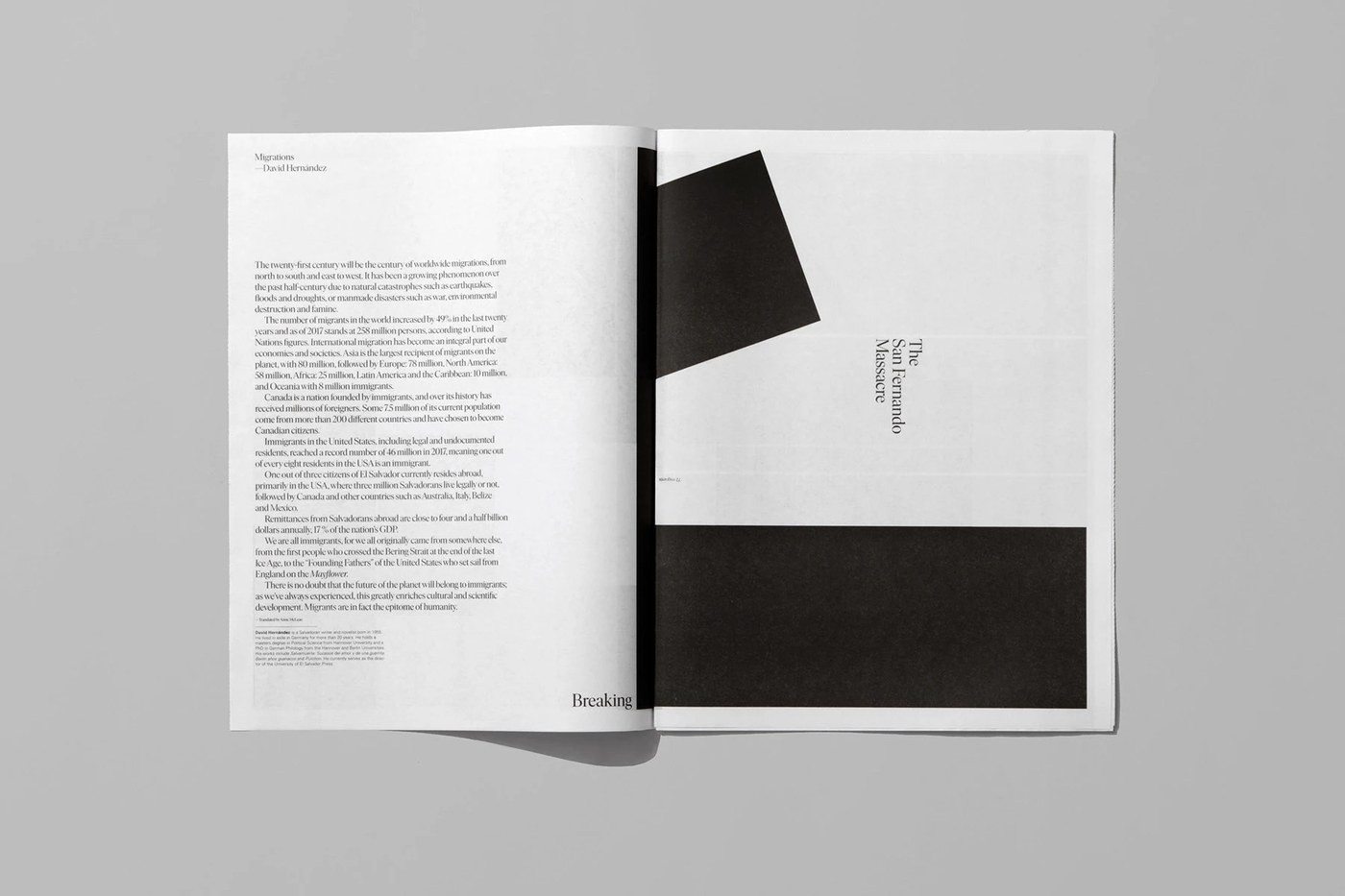
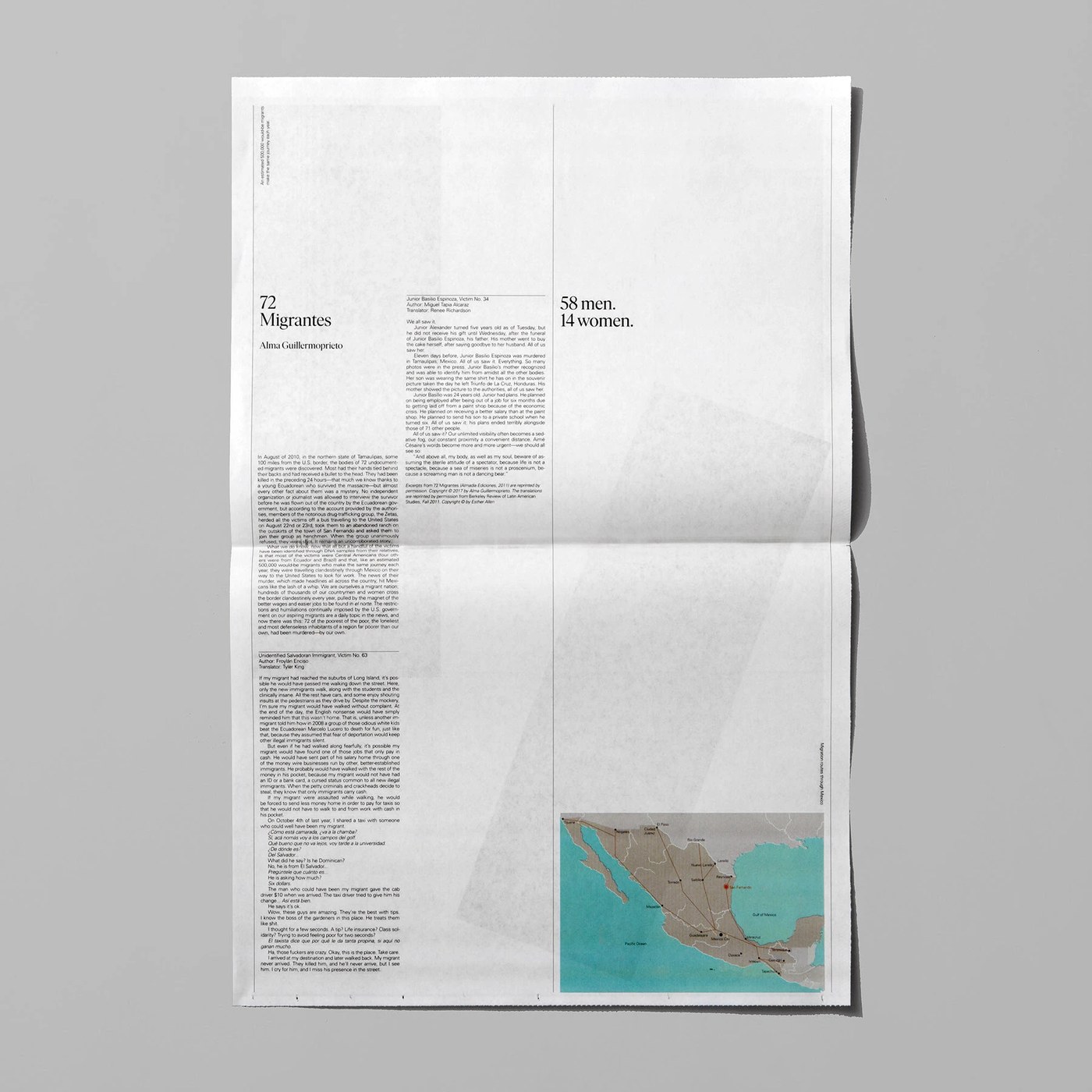
A strict column grid brings clean structure to every page. Underline Studio splits the wide sheets into sharp, even columns. Short text blocks sit next to tall, dark display type. This scale difference creates strong contrast across the whole paper. Small headers and thin rules help sort the essays. The simple type scale keeps every voice clear and legible. White space frames each section with great care. Wide margins give the dense text plenty of room to breathe. The clean editorial design helps readers absorb each story with ease.
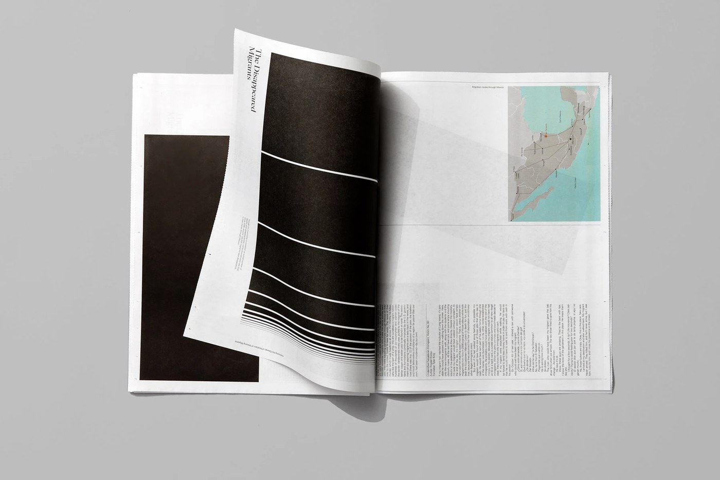
Real newsprint gives the reader a raw, tactile print feel. The porous paper takes black ink with a soft matte look. Crisp horizontal folds echo the feel of city daily papers. Readers hold a large sheet that asks for real focus. Underline Studio created the paper to support shelter Hermanos en el Camino. Simple print methods grant the issue real documentary weight. The tangible paper creates a shared bond with the reader. The project shows how editorial design can spark action for human rights. Independent print stays a vital tool for social change.
See the full project by Underline Studio on Behance.