Victor Hwang on why we should be updating existing websites rather than making new ones
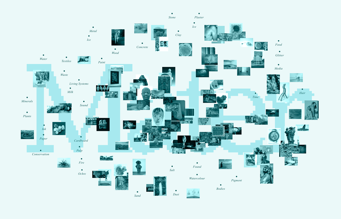
When Victor Hwang is offline, he’s likely making some very avant-garde clocks with his housemate, or working in the adventurous activities department of a local school, getting kids outdoors hiking and camping. But when he’s online, you can be sure to find him making some of the most thoughtful, inventive and climate-conscious websites to grace our screens. Like, for example, Mater, a research and publishing platform exploring the material world, founded by artist Maddie Rose Hills, for which Victor has recently done an extensive website update, mining inspiration from analogue directories, “slow content” and the early internet.
We first spoke to Victor back in 2022 when he had just completed the first iteration of the Mater site, where also he offered up some useful tips for how to make your own low-carbon website. Founder Maddie recently returned to Victor, armed with a 100+ page Google Doc that included all of her many references and notes from the past five years of Mater – she wanted to make it a “living, public archive” for all to access. Initially, the pair deduced that the archive could live in a new section on the website, but it soon became clear that it made much more sense for this archive system to become the central backbone of the whole site.
Despite this overhaul, rather than building a new URL, Victor and Maddie resolved to do what might best be called digital recycling – update the existing site. “The thing that makes me happiest is when someone wants to make updates to a website they’ve been using for years, rather than starting over again,” says Victor. “In architecture, a lot is made from adaptive reuse, and the same should apply for digital things. Knowledge builds up over time in all the tweaks you make, and throwing away a website is like destroying a whole ecosystem that’s built up over years!”
Victor describes the reference behind the website updates rather beautifully, as “a mix of the pragmatic and poetic”. It was important that the newer, archived aspect of the website was distinguishable from the existing commissioned content, and this was most easily achieved through colour. Victor landed on a pastel wash, which “felt like a nice nod to the Yellow Pages – the pre-internet directory”, but opted for a blue, rather than yellow, as a homage to the original colour of hyperlinks. Another key reference was Rolodex, the rotating wheel often packed with business cards or contacts lists, once a mainstay of the corporate office desk. Victor mainly wanted to capture the motion of the Rolodex, the experience of taking time to flick through a finite list to find something, an experience Victor notes has been all but lost on the internet. This is reflected in the animated elements now featured on the homepage, a first for the Mater website. Slow and considered, the animation is far from the flashy motion you might have come to expect today; instead it emulates “the feeling of a webpage in the 90s loading, when you could almost feel it coming down the wire as pictures appeared from top to bottom,” says Victor. “Bringing back that tactility of the internet felt like an important touch.”
While the website underwent some expansive updates, Victor and Maddie were dedicated to keeping it as low-carbon as possible, even making some more eco-adjustments to existing elements – as Victor puts it: “we redid a lot of the plumbing”. Pages arrive with less javascript, meaning devices are doing less work; the new structure means less computer power is needed to assemble the site when new content is added; and the content has been brought in-house, so rather than being pulled from an external CMS, all content lives within Mater – meaning one less server is running on behalf of the website.
But, overall, this more environmental approach is underpinned by a key design philosophy – prioritising “slow content”, and a less is more ethos. Mater is made up of majority text and images, as opposed to video, and the typeface remains the universally accessible Times New Roman. Fundamentally, says Victor, “it’s mostly about doing the boring foundational stuff in a thoughtful way”. It’s true, the project is evidence of how opting out of the unrelenting hamster wheel of flashy, rapid-fire creation means you don’t have to compromise on functionality, beauty or sustainability – Mater, in fact, has it all.