Inside EMI and Island Records’ New HQ
What was a chaotic, scrappy space, where ‘everyone was jammed in,’ says Studio Eye’s creative director Holly Williams, now has a better-organised layout and inspiring artworks. As the in-house creative studio for Island and EMI, the 12-strong Studio Eye designs album covers, music videos, content, and live shows for the labels’ artists.
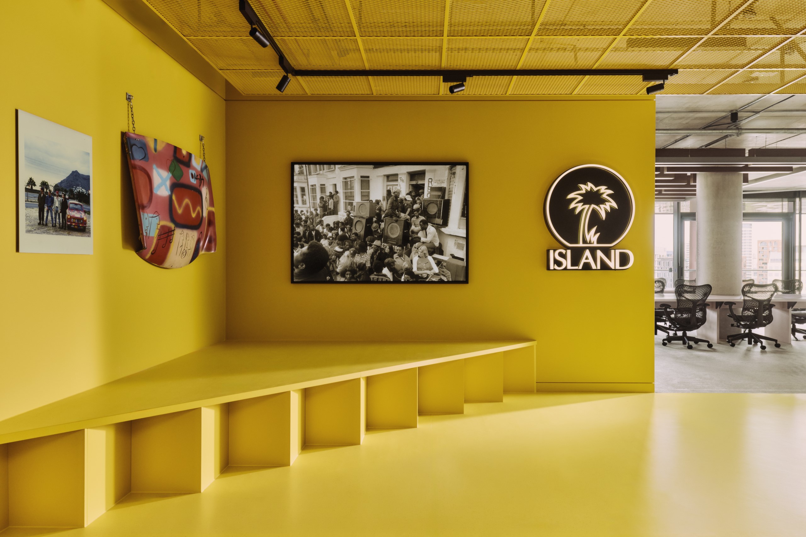
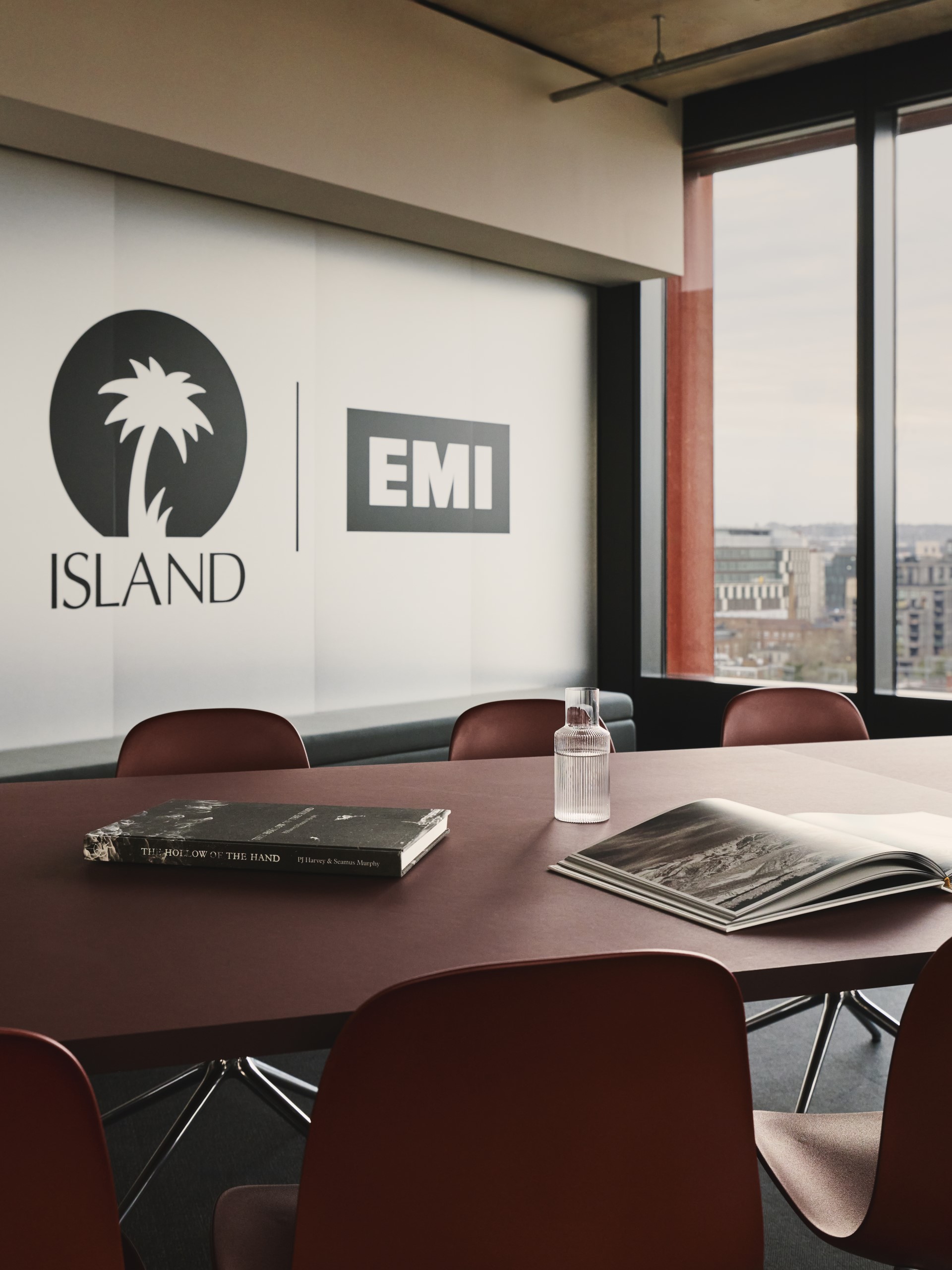
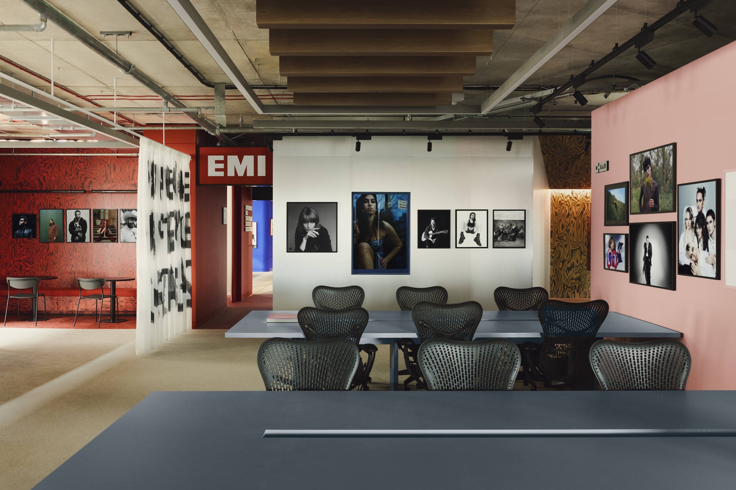
EMI was started in London in 1931, while Island Records was founded in Jamaica in 1959. Between them, they represent artists including Bob Marley, The Beatles, U2, Grace Jones, Elton John, Taylor Swift, Amy Winehouse, and Lola Young. Both labels are part of Universal Music Group and have been based in London’s Pancras Square on different floors since 2015. Two years ago, the EMI team relocated to join Island in their 800 sq m space on the ninth floor, prompting the need for a redesign.
Establishing Identities
The designers’ aim was to establish those two separate identities in one space, Williams adds. ‘A lot of our artists come to our floors, and artists we’re trying to sign, and for them and our internal teams, it was important for us to have very clear identities.’
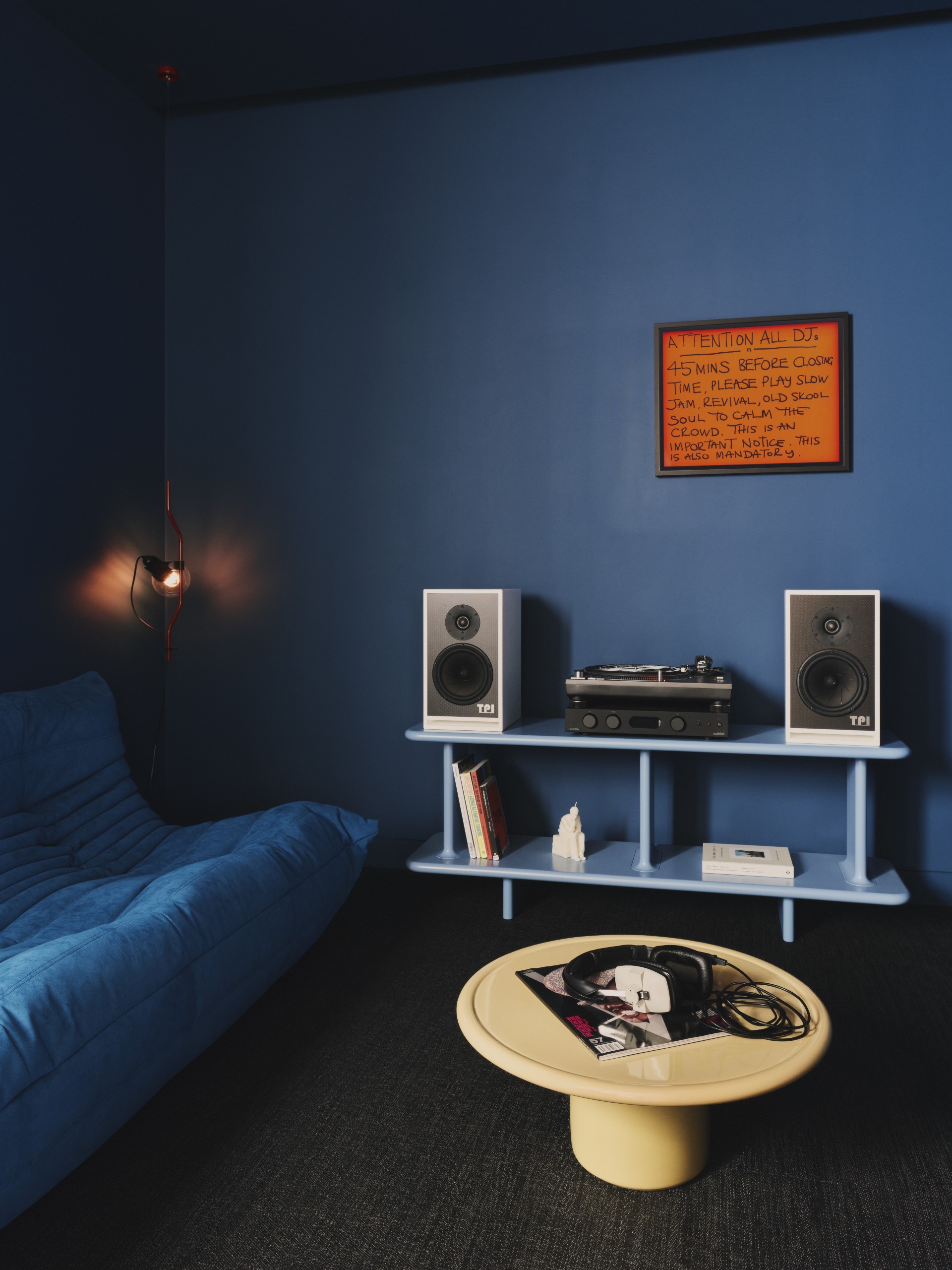
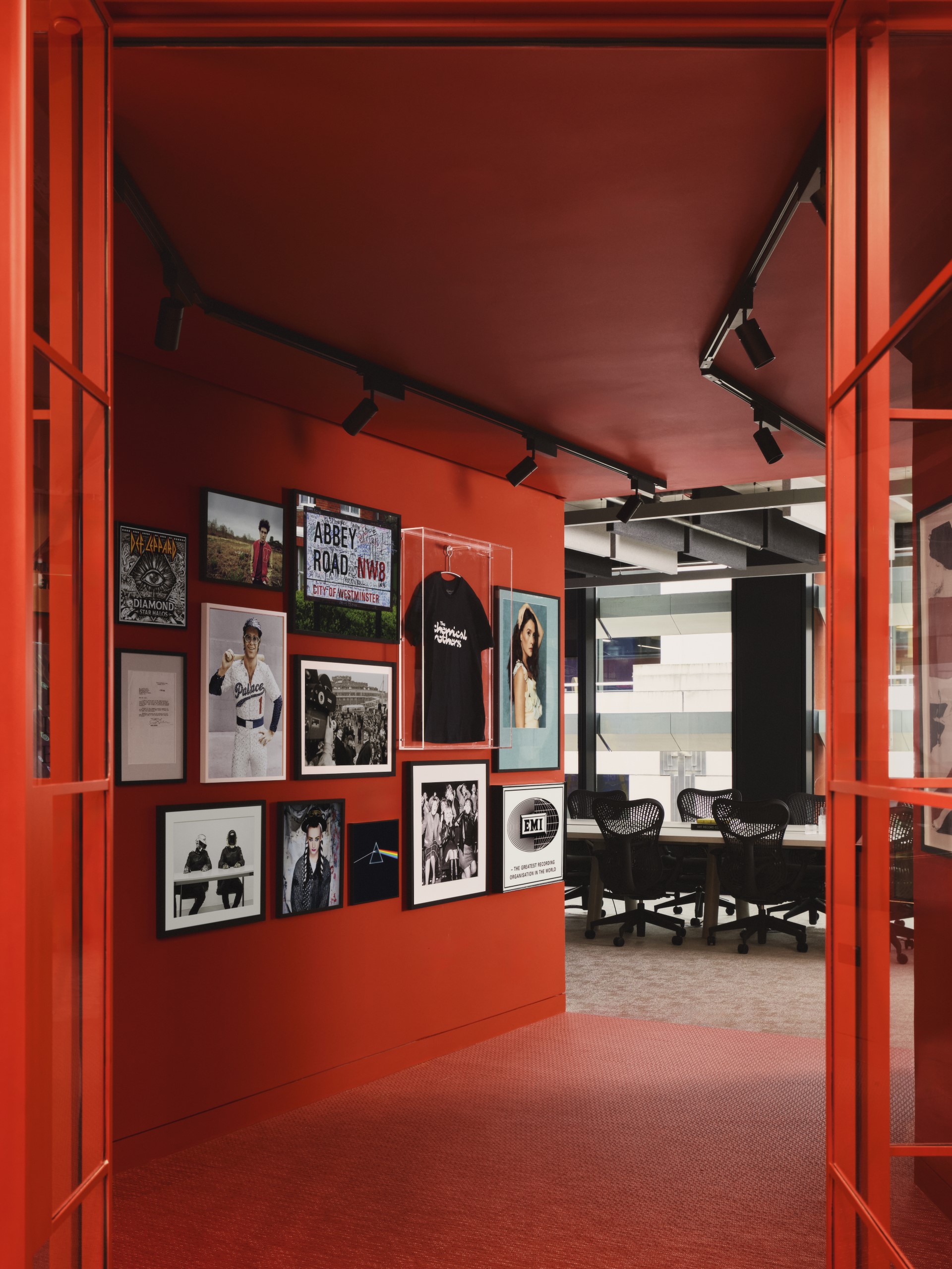
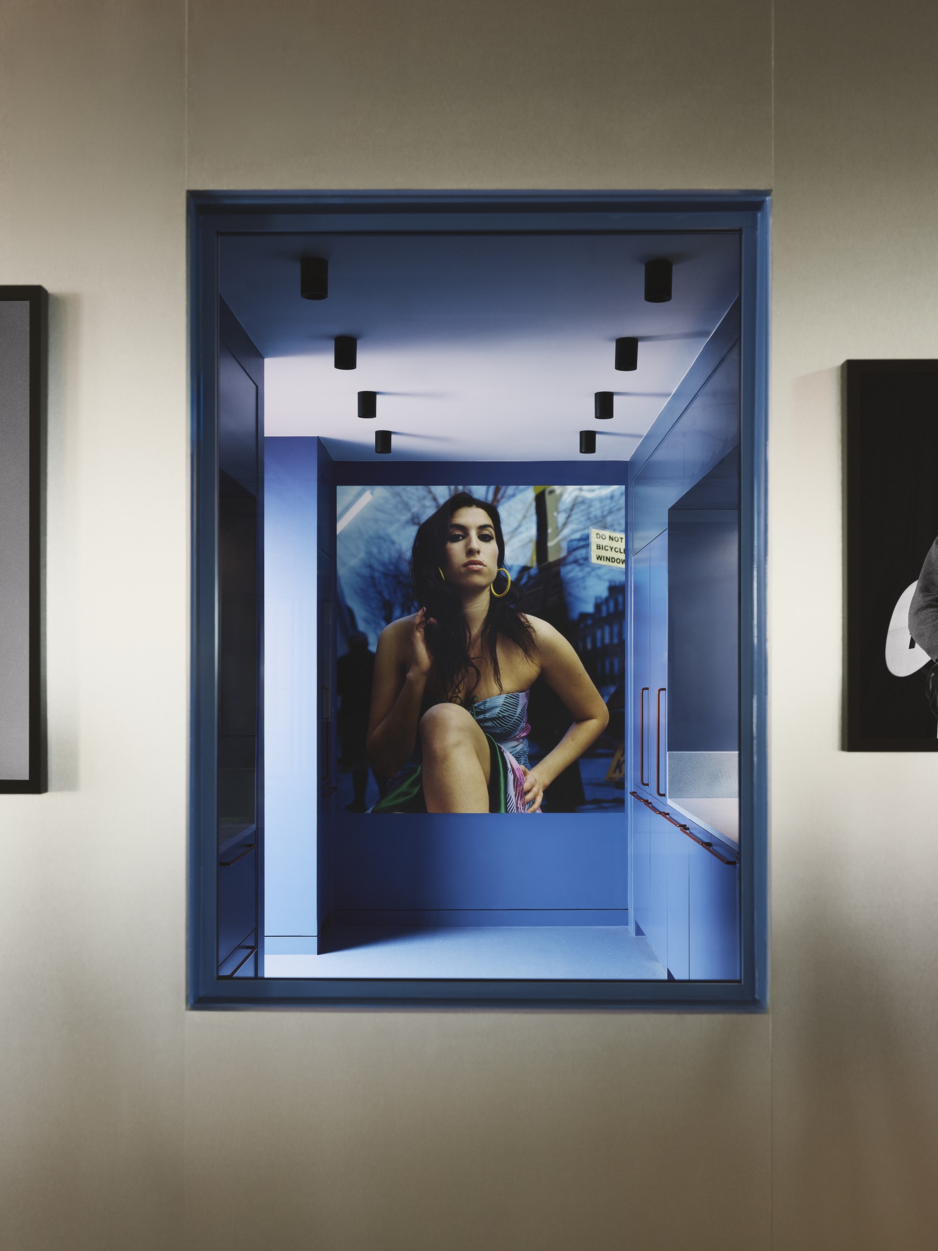
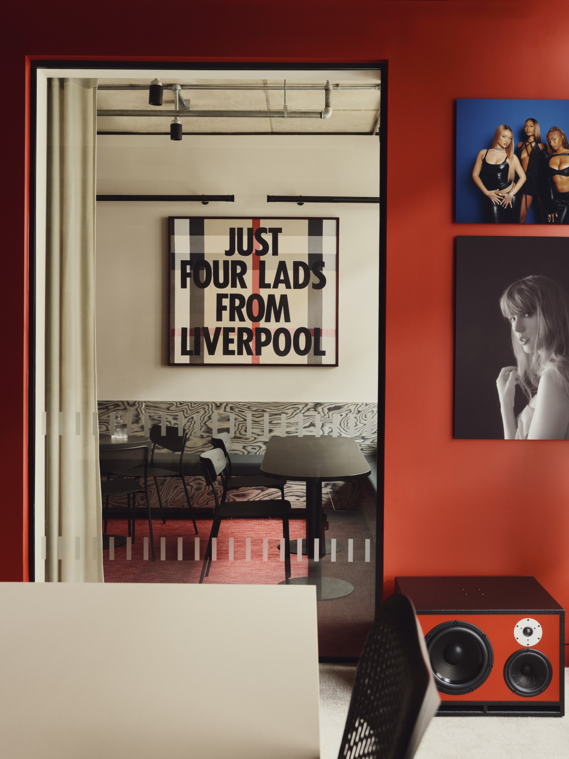
Interesting Projects director Joana Filipe describes the previous workplace as a bit of a labyrinth. ‘There were so many things happening, they had merchandise everywhere and a very loud patterned carpet.’
Williams approached Interesting Projects after seeing their exhibition design for Tate Liverpool’s 2019 Keith Haring retrospective. ‘They had a really good understanding of music and environments, and it was unlike anything I had really experienced – so considered and purposeful,’ she says.
Balancing Acoustics and Social Space
By surveying staff, Interesting Projects discovered that more than 40 per cent needed more space for collaboration and social connection, and more than half wanted more meeting spaces.
‘Even though it was chaotic, it had a really nice energy, with loud music coming out of every office, it was buzzing,’ Filipe adds. But the survey showed that ‘dedicated spaces and better acoustic performance were a must,’ she adds.

So the task was two-pronged: to create a space that functioned better for staff and visitors and that clearly expressed the two labels’ cultures.
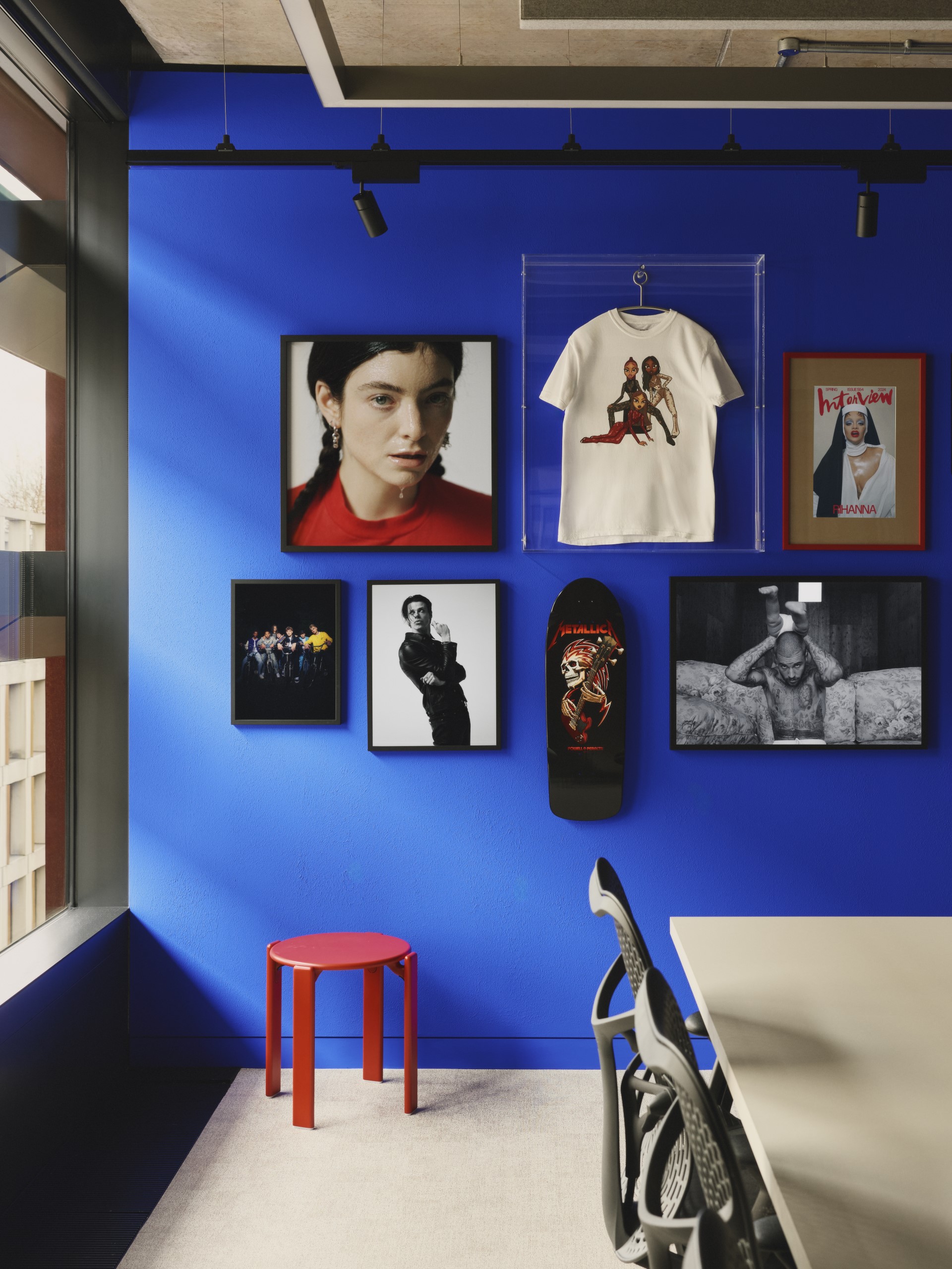
For the latter, Williams wanted to maximise the wall space to show art that represented the artists and labels. ‘Whether you’re a staff member, a (recording) artist, a manager, a contact, when you walk through and you see things on the wall that you recognise or you’re inspired by, it explains why we do what we do.’
Hybrid Workplace and Exhibition
The designers describe the result as a hybrid between a workplace and an exhibition. More than 70 historic and newly commissioned artworks, photography and ephemera span the cultural histories of both labels, with works by Annie Leibovitz, Thierry Noir, Jeremy Deller, Corbin Shaw, Anton Corbijn, and others on show.
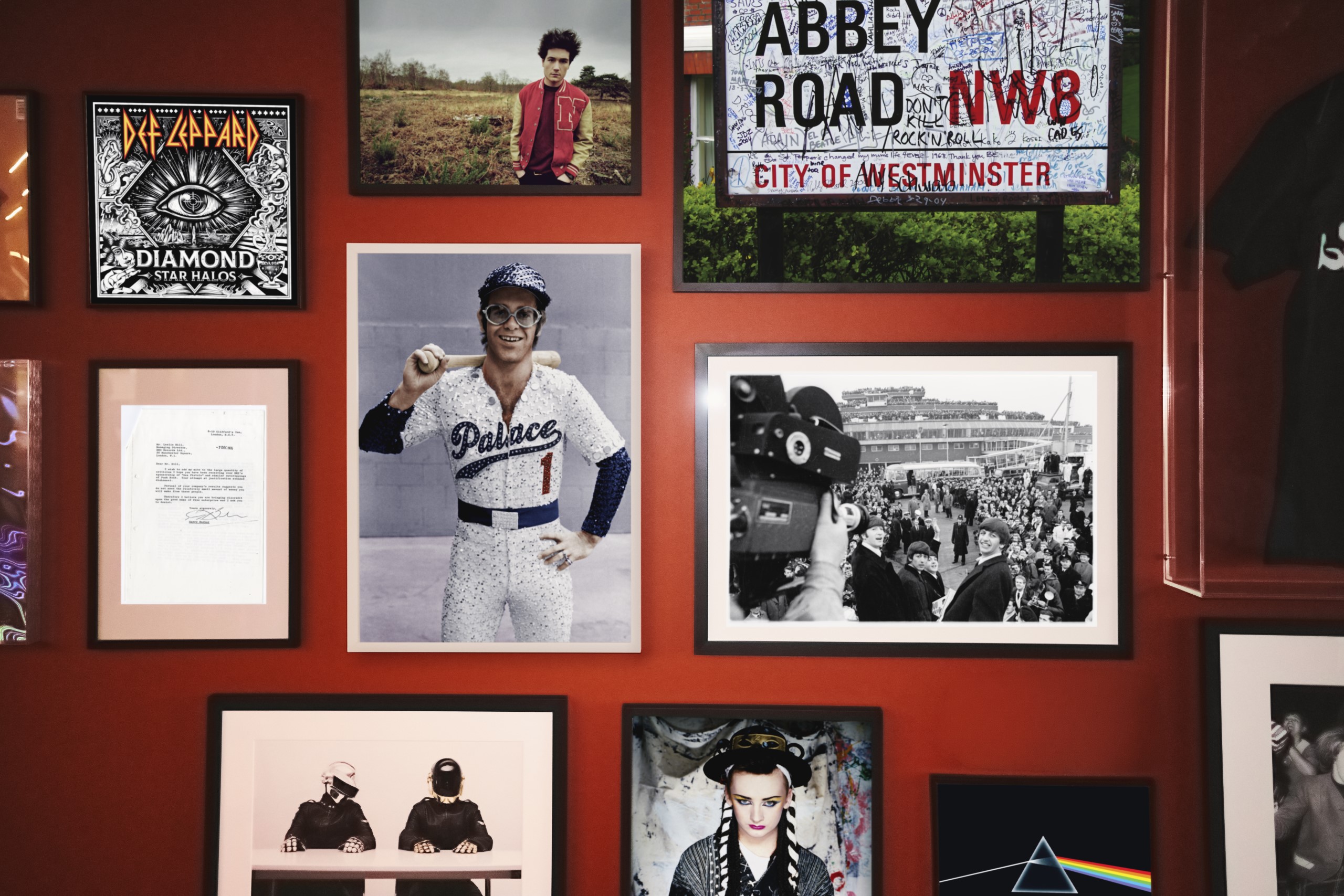
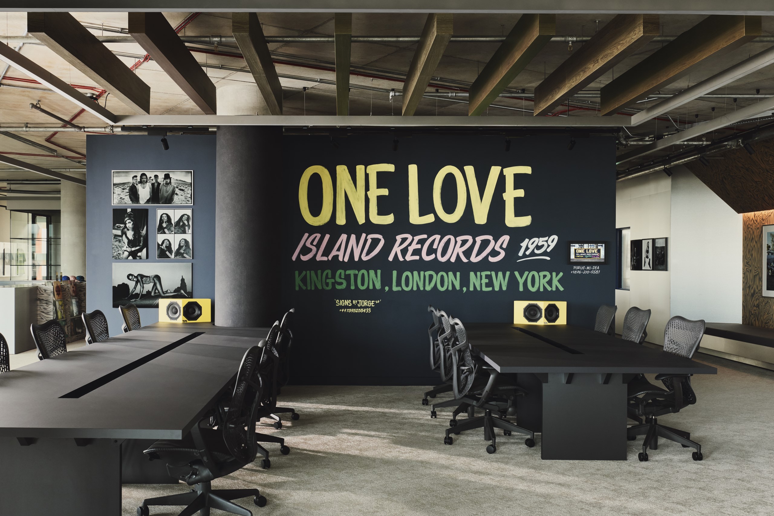
In the Island Records area, for example, there’s a hand-painted mural by British Jamaican sign-painter Jorge Jacobs, which originated with the Nurse Signs collective in Jamaica. The label’s signature yellow Pantone 109C has been paired with bright pink Pantone 671C, in a nod to its progressive and folk era of the late 1960s.
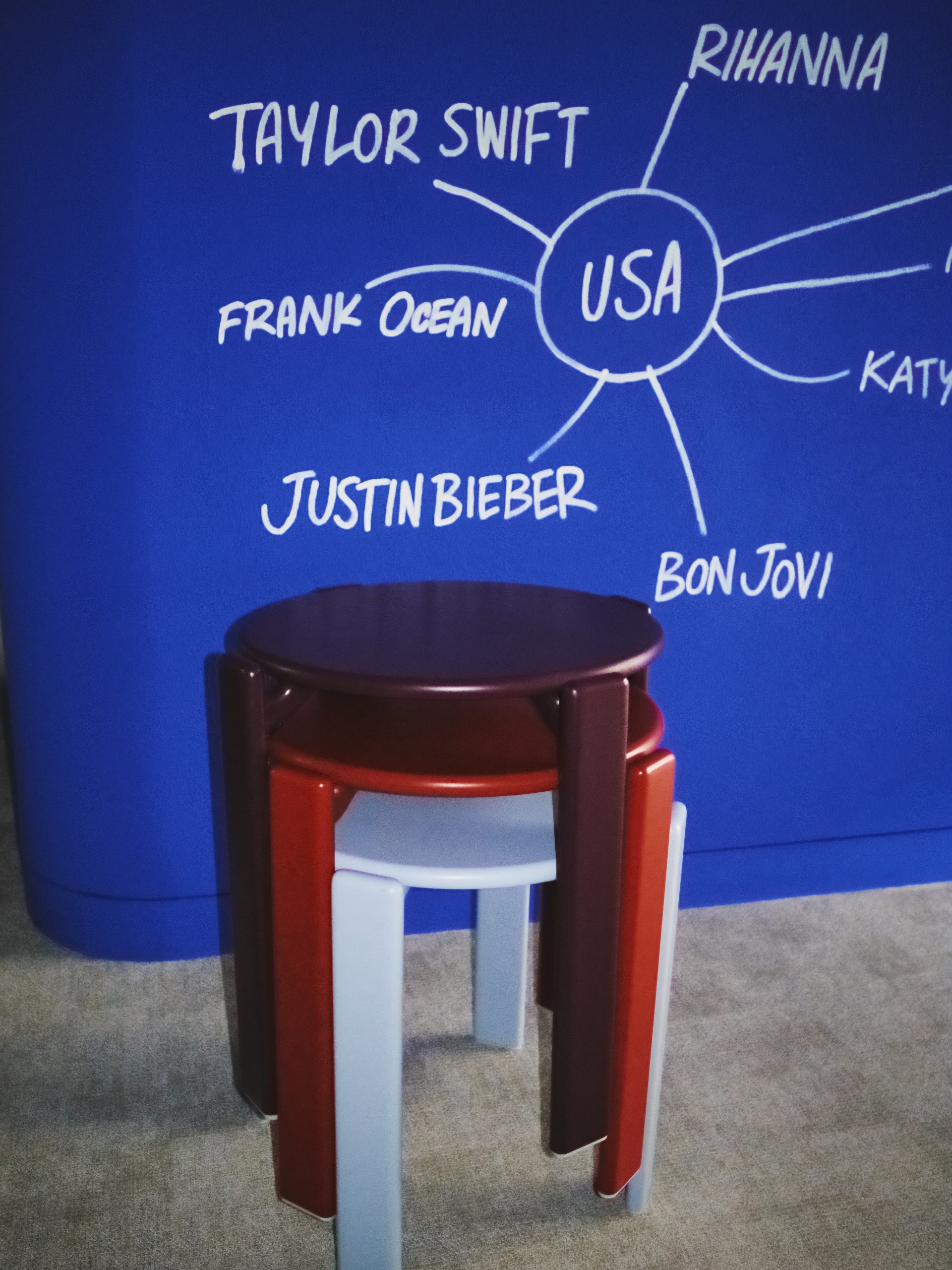
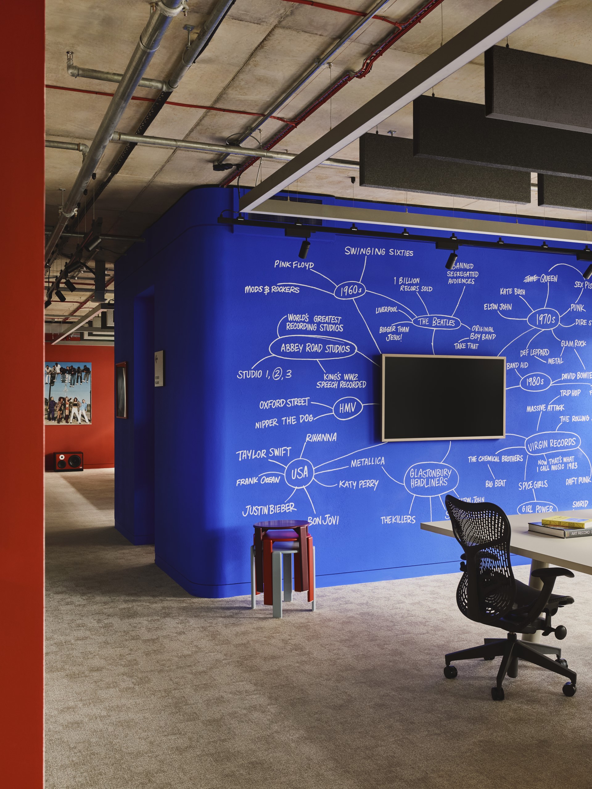
A lot of thought went into how to express EMI’s Britishness, Williams says, ‘so that it felt inclusive, collaborative and welcoming.’ Their solution was to introduce a colour scheme that deconstructed the Union Jack, with red, white, and Yves Klein blue, which is more royal than the flag’s traditional navy.
Layout and Sustainability
In sustainable terms, Filipe says that 20 per cent of the wall partitions were retained, and all the acoustic glazing and the lighting were reused. Meanwhile, the building’s acoustic lining was upgraded to stop the noise bleeding from one space to another.
As for the layout, each label has its own entrance, and the private offices around the periphery have been retained, with a few more added, and there are a number of open-plan work areas with bench desking.
The thrust of the redesign was the space between the private offices, which now features communal central areas: a boardroom, storage, kitchen, and dining space.
This last space doubles as a private meeting area, and small meeting areas have been added to open spaces such as corridors.