Kraiberg Variable Typeface Medieval Specimen Print Editorial
This variable typeface medieval specimen print editorial showcases Kraiberg, a historic display font family designed by Laura Lackner.
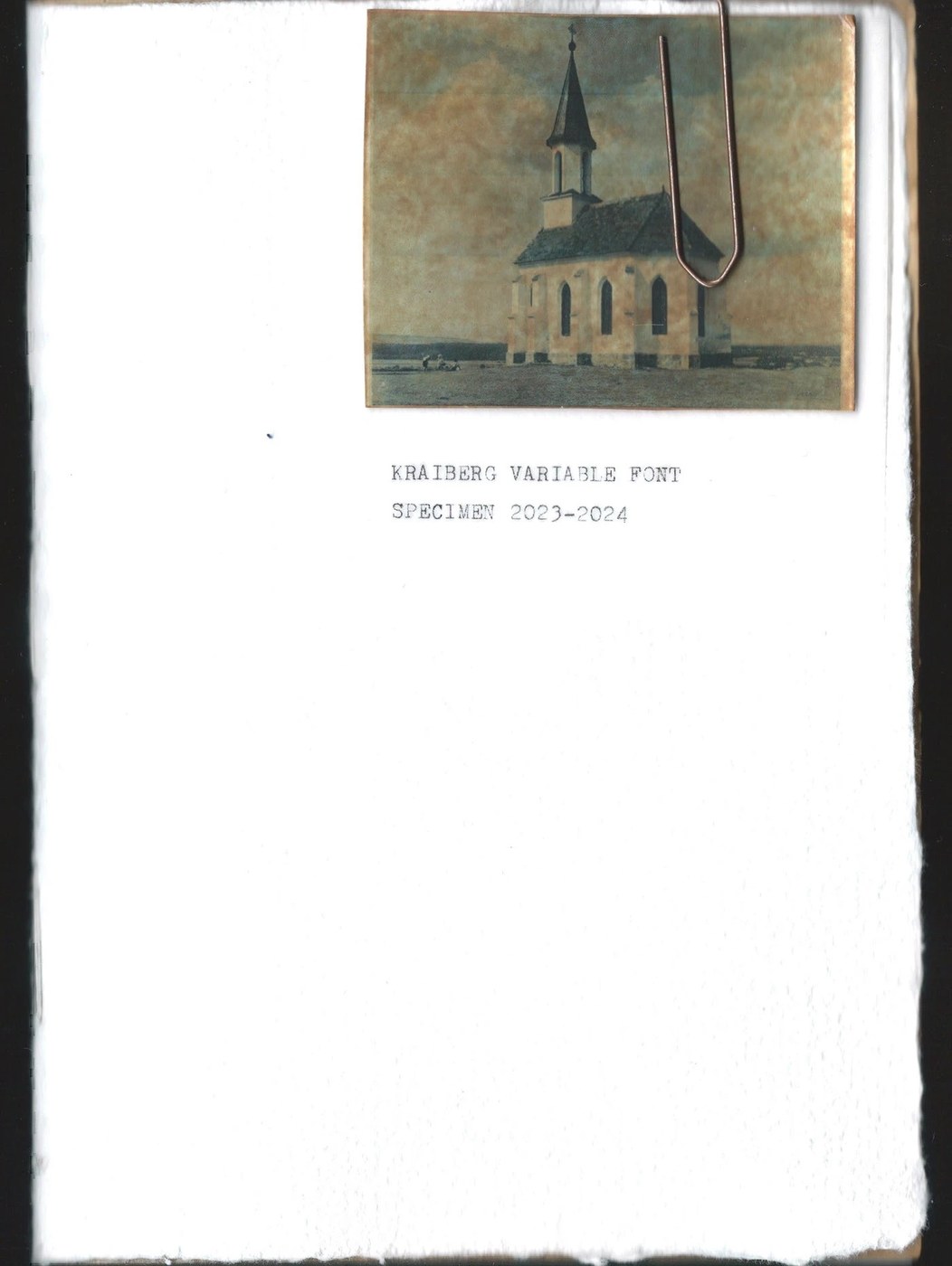
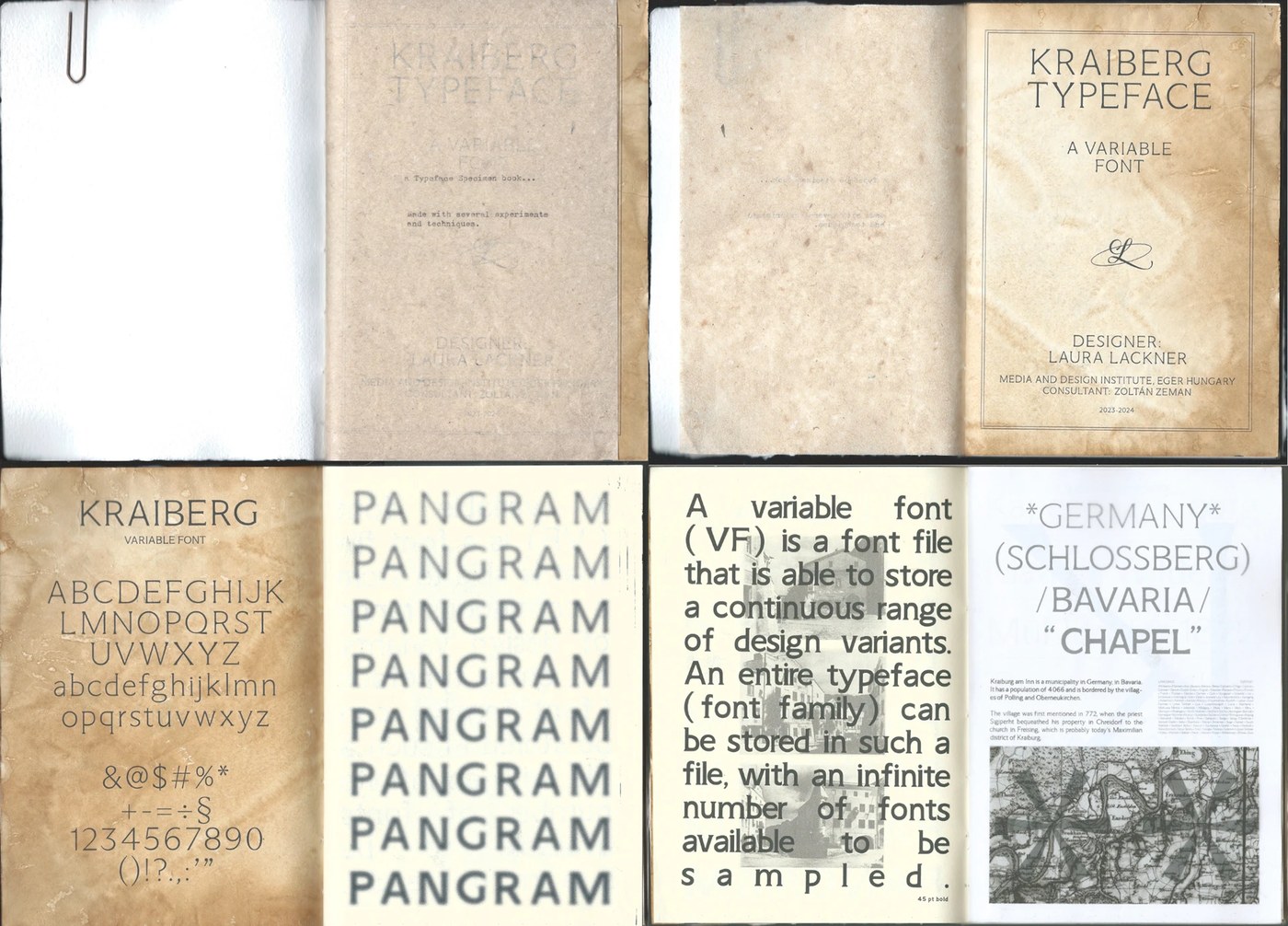
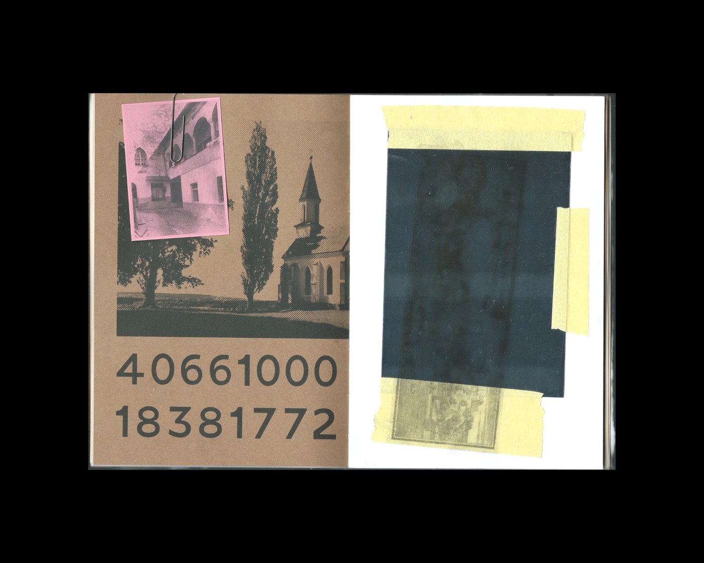
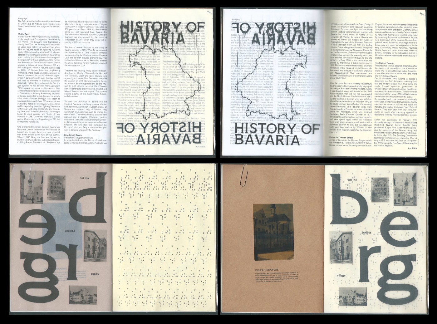
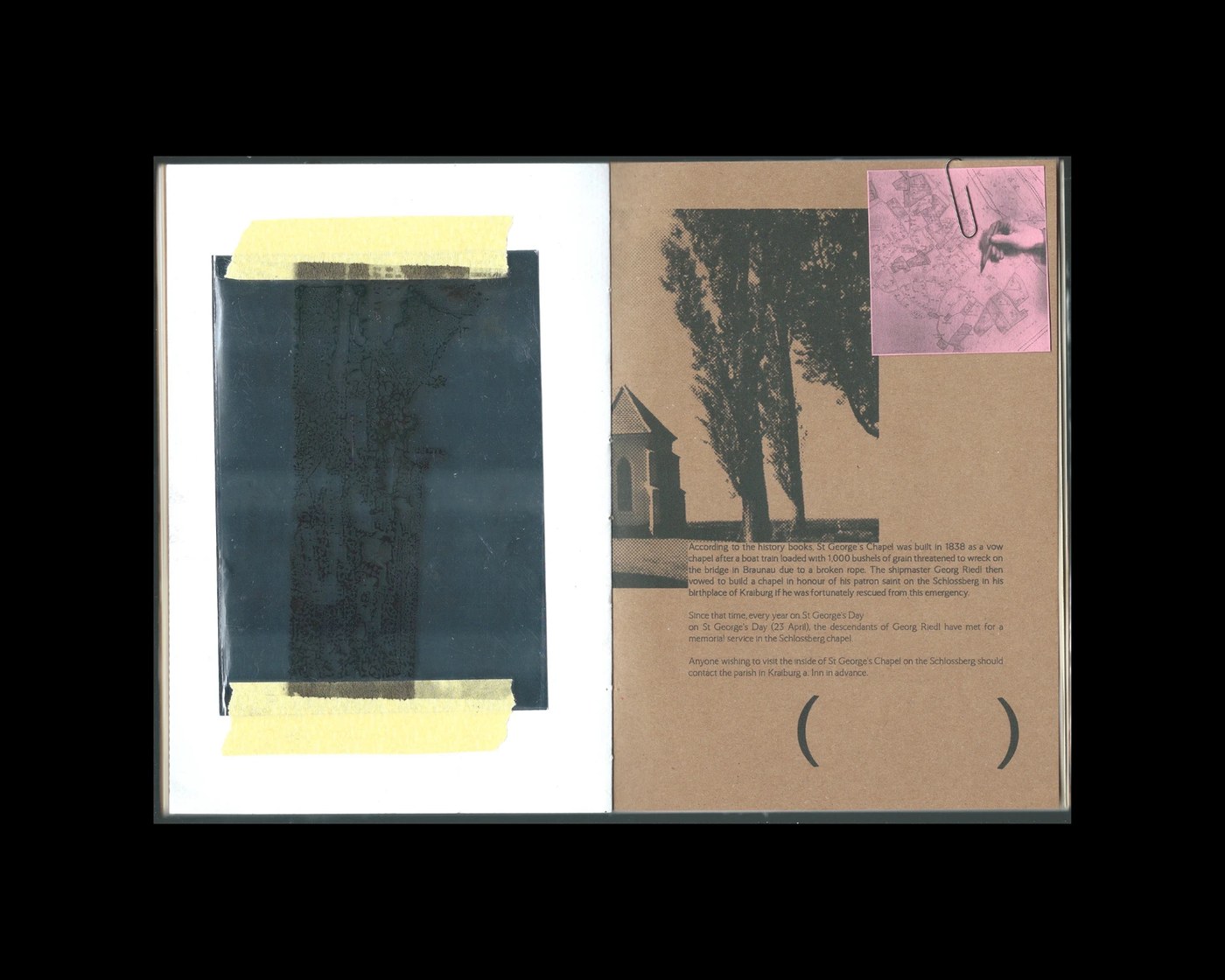
The variable typeface medieval specimen print editorial by Laura Lackner translates the architectural structure of church codices into dynamic display type. The letterforms carry the weight of medieval manuscripts, blending blackletter-adjacent angles with contemporary variable axis flexibility. Rather than presenting the font solely in a digital format, Lackner produced a physical variable typeface medieval specimen print editorial. This manual execution uses home inkjet printers and typewriter keys to establish a raw, archival aesthetic. The resulting layouts feel like an uncovered historical document collection, where structural grid layout guidelines are intentionally broken to explore visual friction.
Variable Typeface Medieval Specimen Print Editorial
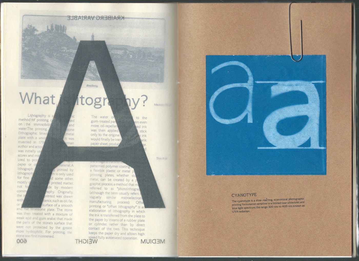
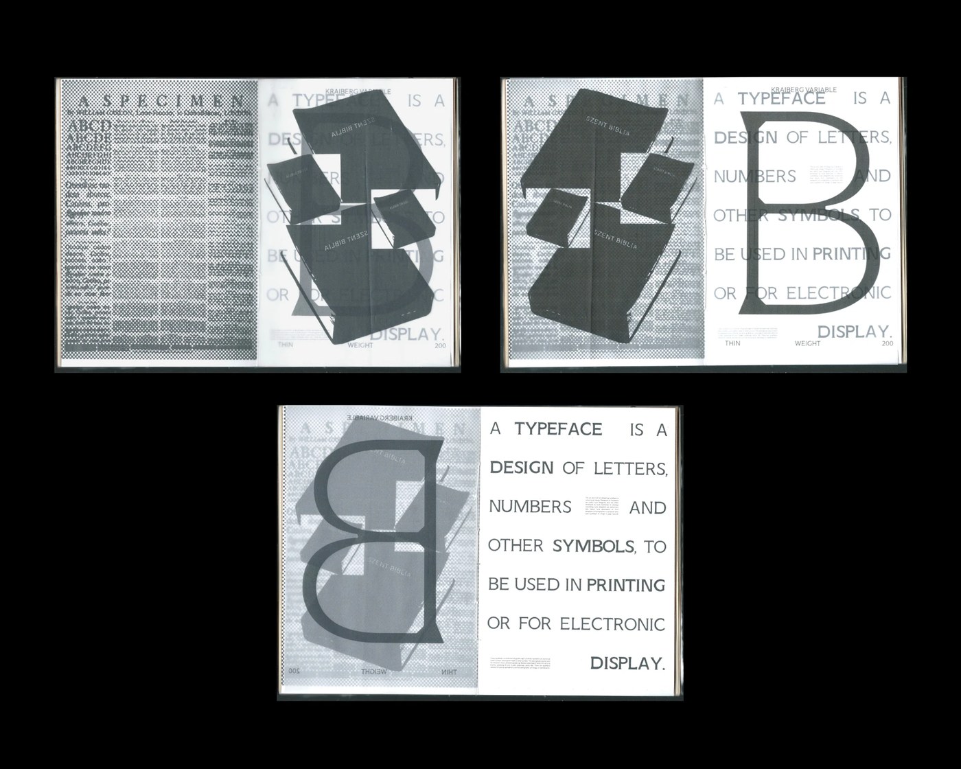
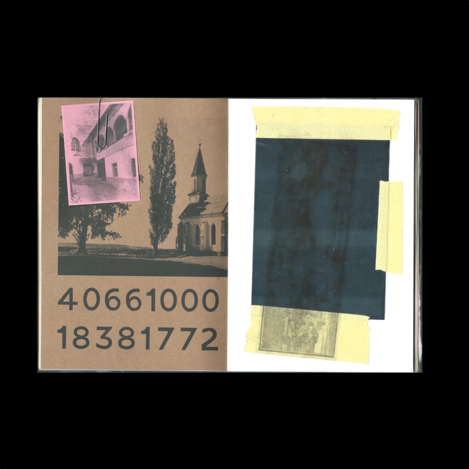
Tactile curation defines the print production, utilizing varied paper stocks and material layering to build a physical document collection. Pages balance technical character maps and variable weight sheets with experimental, abstract spreads that prioritize organic ink bleed over pure legibility. By running sheets multiple times through standard home printers, Lackner creates offset alignments and unique ink saturation levels. This tactile variable typeface medieval specimen print editorial showcases how digital font design benefits from physical, imperfect translation. The stark black letterforms gain depth when pressed against the grainy fibers of chosen papers, turning a digital specimen into a physical artifact.
Ultimately, the publication functions as both a functional catalog and a visual system. The structural tension between clean vector geometries and raw paper textures highlights the neo-archival trend. Lackner establishes a systematic design language where ink bleed and typewriter impressions become part of the font's identity. The variable typeface medieval specimen print editorial showcases how historic reference and analog texture enrich contemporary typography. See the project directly on Laura Lackner's portfolio.