Packaging Design: Saucy by Nathalia Ultramar
Discover the bold packaging design for Saucy by Nathalia Ultramar, pairing punchy typography with bespoke color palettes and body care bottles.
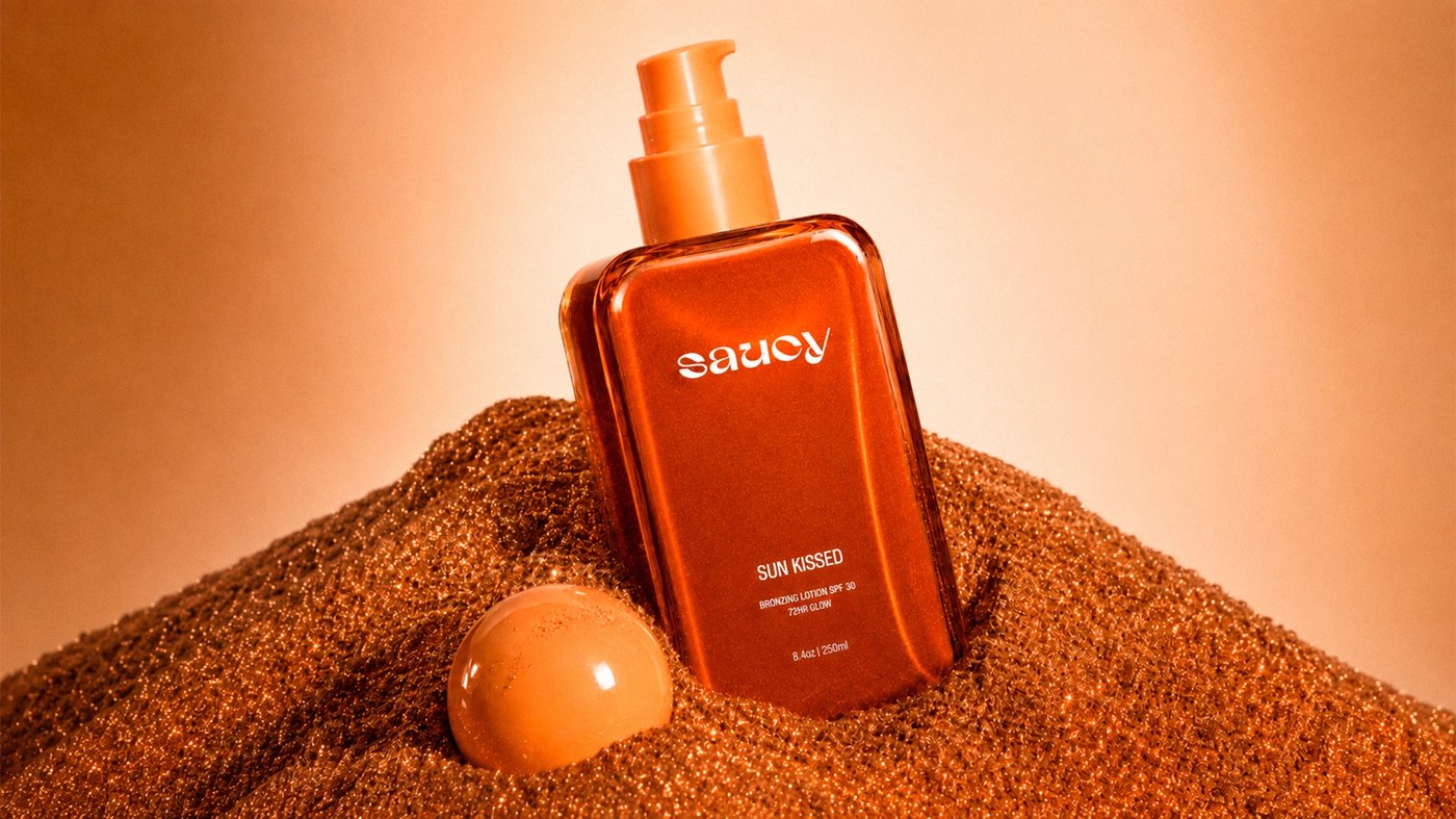
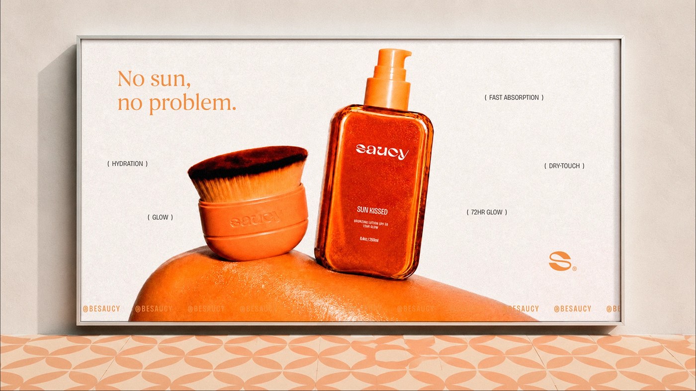
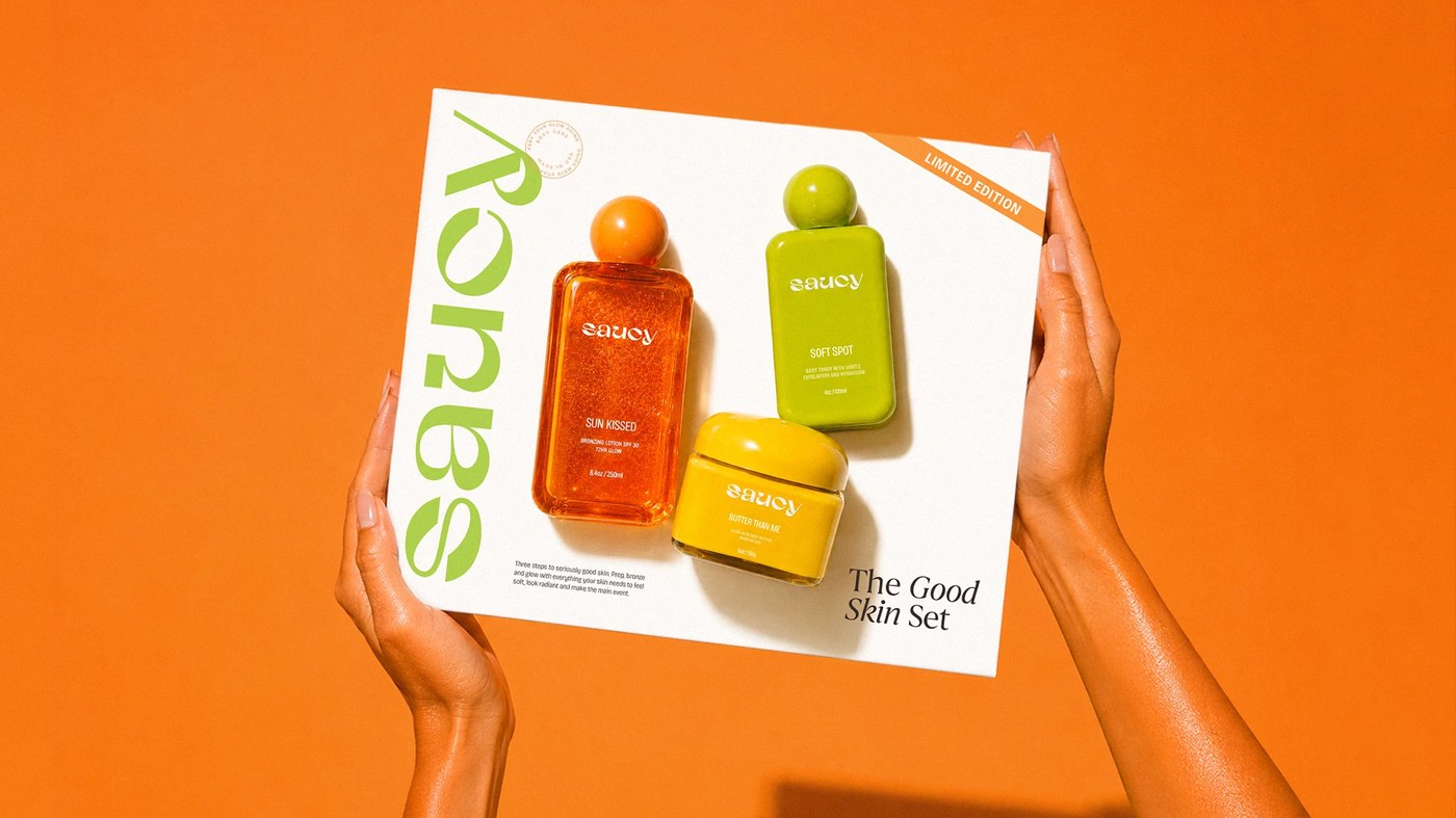
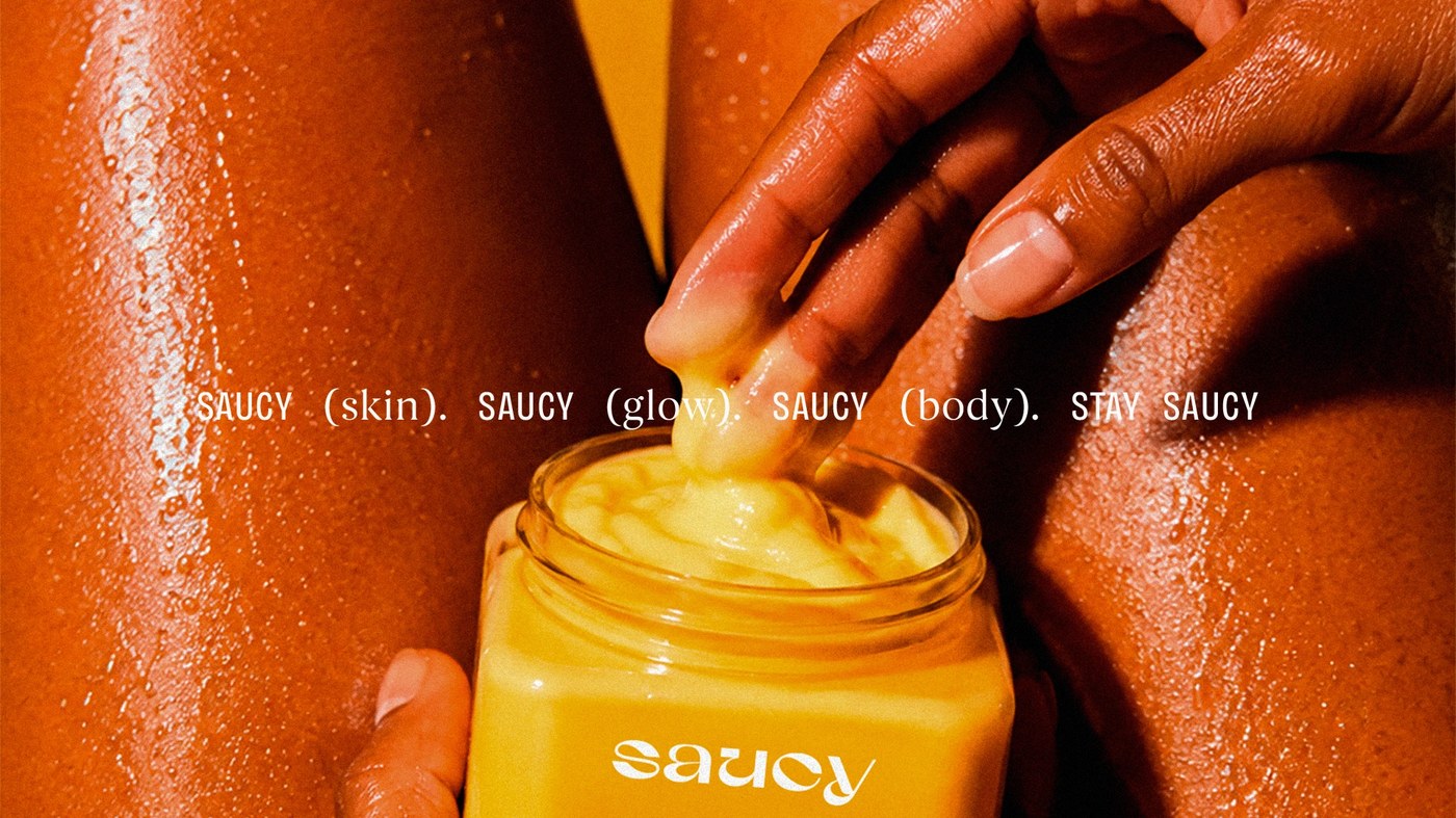
Brazilian designer Nathalia Ultramar developed this comprehensive packaging design and brand identity for Saucy, an original body care line created in collaboration with Orcaah. Moving away from sterile clinical formulas and generic golden tan cliches, the visual strategy infuses everyday skin routines with unapologetic confidence. Ultramar shaped every facet of the brand from the ground up, directing the brand naming, market positioning, and verbal identity. Anchored by the spirited tagline "stay saucy," the graphic language rejects quiet minimalism in favor of charismatic typography, confident proportions, and a chromatic palette designed to command attention on crowded retail shelves.
Personality Driven Positioning and Packaging Design
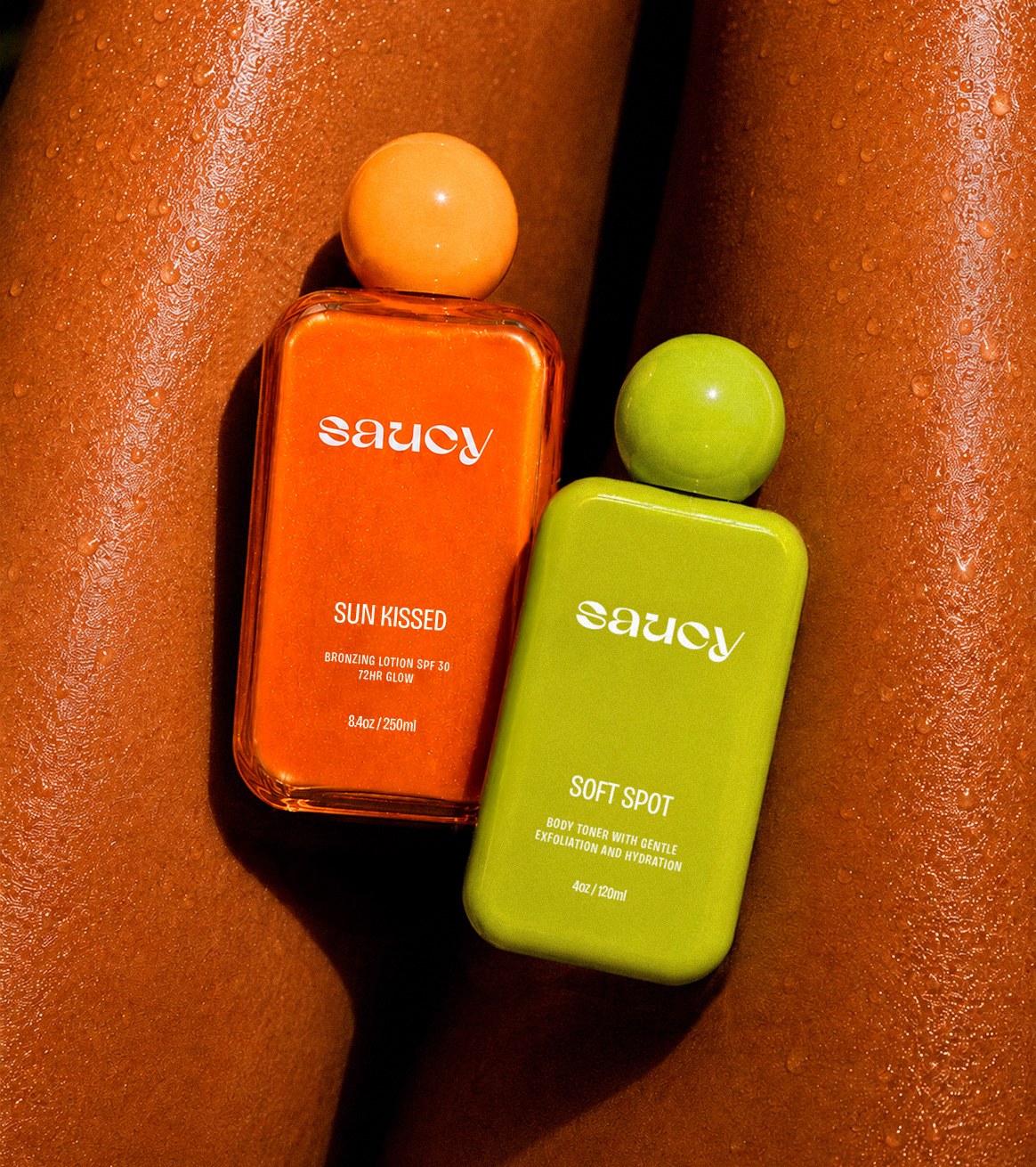
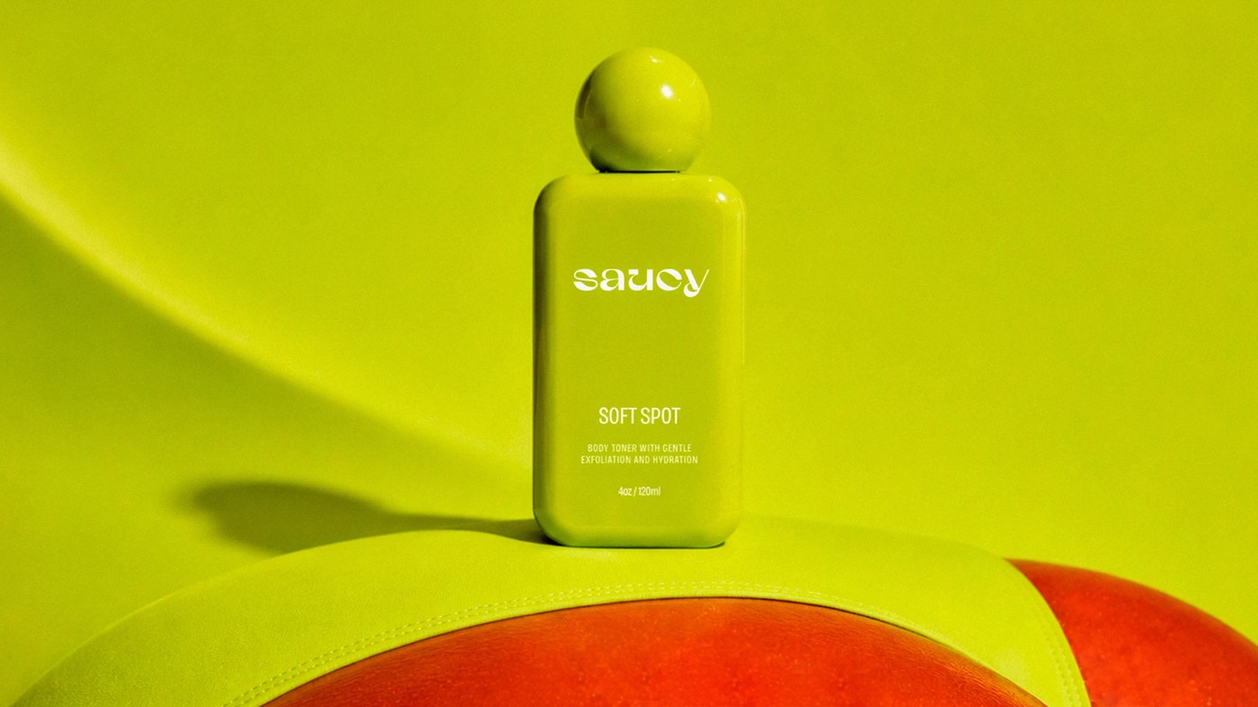
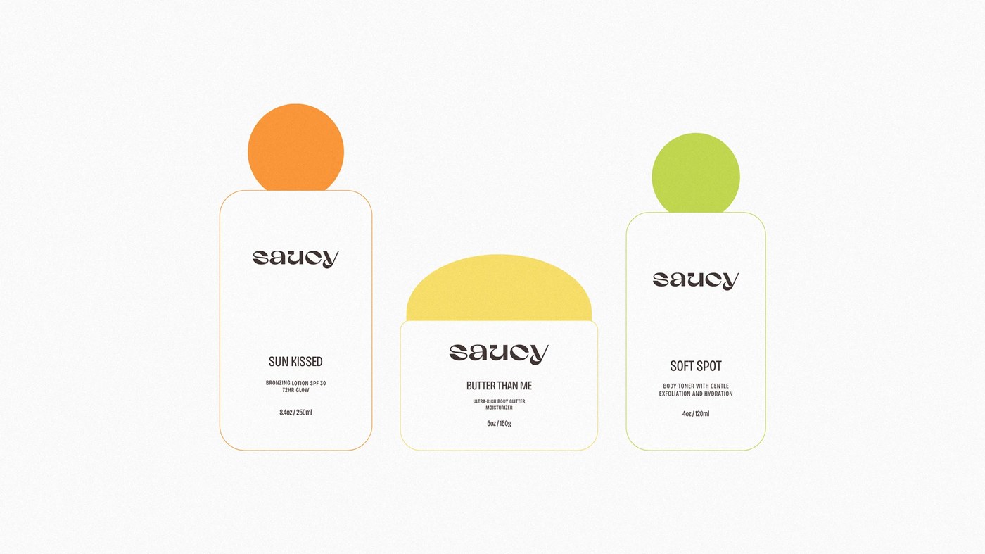
The packaging design organizes product information into clean columns while celebrating playful nomenclature. Rather than relying on generic technical labels, products receive personality-driven titles like Soft Spot, Sun Kissed, and Butter Than Me. Cylindrical pump bottles and squeeze tubes high-contrast color pairings, combining rich cocoa brown, warm marigold yellow, and soft pastel lilac. The typographic hierarchy balances a heavy display wordmark with disciplined, legible sans-serif product specifications. By anchoring bold headlines against generous negative space, the containers establish an energetic rhythm that guides the consumer through ingredient benefits, application steps, and product volumes with immediate visual clarity.
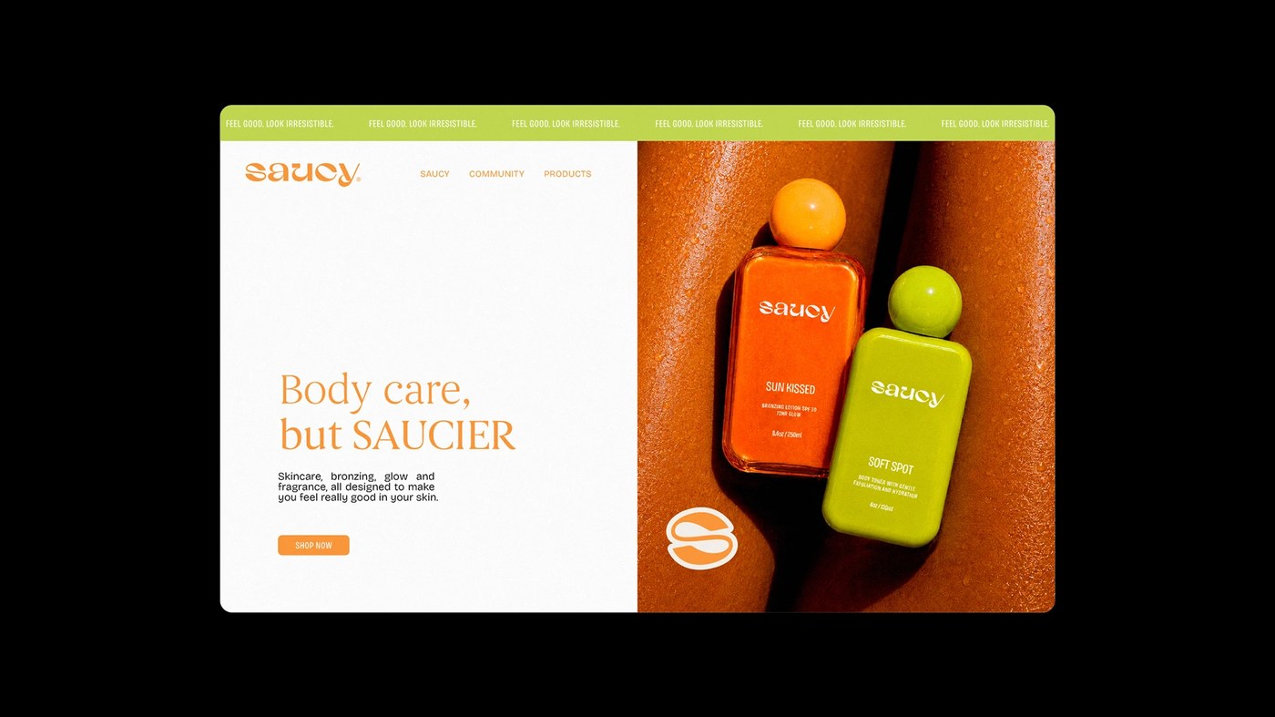
Beyond individual bottle containers, the visual system scales into e-commerce layouts and editorial art direction. Crisp digital product mockups present clean typographic grids, while candid studio photography captures real skin textures and product application rituals. Produced using Adobe Illustrator, Photoshop, and InDesign, the identity demonstrates how strategic packaging design transforms body care from routine maintenance into a pleasurable self-care experience. Ultramar delivers a cohesive visual ecosystem that celebrates individuality, proving that personal care brands can combine bold humor, distinct shelf presence, and sophisticated graphic execution into one unified consumer experience.
See the full project by Nathalia Ultramar on Behance.