Editorial Publication Design: Atelier Poético by Lina Irene Rossi
Atelier Poético by Lina Irene Rossi is an editorial publication design project built on poetic typography and sensitive photography.
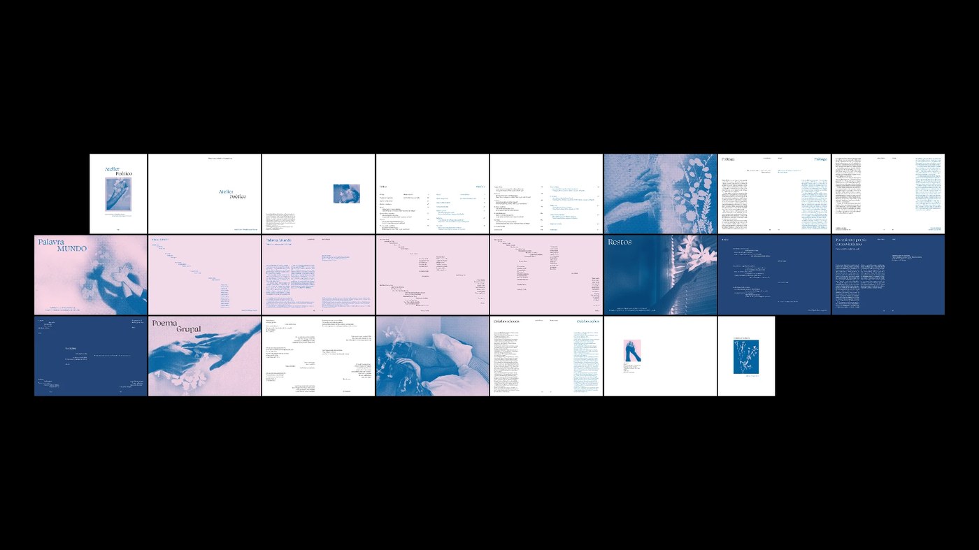
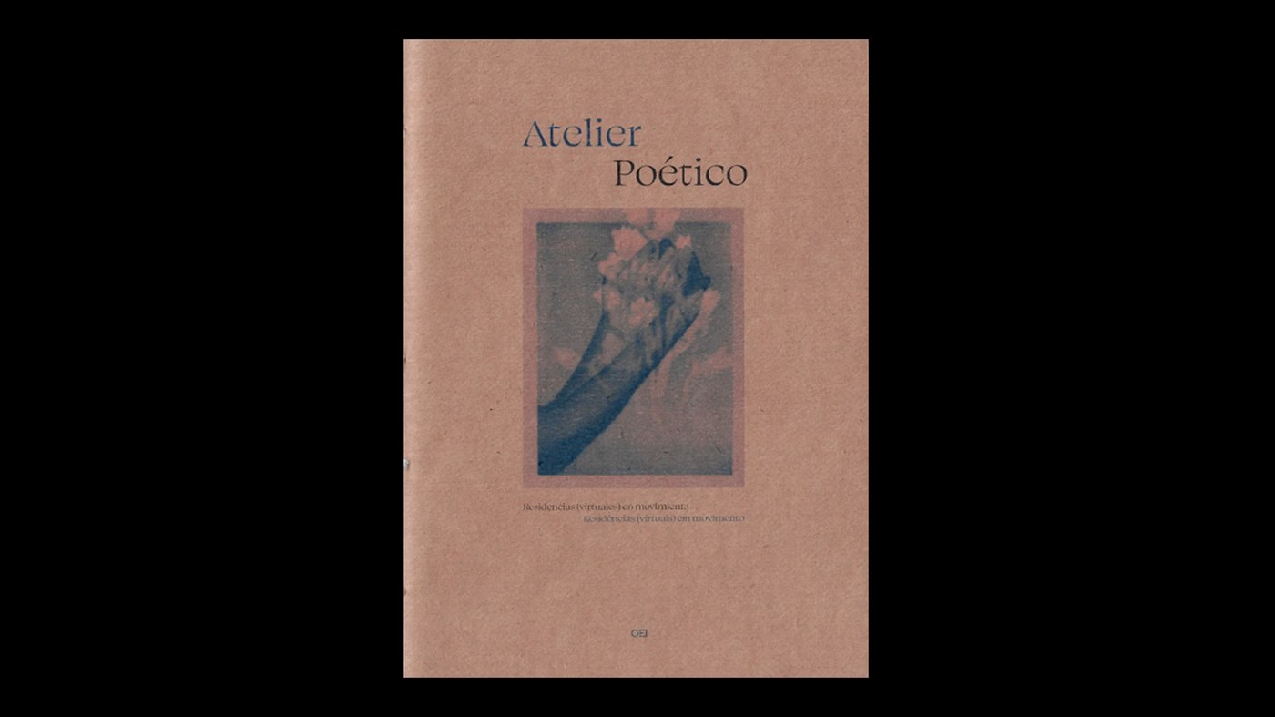
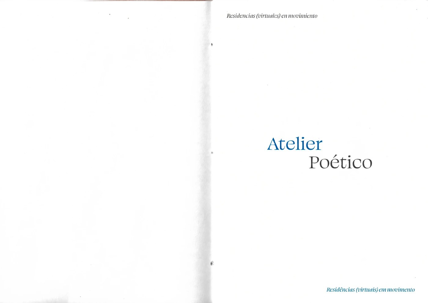
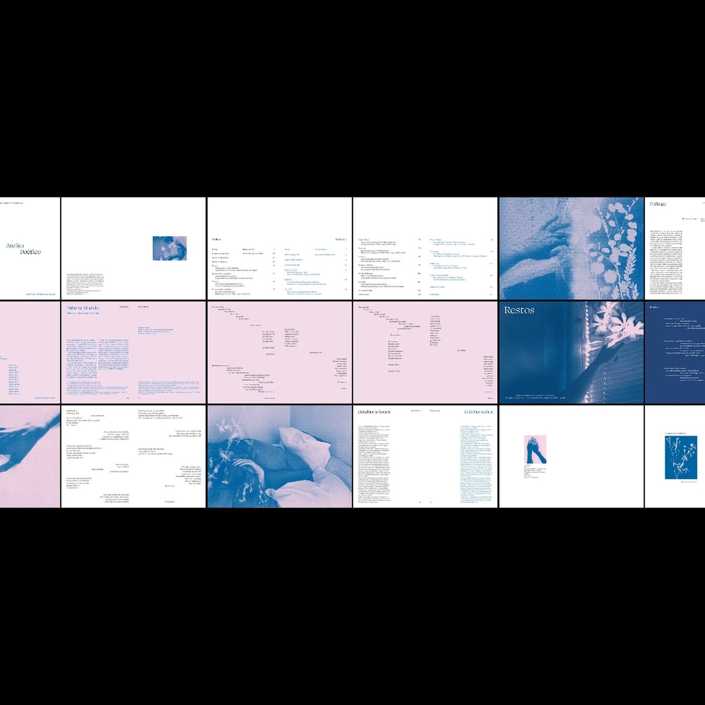
Lina Irene Rossi designed Atelier Poético as a 44-page plaquette publication for OEI, serving as an architectural presentation piece and outreach introduction to the poetry residency book series. Developed at FADU UBA Cátedra Cosgaya, the visual identity uses a typography-driven layout system that balances editorial modulation, graphic design principles, and quiet visual pacing. Warm beige stock, neutral tan tones, and soft monochrome imagery establish an intimate reading atmosphere. Delicate sans-serif typography, generous margins, and subtle letterform contrast transform the poetry fragments into a cohesive, highly structured physical specimen.
Editorial publication design and poetic grid systems
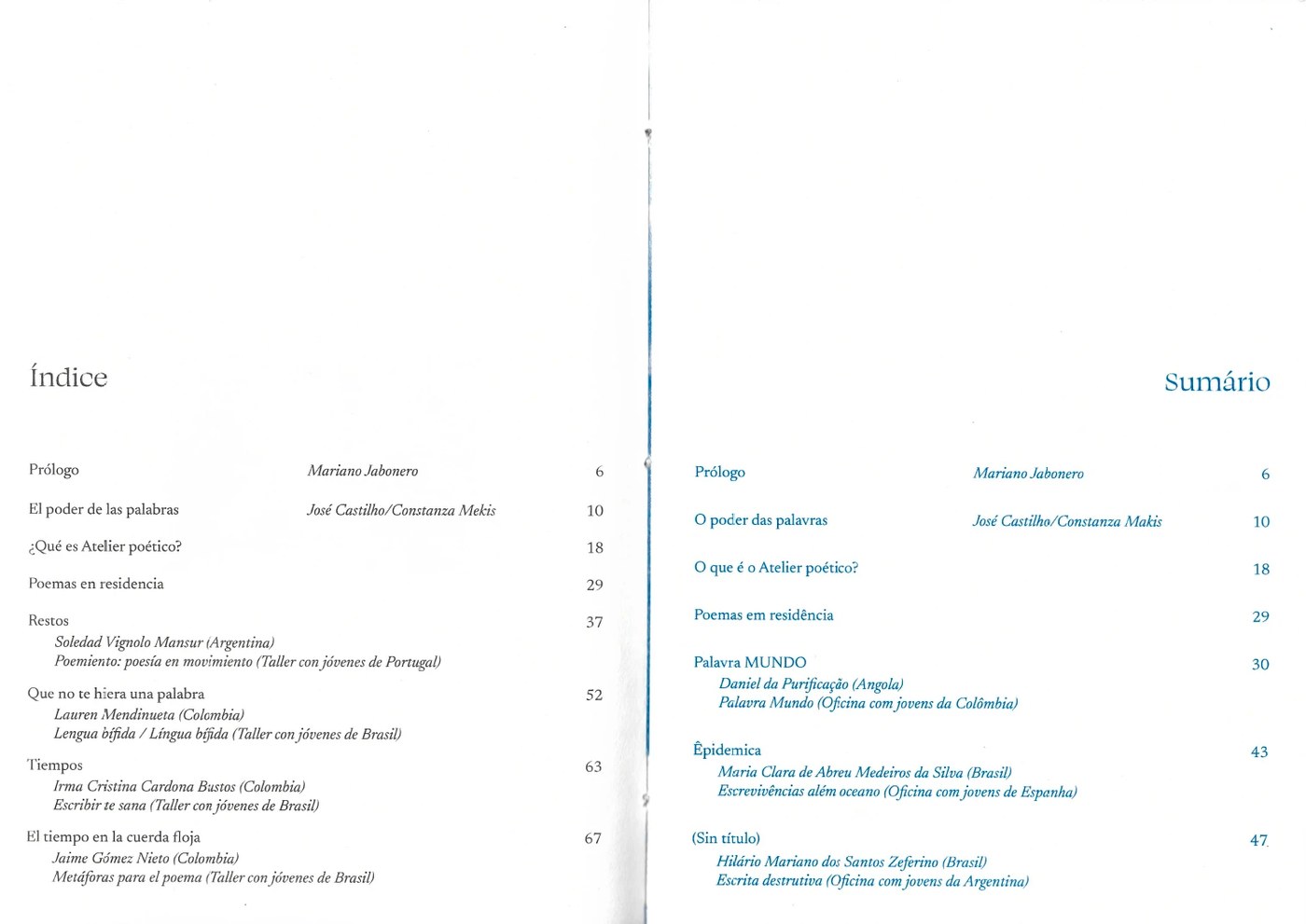
At the foundation of this editorial publication design is a disciplined layout grid designed to honor poetic cadence, stanza alignment, typography standards, and textual hierarchy. By establishing rigid structural boundaries, Lina Irene Rossi allows negative space and letterform geometry to guide visual rhythm across every spread. Scale contrasts between subtle section titles, body stanzas, and micro metadata are calculated to maintain structural harmony without distracting from the text. The resulting compositions present dense poetic fragments with exceptional spatial legibility, showcasing how modular grids structure intimate literary publications.
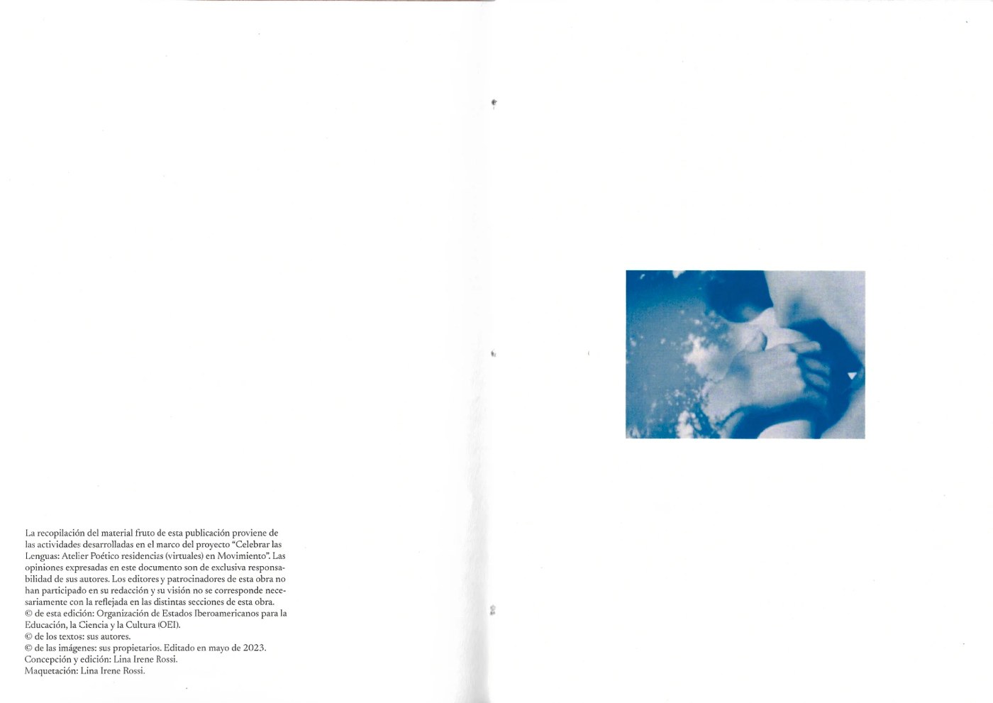
Across physical spreads, paper swatches, cover signatures, and bound pages, the publication leverages material contrast to complement poetic themes and editorial content. The photographic curation pairs quiet architectural textures, soft organic imagery, and tactile textures directly with the editorial layout grid, creating a sensitive balance between text and visual art. Careful attention to paper grain, ink density, trim margins, custom debossed titles, and precise saddle-stitched binding ensures that physical details carry equal weight with the typography. This execution sets a high benchmark for contemporary literary editorial design and publication production.
See the full project by Lina Irene Rossi on Behance.