Best of the Week: Systematic Rigor & Evolving Identities
Our roundup of the week's best design projects, featuring systematic visual identities, tactile packaging structures, kinetic typography, and digital-first brand ecosystems.
This week's selection highlights a growing industry focus on systematic rigor—using strict grids, code-adjacent monospace type, and mathematical layouts to ground complex digital platforms. At the same time, we see designers introducing visual tension by pairing these highly structured grids with organic textures, custom letterforms, and kinetic variables, proving that strict formulas can yield remarkably expressive results.
Inflection — Lundgren+Lindqvist
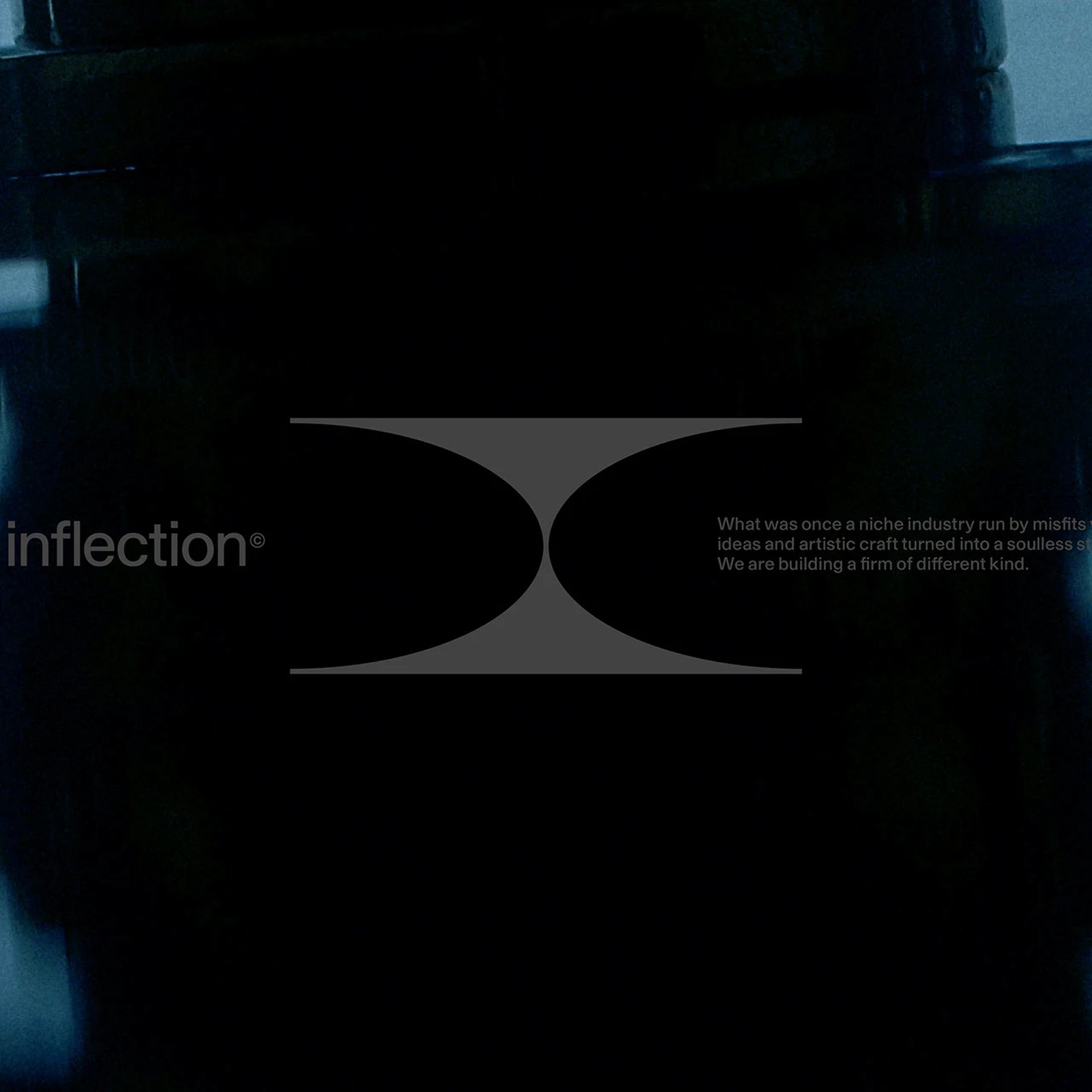
Designed by Swedish studio Lundgren+Lindqvist, the brand identity and website for venture capital fund Inflection draws inspiration from Janus, the dual-faced Roman god of transitions. The system relies on monospace typography, structural layout grids, and a custom logomark with elliptical cuts that serve as frames for portfolio companies. It represents a masterclass in treating technical code logic as a premium editorial asset. View Project
Birga Beer — FCB Artgroup Tbilisi
FCB Artgroup Tbilisi's packaging concept for Birga Beer bypasses traditional beer branding tropes to appeal to a conservative market. The design employs a bold, structural sans-serif font paired with vibrant color-blocking and custom vector cat characters. The system demonstrates how a cohesive visual language can elevate everyday products across cans, cardboard carriers, and merchandise. View Project
Ruda — Yai Salinas
Yai Salinas's brand identity for Ruda is a typographic exploration that balances strict grid layouts with expressive geometries. The project centers around a custom-drawn monogram, creating a high-contrast voice that scales effortlessly across physical stationery, packaging fields, and digital applications. The contrast between heavy dark type and light packaging fields provides a refined, clinical feel. View Project
GRID Coffee — Elizaveta Kharchenko
Elizaveta Kharchenko constructs a modular brand language for GRID Coffee shop and roastery, where the layout grid itself serves as the hero mark. Shifting away from illustrative logos, the system utilizes raw cardboard substrates, black ink stamps, and high-contrast lines to build a tactile, industrial brand experience. The grid system functions as signage, small labels, and internal packaging. View Project
Sandisk Packaging — Unspoken Agreement
Unspoken Agreement reimagines consumer electronics packaging for SanDisk, moving away from cluttered plastic blister packs. The case study utilizes clean typographic systems and high-fidelity 3D renderings to position storage media as premium lifestyle products. It shows how technical specifications can be organized cleanly without introducing visual clutter on retail shelves. View Project
Plant Atelier — Ayna Kravetskaya
Ayna Kravetskaya's online shop design for Plant Atelier bridges the gap between editorial layout and functional e-commerce UX. By introducing generous whitespace, sophisticated serif headings, and natural tones, the interface mimics the experience of browsing a premium print magazine. It presents a calm, transaction-focused digital product that prioritizes photography spacing and user flow. View Project
Temporal — .raw lab
.raw lab's Temporal brand identity explores generative grammar, using algorithm-driven visual elements that morph in response to real-time environmental data. The visual system maintains structural legibility across both dynamic digital layouts and static printed collateral. It showcases the future of responsive brand design, where the logo behaves as a living, breathing digital organism. View Project
ERA Skincare — Yana Malets
Yana Malets' skincare identity and packaging design balances calligraphic script with radical, unadorned structural packaging. The design creates editorial tension by placing expressive handwriting details next to strict, industrial grids and muted earth tones. The project stands out for its sustainability-minded reduction of unnecessary secondary packaging boxes. View Project
Coaltown Coffee — Smörgåsbord
Cardiff-based studio Smörgåsbord developed a refined identity system for Coaltown Coffee, celebrating the brand's Welsh mining heritage. The rebrand pairs a custom slab-serif logotype featuring industrial "nicks" with a color scheme of "Coal Black" and muted tones, accented by "Purpose Orange." The new packaging features modular, brick-like retail boxes designed for clean structural stacking. View Project
Bace Platform — Dirt
Creative collective Dirt designed the end-to-end branding and digital ecosystem for fitness platform Bace. The system moves beyond traditional identity assets to build a comprehensive digital environment utilizing high-contrast type scales and refined editorial grid systems. The brand establishes a premium wellness universe across its web applications and custom video production frameworks. View Project
AOTO Brand Identity — Garde Design
Stockholm-based studio Garde Design crafted a fast, highly directed brand identity for automotive financing company AOTO. The visual language utilizes a bold, flexible typographic system that scales to indicate movement, pace, and direction. It avoids typical corporate tropes in favor of graphic tension, dynamic letter scales, and high-contrast digital layouts. View Project
Stay tuned for next week's roundup, where we will examine how independent studios are using retro-futuristic geometries and eclectic type scales to challenge digital minimalism.