Best of the Week: Editorial Pacing and Modular Type
We gather the best of the week features across branding, packaging, editorial design, and typography from ISO week 2026-W37, spotlighting architectural grids and tactile print craft.
This week’s editorial throughline examines the tension between structural restraint and tactile material expression. Across independent publishing platforms, custom display typefaces, and sculptural packaging suites, designers prioritized rigorous layout hierarchies, raw paper substrates, and deliberate graphic frictions.
Featured Design and Branding Picks
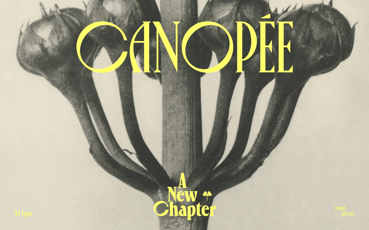
Canopée Typeface by Violaine & Jeremy
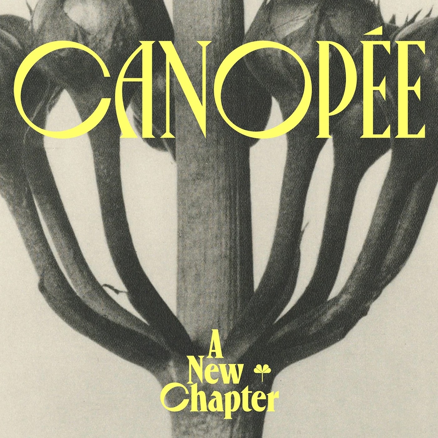
Parisian studio Violaine & Jeremy expanded their signature display typeface with a complete lowercase set and versatile weight spectrum through VJ-Type. The design balances razor-sharp geometric serifs against organic rounded silhouettes, creating a rhythmic visual tension that shines across Karl Blossfeldt botanical specimen pairings. Its alternating character widths establish a distinct editorial cadence across large-scale display titling and dense cultural publications.
View Feature
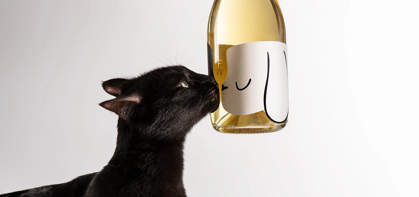
White Flag Wine Packaging by Backbone Branding
Backbone Branding engineered an origami-inspired structural paper jacket that transforms wine packaging into a symbolic physical artifact. The monochromatic unvarnished cotton label unfolds like a peace flag, utilizing blind embossing and micro-perforations to establish stark contrast against pitch-black glass. A hidden negative space silhouette between cat and dog profiles adds conceptual warmth without sacrificing architectural minimalism.
View Feature
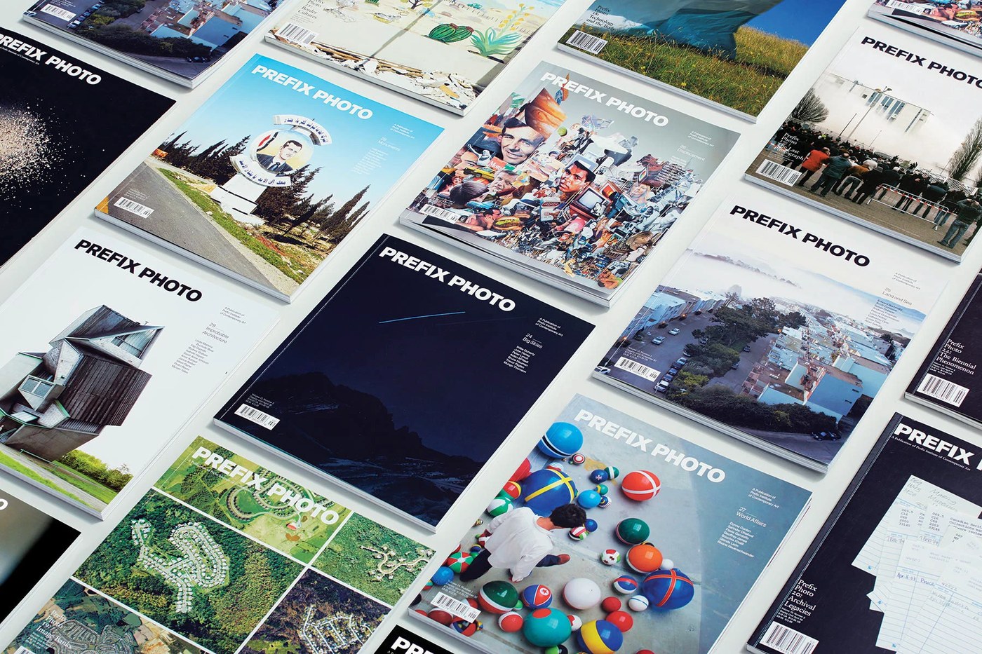
Prefix Photo Magazine by Underline Studio
Underline Studio brought Swiss grid discipline to Prefix Photo Magazine, crafting an archival publication that gives contemporary photography room to breathe. The editorial pacing alternates between quiet full-bleed visual spreads and restrained multi-column essays set in delicate serif typography. Printed on tactile uncoated art paper with thread-sewn binding, the magazine demonstrates museum-grade publication craftsmanship.
View Feature
Locomotive Agency Website by Locomotive
Locomotive delivered an expressive digital experience that redefines portfolio presentation through fluid viewport transitions and tactile micro-physics. Oversized grotesque typography anchors a modular responsive grid, creating intuitive reading flows that respond dynamically to scroll velocity. The interaction design treats digital space as a physical substrate, pairing technical performance with editorial elegance.
View Feature
Uniscent Visual Identity by Lundgren+Lindqvist
Gothenburg studio Lundgren+Lindqvist translated the invisible, fleeting nature of scent into a tactile graphic ecosystem. The identity pairs an austere monospaced typeface evoking scientific laboratory precision with a fluid, gestural monogram that visualizes fragrance escaping its vessel. Printed envelopes and macroscopic botanical scans bridge digital exactitude with raw, porous paper finishes.
View Feature
Lock Superfamily by Mash Creative
Mash Creative developed an ambitious typographic superfamily that bridges the dichotomy between sharp, outspoken serifs and blunt, functional sans-serif structures. Engineered with playful calligraphic stencil companions and smooth variable font interpolation, the type system demonstrates remarkable versatility. Astrid Stavro’s printed specimen publication celebrates the letterforms through blind debossed covers and refined multi-column typography.
View Feature
Glyphic Biotechnologies by Obys Agency
Obys Agency engineered a digital platform for Glyphic Biotechnologies that translates complex de novo protein sequencing into an intuitive narrative journey. Modernist layout grids structure dense scientific telemetry alongside cinematic 3D molecular visualizations that illuminate the dark proteome. The experience sets a high benchmark for deep-tech web design by pairing scientific accuracy with refined editorial typography.
View Feature
Trace Magazine by SocioDesign
SocioDesign designed Trace Magazine as a tactile celebration of spatial architecture and exhibition scenography. Understated sans-serif hierarchies, generous white margins, and refined folio numbering create a meditative rhythm that frames architectural documentation. Heavy blind debossed cover boards and foil-stamped mastheads reinforce the publication’s physical permanence.
View Feature
Studio Hauteville Brand Identity by Brand Brothers
Brand Brothers developed an architectural visual identity for Parisian photography and video studio Studio Hauteville. The system is anchored by a structured typogram punctuated by deliberate graphic accidents, injecting charismatic tension into a rigorous typographic framework. Large-format screenprint poster suites and interior signage activate the physical space with distinct Parisian energy.
View Project
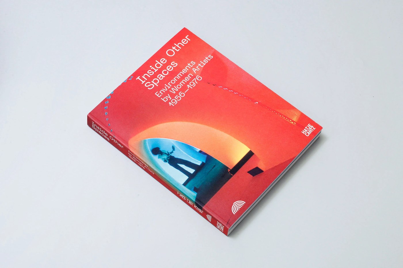
Inside Other Spaces by Johanna Posiege, Karsten Heller & Bureau Borsche
Designed for Haus der Kunst München and published by Hatje Cantz, this 508-page reference volume documents historical immersive environments created by women artists from 1956 to 1976. The publication features rigorous dual-language typography, archival documentary spreads, and precise layout grids that structure complex exhibition reconstructions. It demonstrates how contemporary book design can reframe art historical narratives with scholarly depth.
View Project
GT Sectra Typeface by Grilli Type & Moiré
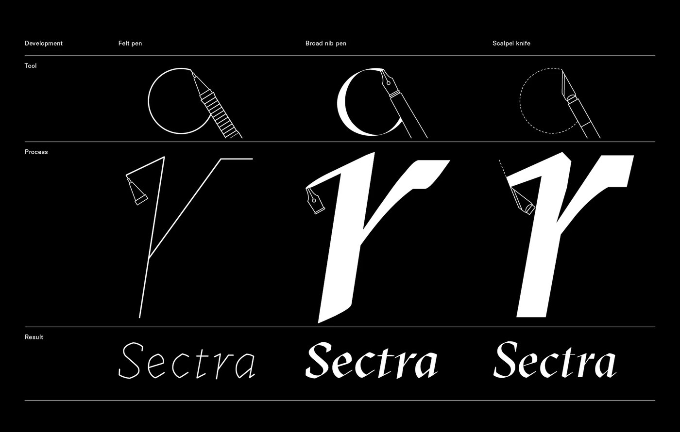
Originally designed for long-form journalism magazine Reportagen, GT Sectra combines the calligraphic ductus of the broad-nib pen with the razor-sharp precision of the scalpel knife. Designers Marc Kappeler, Dominik Huber, and Noël Leu crafted robust x-heights and narrow capitals that fit naturally within dense editorial text. The resulting superfamily provides crisp visual character and exceptional legibility across both print and digital environments.
View Project
Next week, we turn our attention to experimental motion identities and kinetic typography systems, exploring how dynamic brand engines communicate across responsive environments.
For more inspiration check out our curated selections on Abduzeedo.