Editorial Design: Xe Vero Catalogue by Suerte Studio
Explore the editorial design of Xe Vero by Suerte Studio, where calculated white space and editorial grids frame Murano glass craftsmanship.
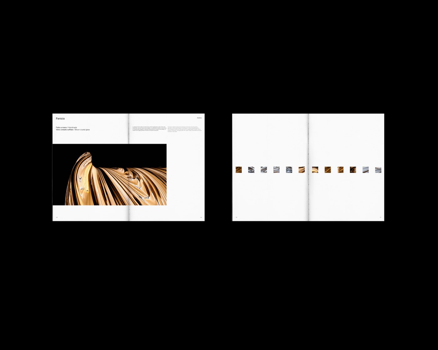
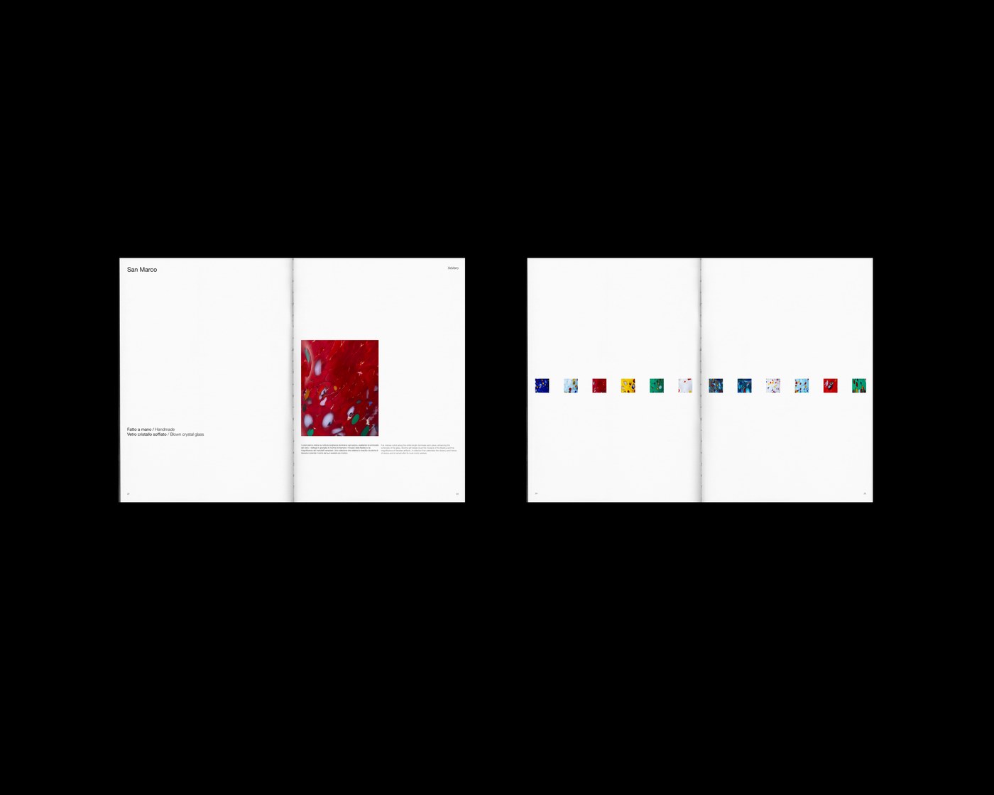
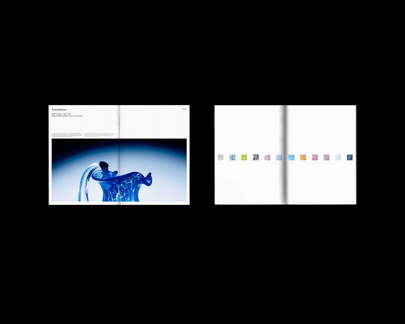
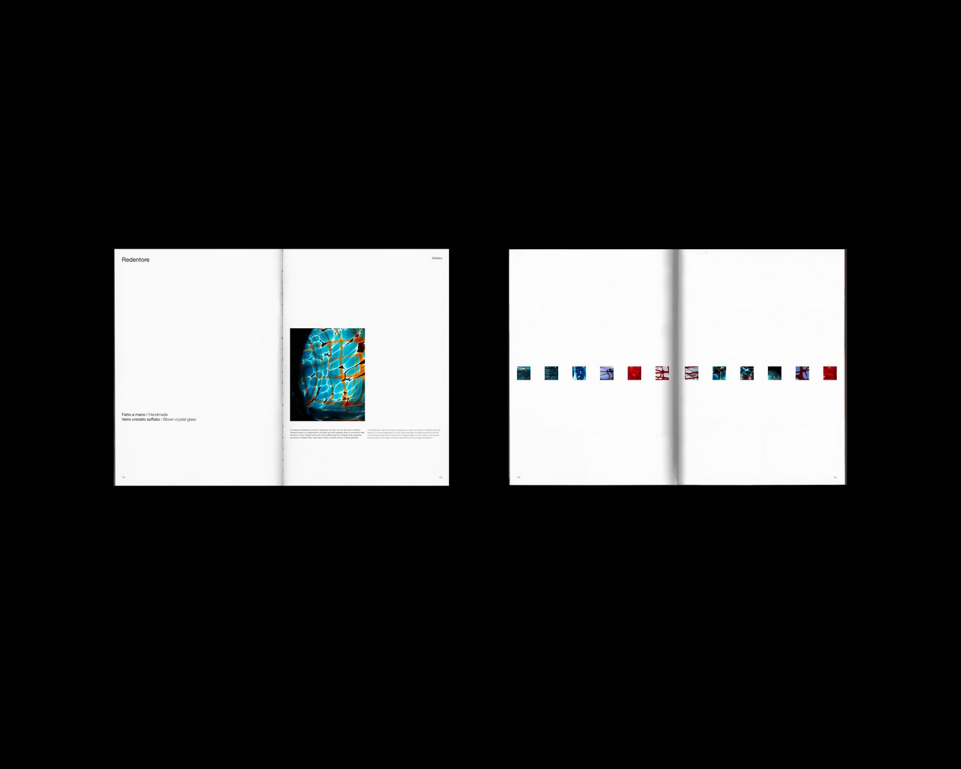
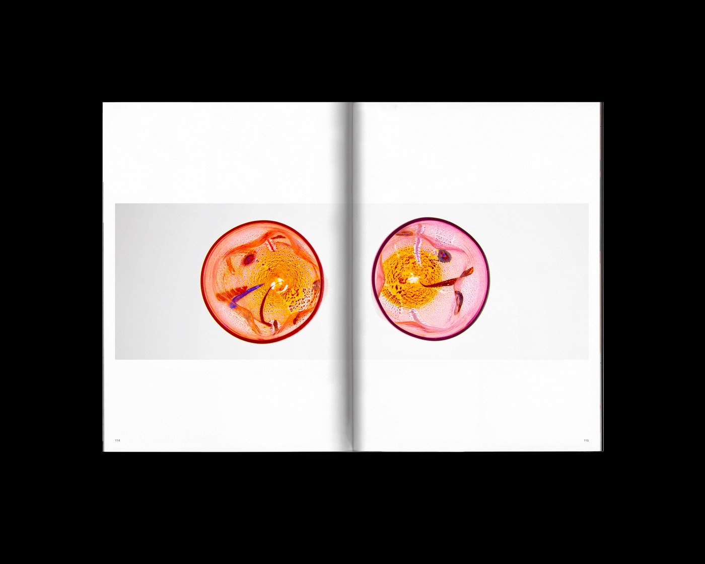
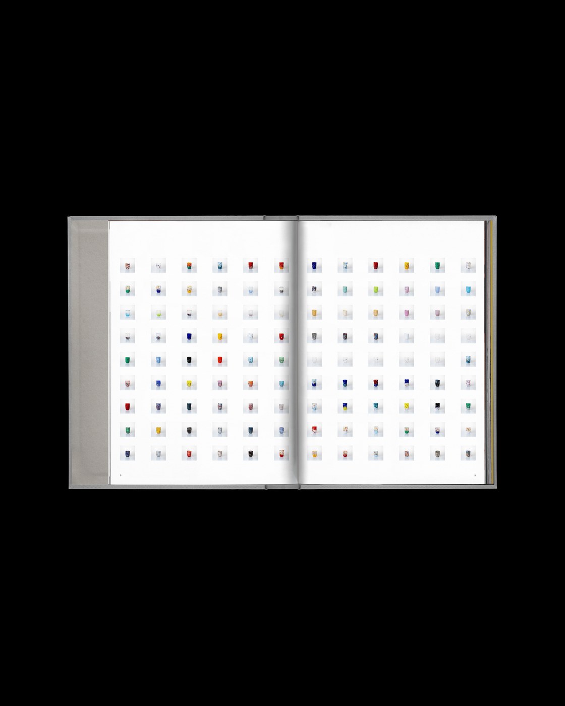
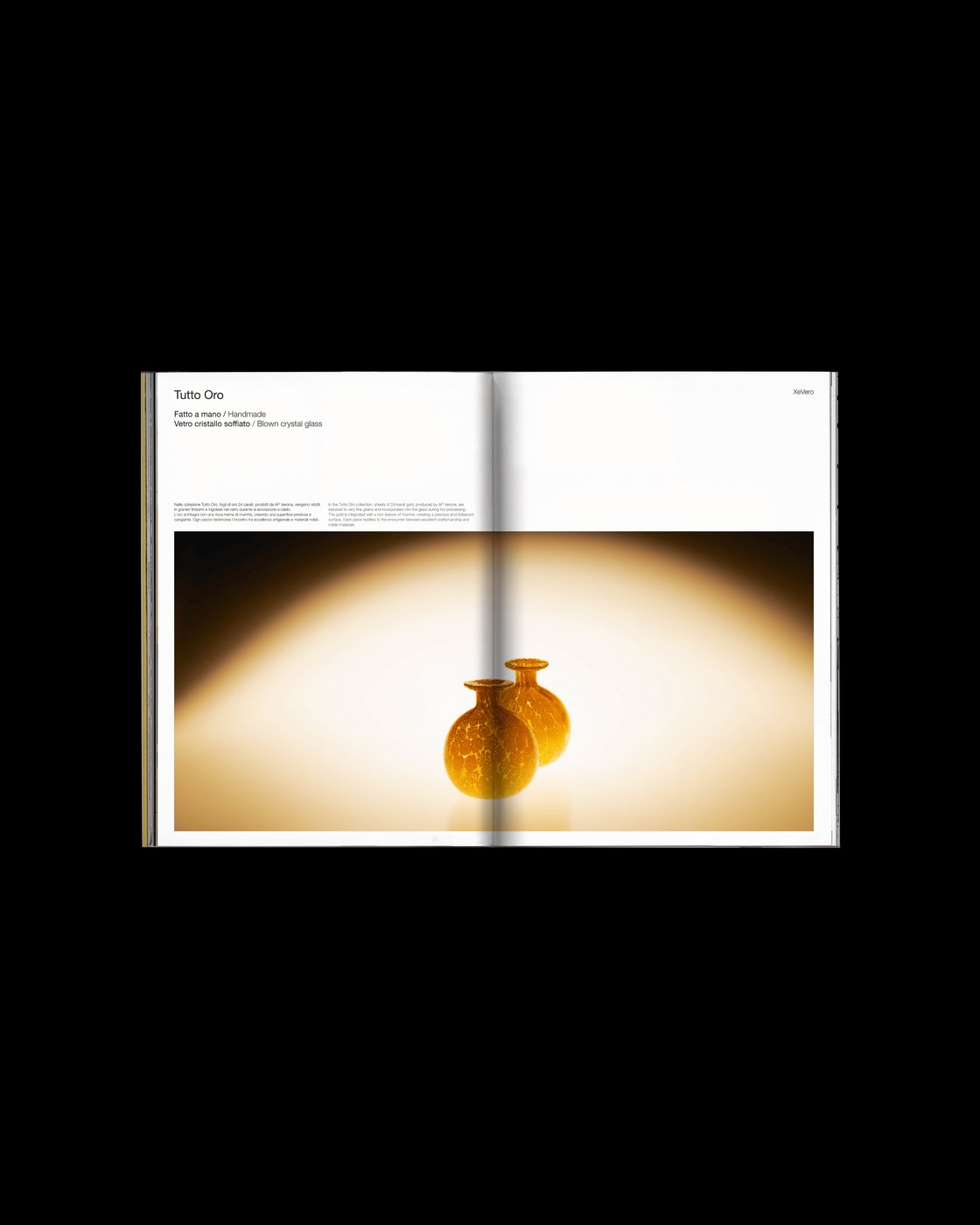
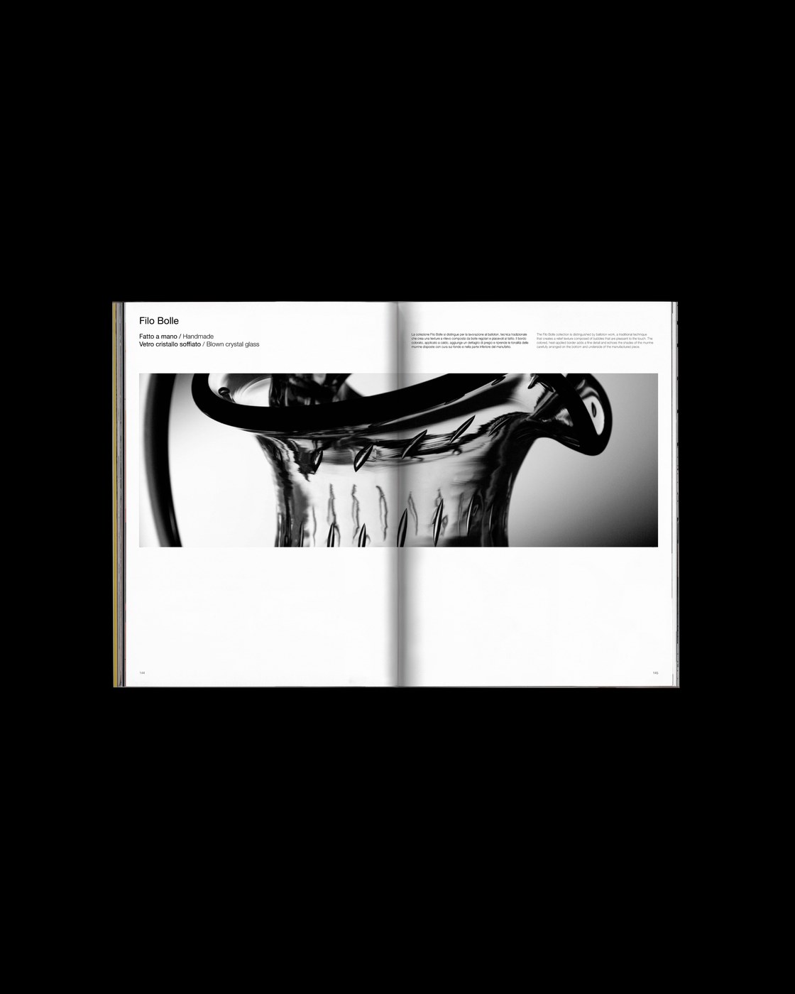
Designing a publication for a historic Murano glassmaker requires balancing centuries of Venetian artisan heritage with an uncompromising contemporary visual language. For Xe Vero, Italian practice Suerte Studio structured a print publication anchored in calculated white space, or bianco progettato. Rather than crowding the spreads with standard product specifications or decorative flourishes, the editorial design treats negative space as an active architectural element. Generous margins and open page fields direct reader attention directly to the chromatic depth, delicate curvature, and luminous light refraction inherent in the glassware. Each spread gives the objects room to breathe, transforming utilitarian containers into sculptural focal points.
Calculated White Space in Editorial Design
The underlying layout system relies on asymmetric multi-column grids that establish deliberate visual pacing across every spread. Typographic hierarchies remain strictly disciplined, letting slender grotesque numerals, subtle technical indexes, and refined sans-serif captions sit quietly along the outer margins. This measured typographic restraint allows the studio photography to dominate each composition without visual competition. By pairing tight macro catalog details with expansive full-bleed stills, the editorial design establishes a rhythmic cadence that encourages readers to browse slowly, contemplating the material transparency and molten fluidity of Venetian glass.
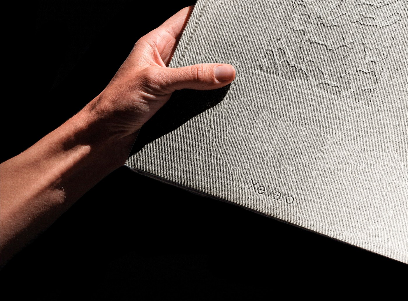
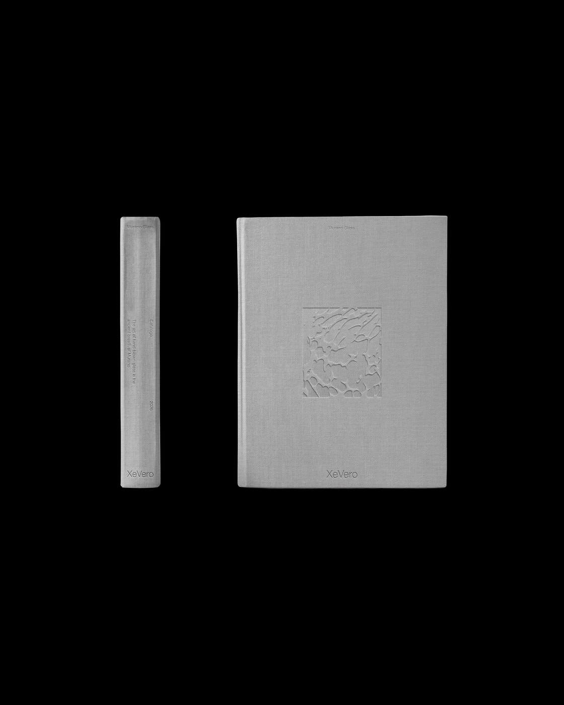
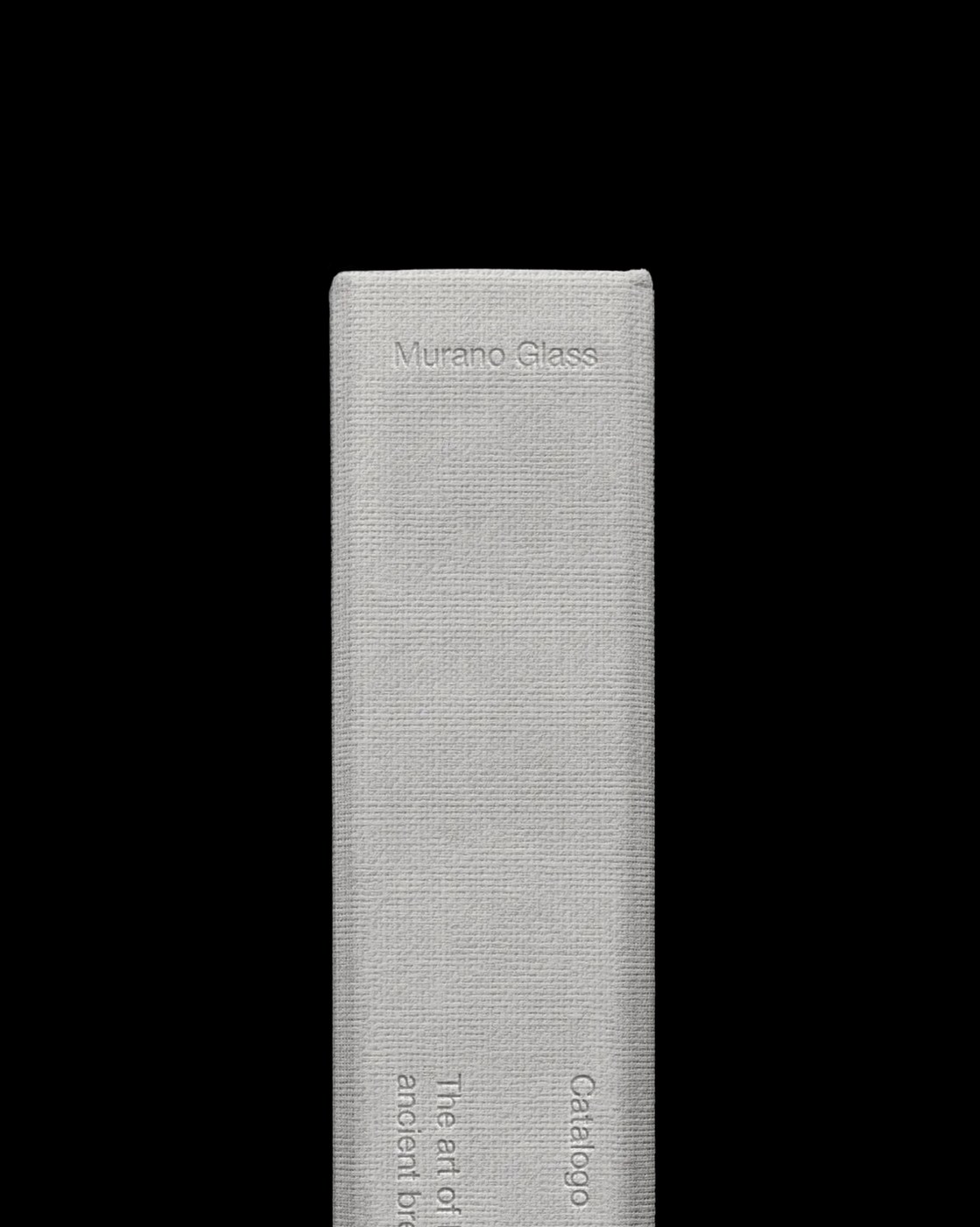
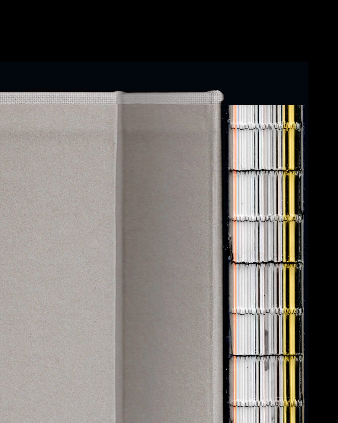
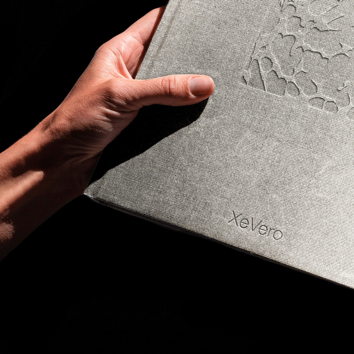
Materiality extends from the featured objects directly into the tactile print production choices. The catalog functions as a physical artifact celebrating the master glassblowers of Murano, pairing uncoated heavy paper stock with deep ink densities, sharp edge trimming, and durable bookbinding. Production workflows developed in InDesign and Photoshop preserve the subtle surface reflections and tonal gradations of each glass piece, bridging industrial precision with hand-worked artisan tradition. Through disciplined composition and honest material respect, the editorial design demonstrates how print catalogs can transcend commercial utility to become enduring design documentation.
See the full project by Suerte Studio.