POVA Brand Identity Redesign by StudioDraft
StudioDraft creates a brutalist brand identity for smartphone maker POVA, combining tactile packaging, engineered layouts, and orange telemetry.
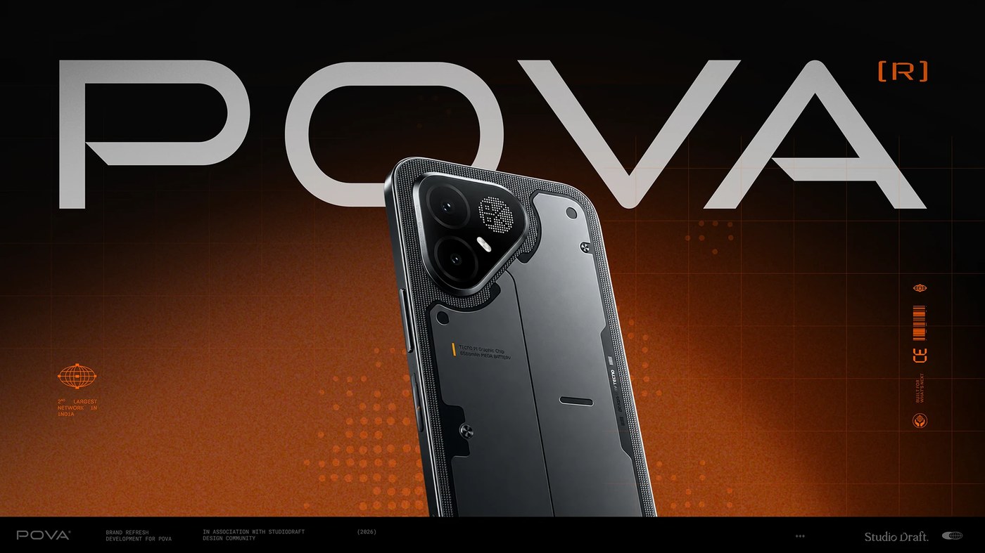
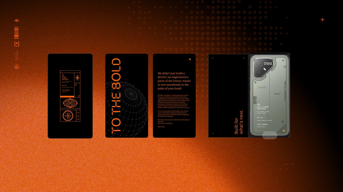
StudioDraft took on the challenge of refreshing tech brand POVA without altering its core logo mark. The team built an expansive visual universe around tools for creators. Deep matte black surfaces pair with bright industrial orange accents. Dense technical data runs across visible modular grids. The studio moved away from sterile tech minimalism. Instead, they built a brutalist brand identity rooted in utility and craft. Phone hardware highlights this direction with knurled camera bezels, exposed hex screws, and dot-matrix displays. Sharp geometric typography anchors every touchpoint. Strong visual contrast balances dark surfaces with luminous safety markers.
Engineered Systems and Physical Brand Identity
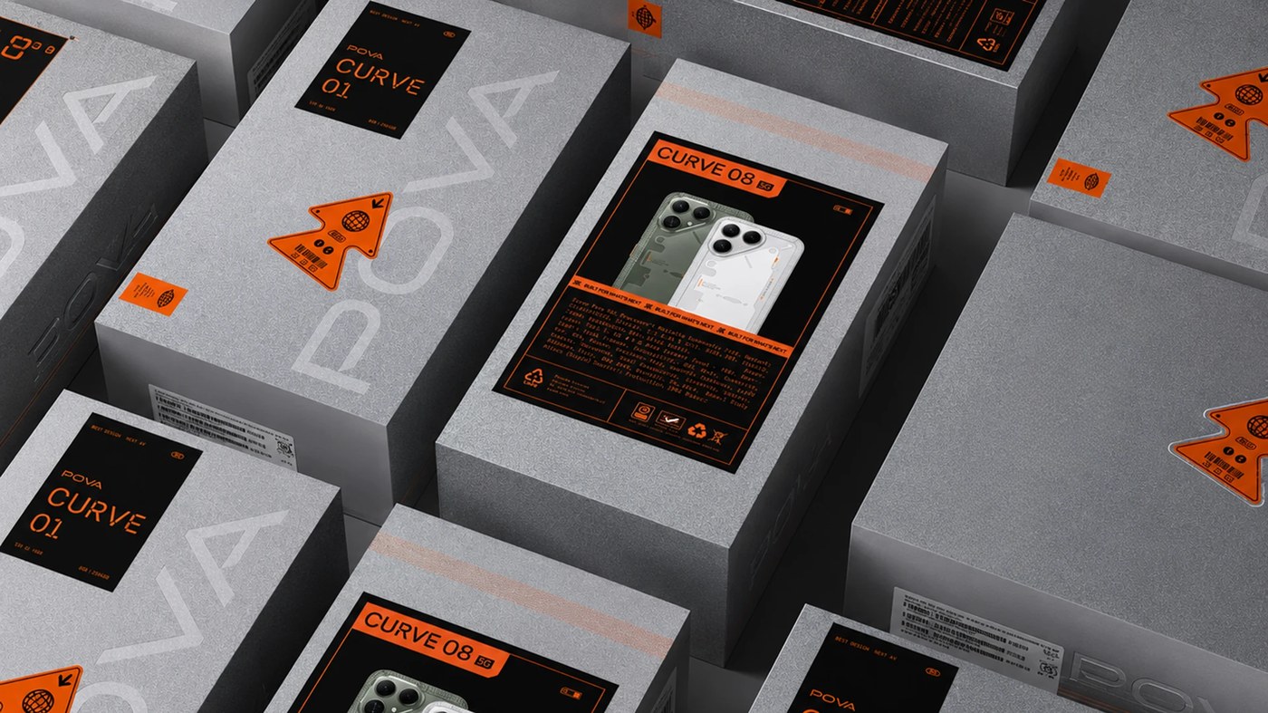
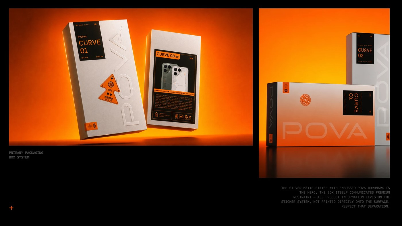
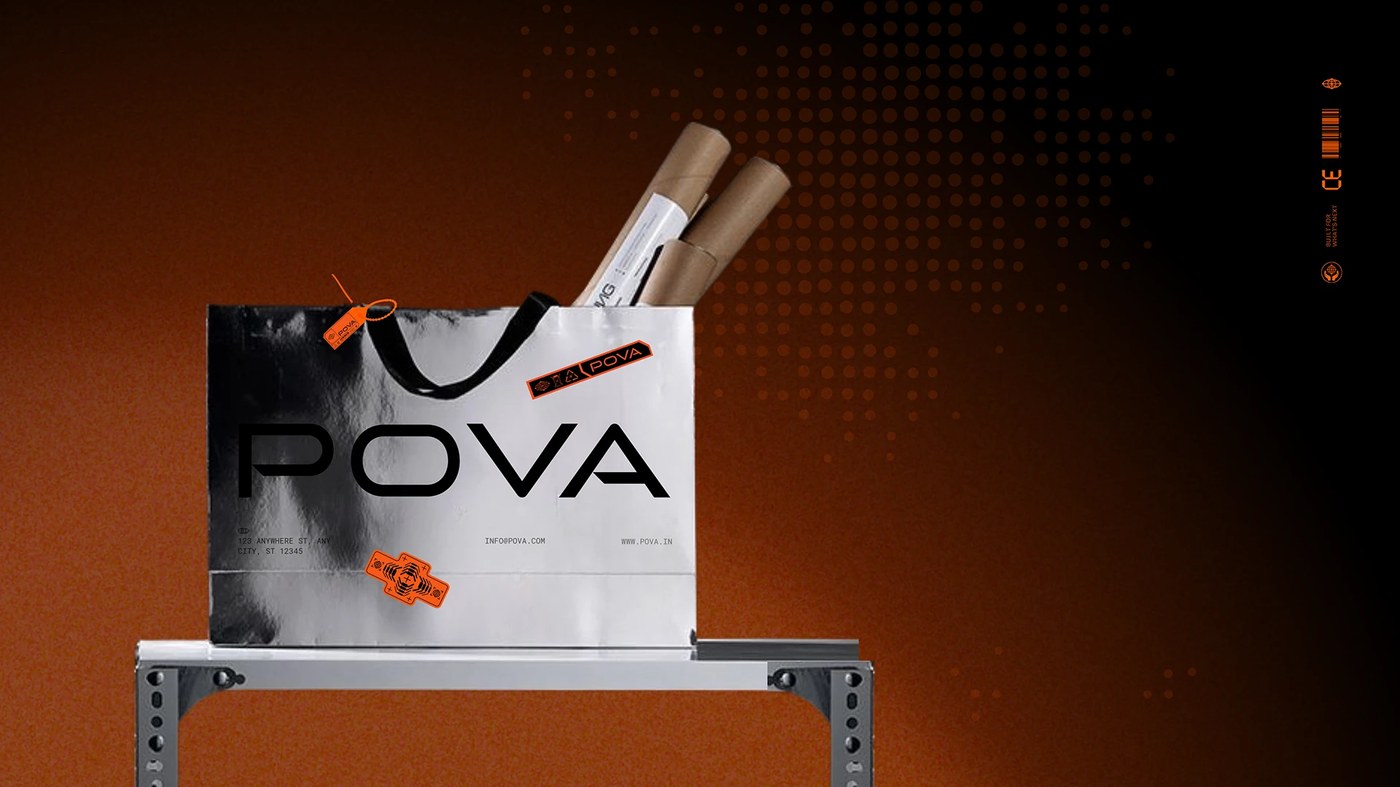
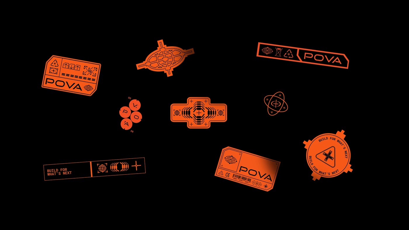
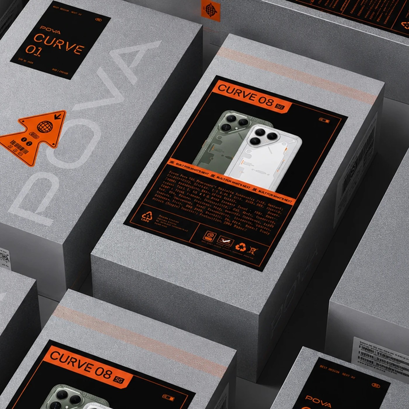
The physical packaging demonstrates how the brand identity functions in real space. Silver paperboard boxes carry blind debossed letterforms that set a quiet material base. The studio chose not to print product specifications directly on the boxes. Instead, all variable specs sit on modular adhesive labels. Die-cut orange hazard arrows, black spec cards, and barcode stickers wrap around each container edge. Metallic bubble mailers and chrome foil shopping bags extend this warehouse aesthetic to retail shelves. This smart separation turns routine unboxing into an industrial test bench ritual. Clean paper substrates contrast with utilitarian label tape.
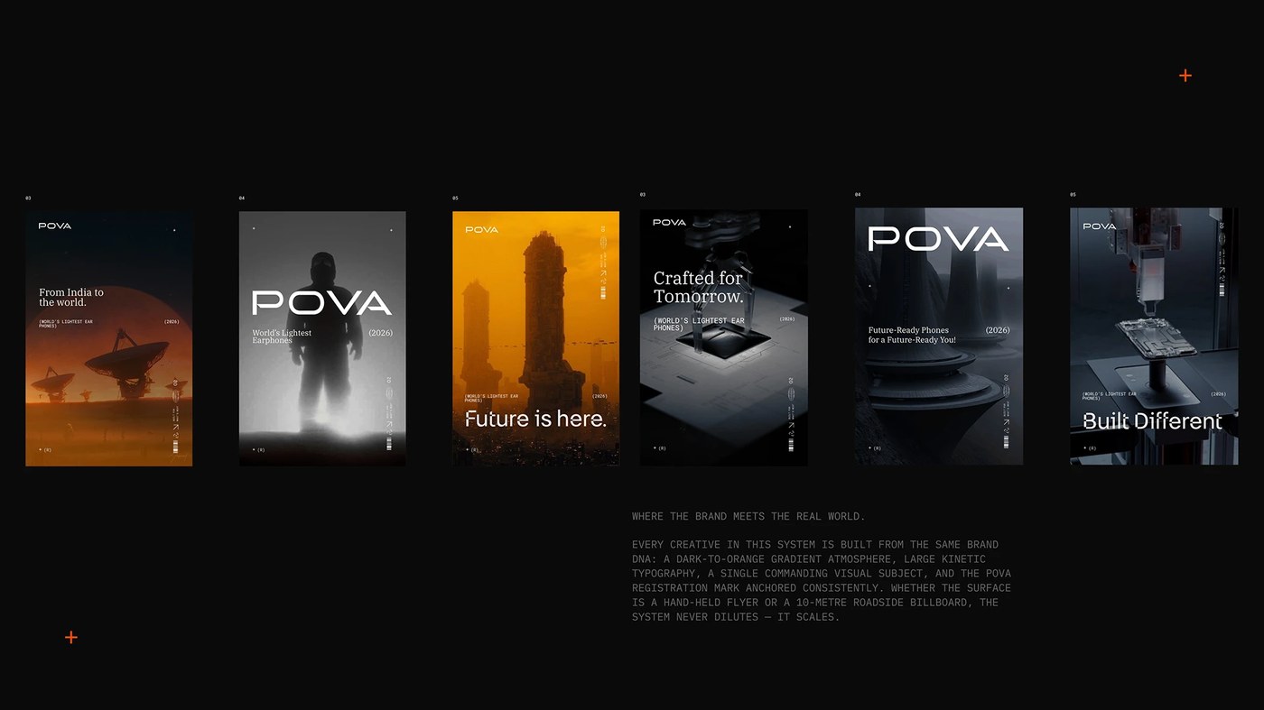
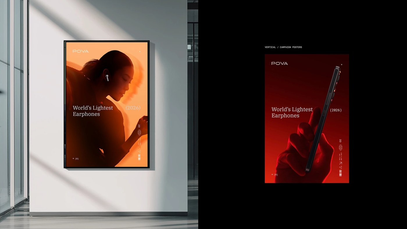
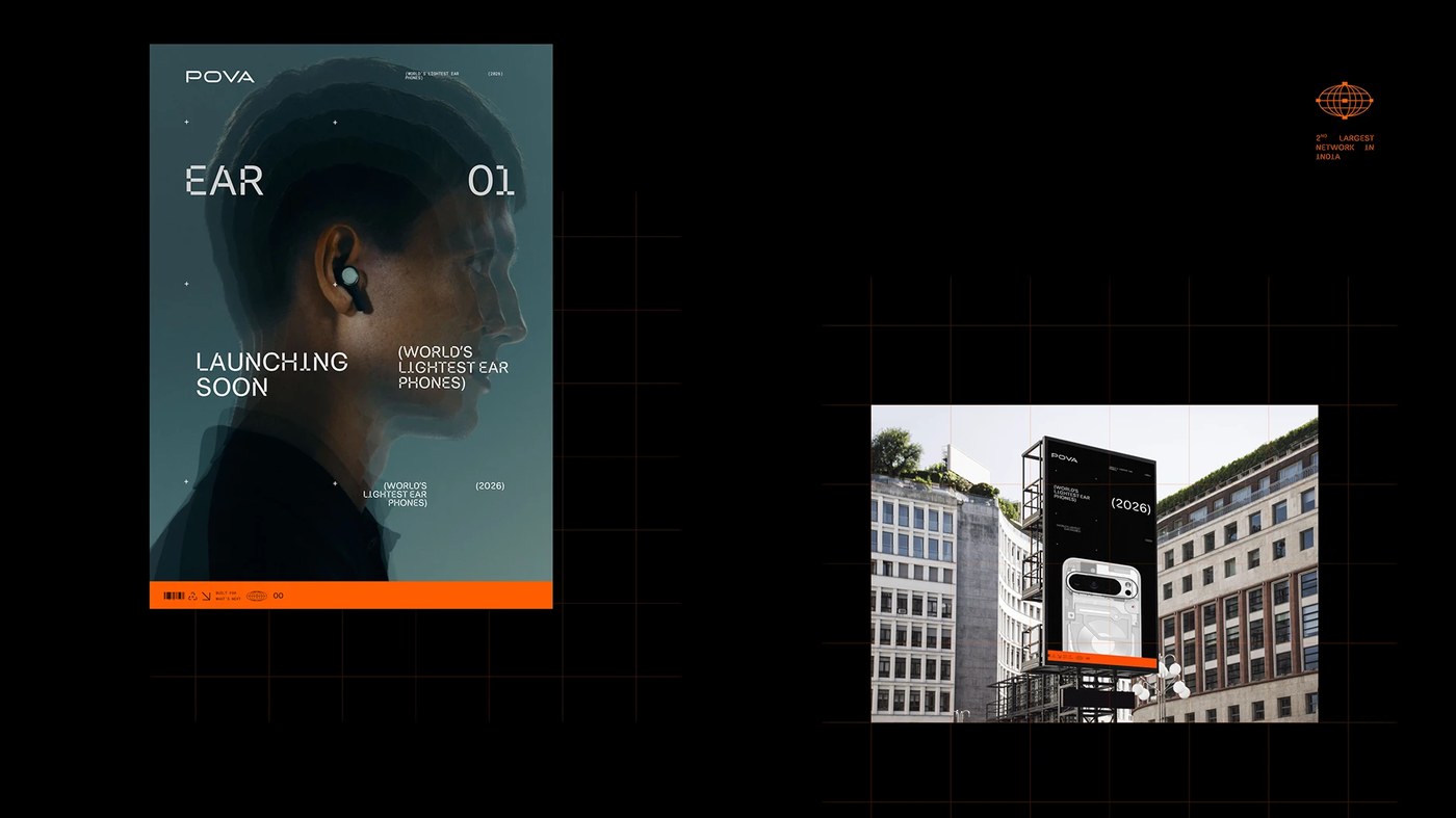
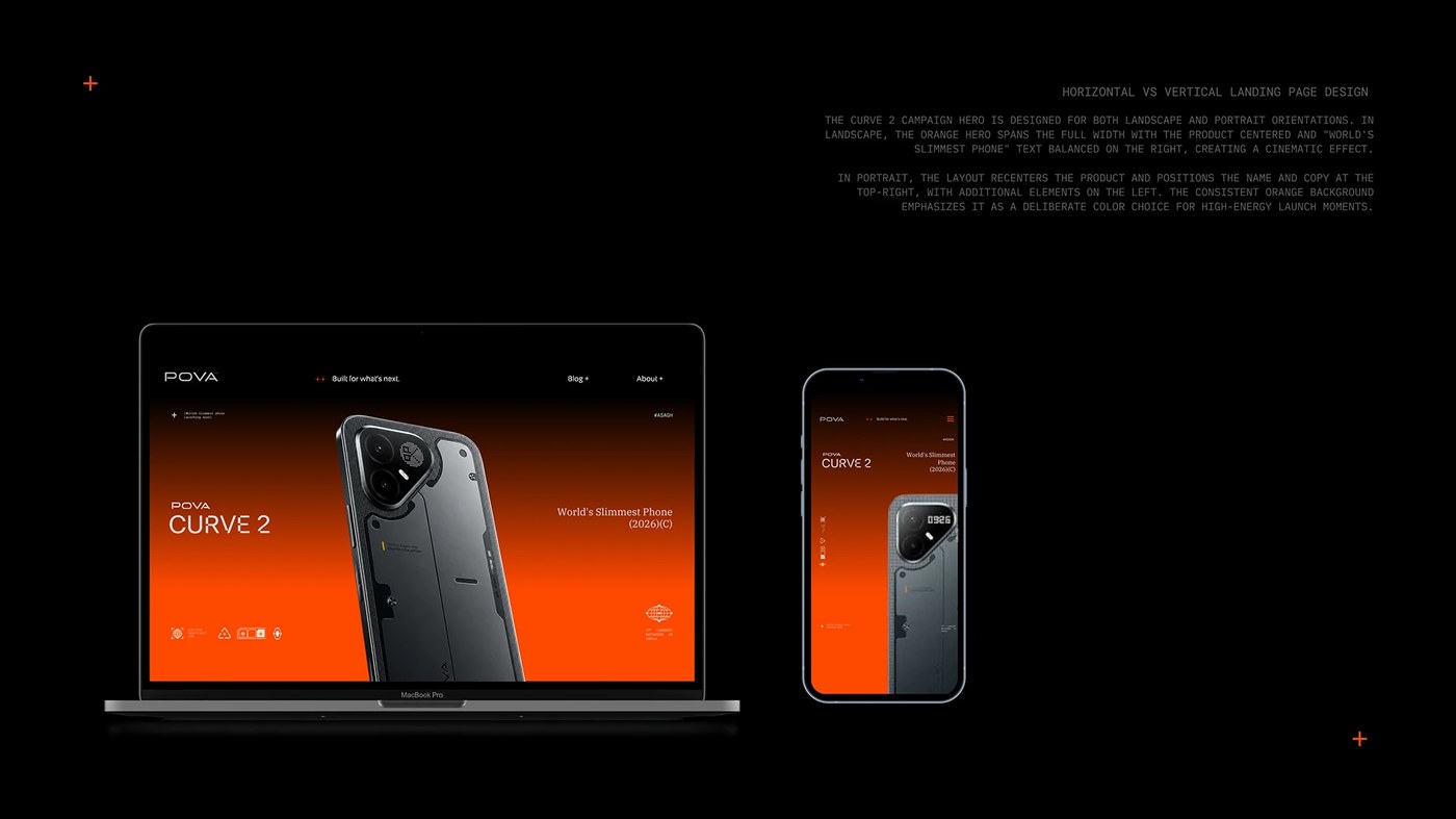
This cohesive discipline extends across the digital ecosystem and outdoor campaign posters. Six vertical poster layouts use cinematic lighting, blueprint coordinates, and bold type to announce hardware releases. Urban billboards bring these high-contrast visuals to city centers. Online product display pages mirror this visual language. Dark mode interface cards hold crisp component schematics and bright orange focus markers. By unifying hardware finishes, retail packaging, and responsive digital layouts, StudioDraft proves that an adaptive brand identity can redefine a tech company while keeping its foundational mark intact.
Explore the complete case study and visual system on StudioDraft.