Page Common Artisanal Coffee Branding and Packaging
Page Common is an artisanal coffee branding and packaging identity by Elaine Fok for Page148 boutique hotel in Hong Kong.
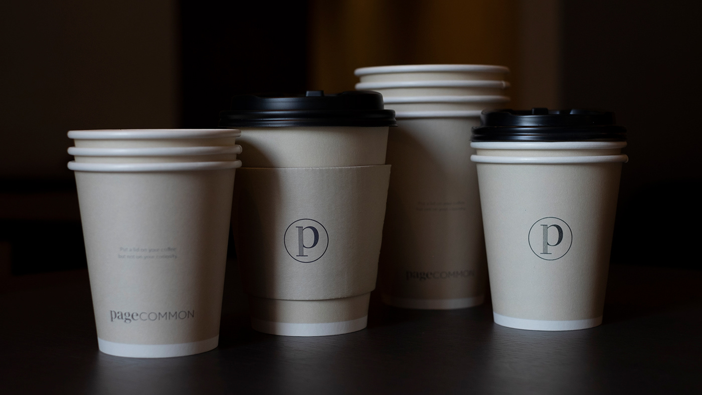
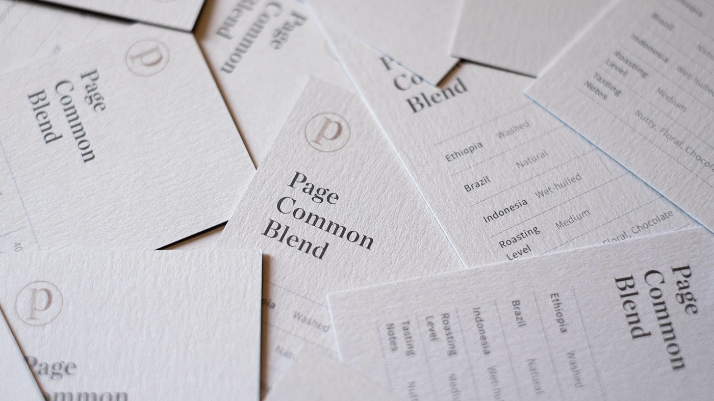
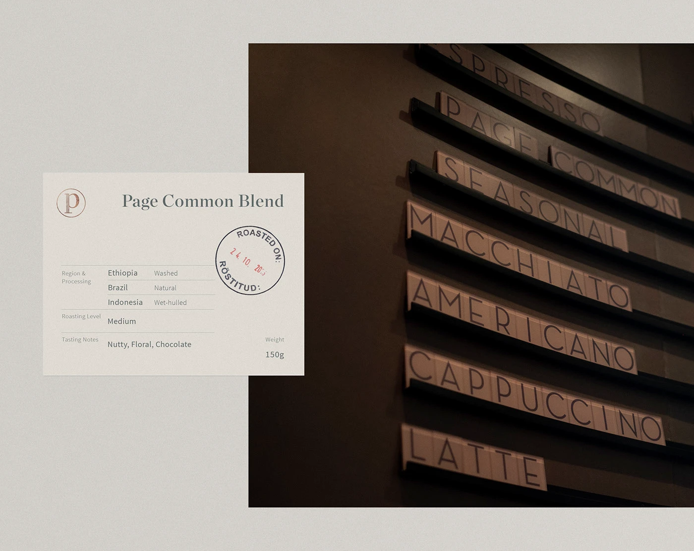
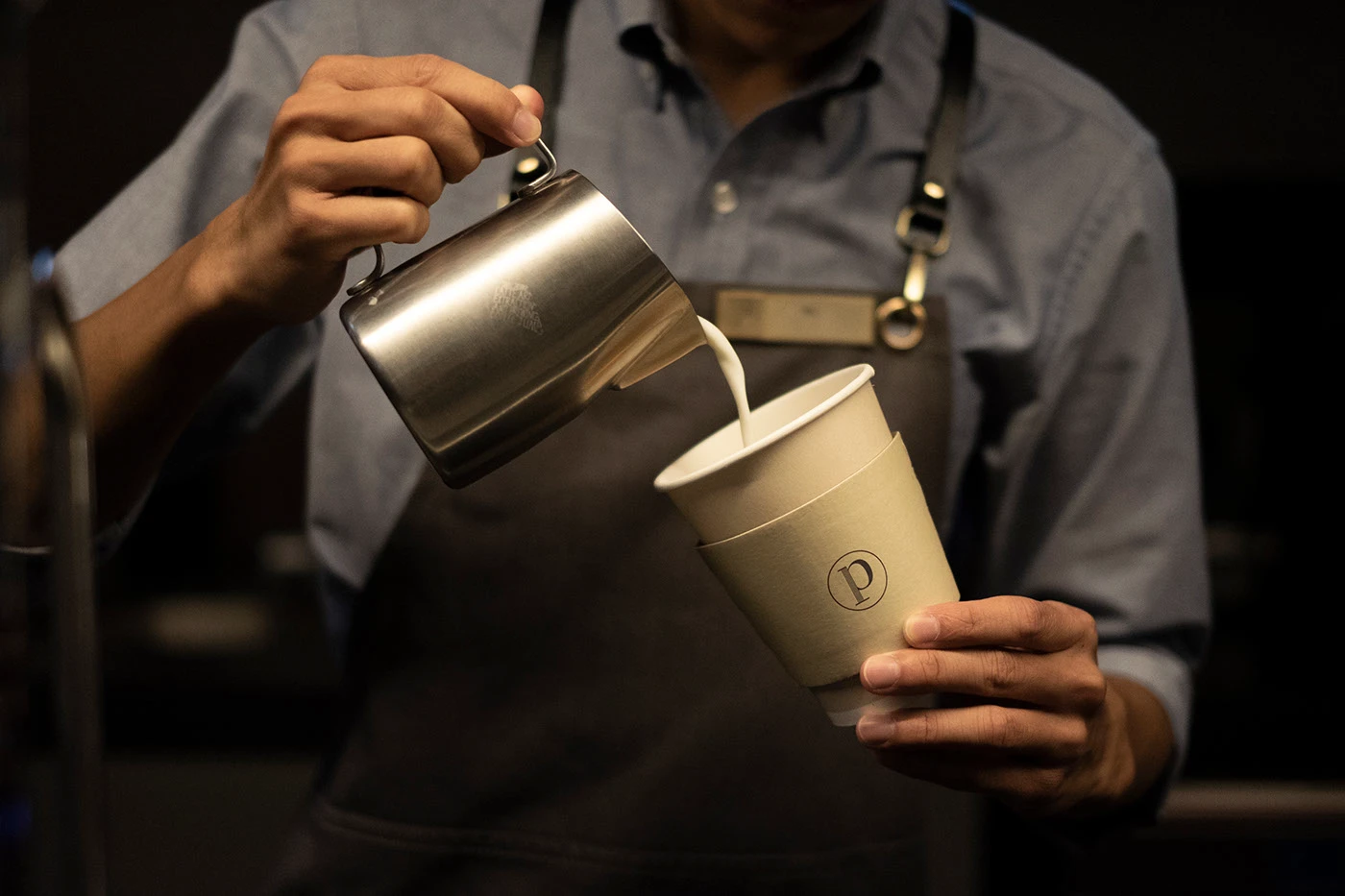
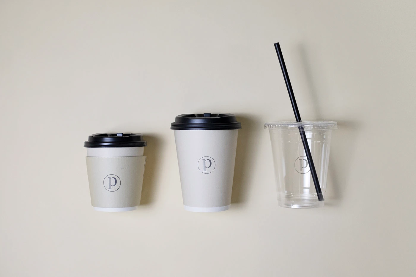
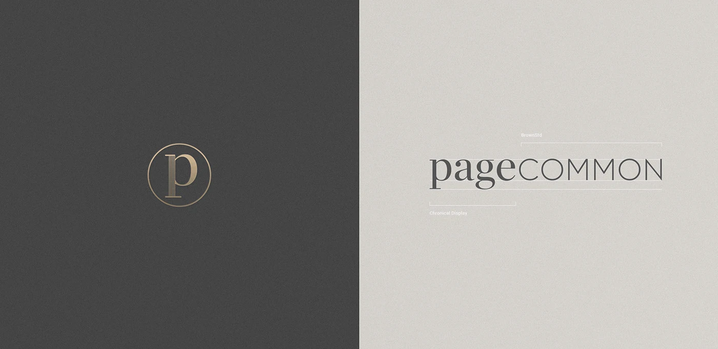
The visual identity shapes a calm mood for urban guests and local coffee lovers. At the center of the branding sits a clean wordmark combining serif and sans letter forms. Designer Elaine Fok selected thick paper stock with soft warm gray tones. Takeaway paper cups feature minimal sleeves with a simple round monogram. Coffee blend info cards list roast dates and flavor notes in clean grids. Every physical item uses subtle print details to share product craft. The clean print style keeps the branding quiet and clear. Soft neutral tones give each item a warm touch.
Tactile Materials and Hospitality Coffee Branding
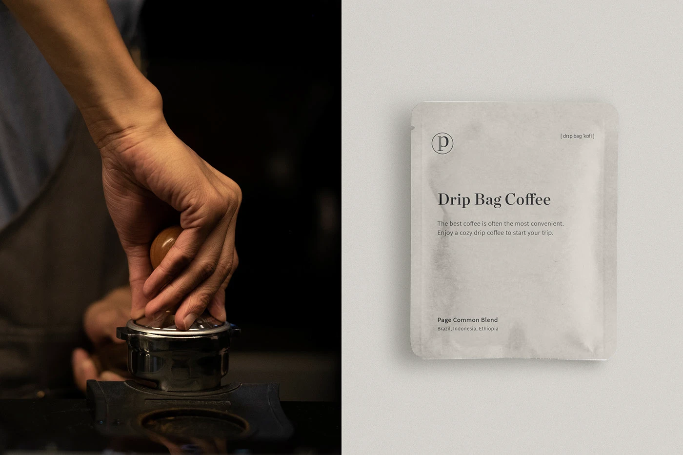
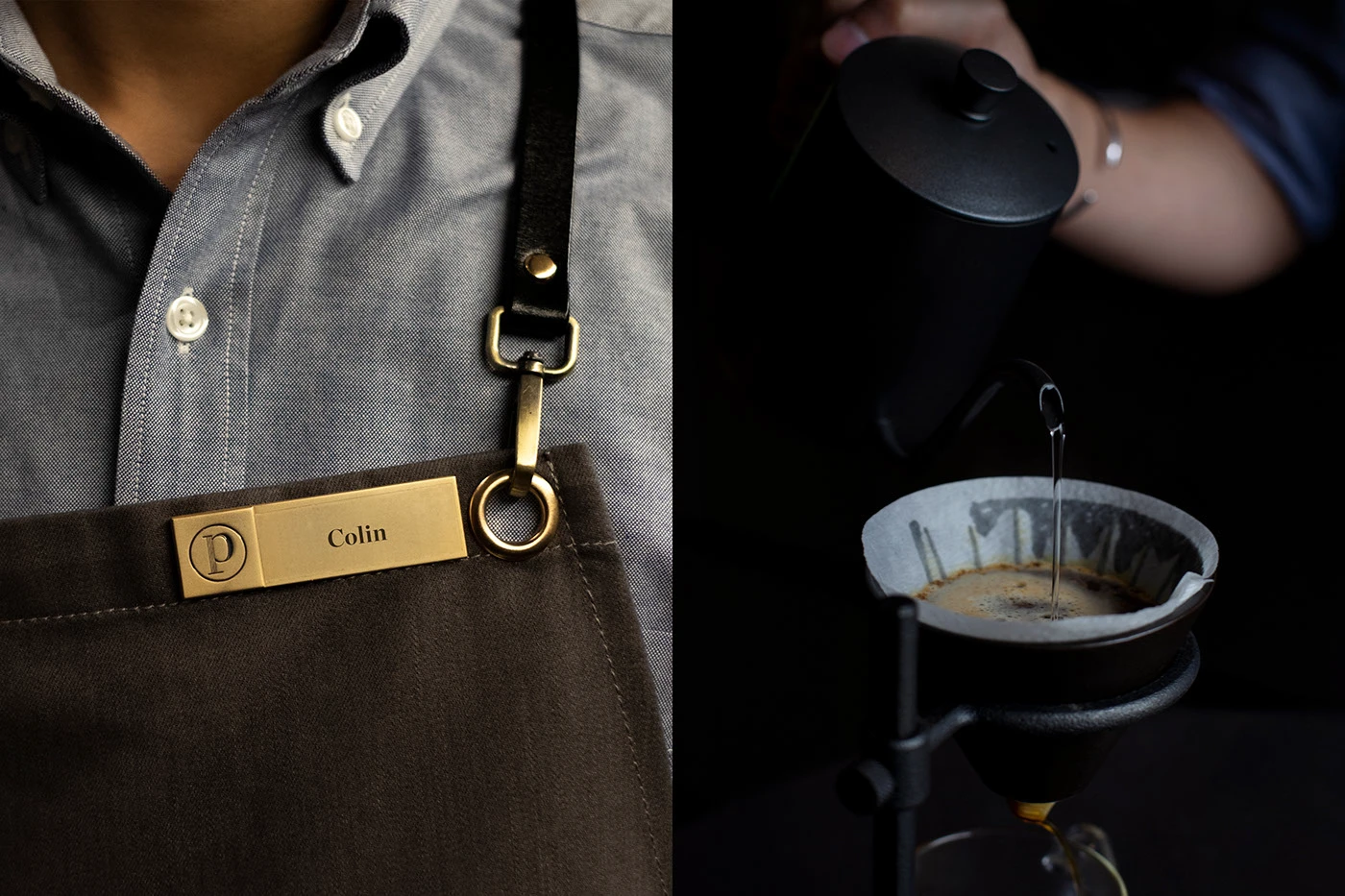
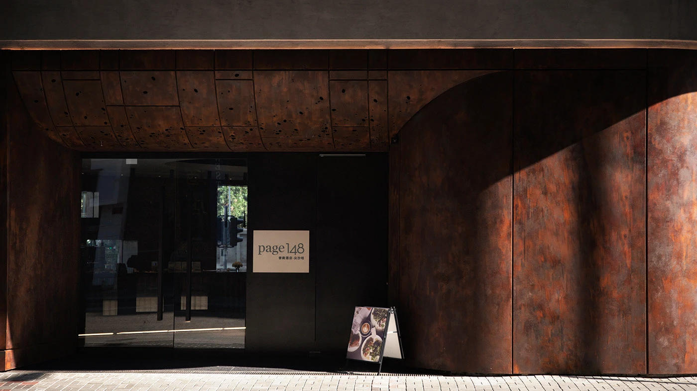
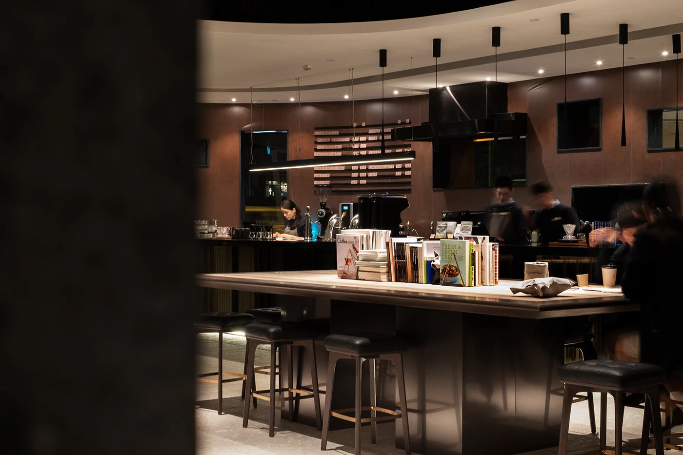
Physical touchpoints extend the branding into the hotel lobby cafe space. Solid brass name badges clip to dark cloth barista aprons with leather straps. Wooden wall menu boards display clear type slats for daily espresso drinks. Single origin drip coffee pouches use matte white bags with simple type order. Outside the front door, weathered steel walls frame the glass cafe shop. The contrast between dark metal and soft paper gives the space a warm feel. Clean grid lines keep each print piece sharp.
The project proves how smart branding connects boutique hotel rooms with street coffee culture. By pairing fine print paper with simple type grids, the visual identity feels both modern and timeless. Each piece invites guests to slow down and enjoy fresh brew rituals. It offers great ideas for designers working on cafe spaces and hospitality packaging. Clear hierarchy keeps each label legible and neat. The simple design choices give the brand a distinct voice. Explore the complete brand identity project on Behance by Elaine Fok.