DutchScot illustrates dream symbolism to give Bar Rêve an ethereal identity
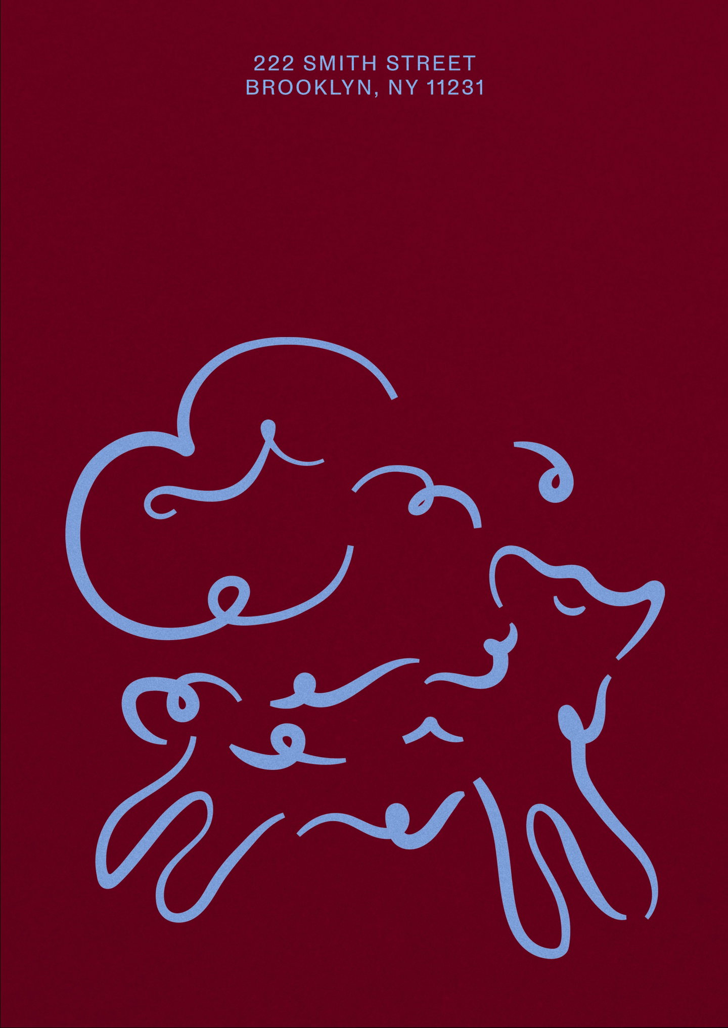
In a dreamy, transatlantic collaboration, London-based design studio DutchScot have created the brand for the new, Brooklyn-based cocktail spot, Bar Rêve. The phantasmal identity nods to classic French menus without getting bogged down in historical fanfare. “From the outset, the client wanted an identity that was timeless, not trendy,” co-founder and creative director Jacob Vanderkar tells It’s Nice That. The brand’s job, instead, was to make sure the Belle Époque-inspired bar felt at home in its stateside residence whilst reflecting the fun concoctions it offers.
“The brand was rooted in equal parts research and whimsy,” Jacob says. The team used its historical explorations as the lens through which to view their contemporary, dreamlike creative concept – subverting them both in the process. “Having such an evocative name to work with also gave us licence to play with convention throughout the project,” he continues, with ‘rêve’ being the French for ‘dream’, which became the identity’s north star. This is most prominent within the bar’s wordmark which, whilst grounded in slick, European calligraphic script, has a distinctly surreal behaviour to it – both in printed and digital spaces – whereby the wordmark seemingly stretches, floats and evaporates.
Similarly, its Brooklyn address, 222, is reimagined as Zzz’s across the brand, nodding to the sleepy dreams Bar Rêve is looking to evoke. Alongside the “deliberately single-minded” colour palette, which presents a link between “the worlds of art and dreams” through its references to Joan Miró’s painterly hues, there is a particular (and perhaps peculiar) quality to the identity. It’s surreal and typographically ethereal without getting lost to the point of abstraction, purposefully playing with the expectations of the patrons, without taking itself too seriously. Even on the website, for example, users are asked to float upwards, rather than scroll down.
The ethereal quality of Bar Rêve’s brand is expanded on through illustration, the state-to-state animation references the interpretive quality of dream symbology. The drawings themselves are sketched in-house, as Jacob explains, and take cues from the wordmark’s design and behaviour. “Slightly calligraphic forms drift off and become looser at points within each composition,” he says. “The three animals [a lamb, swan and bull] were chosen as they’re recurring symbols within dreams.” They’re used sparingly throughout, acting as a “a kind of Easter egg,” Jacob ends. The identity is, quite literally, the stuff dreams are made of.