Wiedemann Lampe unveils brand identity and wayfinding for Gunnersbury Park & Museum
Spanning 72 hectares in West London, Gunnersbury Park & Museum provides communities with access to heritage landscapes, sports facilities, community gardens and local history exhibitions. Jointly owned by Ealing Council and Hounslow Council, the site’s day-to-day operations were transferred to community interest company Gunnersbury Estate CIC in 2018.

Despite remaining free and open year-round, the venue previously faced navigation challenges, with many parkgoers unaware of the museum on site. The new brand and spatial strategy by Wiedemann Lampe seek to clarify the multi-layered offer to encourage repeat visits.
David Bowler, chief executive officer of Gunnersbury Museum and Park, said, “Our organisation is undergoing a moment of transformation, marking its centenary while modernising operations and seeking to strengthen its role at the heart of the local community. We wanted a new identity to match our ambition, to drive wider visitation, to highlight our gem of a museum, and to inspire a wider audience to visit again and again.”
Benji Wiedemann, executive creative director and co-founder at Wiedemann Lampe, said, “The organisation is at an important turning point – its team has grown, its ambition has grown. It therefore needed a brand that could bring cohesion and confidence to match that shift.”
Visualising ‘Life’s Rich Tapestry’
At the core of the project is the strategic positioning ‘Life’s Rich Tapestry’, developed to reflect the diverse moments, histories and communities connected to the site. The visual system establishes distinct assets for both the park and the museum, allowing them to function independently or as a unified brand using green for the park, purple for the museum, and yellow when both appear together.

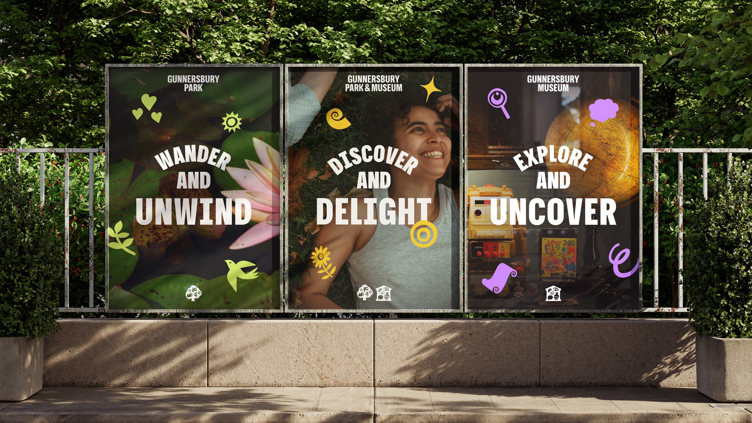


Central to the visual identity is a suite of bespoke illustrations created with illustrator Rebecca Sutherland, depicting local visitors, seasonal changes, wildlife and historical artefacts. A dedicated ‘Gunnersbury 100’ mark extends the language into temporary exhibition displays throughout the centenary year.
The rebrand is completed by a tone of voice framework and an updated photographic style focusing on intimate human moments rather than wide landscape views.
Navigation for a 72-hectare site
The visual overhaul underpins a comprehensive update to the site’s wayfinding system across the entire estate. Due to the expansive scale and complex layout, visitors frequently found navigation challenging, obscuring key locations.
The updated physical signage uses the brand’s signature yellow tone to improve visibility against the natural surroundings. Designed around a clear, icon-led structure, the signage scheme gives visitors autonomy to explore without enforcing rigid routes, while its modular construction allows Gunnersbury Estate CIC to install new elements in phases.
Wiedemann said, “The rebrand delivers a confident identity that reflects the organisation’s transformation and conveys joy, openness and organisational confidence. It reflects an organisation ready to seize its own narrative, becoming more visible, more active and more intentional in how it welcomes visitors.”