Typography Design: Lock Superfamily by Mash Creative
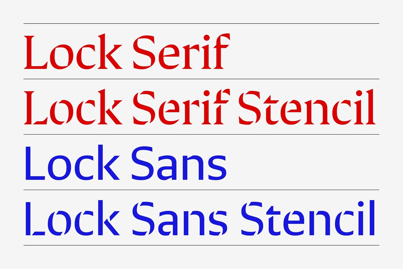
Mash Creative crafts a versatile typography design with Lock Superfamily, uniting sharp serifs, blunt sans letterforms, and playful stencils.
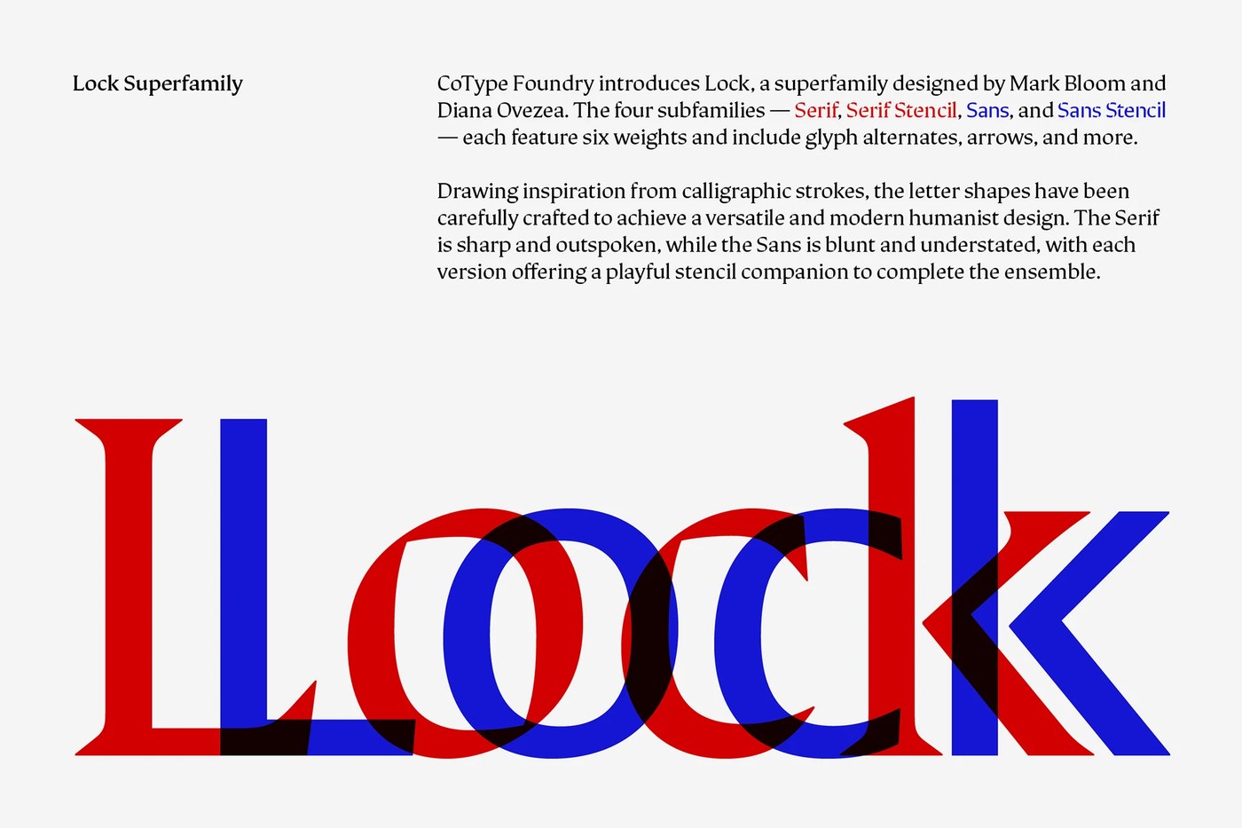
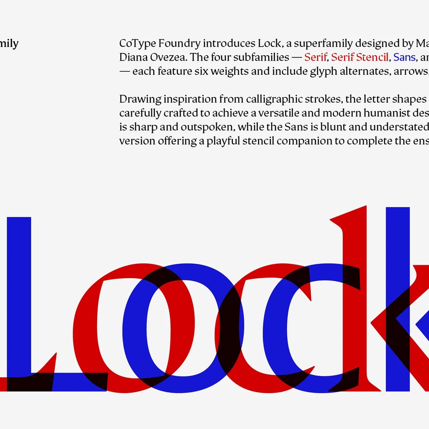
Mark Bloom and Diana Ovezea developed Lock over two years for CoType Foundry. The system solves a common challenge in typography design by bridging two opposing visual attitudes. On one side, Lock Serif uses sharp terminal brackets and outspoken wedge serifs. On the other side, Lock Sans strips away ornament to leave blunt, understated letterforms. Both subfamilies share an identical structural skeleton rooted in calligraphic pen strokes. Specimen graphics place bright vermilion serifs directly over royal blue sans silhouettes. This visual overlap proves how optical weight and cap heights align across styles. The shared proportions give art directors freedom to alternate between classical display lines and clean modern text without breaking layout cohesion in their typography design.
Superfamily Architecture and Typography Design
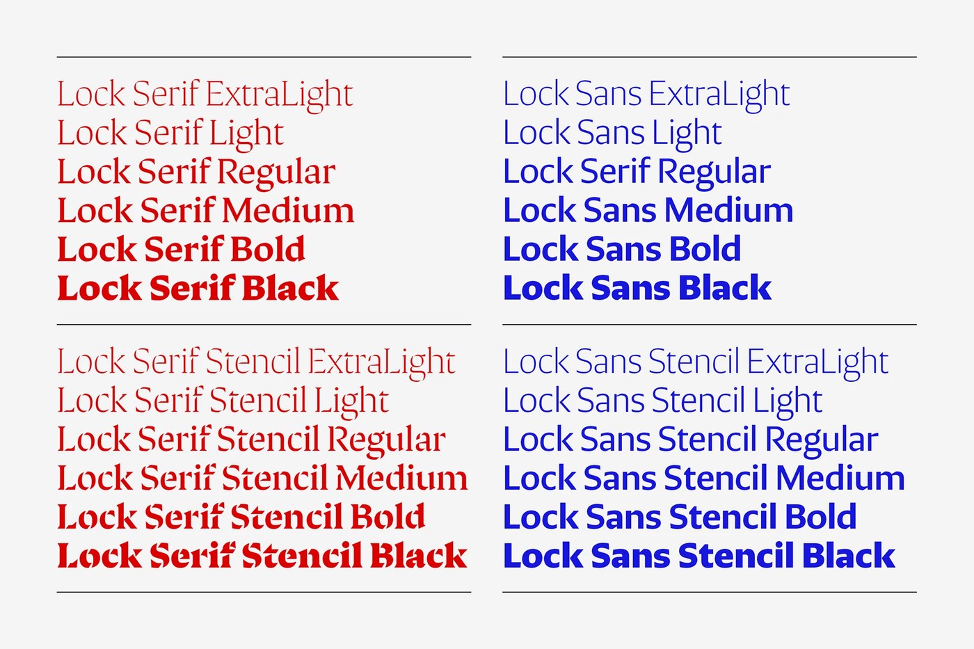
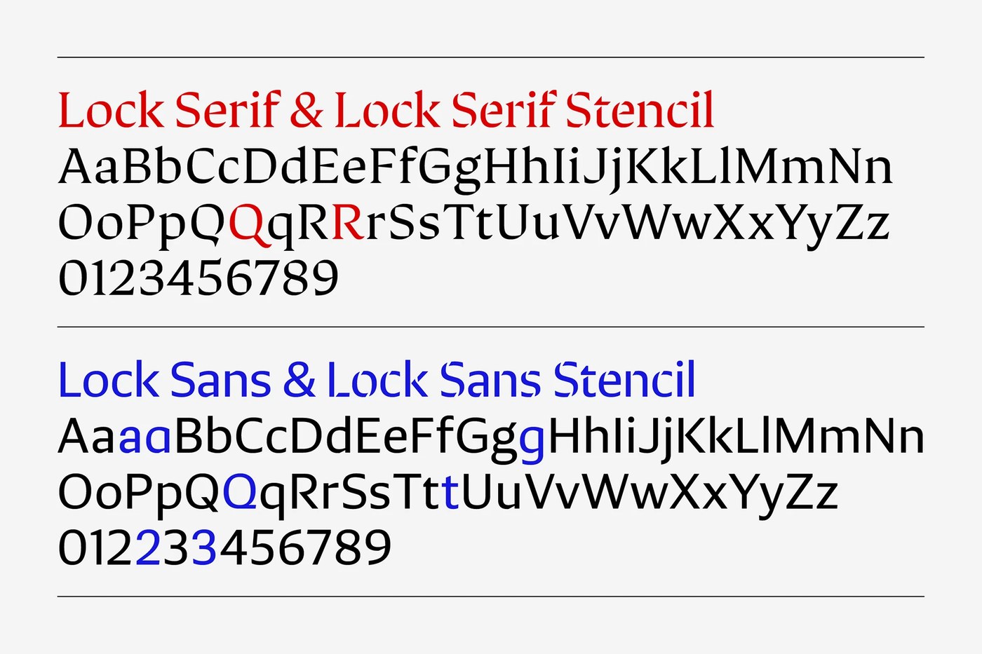
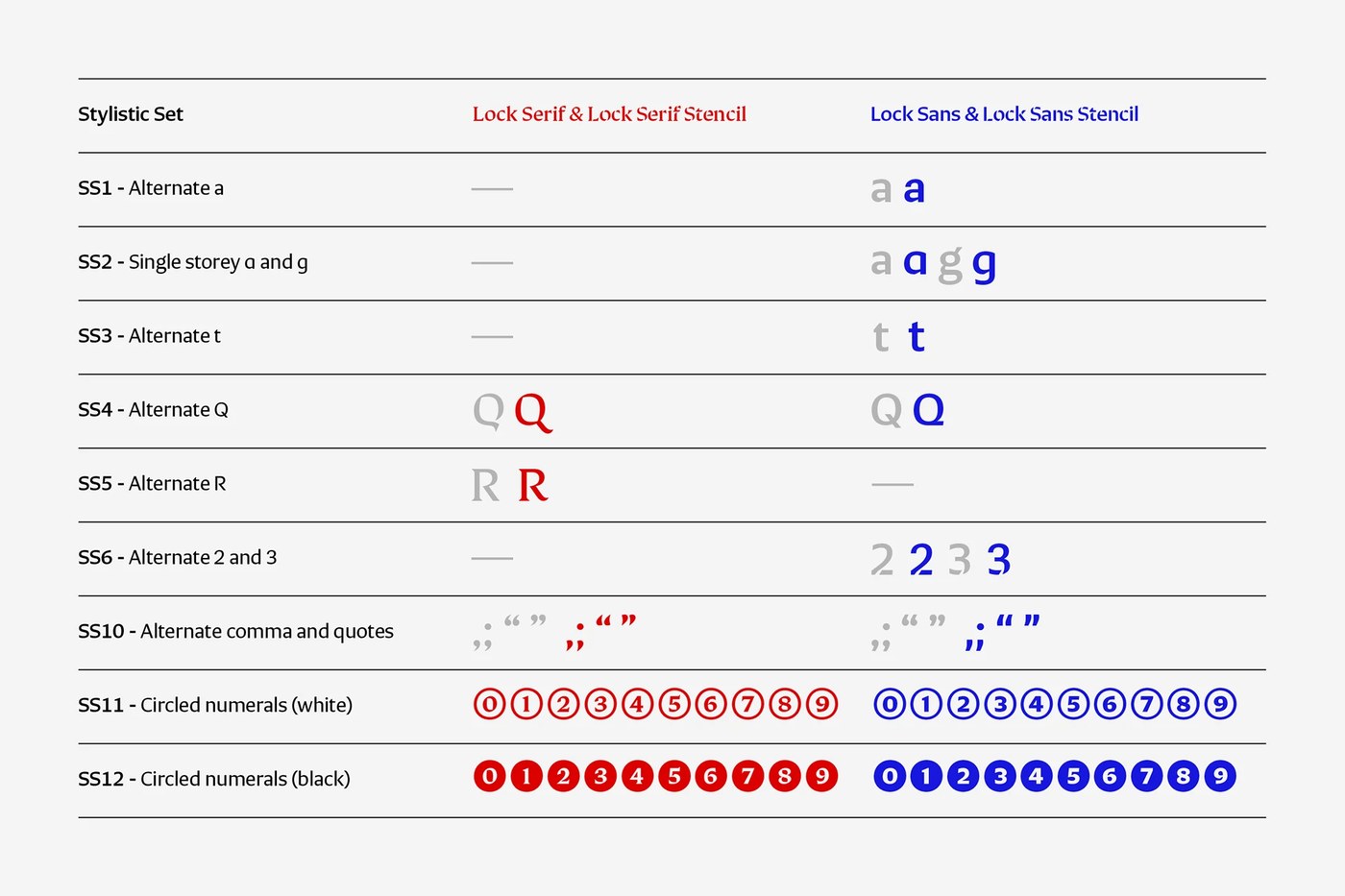
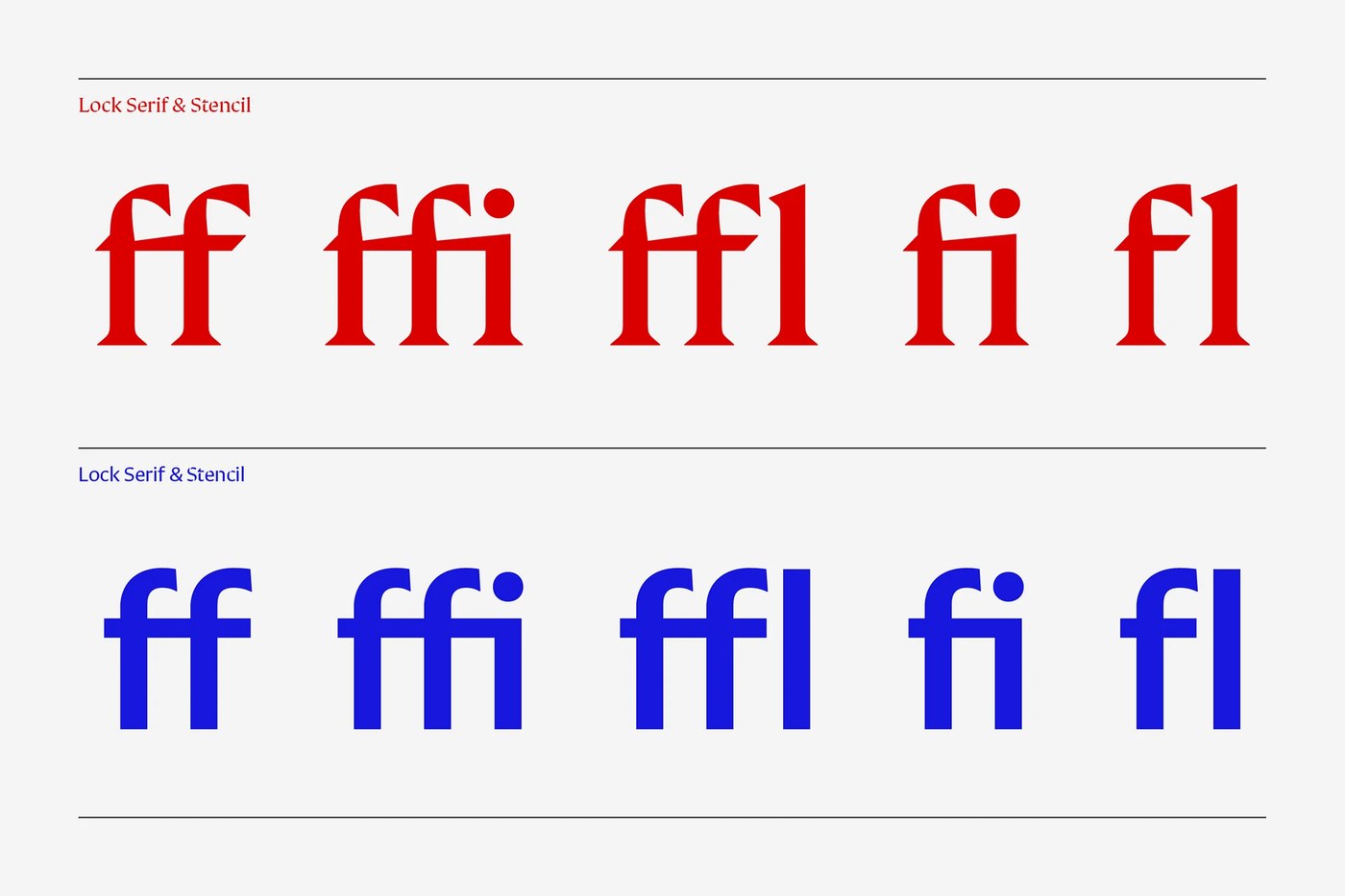
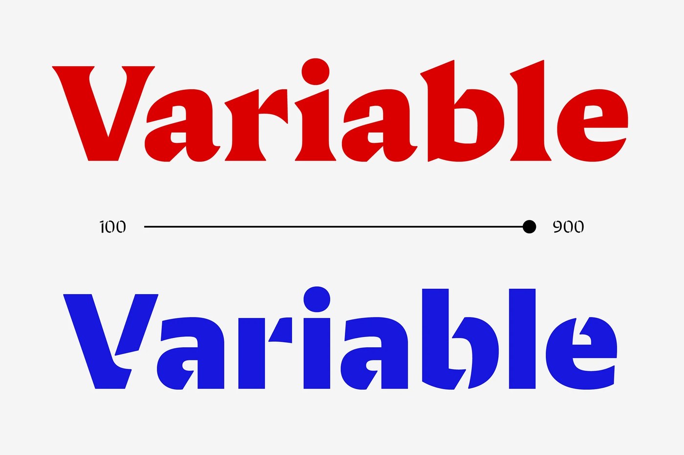
The collection spans four primary subfamilies across six distinct weights, ranging from ExtraLight to Black. In addition to the standard serif and sans models, both branches feature dedicated stencil companions. Rather than applying mechanical cuts, the designers carved angled bridges that mirror the natural rhythm of calligraphic tools. This disciplined typography design also interpolates across a single variable font axis from 100 to 900. Twelve stylistic sets provide deep functional flexibility. Designers can swap between double-storey and single-storey forms for letters 'a' and 'g', engage alternate 'Q' and 'R' glyphs, or deploy circled numeric indices and standard ligatures.
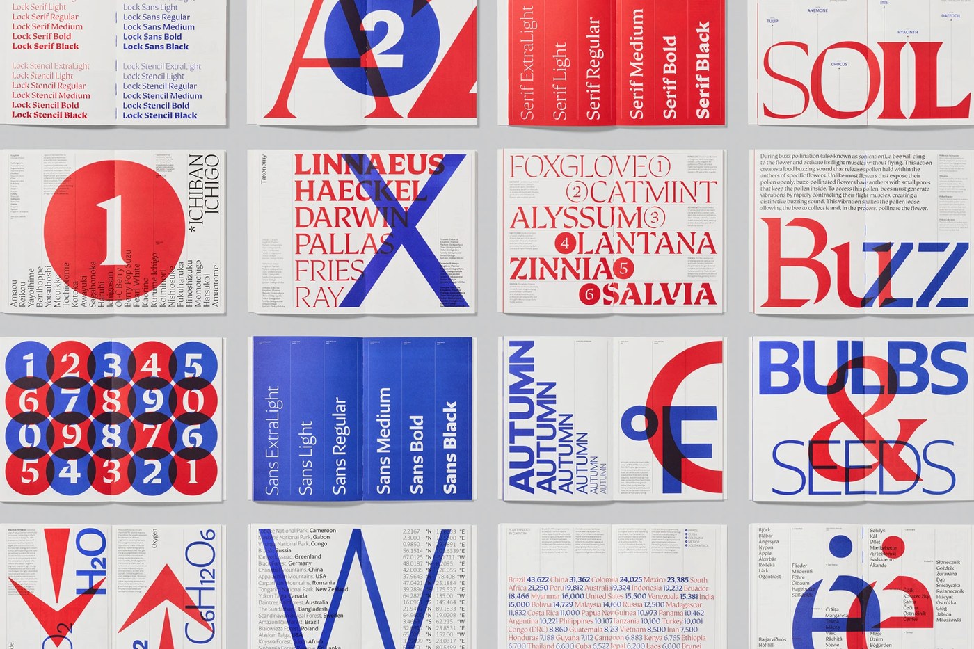
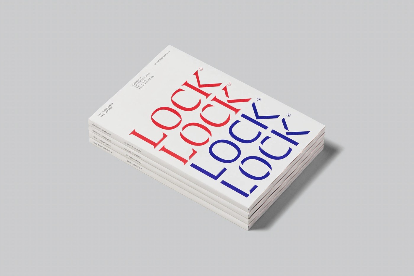
To demonstrate the system in physical print, Astrid Stavro designed a dedicated specimen book produced by Future Format. The publication treats typography design as an active editorial protagonist rather than a passive catalog. Dense biological taxonomies and botanical tables pair with monumental display specimen spreads. Crisp blind debossing on the cover board introduces tactile friction before the reader opens the volume. Printed in rich spot red and deep blue ink on smooth uncoated paper, the pages highlight ink holdout and legibility across all six weights. The publication confirms that a cohesive typography design can handle dense scientific data and expressive editorial headlines with equal authority.
See the full project by Mash Creative on Behance.