Brand Identity: Uncommon by Victor Berriel
Victor Berriel crafts a high-precision brand identity for DTC agency Uncommon, pairing Neue Montreal with tactical orange telemetry.
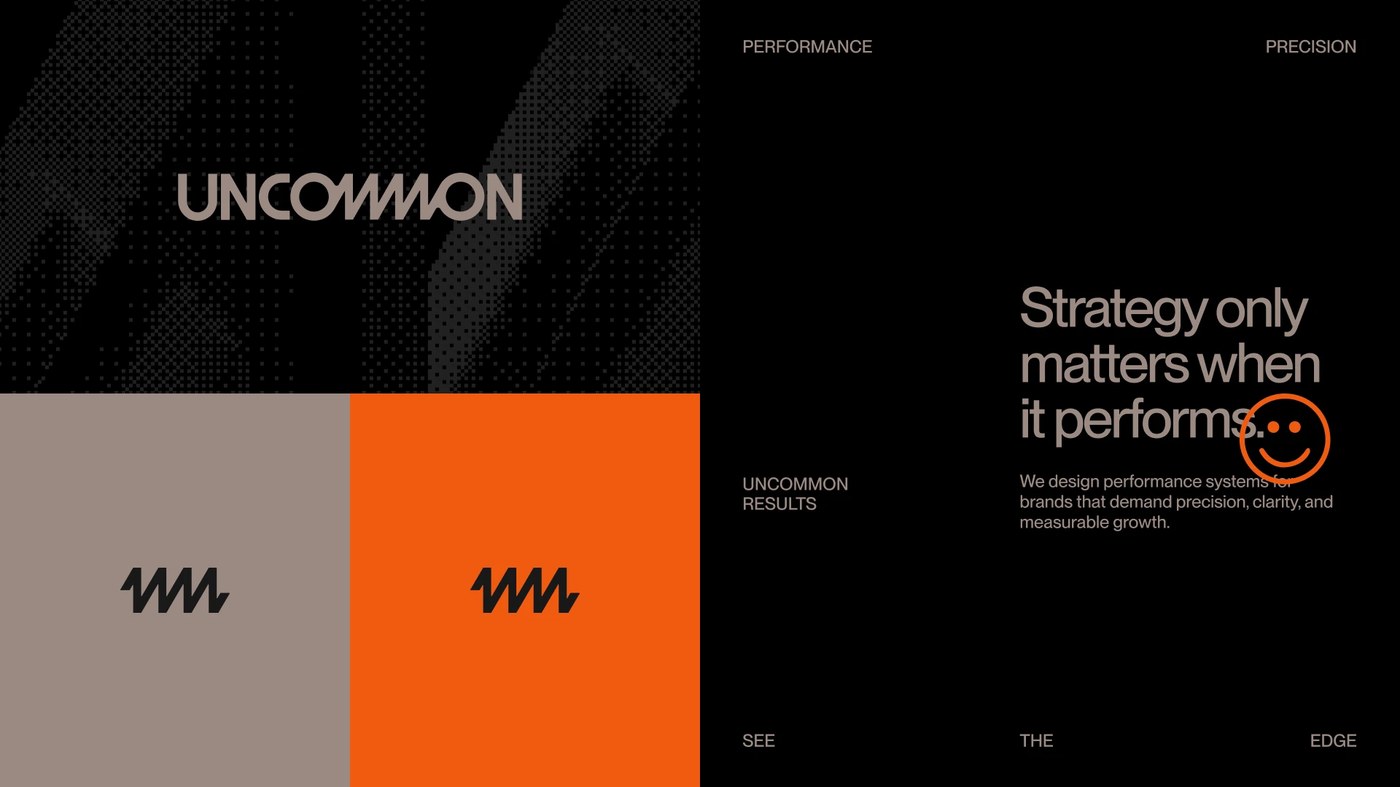
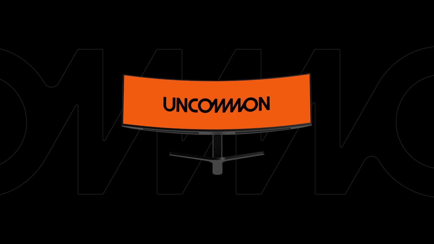
Performance marketing agencies frequently lean into predictable design tropes: sterile corporate gradients, friendly rounded cards, and stock dashboard wireframes. For Uncommon, a performance-driven agency built for direct-to-consumer brands operating at scale, designer Victor Berriel inverted that convention entirely. The resulting brand identity establishes strategic authority through the disciplined visual language of a high-precision technical operator. Rooted in deep obsidian black and raw slate foundations, the visual system is electrified by calculated hits of high-visibility safety orange. At the core of the identity sits a bespoke wordmark punctuated by an angular zigzag ligature across the central letterforms, evoking continuous signal flow and algorithmic precision.
Modular Performance Systems and Telemetry in Brand Identity
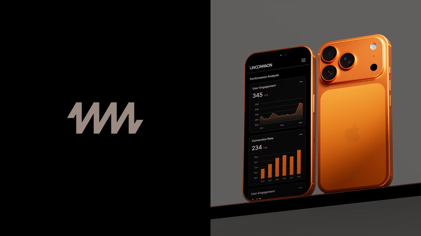
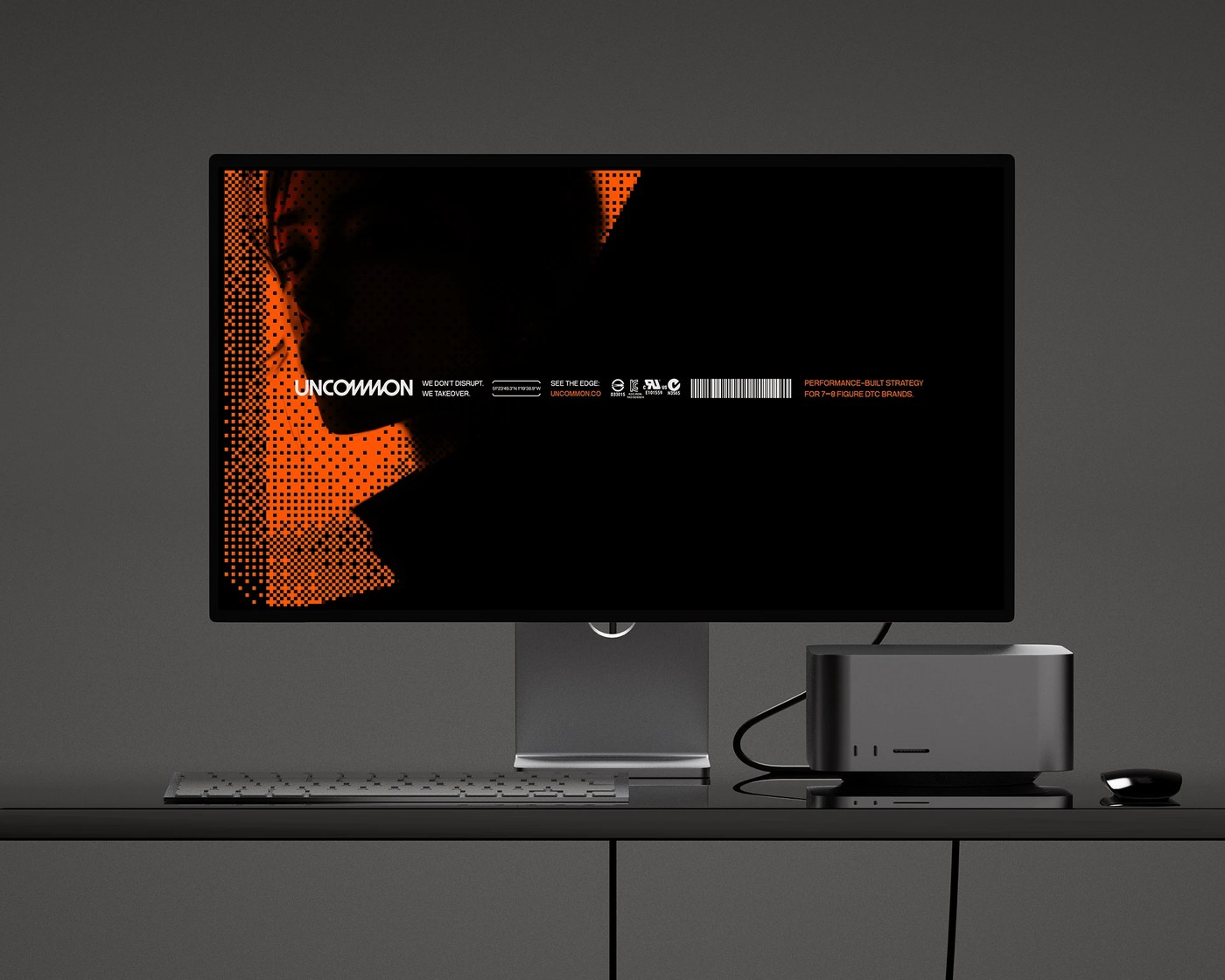
A rigorous typographic hierarchy governs the brand identity across physical artifacts and digital interfaces. Berriel paired Pangram Pangram's versatile grotesque Neue Montreal for commanding display headlines with NeueBit, a retro-digital bitmap typeface deployed for technical telemetry metadata. GPS coordinates, registration crosshairs, system status badges, and scannable barcode strips function as primary graphic architecture rather than passive decoration. This systematic framing translates directly into analytical dashboards, responsive web views, and wearable interfaces, delivering complex conversion metrics and performance datasets with uncompromising clarity and optical control.
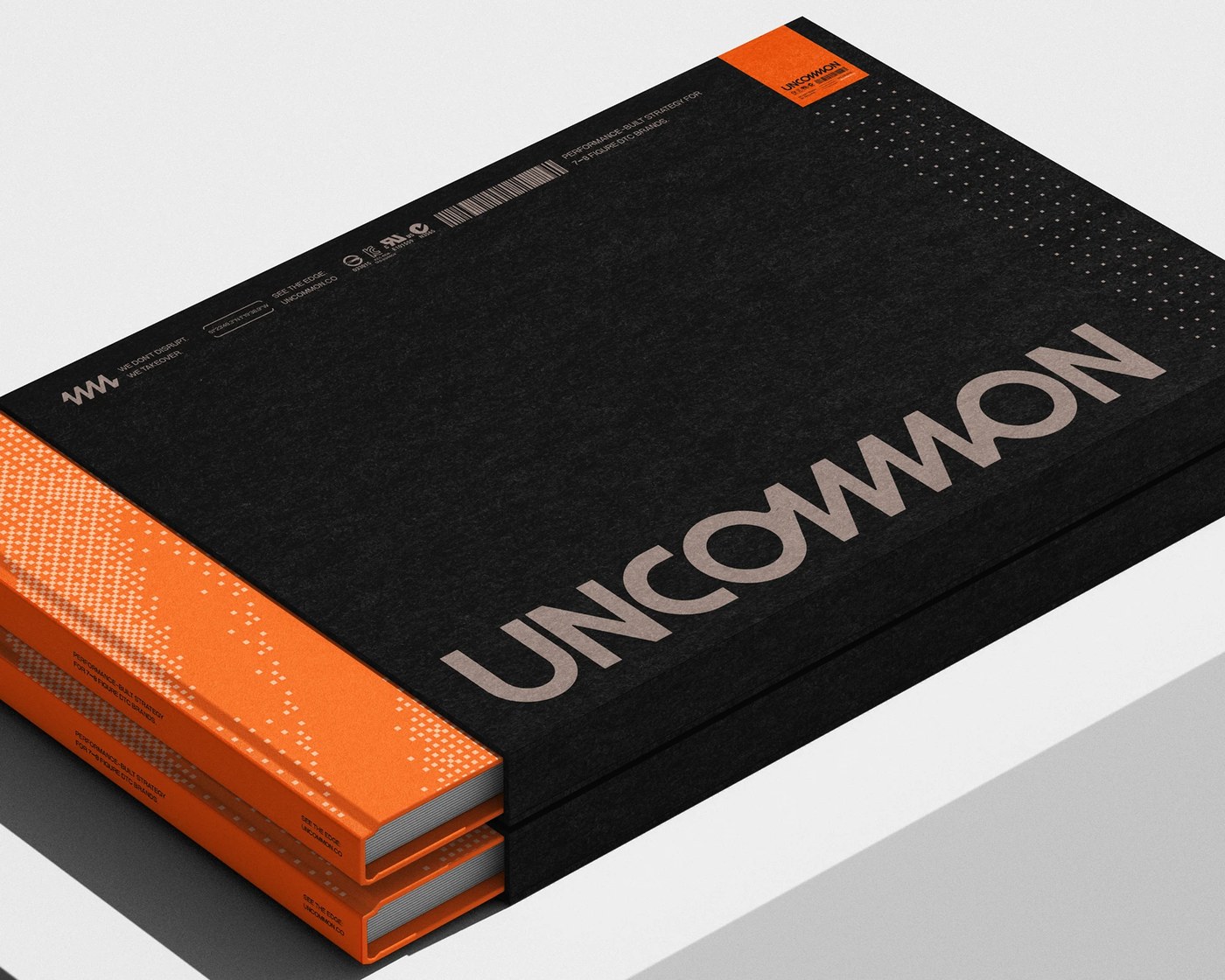
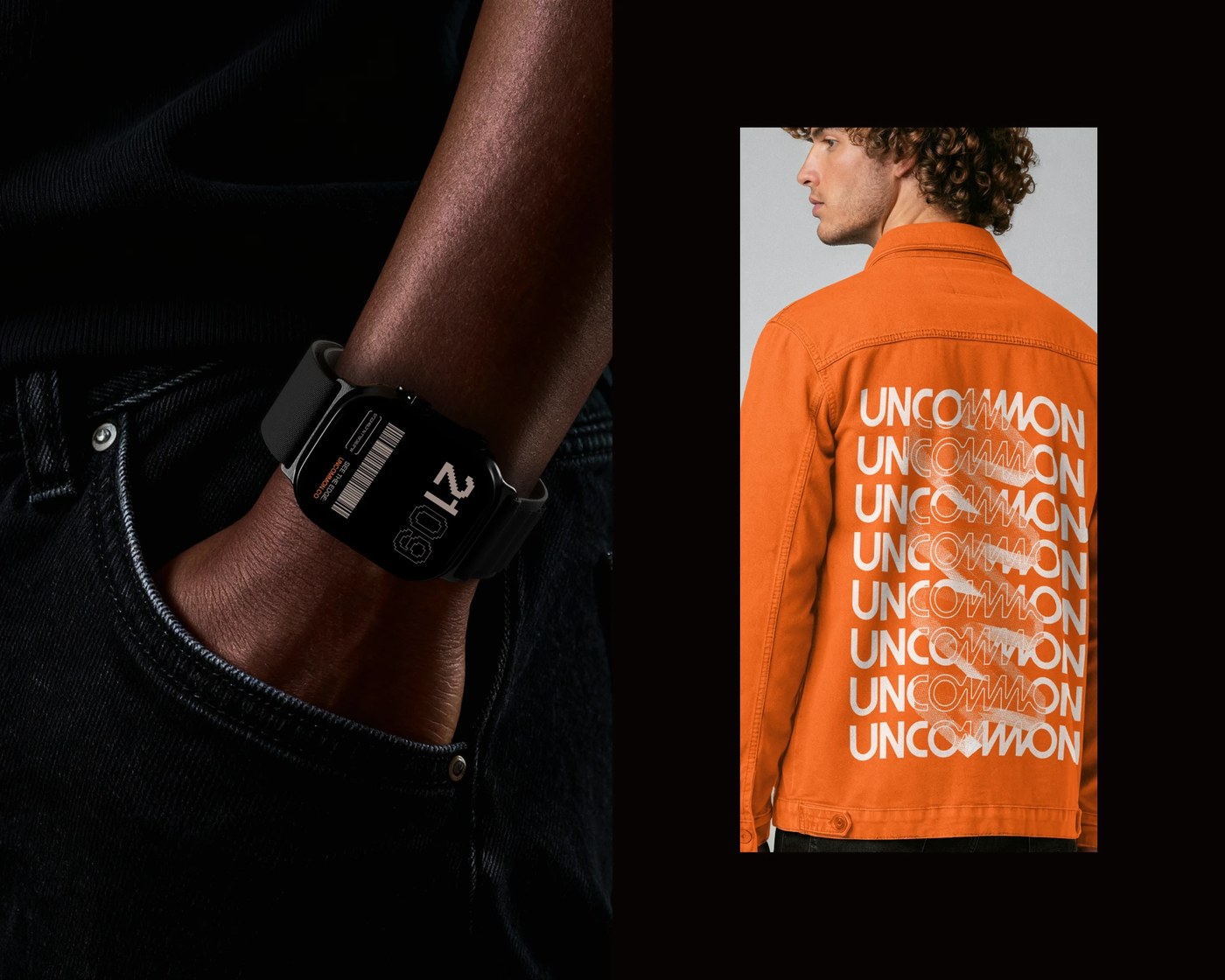
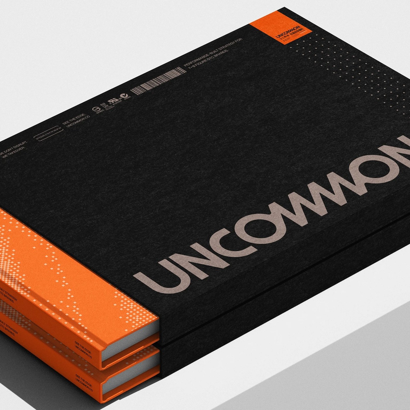
Physical print and apparel collateral ground the brand identity in tangible material reality. The editorial suite features a dense matte black slipcase with textured paper grain and spot orange technical stickers, holding twin volumes bound with saturated pixel-dithered gradient spines. Utilitarian workwear reinforces the operator ethos, highlighted by an industrial orange cotton chore jacket displaying a screenprinted kinetic repeat of the primary wordmark. By fusing brutalist restraint with high-contrast functional energy, the visual system demonstrates how disciplined art direction can transform performance marketing into an authoritative creative statement.
See the complete project by Victor Berriel on Behance.