Typography Design: Rocket Type System by TypeType Foundry
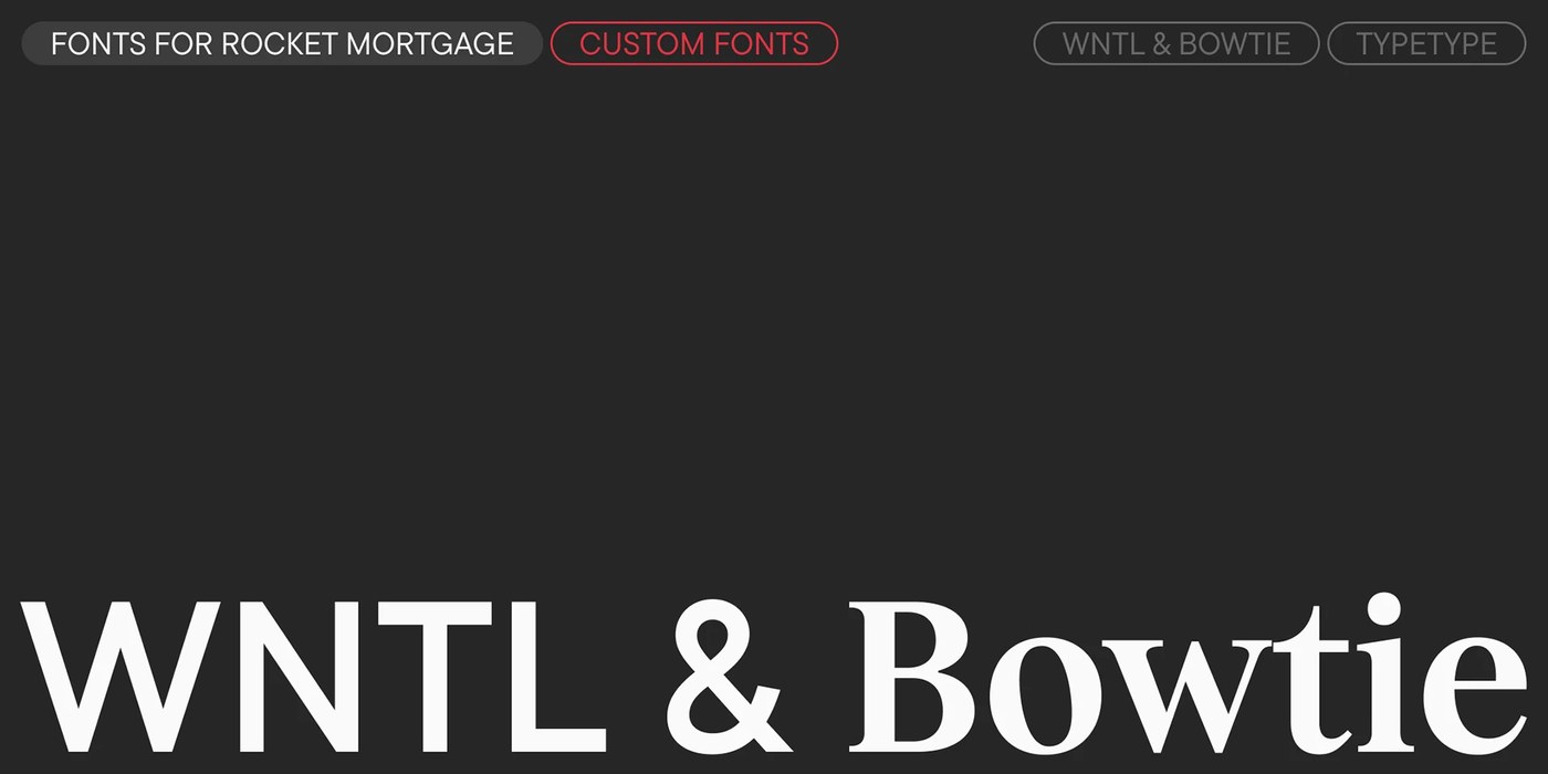
TypeType Foundry engineered a bespoke dual-family typography design for Rocket, pairing geometric sans WNTL with transitional serif Bowtie.
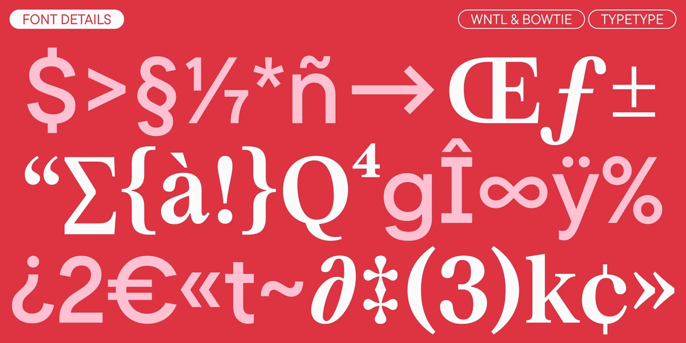
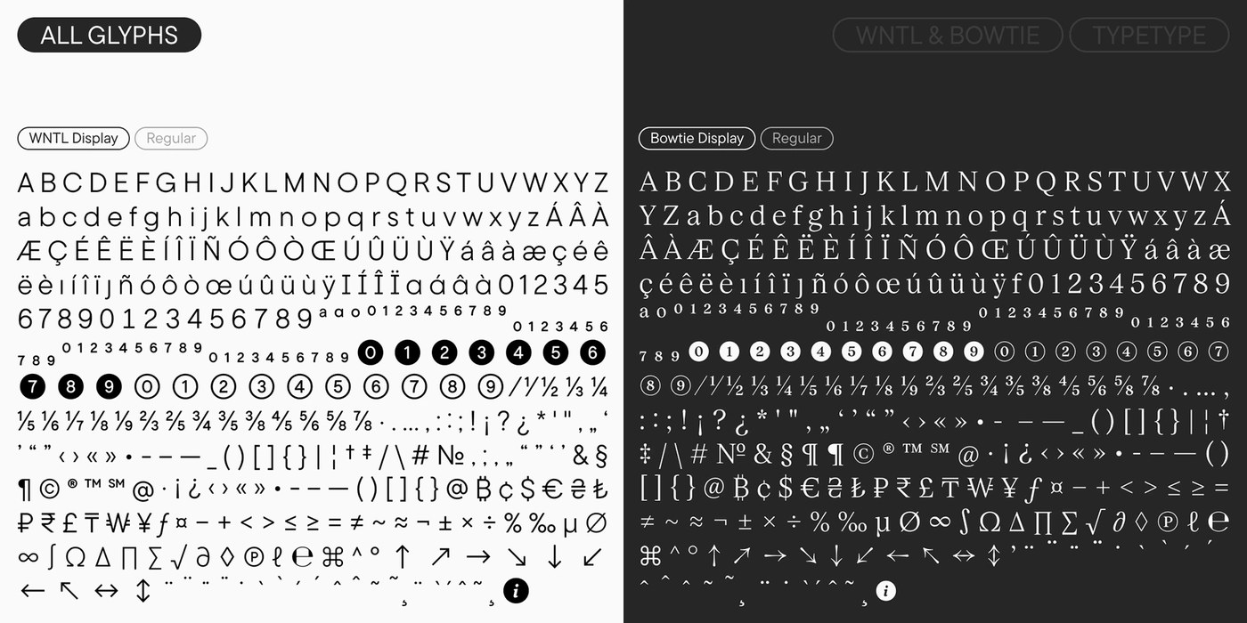
Built as the centerpiece of Rocket’s visual ecosystem, the dual-family system reconciles two distinct design voices into one cohesive engine. WNTL modifies TT Commons™ Pro into a concise geometric sans-serif with open counters and clean baseline terminals, signaling accessibility. Bowtie customizes TT Livret into a stately transitional serif, introducing sharp bracketed serifs, vertical stress, and high stroke contrast. On specimen plates, TypeType Foundry presents this typographic tension across intense scarlet backgrounds with pale pink accents and white letterforms. Side-by-side specimen tables reveal matching currency marks, circled numbers, and directional arrows across both families. The pair avoids corporate sterility, using crisp structural geometry to give the typography design distinct warmth.
Dual Typographic Architecture and Custom Typography Design
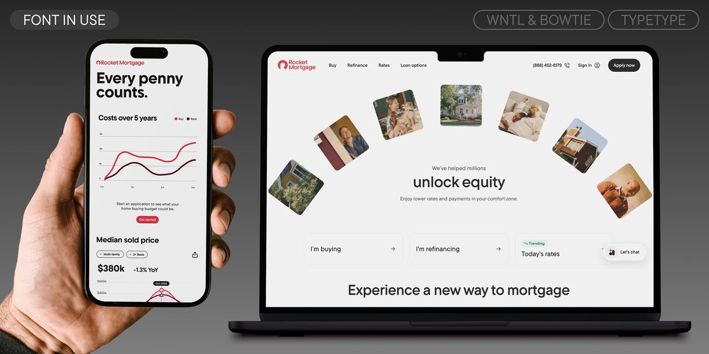
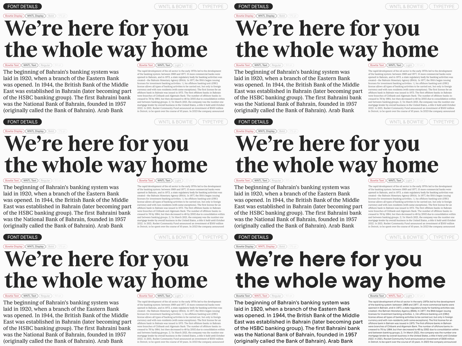
Screen performance anchors the engineering behind this typography design. Technical director Yuri Nakonechny and hinting programmer Victor Rubenko calibrated custom delta hints to ensure pixel-level sharpness across dense digital interfaces. In the mobile loan application, WNTL Text renders mortgage payment charts, rate calculations, and data cards with calm legibility. Meanwhile, Bowtie Display handles editorial headlines on responsive web platforms, where fluid line heights and wide proportions preserve character definition. The foundry developed targeted optical cuts, stepping from monumental 175-point display headlines down to 22-point text sizes. This scalable typography design ensures financial figures and domestic storytelling remain clear across every viewport.
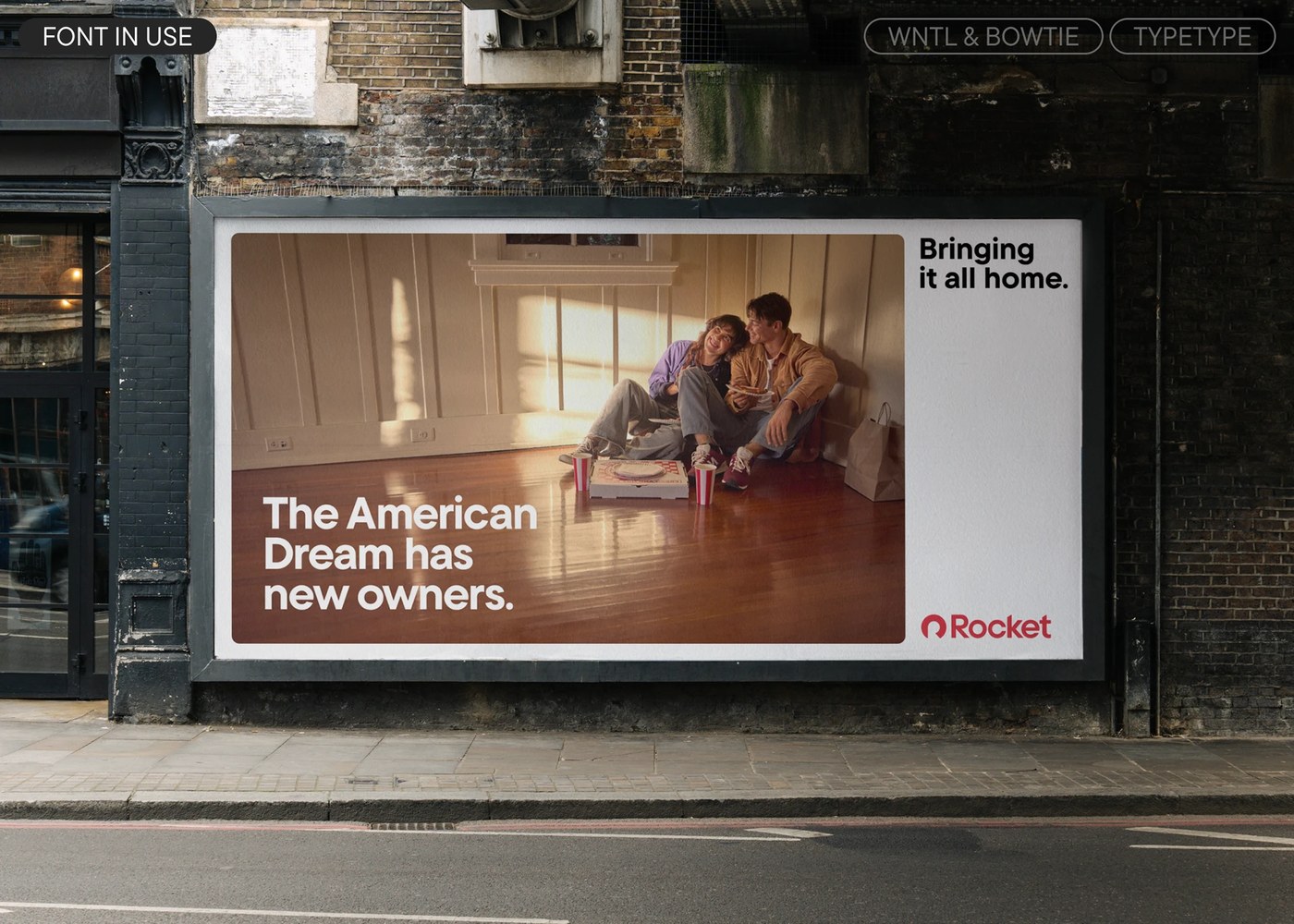
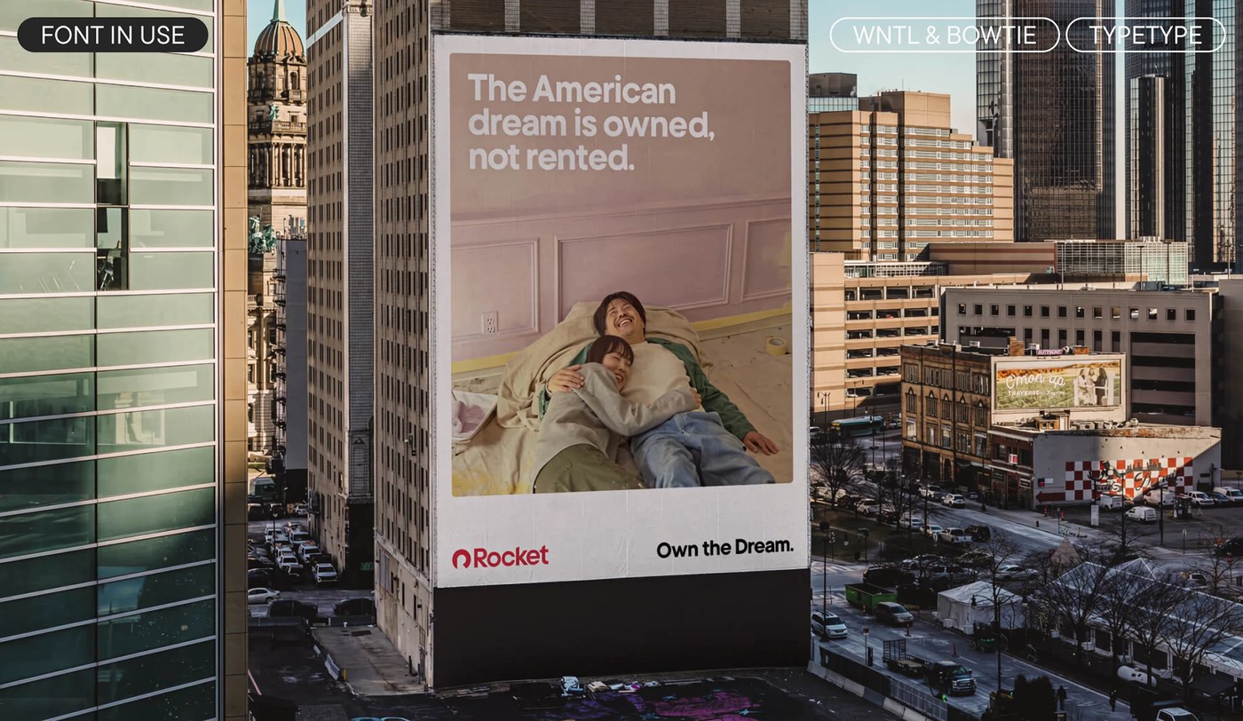
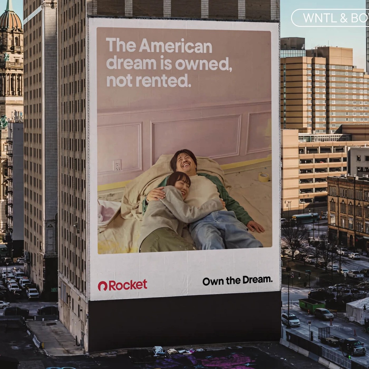
Beyond technical rigor, the type system carries personal resonance. The naming honors Nick Gilbert, the late son of the company’s founder. WNTL takes its letters from Nick’s lifelong motto, "What’s Not To Like," while Bowtie commemorates his trademark neckwear. This personal narrative manifests visually across massive urban applications. On downtown Detroit skyscraper murals and street-level billboards, WNTL spans wide brick facades above photographs of homeowners on raw hardwood floors. At civic scale, the clean letterforms hold crisp edges against changing daylight and harsh weather. TypeType Foundry proves that large-scale corporate typography design can embody emotional tribute while maintaining absolute functional discipline.
See the full typography design project by TypeType Foundry on Behance.