Packaging Design: Tenderleaf Botanical Care by Svetlana Kalinova
Explore the Tenderleaf botanical skincare packaging design and brand identity by Svetlana Kalinova, pairing serif type with frosted glass.
Skincare shelves are usually loud. Walk down any beauty aisle and every clinical serum bottle is shouting percentages at you in stark black sans-serif type. For Tenderleaf, designer Svetlana Kalinova went the complete opposite route. She built a botanical skincare and bodycare identity rooted in quiet restraint, treating daily routines like a slow, meditative pause rather than a rushed chore.
Packaging Design: Serif Rigor Meets Calligraphic Flow
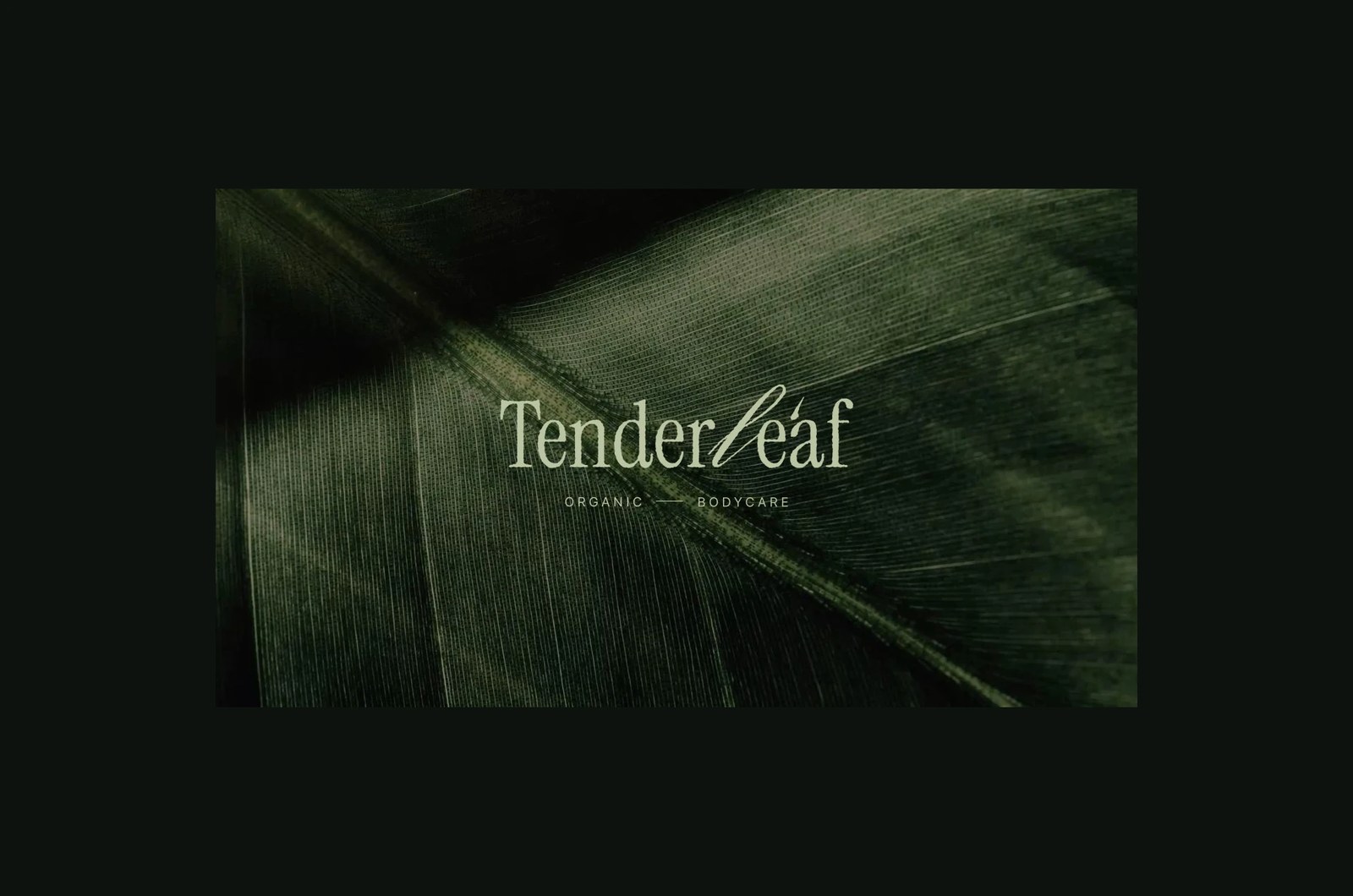
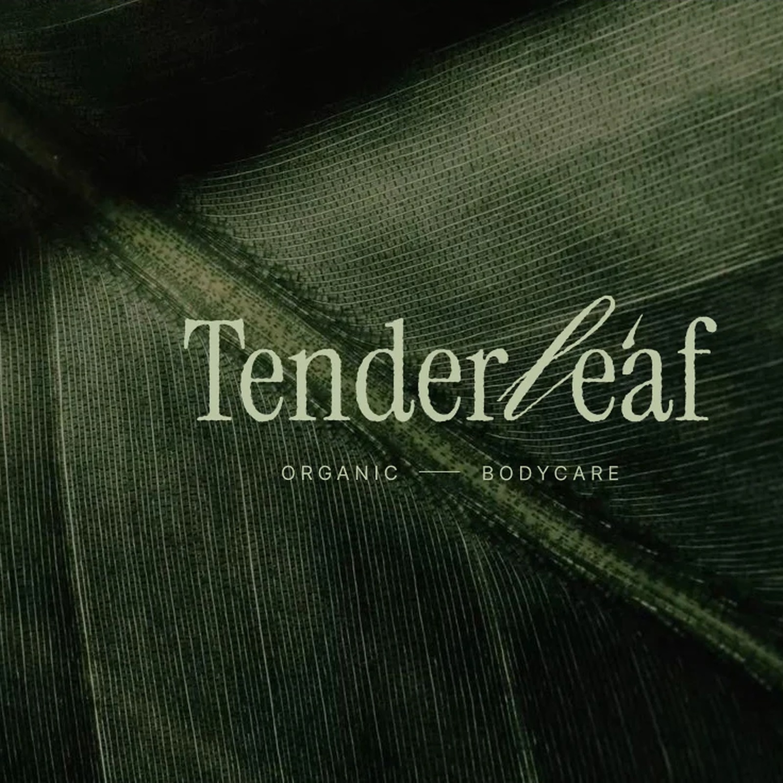
Look closely at the wordmark first. Most minimalist beauty brands default to either a rigid, high-fashion didone or a safe geometric grotesk. Kalinova instead sets "Tenderleaf" in a crisp, narrow-proportioned serif and breaks the center wide open by drawing the "le" in "leaf" as a sweeping, ribbon-like calligraphic script. That single gestural stroke changes the whole mood. It keeps the typographic authority of an apothecary label while injecting a soft, organic pulse right in the middle of the name, underscored by widely tracked "ORGANIC — BODYCARE" micro-type.
Dusty Sage, Sleeping Moss, and Tactile Vessels
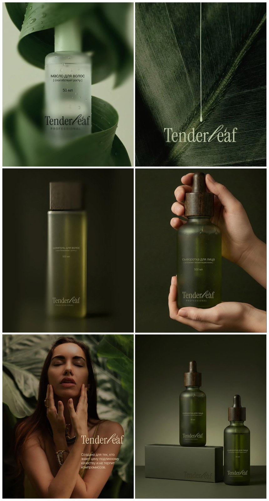
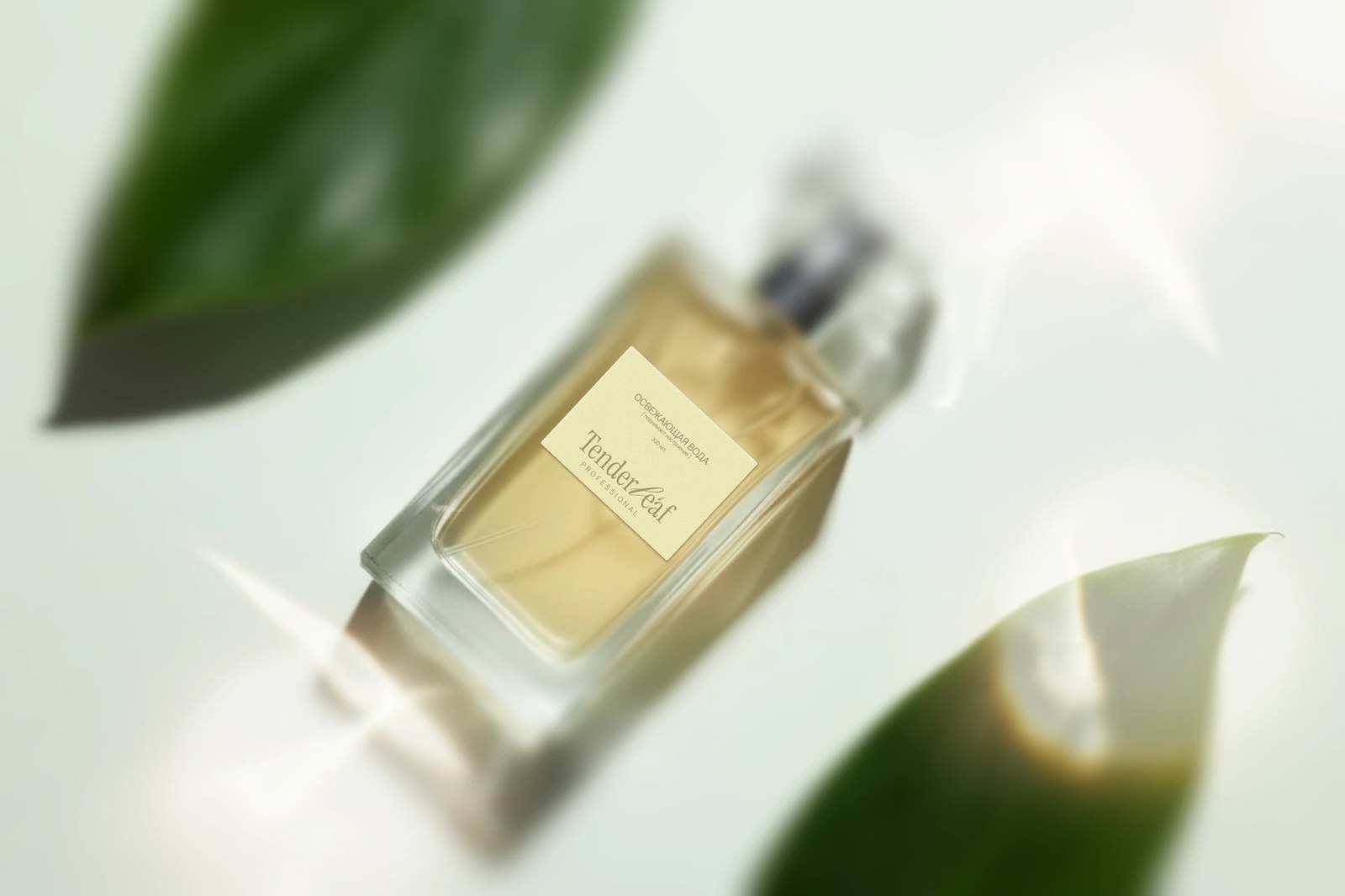
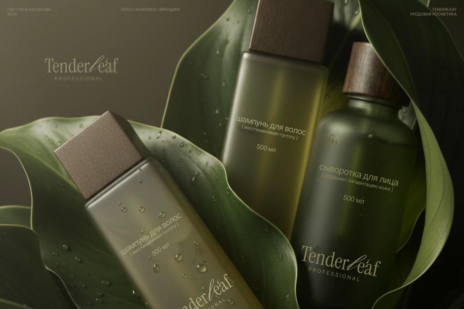
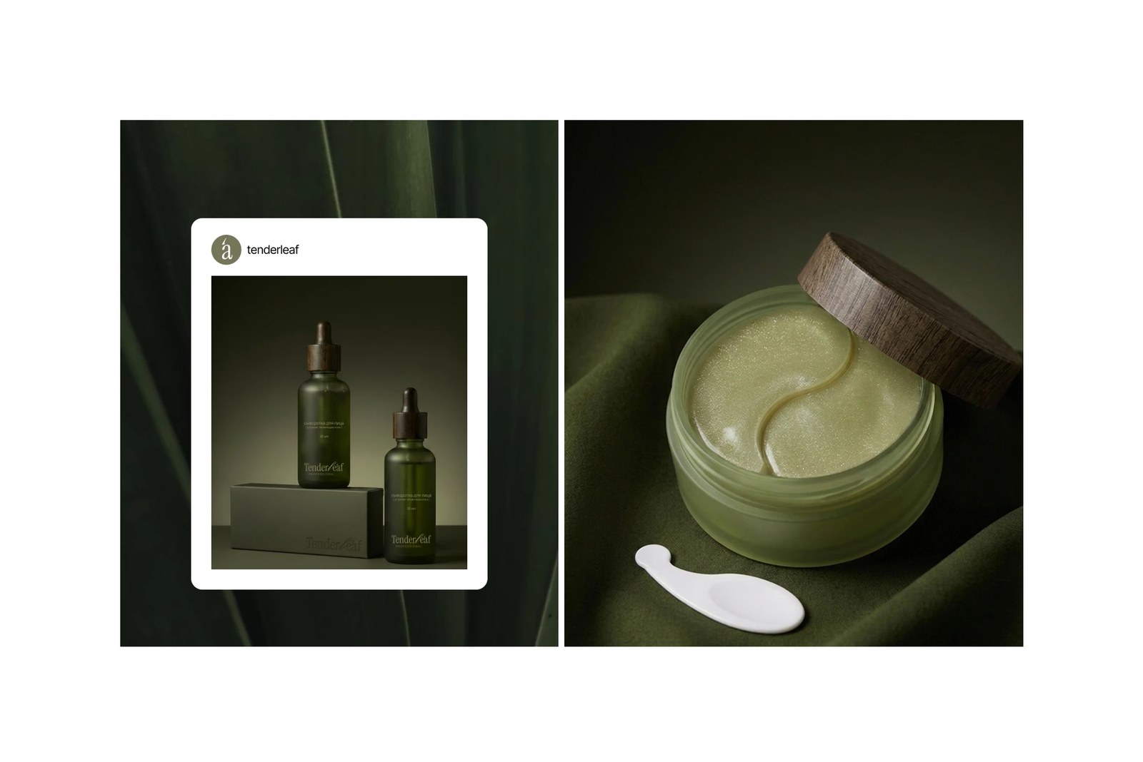
Where this packaging design really wins me over is the material honesty across the containers. Kalinova anchors the entire palette in two deep, earthy tones: Dusty Sage (#626C49) and a dark, shadowy Sleeping Moss (#1F2608). Instead of glossy plastic tubes, the line lives inside heavy, acid-etched frosted glass bottles and squat jars topped with raw, open-grain dark timber caps and droppers. You can almost feel the cool, matte resistance of the glass against the warm wood grain before you even twist the cap off.
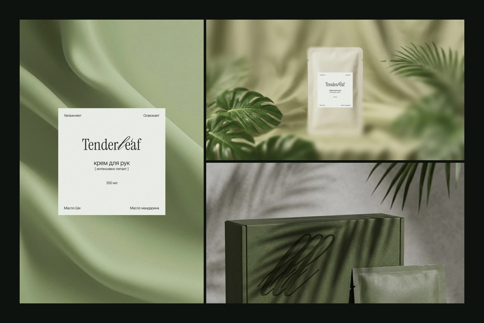
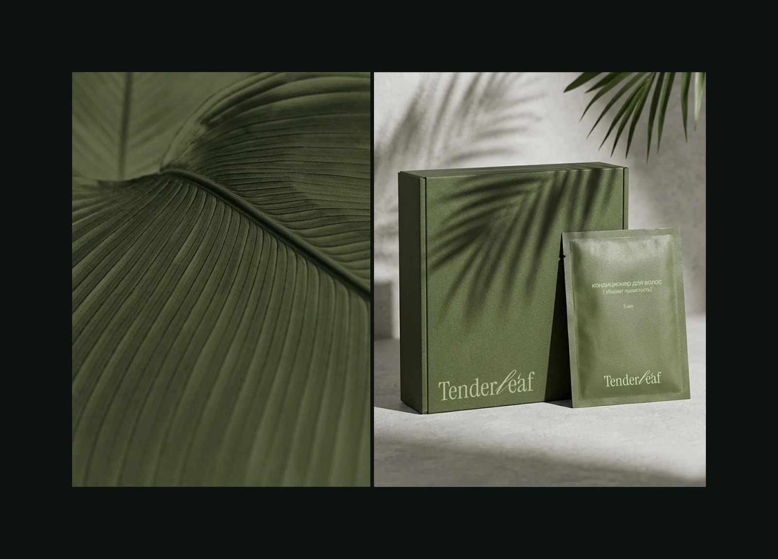
The secondary packaging carries that same restraint through contrast and texture. Rigid outer cartons use uncoated, fibrous moss paperboard stamped with oversized, tone-on-tone script loops that catch the light at an angle without needing flashy metallic foil. Even the 350ml hand cream pouches and single-dose 5ml hair conditioner sachets stick to strict editorial grids, pinning functional notes to the outer corners of textured cream labels so the center stays calm and uncluttered.
See the full project by Svetlana Kalinova on Behance.