Tonewood Visual System and Acoustic Studio Branding
Tonewood explores acoustic wood craft with bold branding, combining rich timber tones, orange accents, and custom fonts.
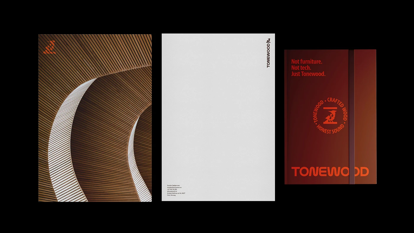
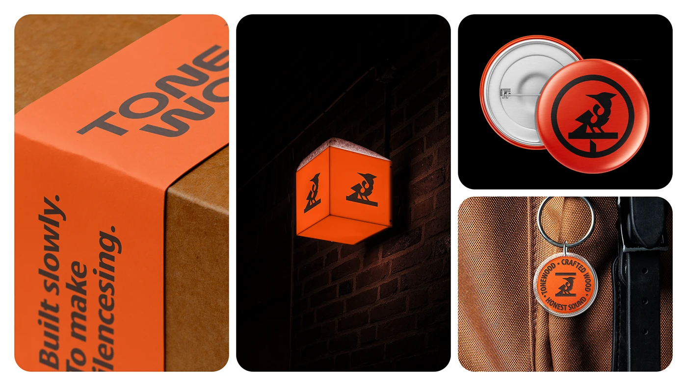
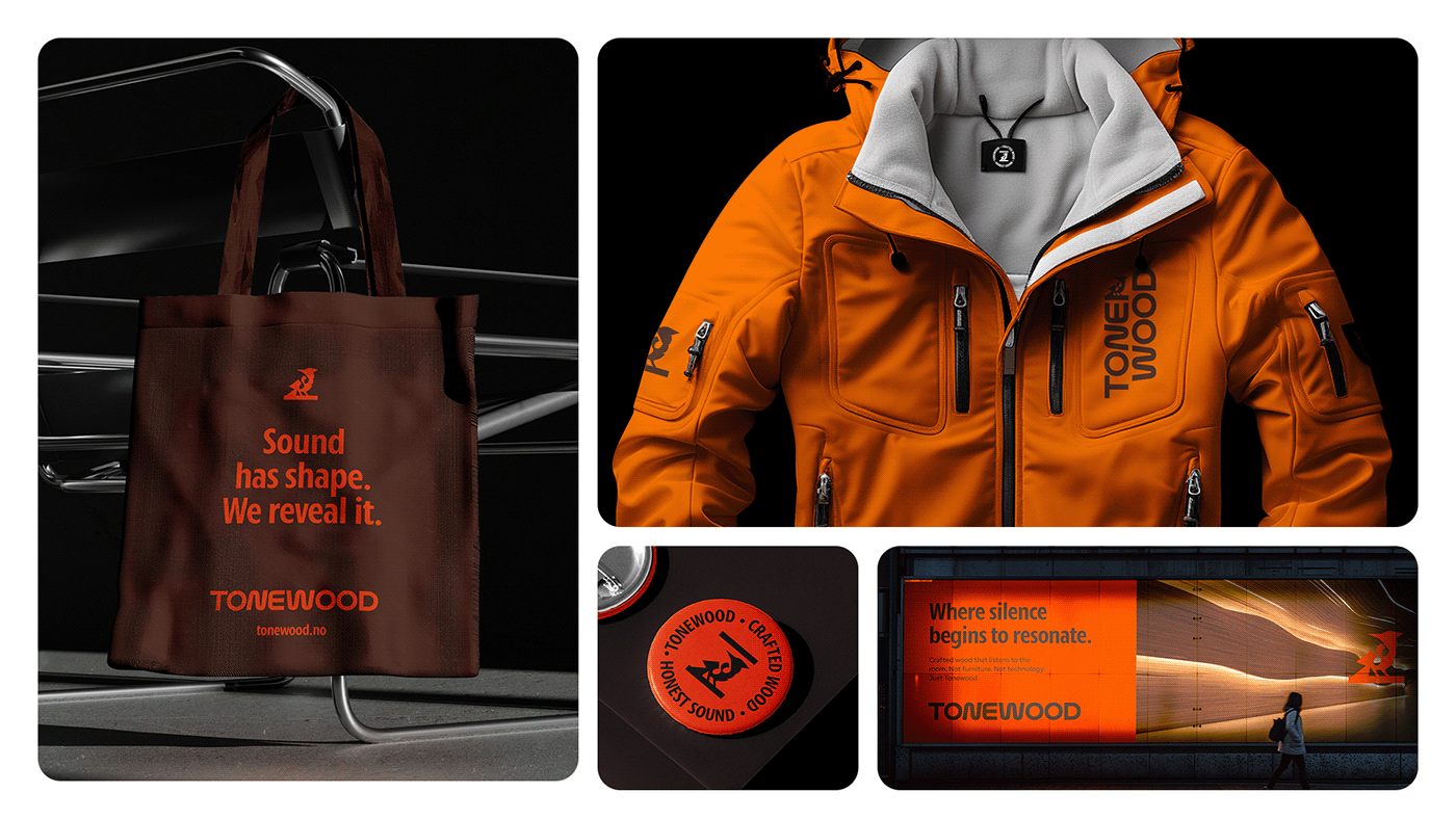
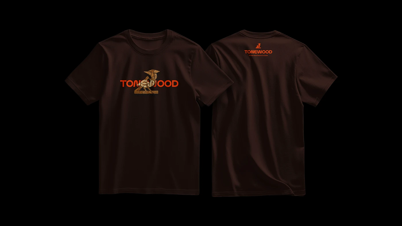
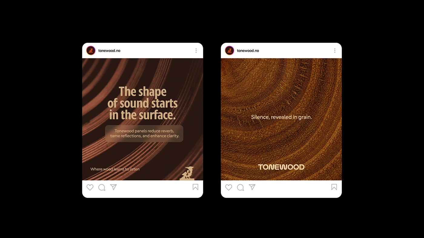
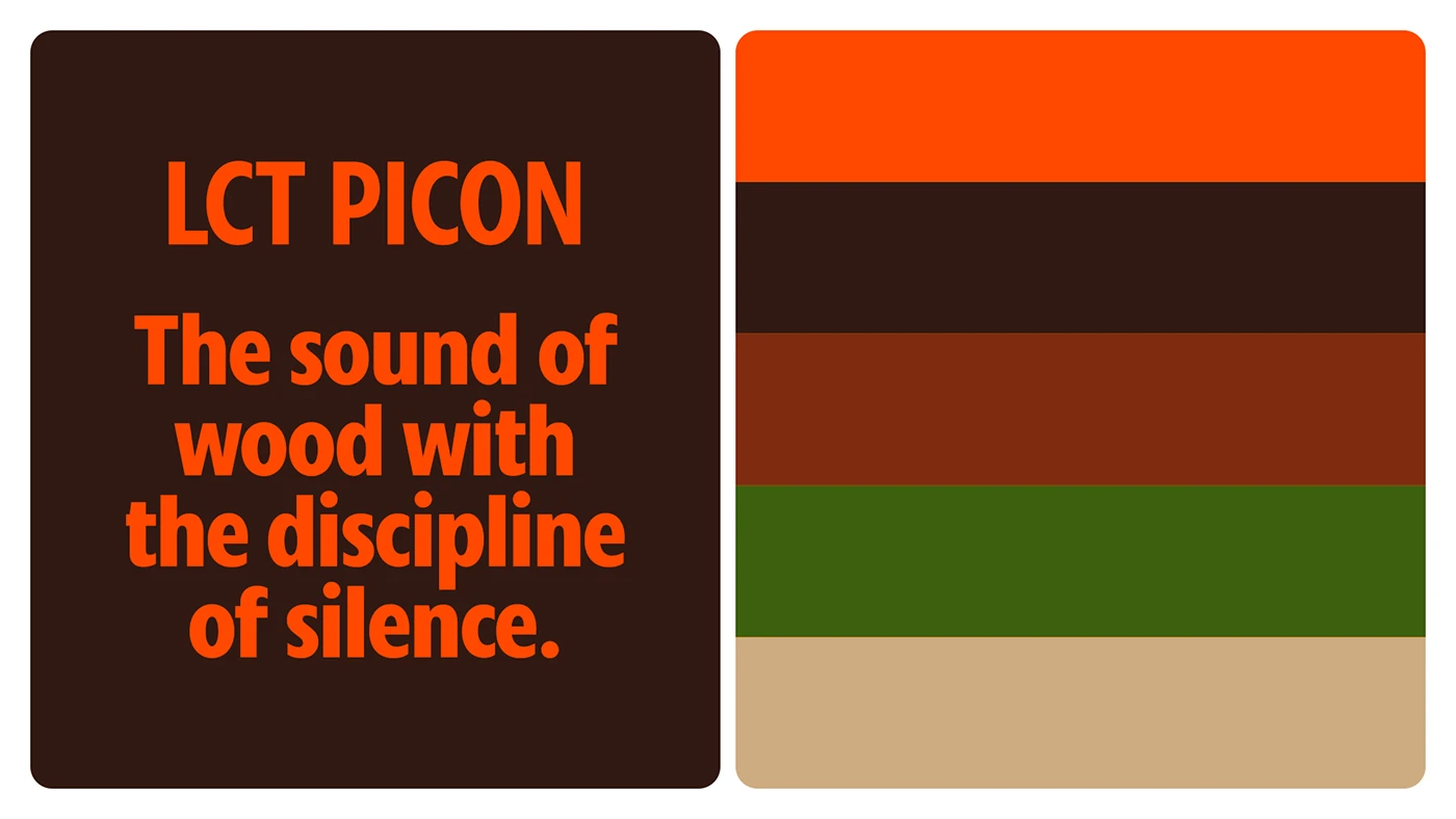
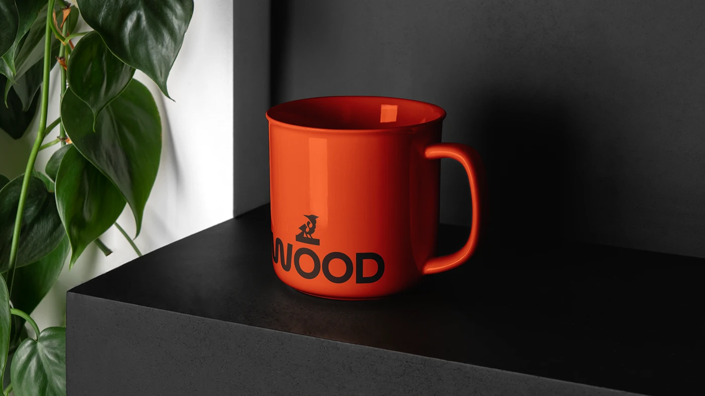
Designed by Matthew Corseuil, the brand system reflects the quiet feel of acoustic timber rooms. Each graphic item pairs warm wood grain with clean lines. The core color palette uses deep brown, rich wood red, forest green, and bright orange. Bold condensed type gives printed items a neat physical scale. Printed cards, envelopes, and bound books show strict grid balance across every item. The brand mark features a stylized bird icon set on a wood beam. Bright orange badges and woven tags add soft tactile contrast to dark wool jackets. Simple enamel pins and round patches bring the logo to life on small objects. Each detail highlights natural wood texture.
Systemic Artifacts in Modern Studio Branding
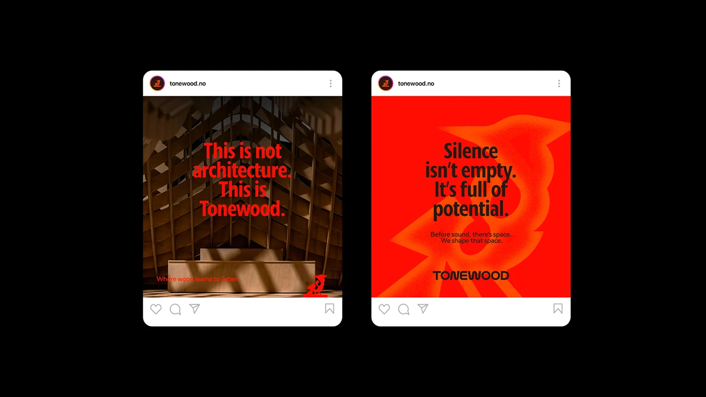
The layout rules rely on strong contrast color fields and clean type layout. Condensed letters anchor social posts, billboards, and product boxes. Every branding layout maintains visual balance between raw natural wood and fine print work. Bright orange paper bands wrap around brown cardboard boxes to seal studio goods. Letterhead sheets feature small corner logo marks, keeping main space open for text notes. The main mark adapts easily across small metal pins, cloth patches, and large outdoor signs. Clean grid lines keep all info clear on digital screens and physical items alike. The color system uses warm wood tones to unify all studio goods.
By uniting acoustic wood craft with bold art, the visual layout defines a clear system for sound design. The studio branding balances natural wood textures with functional print elements. Custom font rules ensure a consistent tone across print media, signs, and clothes. Bright color accents cut through dark backgrounds, giving the brand a bold market place. Explore the complete case study on Behance by Matthew Corseuil. The collection stands as a fine reference for timber craft and modern branding.