Atelier Cervantes — Masterclass in Editorial Design by SAVVY
SAVVY STUDIO balanced curatorial mystery and rational typographic structure in editorial design for arts laboratory Atelier Cervantes.
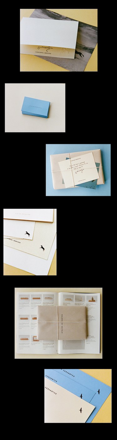
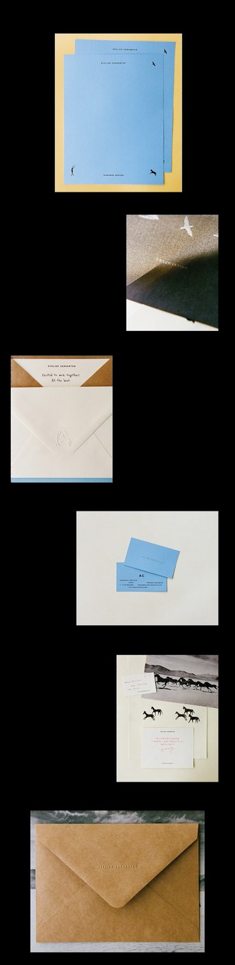
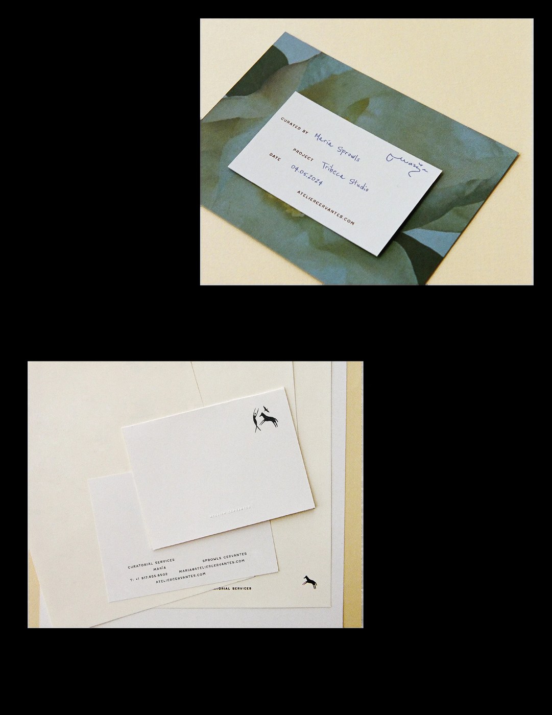
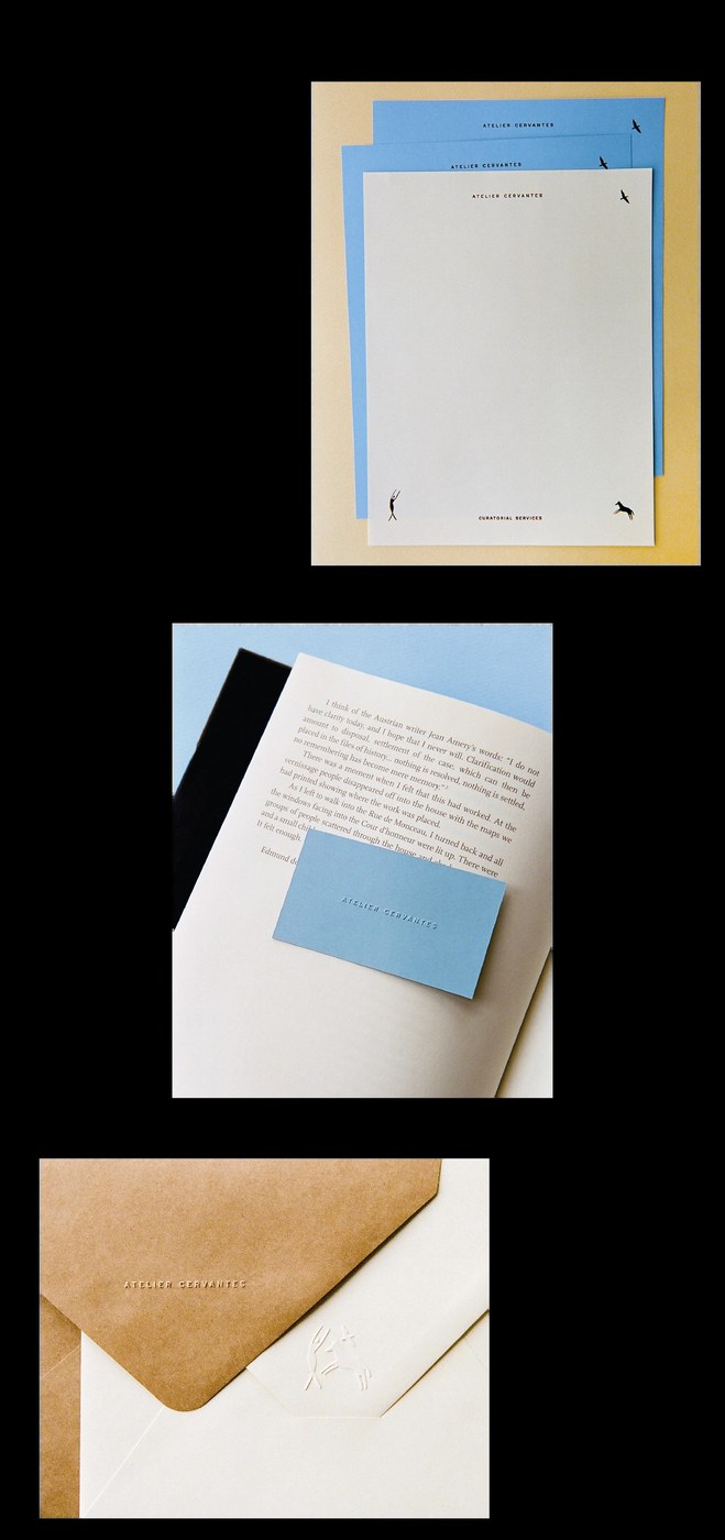
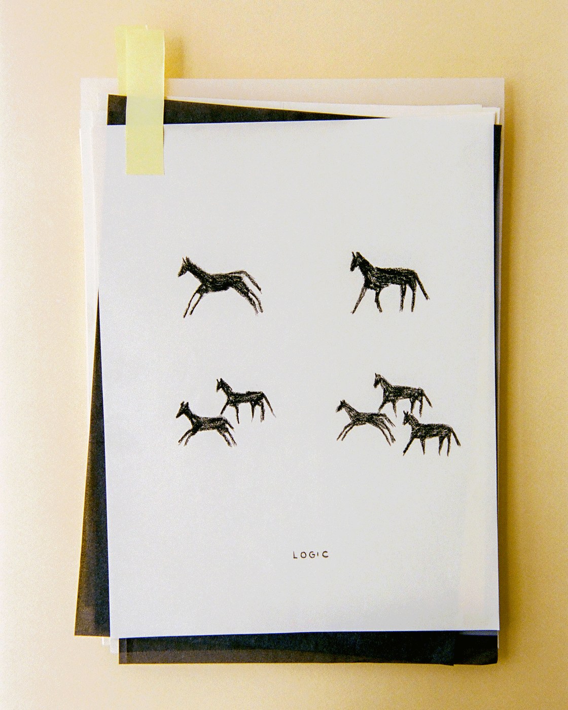
Atelier Cervantes operates as a curatorial and arts consulting laboratory founded by María Sprowls Cervantes. Working between New York and Mexico, the practice investigates the intersection of intellectual discourse, research, and aesthetic intuition. Rather than assembling a conventional corporate identity, SAVVY STUDIO shaped a poetic approach to editorial design that reveals meaning through quiet observation. The visual universe centers on balance: rational logic softened by human sentiment. A symbolic language of line-drawn emblems—a dancing feminine figure, running horses, rising birds, and a slender greyhound—weaves through each artifact. Documented in atmospheric photography by Clément Pascal, the chromatic palette contrasts warm ochre and sky-blue paper stocks against tactile cream substrates and raw kraft wrapping.
Curatorial Pacing and Symbolic Typography in Editorial Design
The underlying layout system brings disciplined structural pacing to print publications and curatorial collateral. SAVVY STUDIO anchored the editorial design in generous, asymmetric margins and calibrated whitespace. Spreads from exhibition catalogues pair curatorial essays with object inventories, documenting artworks in porcelain, gold, liquid clay, and oak. Typographic hierarchies balance crisp uppercase titles set with wide tracking against quiet serif body text citing cultural thinkers like Jean Améry and Edmund de Waal. Modular columns organize catalog numbers, material descriptions, and folio markers with quiet precision. Hand-inscribed project cards bearing handwritten dates and notes from the curator introduce personal intimacy to the formal typographic architecture.
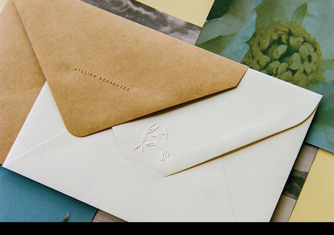
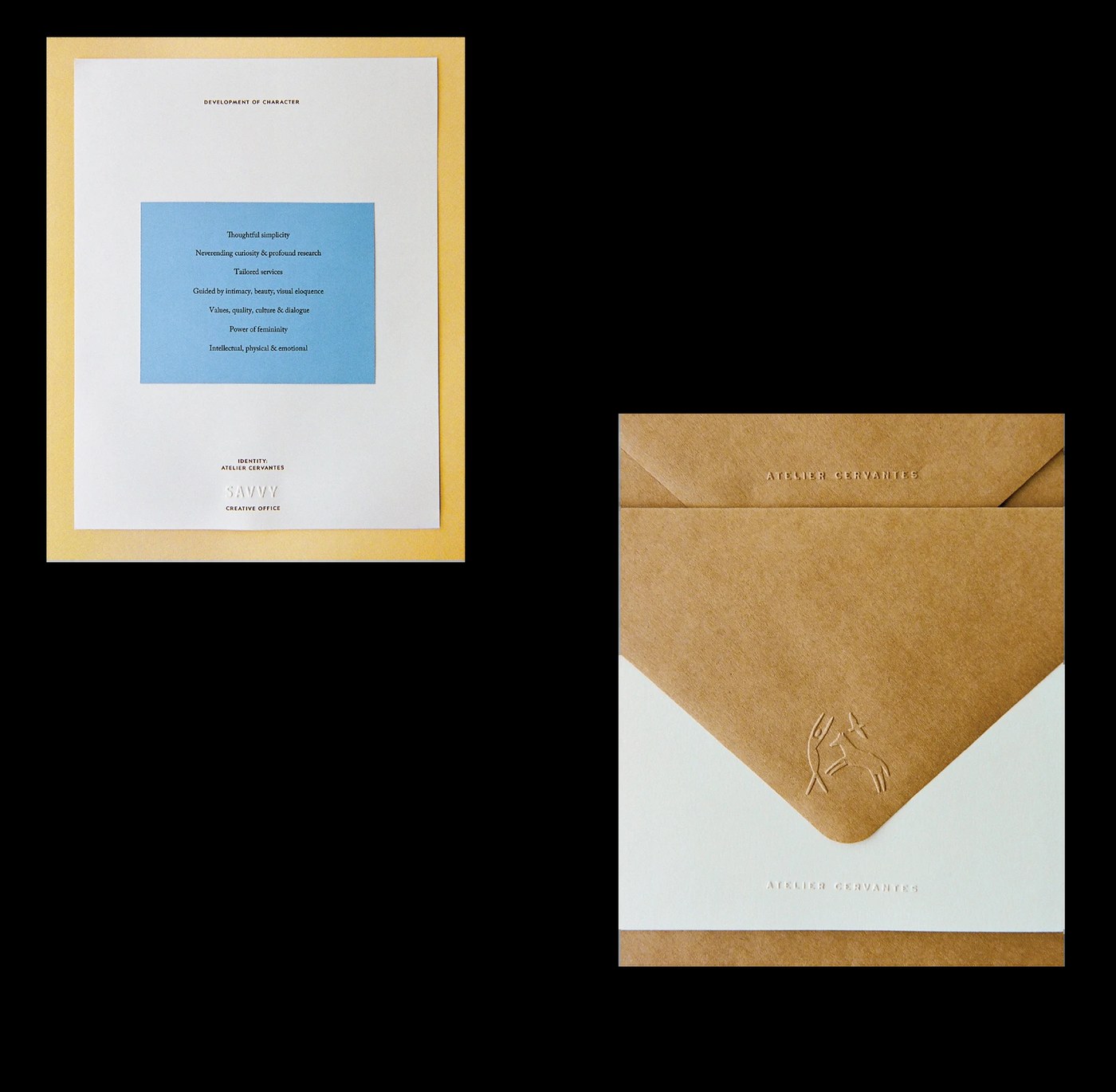
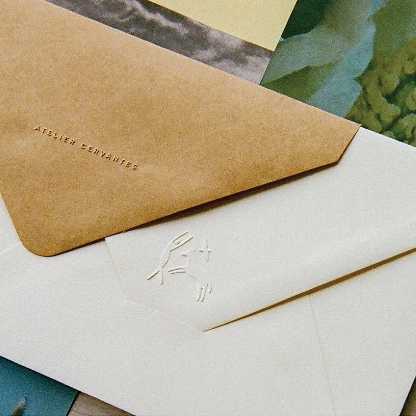
Physical production underscores the tactile presence of the printed objects across every touchpoint of the editorial design. Hardcover monograph publications feature blind debossed titles and thread-sewn binding designed to lay flat during curatorial review. Stationery suites include multi-toned letterhead sheets bearing micro-symbols at alternating page corners, allowing the dancing figure and animal emblems to act as quiet structural markers. Envelopes in unbleached kraft paper and ivory stock receive deep blind embossing along their closure flaps, pairing the Atelier Cervantes wordmark with delicate raised illustrations. Exhibition parcels arrive wrapped in fibrous kraft paper tied with unbleached cotton string, reinforcing the studio’s commitment to tactile editorial design and deliberate craftsmanship.
See more from SAVVY STUDIO on Behance.