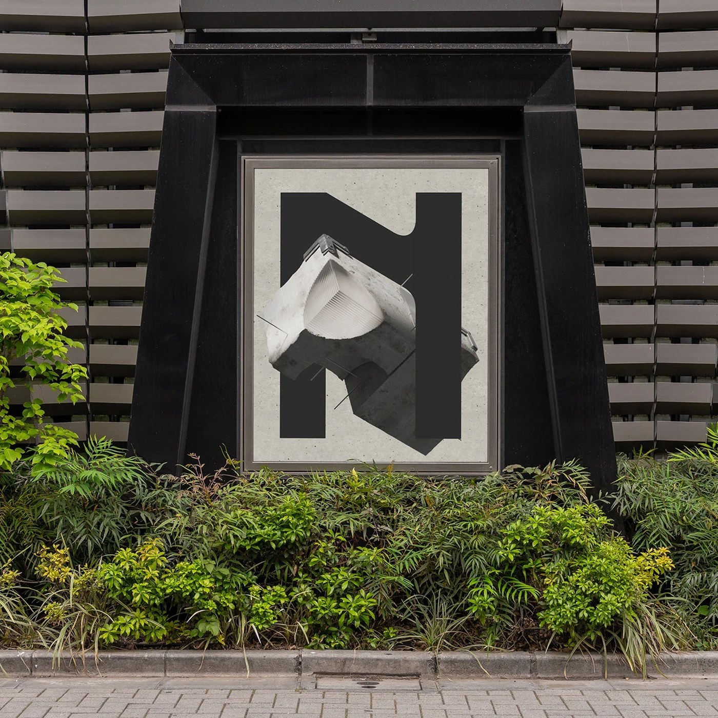
Brutalist Visual Identity: Framing Technical Design for Neckel
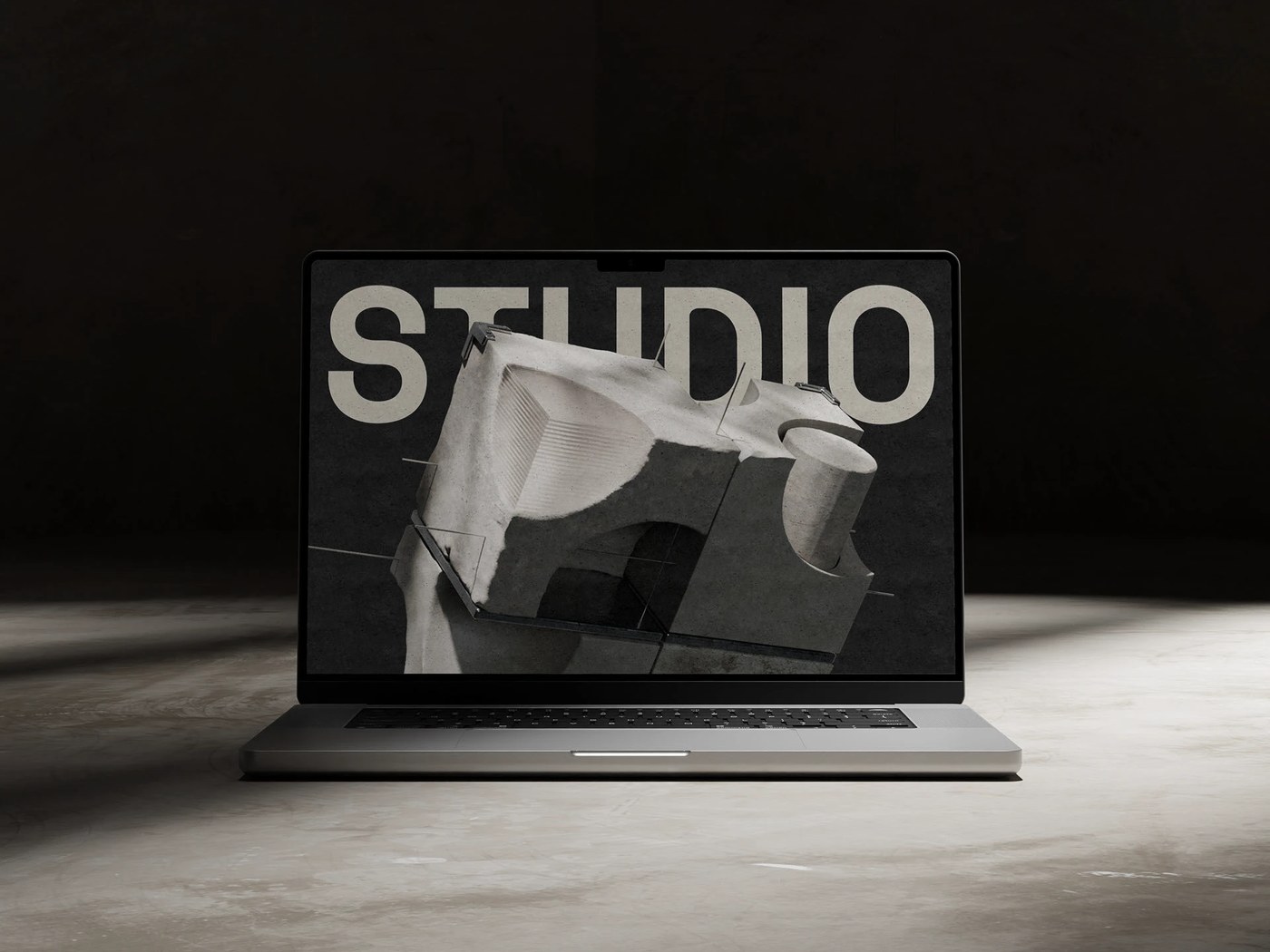
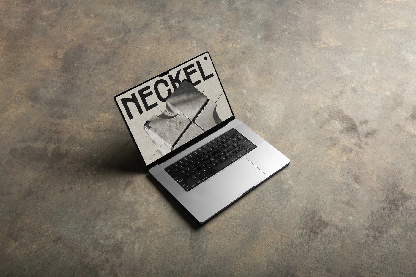
Monga Design created a brutalist visual identity for Neckel Studio. This raw system pairs heavy typography with neutral tones.
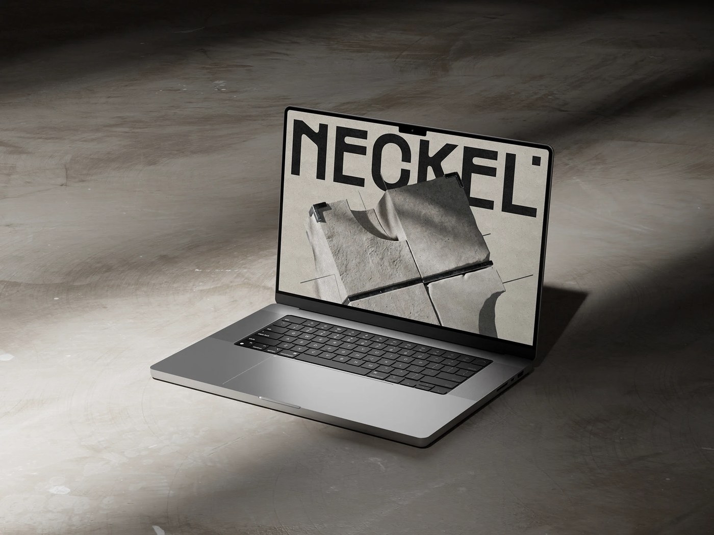
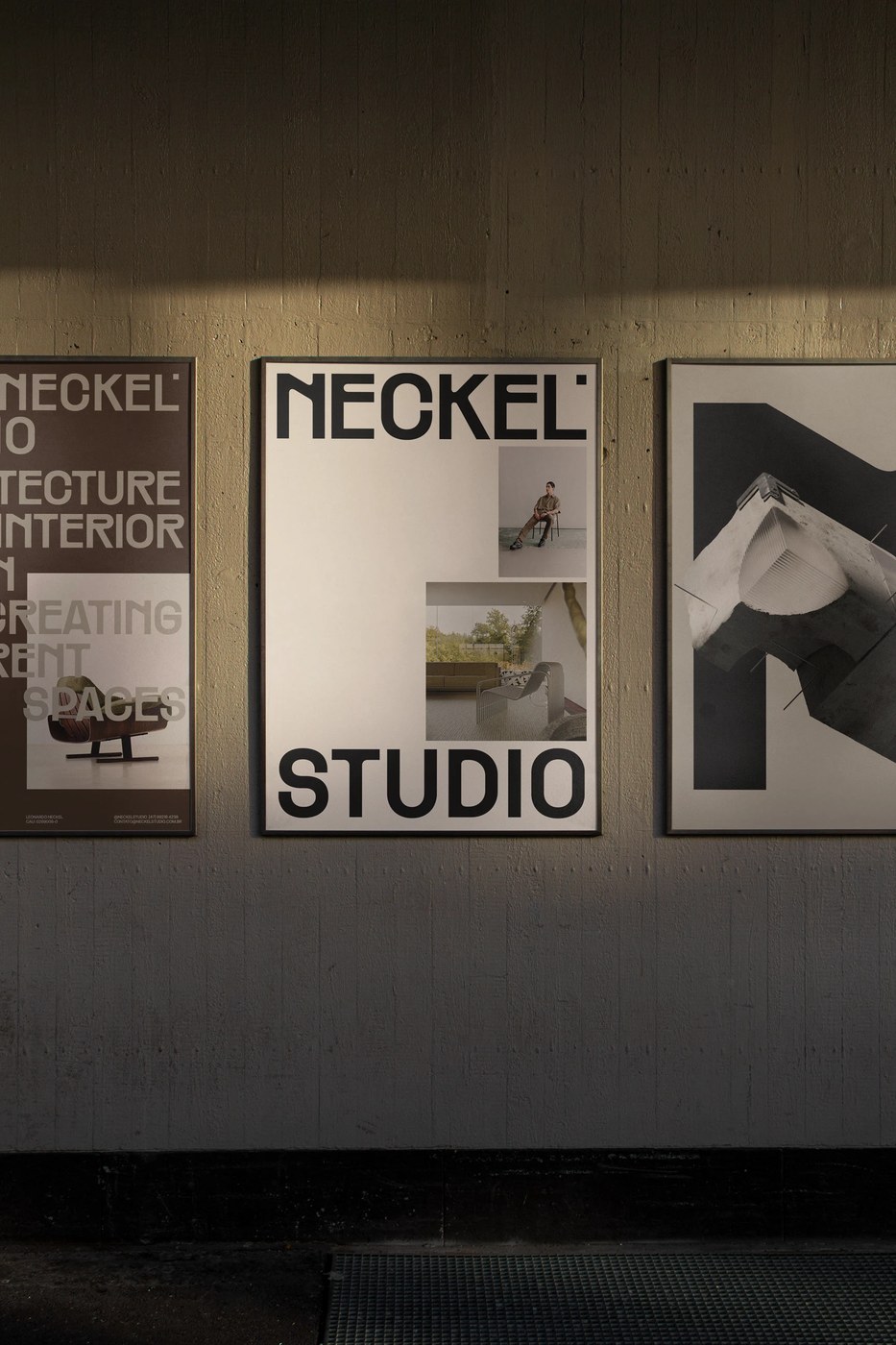
The layout relies on a strict modular grid. Heavy graphic blocks frame the digital content. This choice creates strong compositional tension. Negative space directs the eye to key elements. Stark borders define the clean editorial layout. Each component aligns to a rigid baseline. Raw layout structures project engineering precision. The visual system rejects unnecessary decoration. It relies instead on structural hierarchy. Asymmetrical alignments create dynamic pages. This framework ensures consistent scaling. The elements fit together like architectural blocks. Stark grid lines guide the user journey. The resulting layout feels stable and robust.
Applying a Brutalist Visual Identity
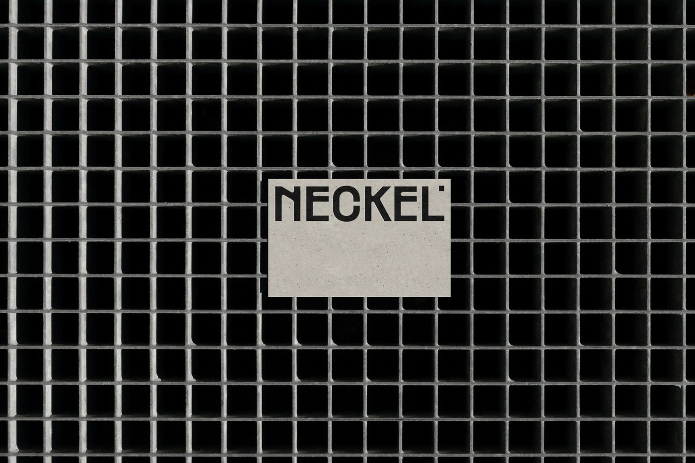
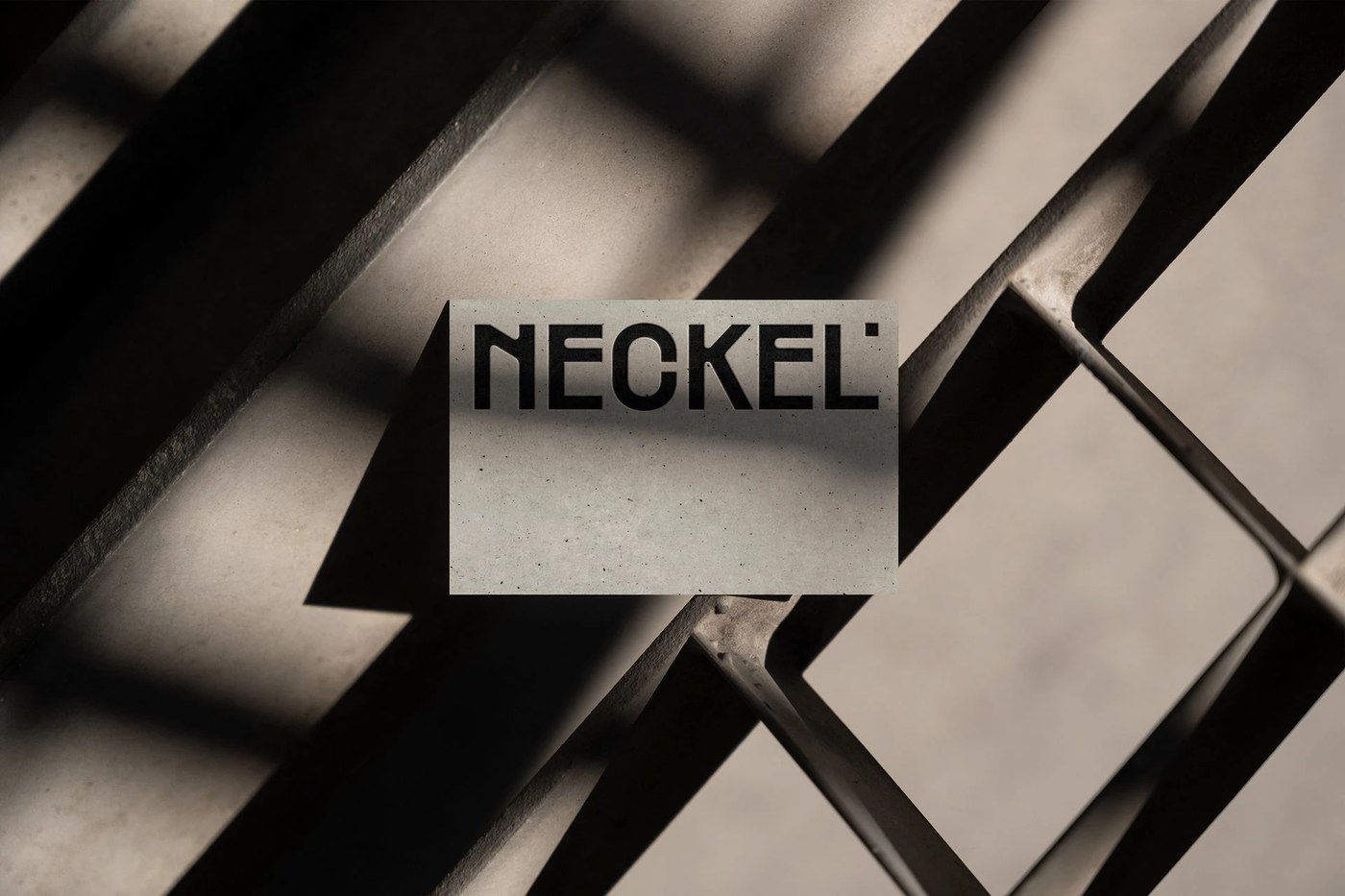
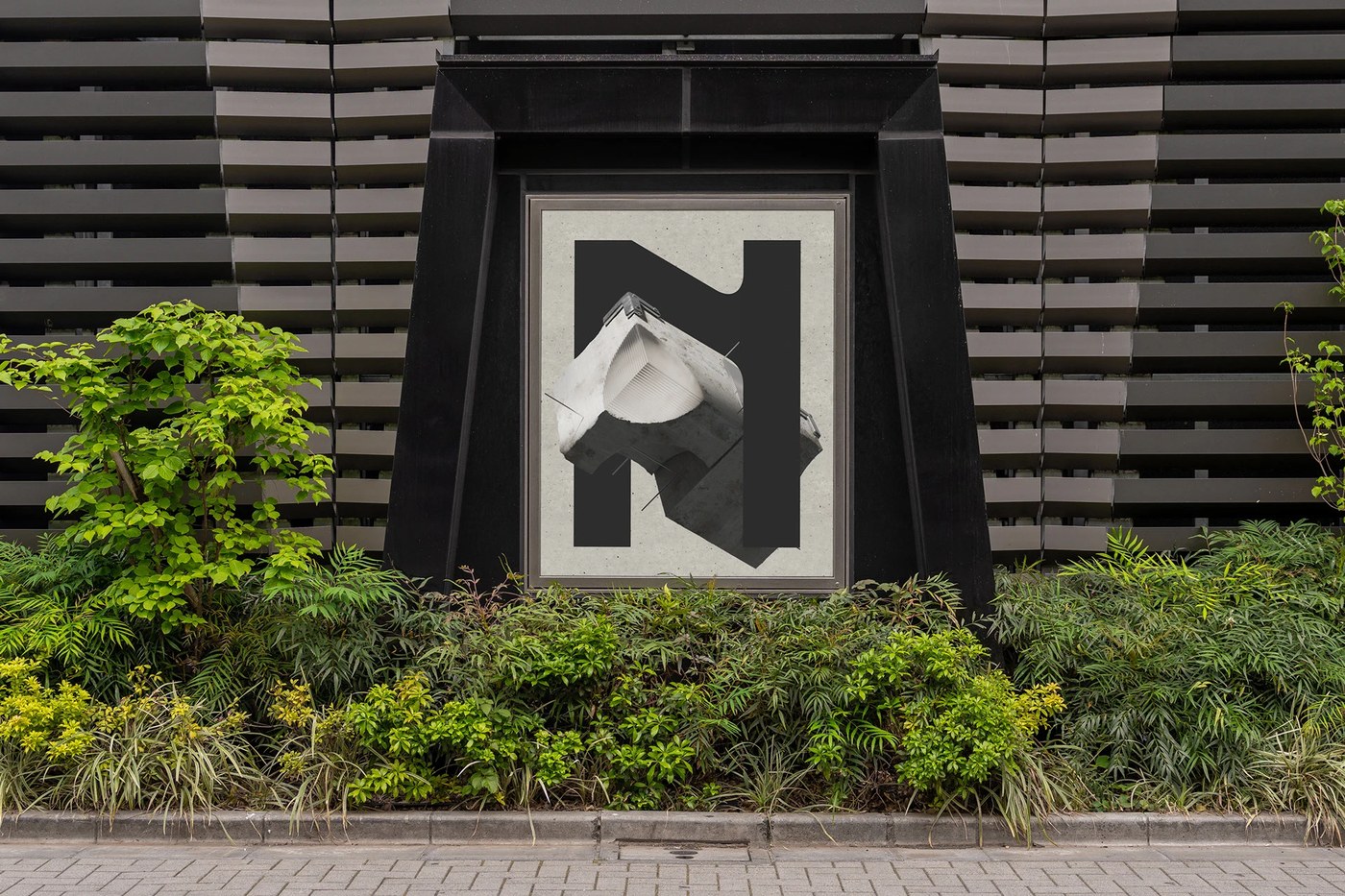
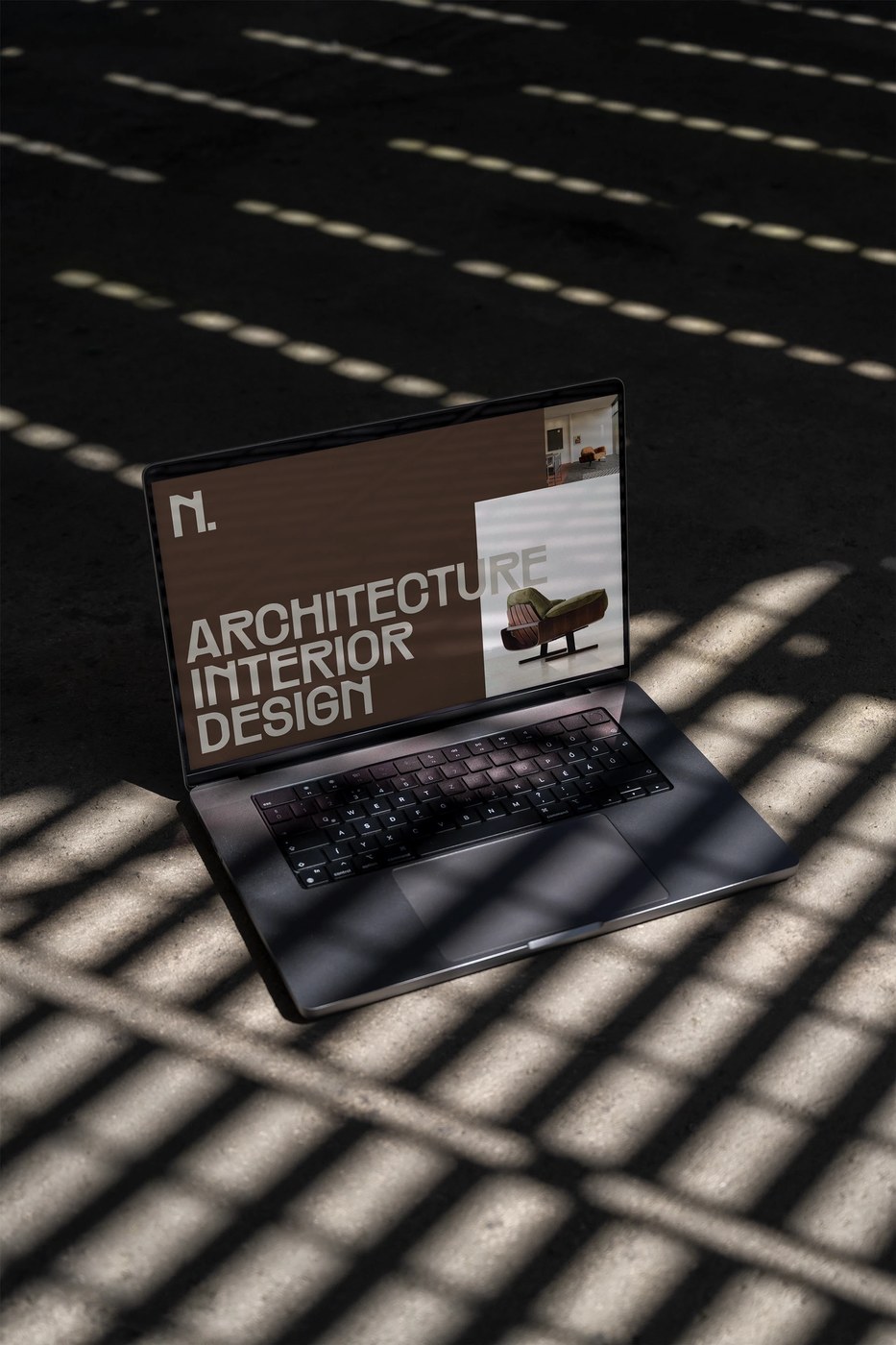
The brutalist visual identity utilizes high-contrast sans-serif letterforms. This choice projects strength and reliability. Typographic scaling creates a clear hierarchy. Large headlines dominate the page space. Small metadata blocks balance the composition. The color system employs a stark neutral palette. Off-white, gray, and deep charcoal define the brand. This chromatic restraint feels modern and clean. It allows the typography to act as visual art. Material applications feature tactile paper stocks. Embossed lettering adds a physical depth. Printed folders use heavy cardboards for durability. The texture contrasts with the digital design. This tactile contrast reinforces the brand quality.
Monga Design positions the studio at the intersection of architecture and design. They draw inspiration from brutalist architecture. This style values honesty in materials. The branding reflects this architectural philosophy. It projects stability, structure, and order. Many modern brands prefer decorative styles. In contrast, Neckel embraces geometric restraint. This design language communicates technical expertise. It appeals directly to architecture professionals. The studio establishes a highly professional presence. This positioning sets them apart in their field. It builds trust with corporate clients. The identity proves that minimalist systems can command attention.
View more work on the Behance page of Monga Design.