Dashboard UI Design: Bakker's Inn by Dnyanesh Maid
Bakker's Inn by Dnyanesh Maid is a dashboard ui design project featuring modular analytics widgets and clean data visualization.
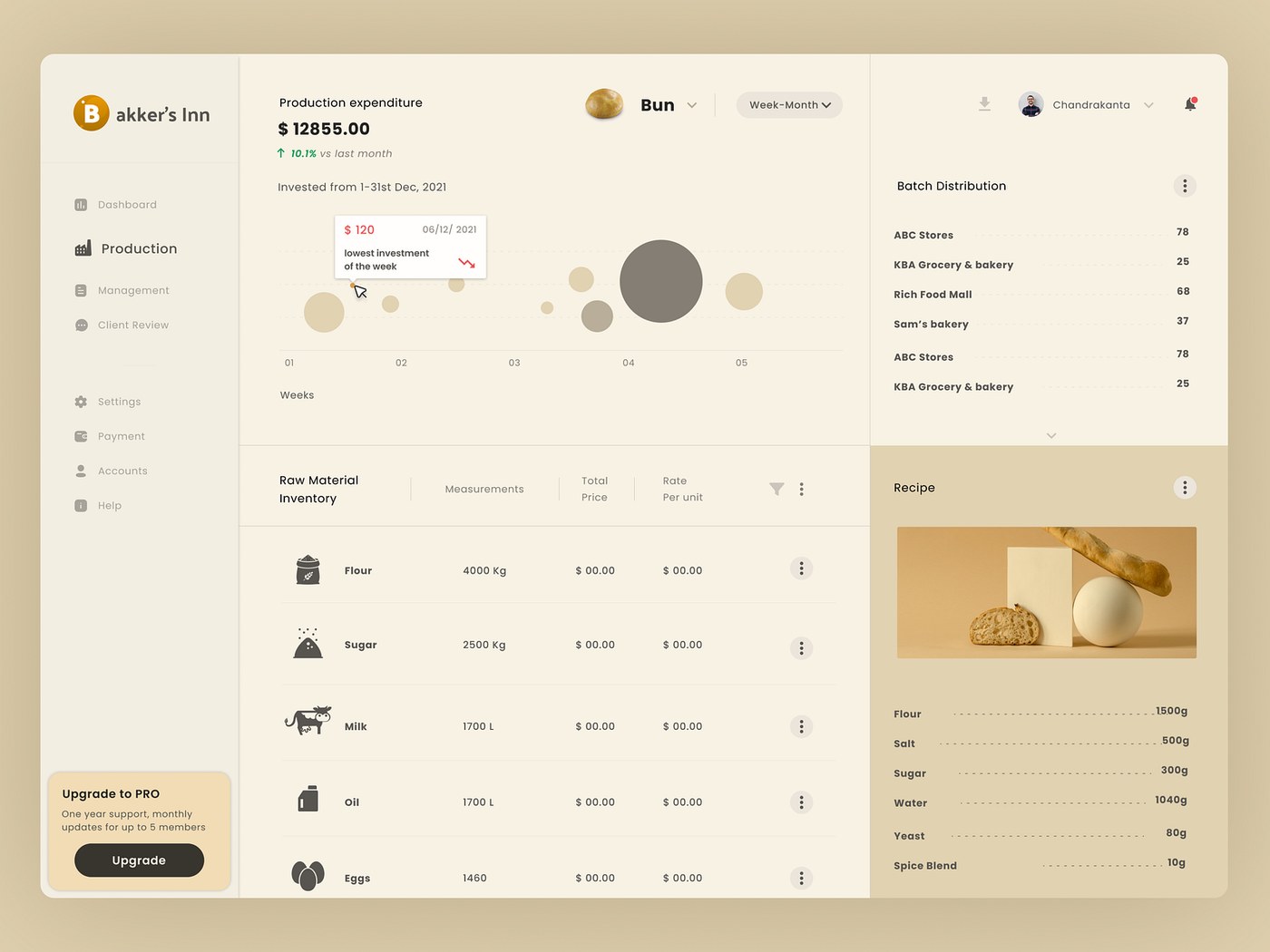
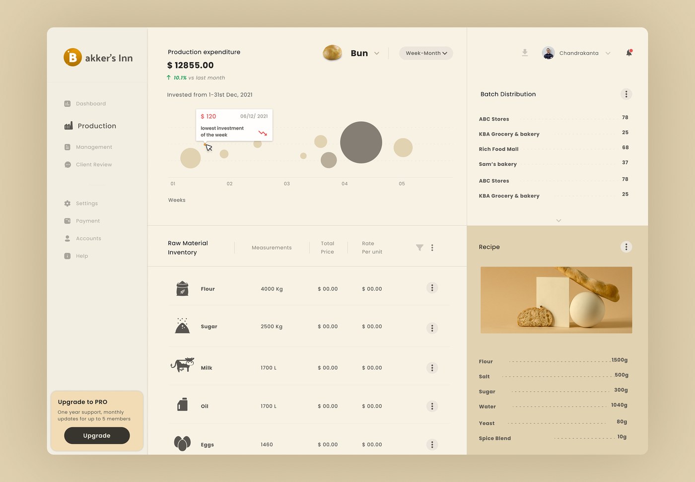
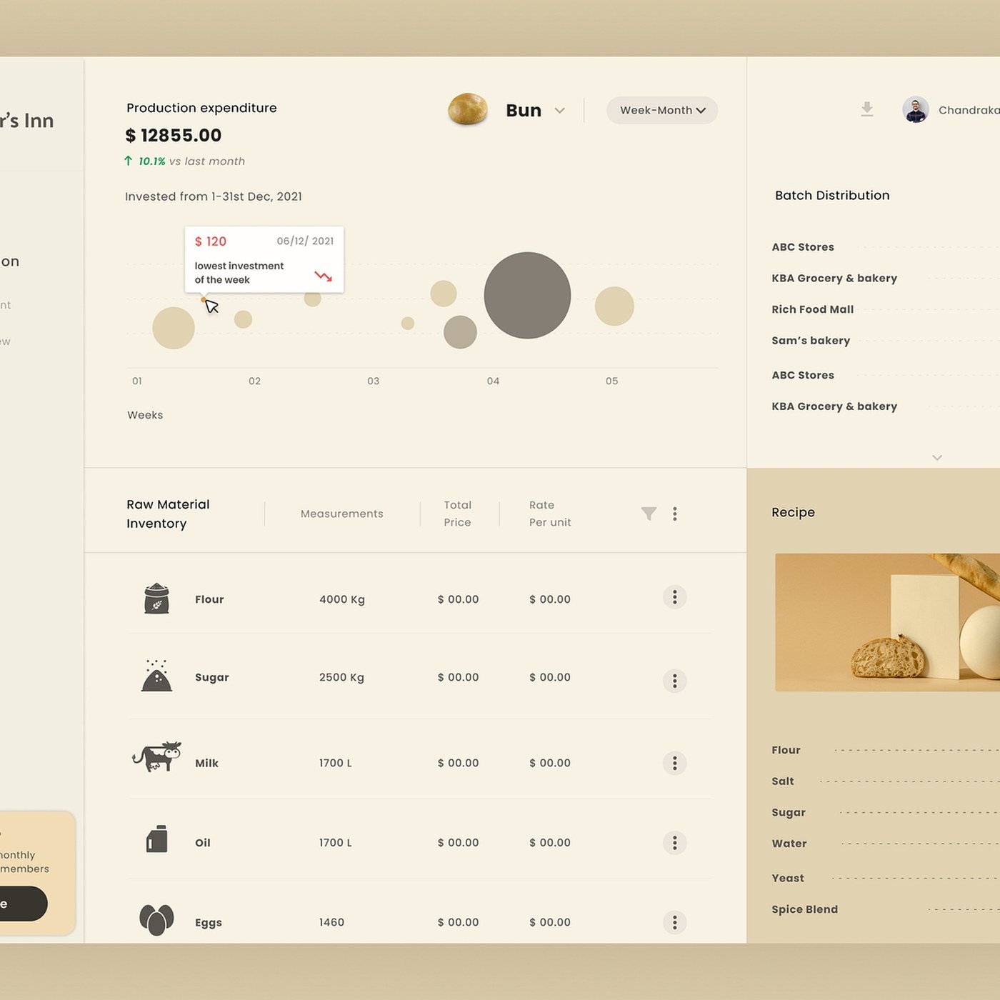
Dnyanesh Maid developed the management portal, custom analytics widgets, and operational interface for Bakker's Inn, organizing complex business metrics into a clean, modern SaaS layout. The visual language centers on structured grid modules, high-contrast numerical metrics, clear visual hierarchy, and dark slate background tones. Across financial overviews, booking schedules, revenue analytics, and inventory trackers, crisp sans-serif typography and letter-spaced metadata communicate real-time clarity. The color palette balances deep charcoal backgrounds, warm amber accents, and neutral grey card containers, creating an efficient workspace for daily hospitality operations.
Dashboard ui design and modular interface hierarchy
At the foundation of this dashboard ui design is a disciplined component grid engineered for multi-column responsiveness, flexible layouts, responsive breakpoints, and quick data scanning. By establishing rigid alignment boundaries and clear padding systems, Dnyanesh Maid allows negative space and letterform geometry to guide visual pacing across dense financial summaries, table views, transaction logs, and reservation calendars. Scale contrasts between heavy metric indicators, section headings, status labels, and micro metadata are calculated to maintain structural harmony without clutter. The resulting dashboard layouts present operational data with exceptional visual legibility, demonstrating how modular grids organize complex web applications.
Across desktop browser viewports, tablet control screens, and mobile management dashboards, the interface demonstrates how systematic digital design transforms complex administrative tasks into an intuitive, user-friendly experience. Custom data visualization charts, status indicator badges, action buttons, dynamic filter menus, and streamlined navigation sidebars ensure that key performance metrics remain immediately accessible. Careful attention to padding, elevation shadows, contrast ratios, micro-interactions, and touch-friendly controls ensures that functional components carry equal weight with the typography. This execution sets a strong benchmark for contemporary enterprise dashboard design.
See the full project by Dnyanesh Maid on Dribbble.