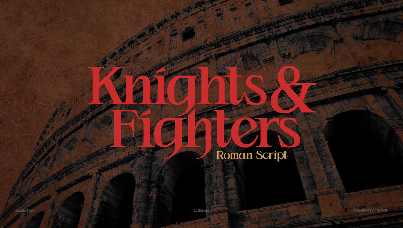
Typography: Knights & Fighters Typeface by Noodle Wang
Explore Knights & Fighters typography by Noodle Wang, blending classical Roman proportions with sharp high-contrast serifs and Gothic details.
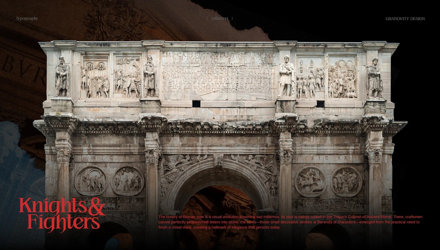
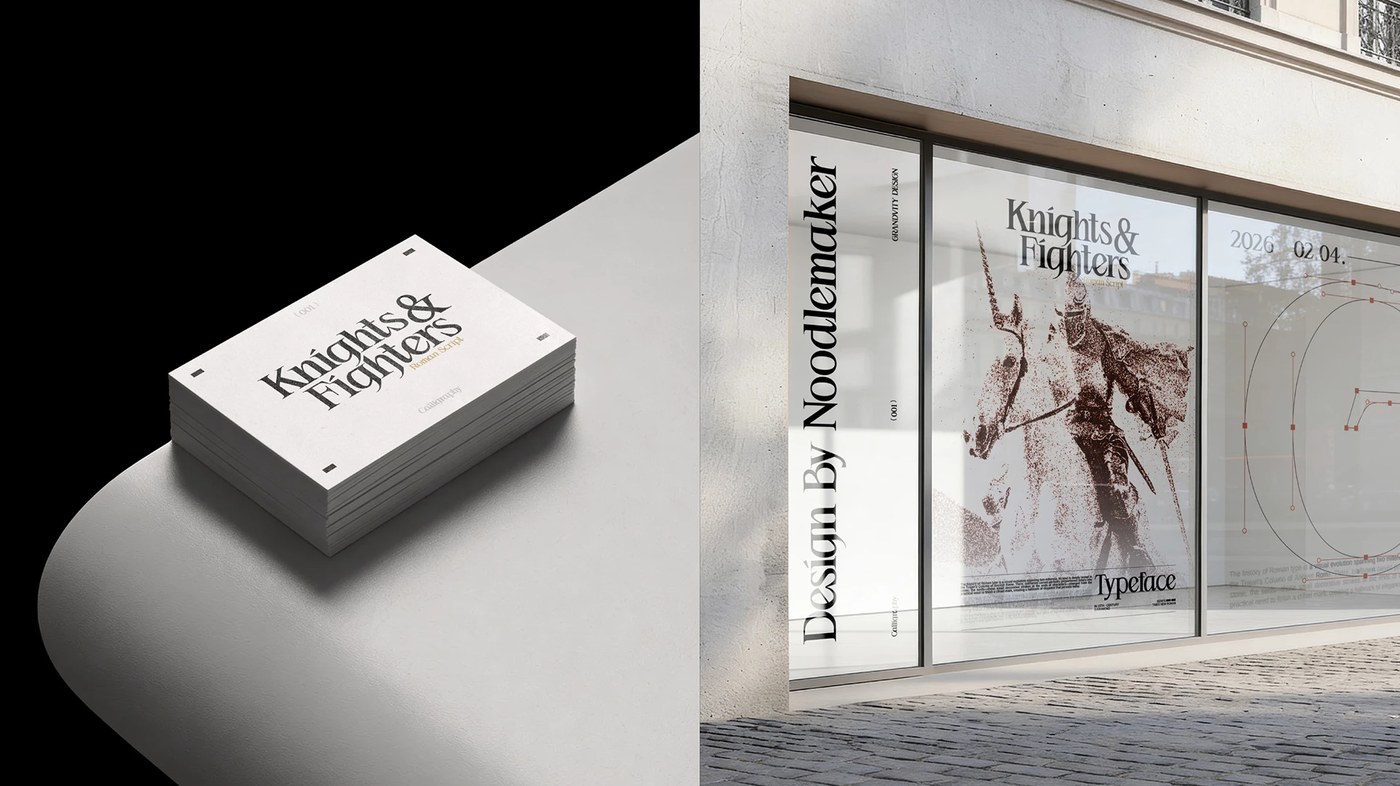
Created under his artist imprint Noodlemaker, type designer Noodle Wang developed this typography release to examine how enduring historical forms converse with contemporary subcultures. The glyph architecture traces its lineage back to the inscriptional capitals of Trajan's Column from 113 AD, dissecting two millennia of Roman lapidary proportions. Rather than executing a literal historical revival, Wang deconstructed classical geometry to inject aggressive modern tension. The heavy vertical stems evoke solid plated armor, while razor-thin hairlines and acute terminal spikes slice across the counters like sharpened blades. The resulting glyph system balances rational imperial order with fierce graphic rebellion.
Roman Proportions and Modern Typography Anatomy
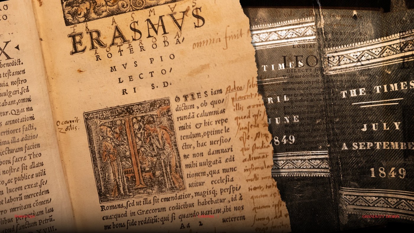
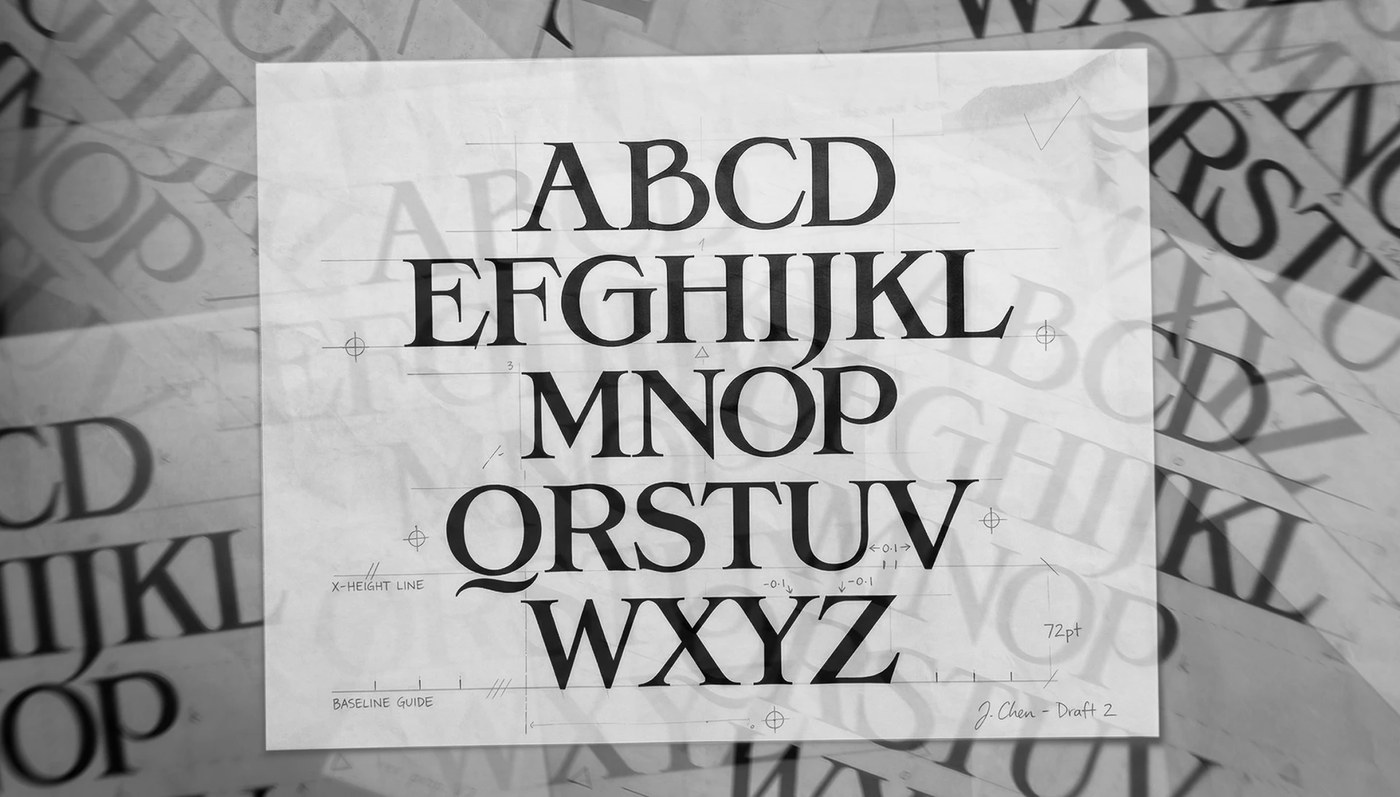
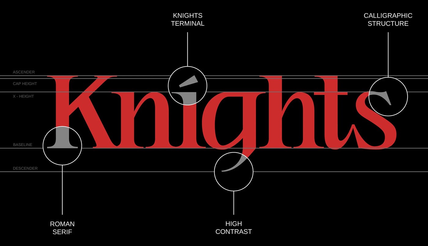
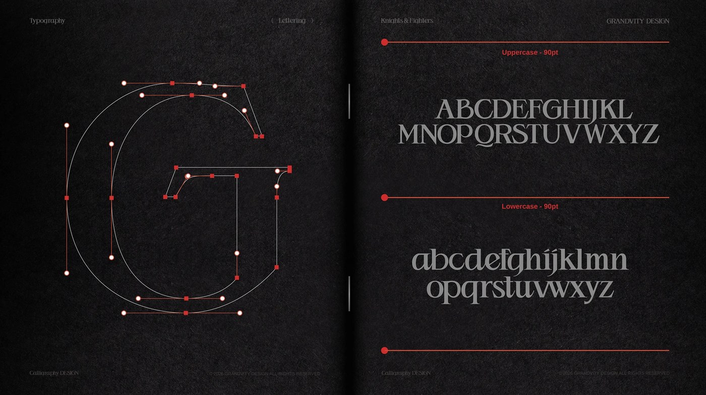
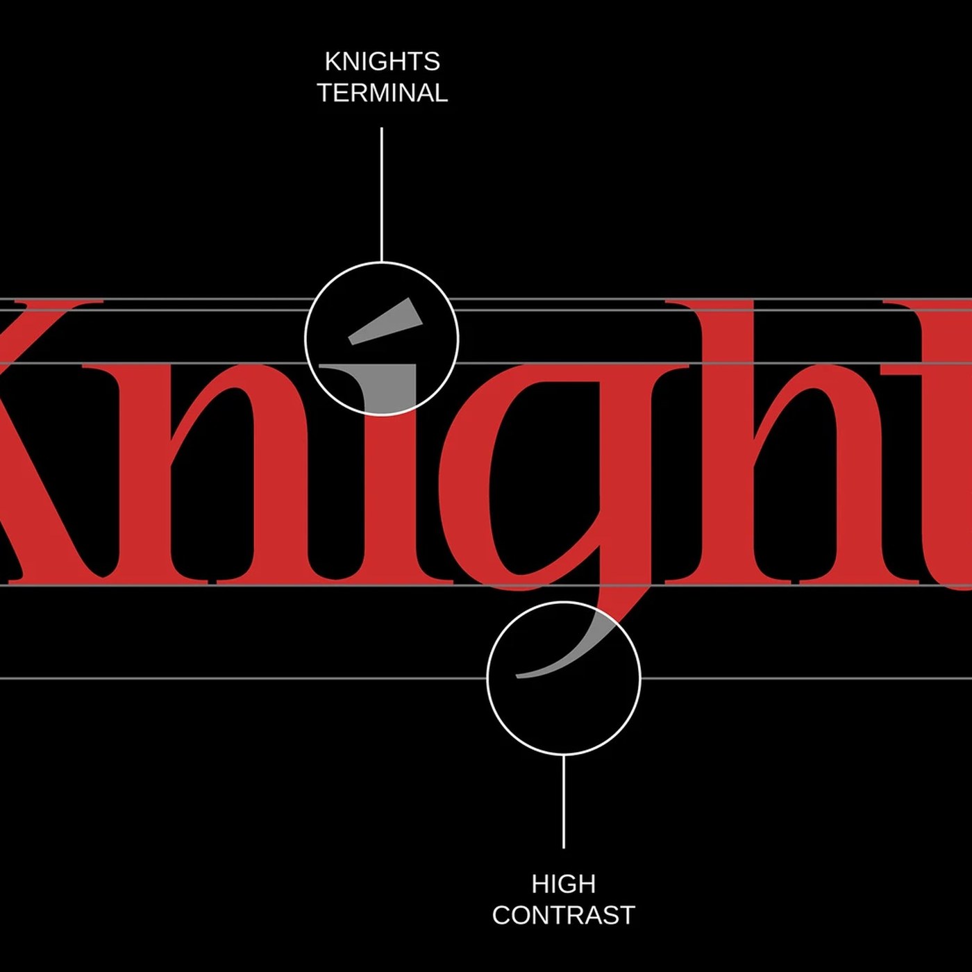
The typography achieves dramatic visual tension through extreme contrast ratios and sharp triangular serifs. Wang looked beyond conventional Roman models, absorbing geometric ornamentation and vertical density from Northern European Blackletter manuscripts. Inscriptional curves transition abruptly into acute angles, generating dynamic negative space inside circular counters like O and C. The diagonal strokes of letters such as K, R, and X culminate in chisel-edged terminals that ground each glyph firmly on the baseline. Across editorial specimen books, hardbound monograph covers, and archival print sheets, the letterforms function as monumental graphic monoliths rather than neutral text carriers.
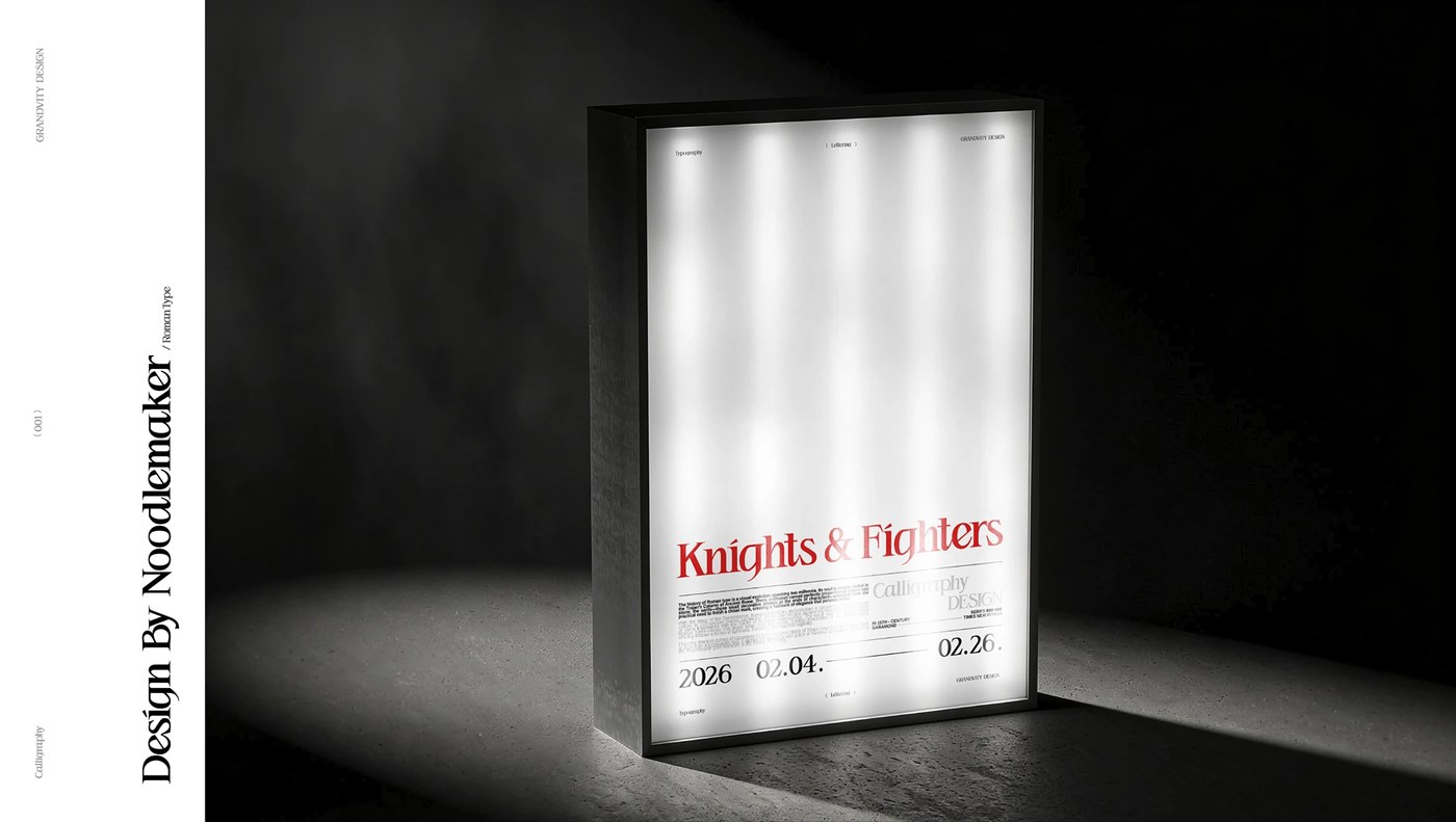
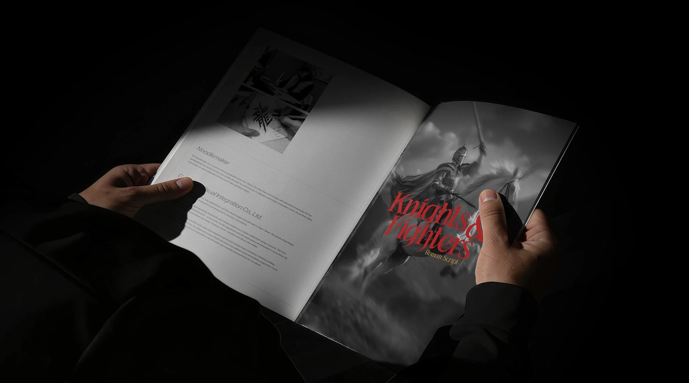
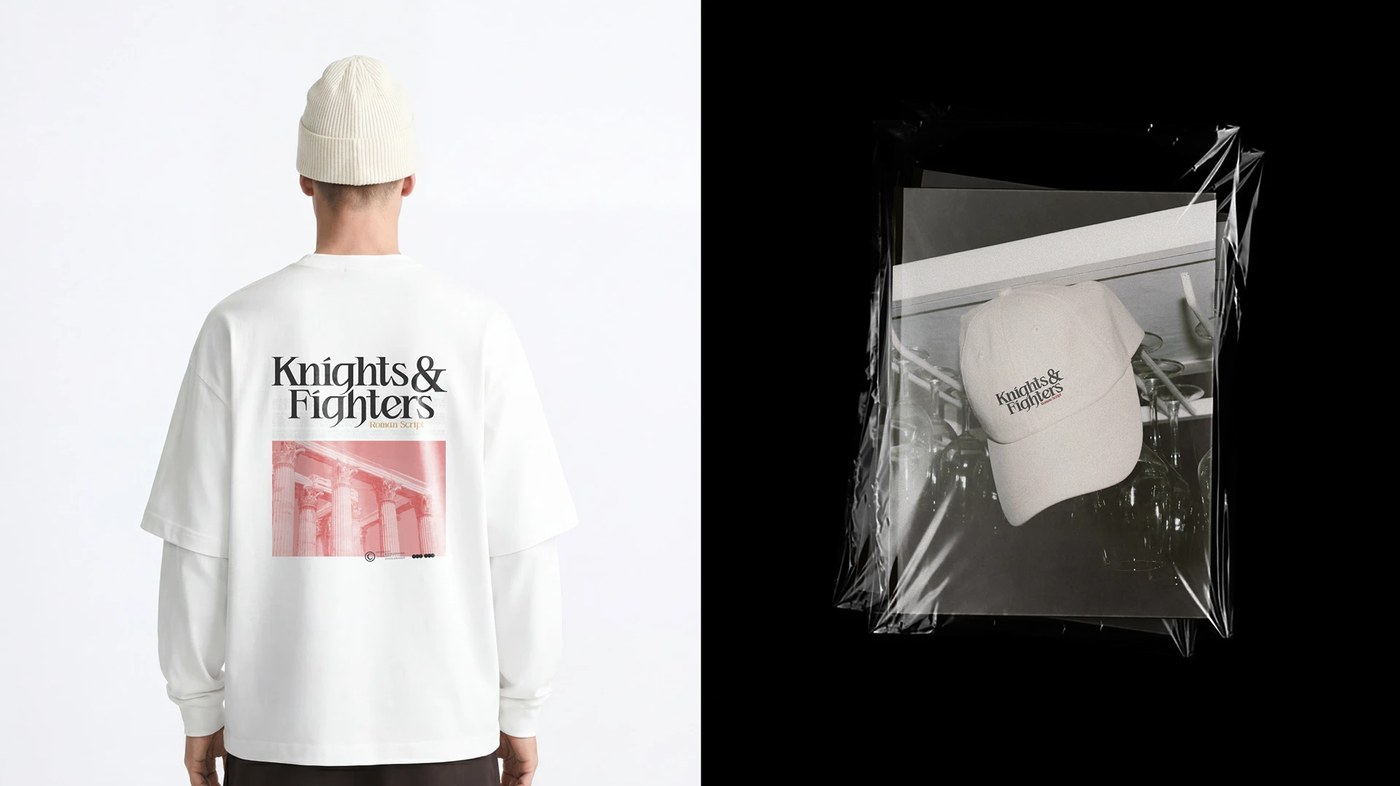
Produced in collaboration with Grandvity Design, the release explores tactile applications across physical media. Letterpress proofs on textured paper stock accentuate the razor-sharp serif transitions, allowing deep ink bite to emphasize stroke weights. Woven garment patches and embroidered apparel details translate the vector precision into tangible thread relief. Working across specialized type design software, Adobe Illustrator, and InDesign, the studio crafted a cohesive typographic ecosystem. This typography specimen proves that historical letterforms remain fertile territory for experimental design, offering creative directors a formidable display voice that bridges ancient masonry and modern editorial grit.
See the full project by Noodle Wang.