Snarkitecture crafts portal-inspired packaging for Bowmore’s 20-year-old whisky collection
The release of the Bowmore Captivo Collection marks New York-based practice’s first foray into whisky packaging. The collaboration brings the studio’s focus on spatial experience and threshold-crossing – normally seen in their immersive, monochromatic architectural installations – to Scotland’s second-oldest licensed distillery.
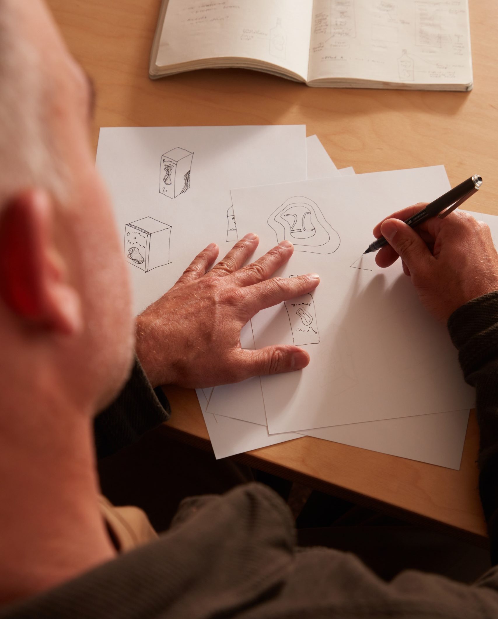
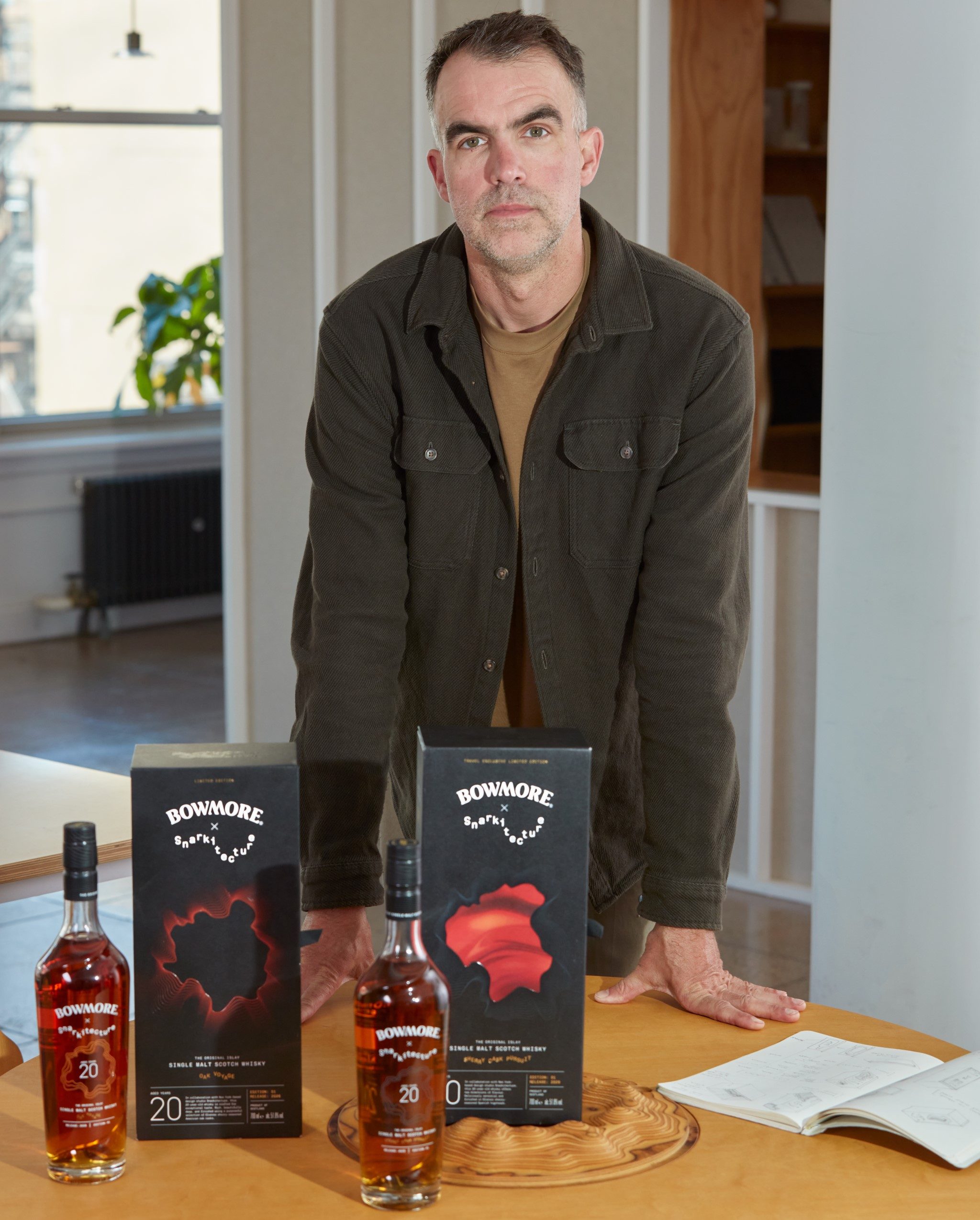
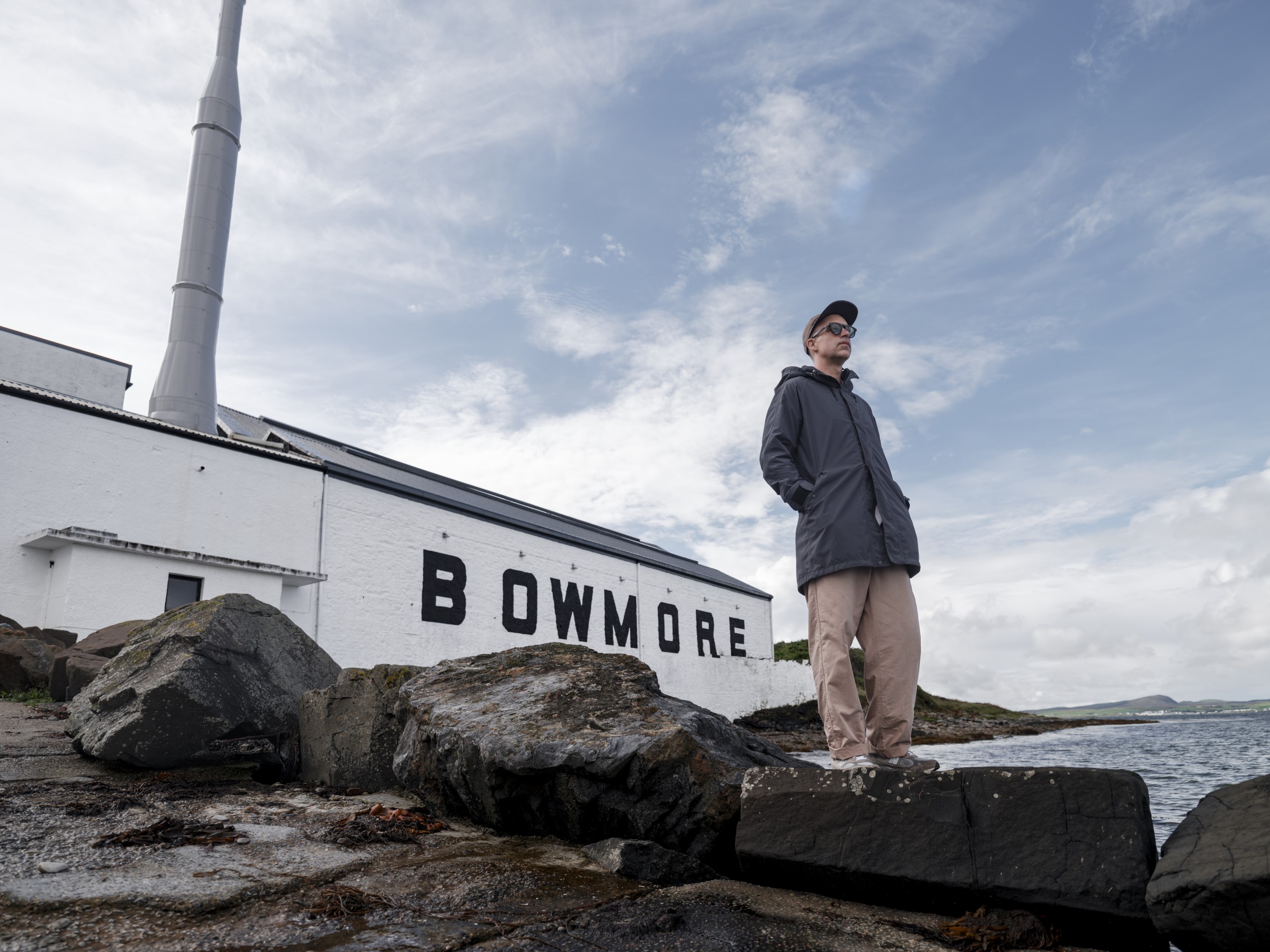
Snarkitecture co-founder Alex Mustonen developed the concept following a trip from New York to Islay, drawing inspiration from the natural topography of the island and the dark interior of Bowmore’s No. 1 Vaults maturation warehouse. The artwork translates these influences into layered, portal-like graphics etched across the bottles and presentation boxes.
Mustonen said, ‘Stepping into the world of whisky is a first for Snarkitecture. I drew similarities between how Bowmore’s whisky is made, and how I approach an architectural environment. In architecture, spaces and objects invite people to look again and question their assumptions. I discovered whisky-making shares a similar philosophy, rewarding time, patience, and curiosity.’
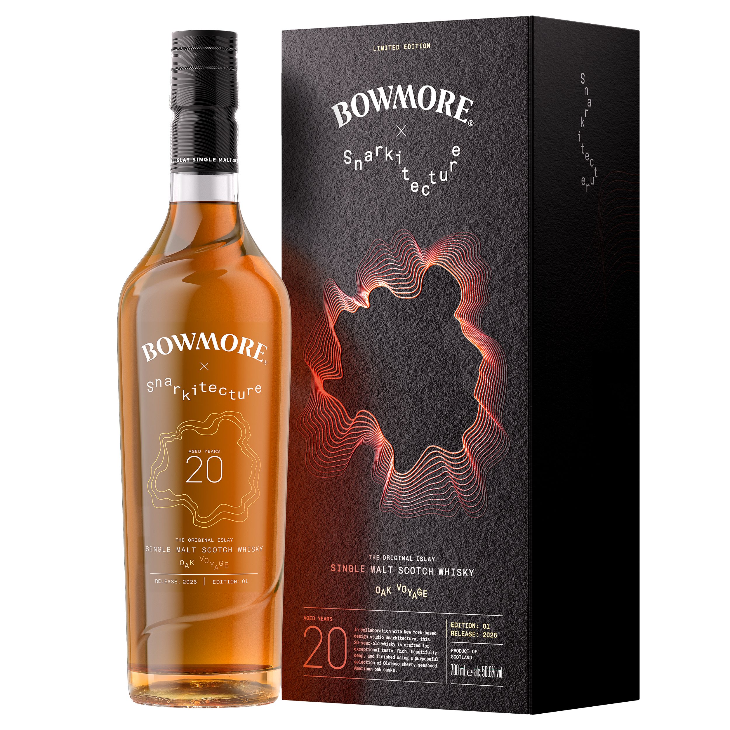
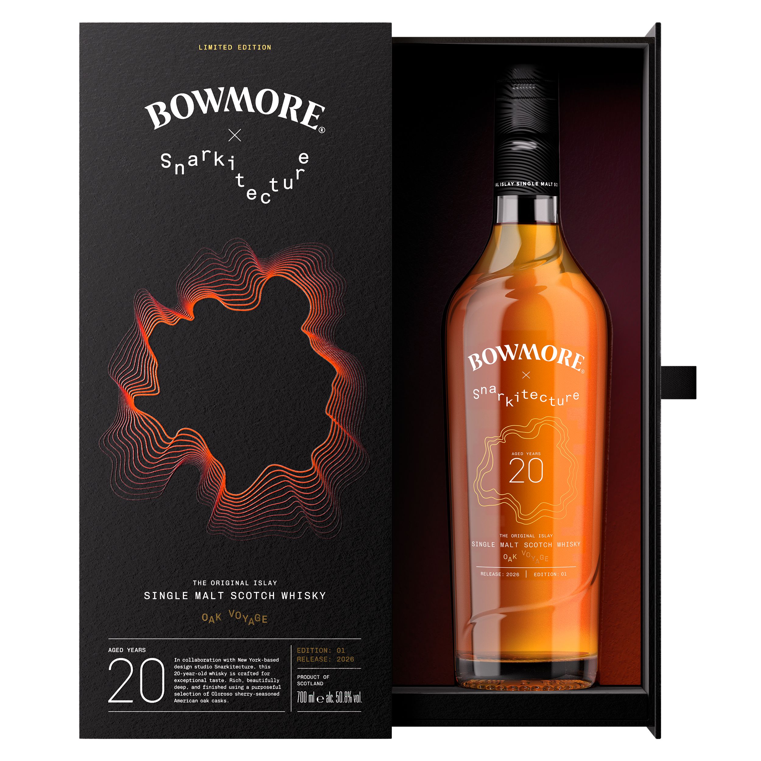
The collection comprises two distinct bottlings paired with customised visual motifs that reflect their cask lineage. Bowmore Captivo Oak Voyage features fine contour lines echoing the ringed grain of oak and the passage of time across its 20-year maturation in American oak ex-bourbon casks and Oloroso sherry butts.
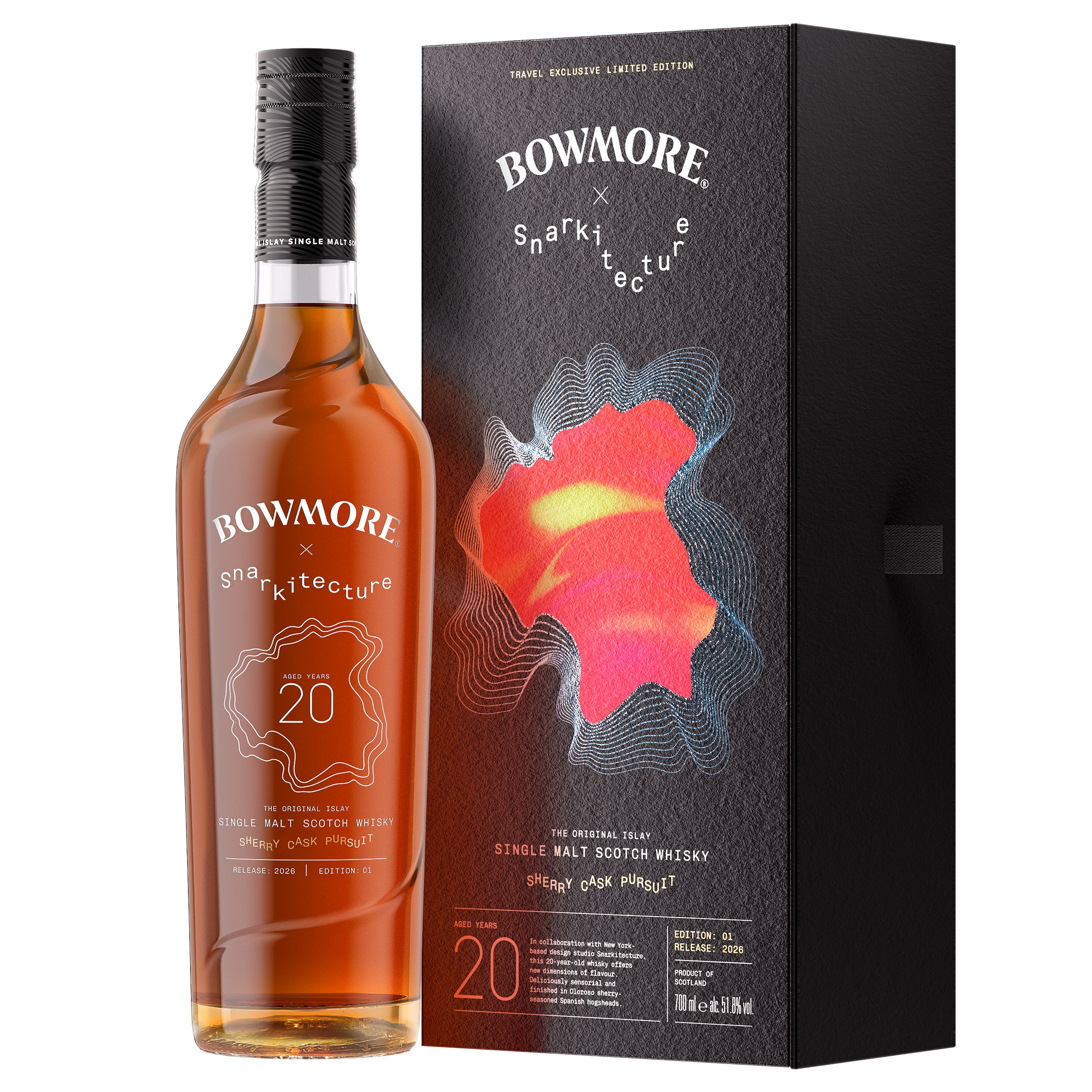
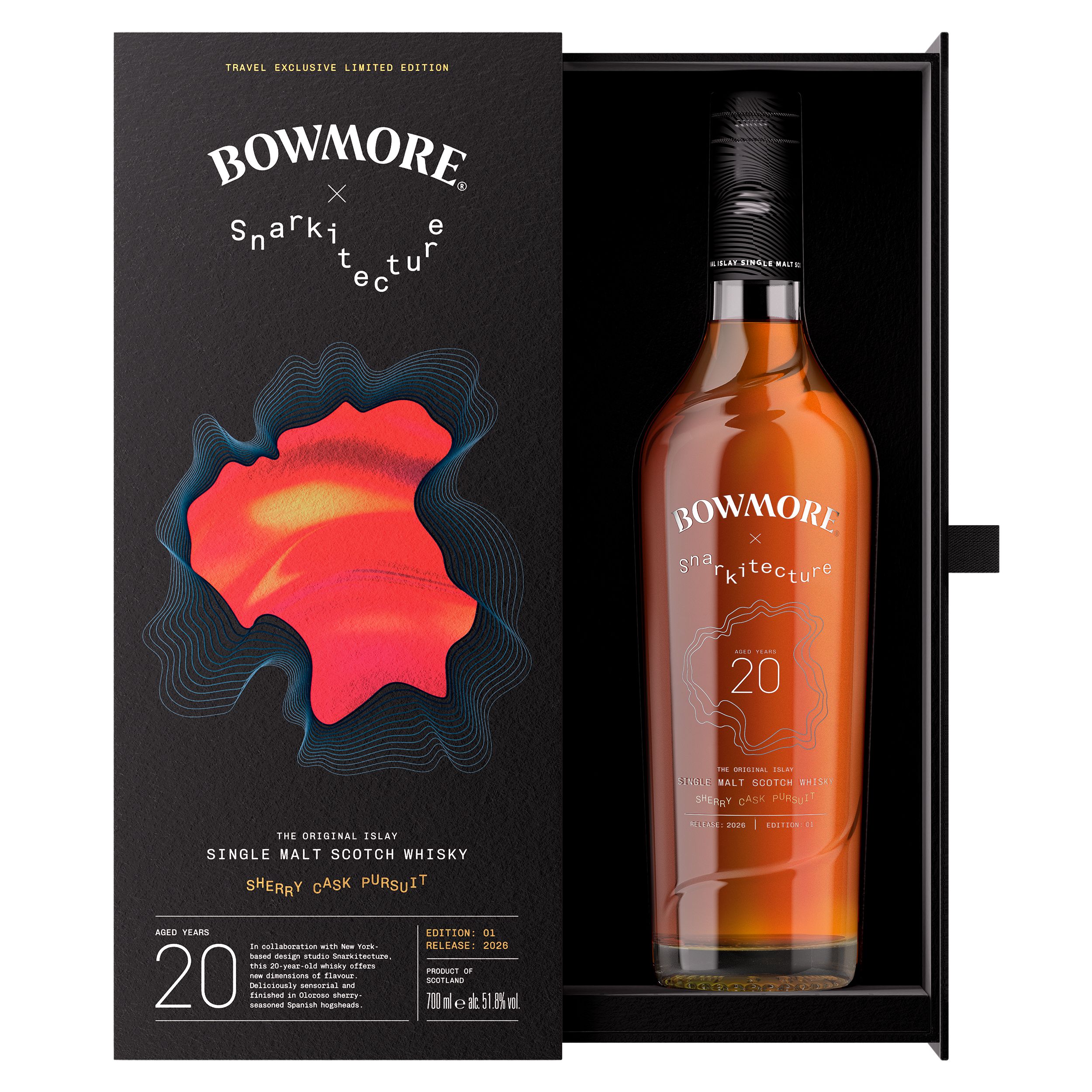
Bowmore Captivo Sherry Cask Pursuit – a global travel retail exclusive – uses dynamic, heat-map-like visual layering in warm palette hues to evoke Spanish bodegas and its Oloroso sherry hogshead finish.
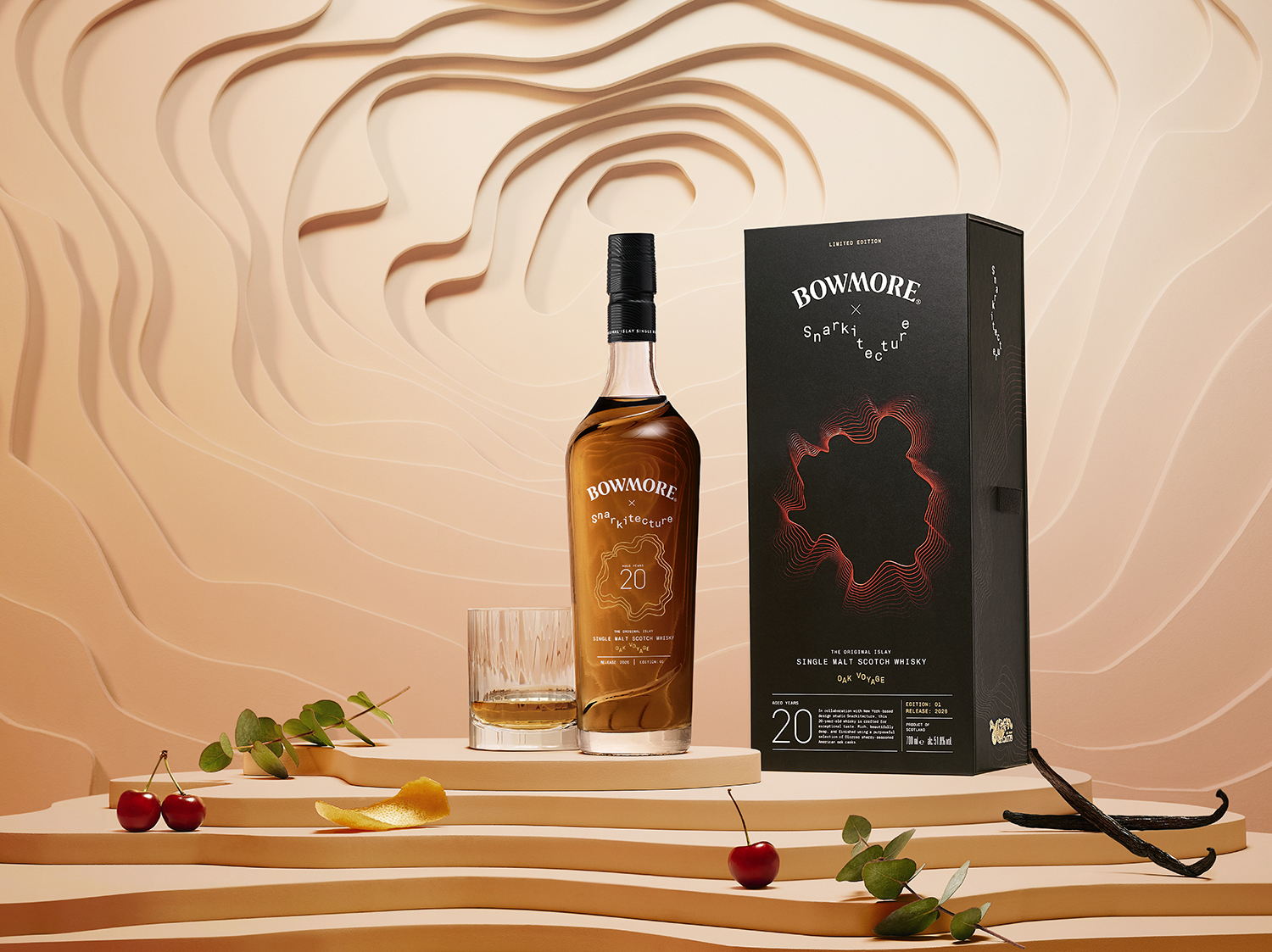
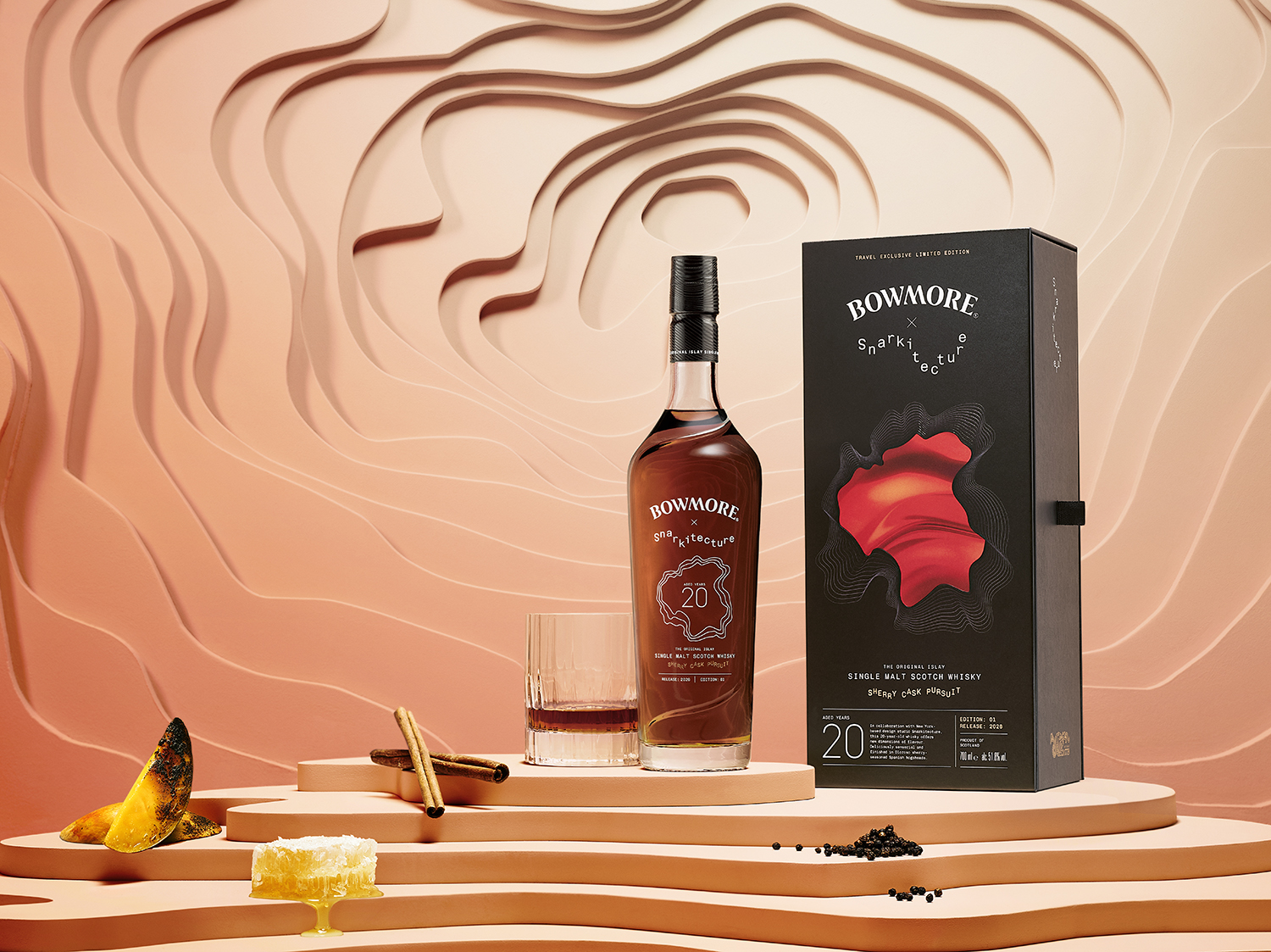
Dr Calum Fraser, master blender at Suntory Global Spirits, said: ‘These beautifully aged whiskies are intentionally designed to reward exploration and reveal layers of flavour over time. While Bowmore’s signature style remains at their heart, balancing citrus, sweetness, and delicate smoky notes, each expression showcases the influence of different oak casks in a distinct way. Snarkitecture has captured that sense of discovery brilliantly, creating designs that express the individuality of each whisky, while remaining true to Bowmore’s heritage.’
The Bowmore Captivo Collection Oak Voyage is priced at £312 ($360) and is available via Bowmore’s website, with a UK retail rollout at Harrods scheduled for 1 September. Bowmore Captivo Sherry Cask Pursuit is priced at £320 ($380) and will launch across select global travel retail outlets later this year.