Branding Design: EllisDon by Underline Studio
EllisDon by Underline Studio is a branding design project pairing heavy civil infrastructure with modular print collateral and Swiss typography.
Toronto-based Underline Studio took on the challenge of refreshing the visual communications for EllisDon, a global construction and building services company executing more than $3.5 billion in annual contracts. To communicate the specialized capabilities across varied operating divisions, the studio established a disciplined print framework debuting with the EllisDon Capital division. The visual language hinges on a striking dialogue between high-contrast architectural photography and generous white space. Cover spreads present rich wood spirals and aerial transit corridors, punctuated by vertical white title typography and crisp cerulean blue callout tags that direct the reader's attention without visual clutter. Through this rigorous branding design strategy, complex financial advisory and public-private partnership capabilities become immediately accessible.
Stepped insert systems and corporate branding design hierarchy
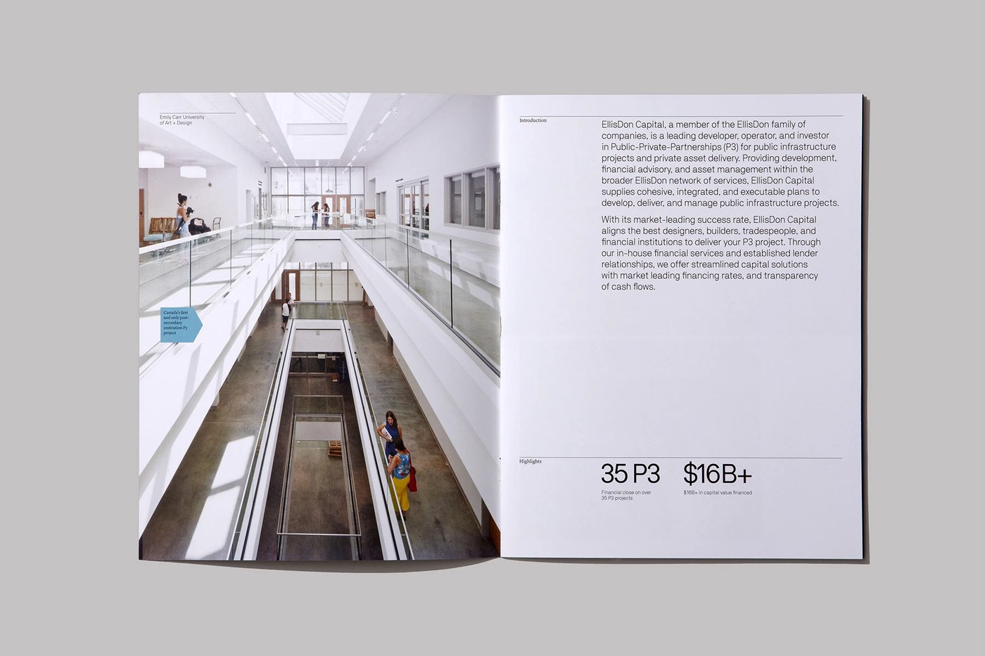
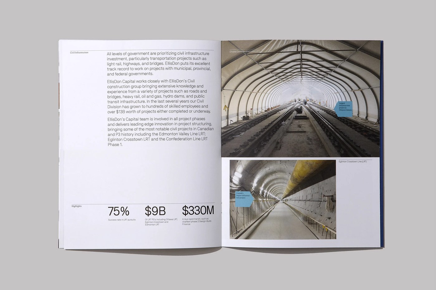
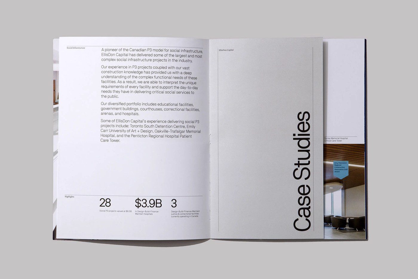
The interior grid architecture utilizes asymmetrical layouts that balance dense technical data against uncluttered reading margins. Underline Studio structures each spread with precise baseline alignments, pairing clear category headers like “Civil Infrastructure” and “Social Infrastructure” with prominent typographic data points. Monumental numeric figures such as “35 P3” and “$16B+” anchor the lower quadrants beneath fine horizontal hairline rules. A defining structural element within this branding design system is the use of stepped insert sheets; narrower divider leaves featuring vertical “Case Studies” lettering reveal underlying case project imagery, creating a tactile tab navigation experience within the publication.
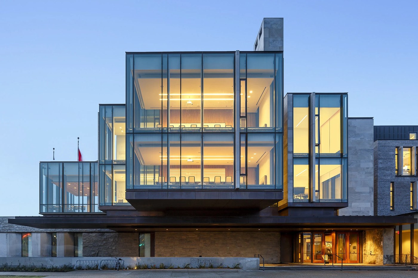
Print production choices reinforce the strength and precision associated with large-scale civil engineering. The brochures employ smooth, uncoated paper stocks that reproduce crisp linework, deep black shadows, and vivid full-bleed project photos of landmark structures like the Emily Carr University of Art + Design and the Richard Ivey Building. By eschewing decorative corporate clichés in favor of Swiss typographic discipline and modular templates, Underline Studio created an enduring branding design benchmark for infrastructure and building enterprise communications.
See the full branding design project by Underline Studio on Behance.