Best of the Week: Tactile Print and Dynamic Type
We gather the best of the week features across branding, packaging, editorial design, and typography from ISO week 2026-W36, spotlighting tactile craft and disciplined visual systems.
This week’s editorial throughline explores the friction between rigid architectural grids and expressive material surfaces. Across type foundry journals, ceremonial packaging, and subterranean spatial systems, designers prioritized tactile print finishes, variable letterforms, and uncompromising layout hierarchies.
Featured Design and Branding Picks
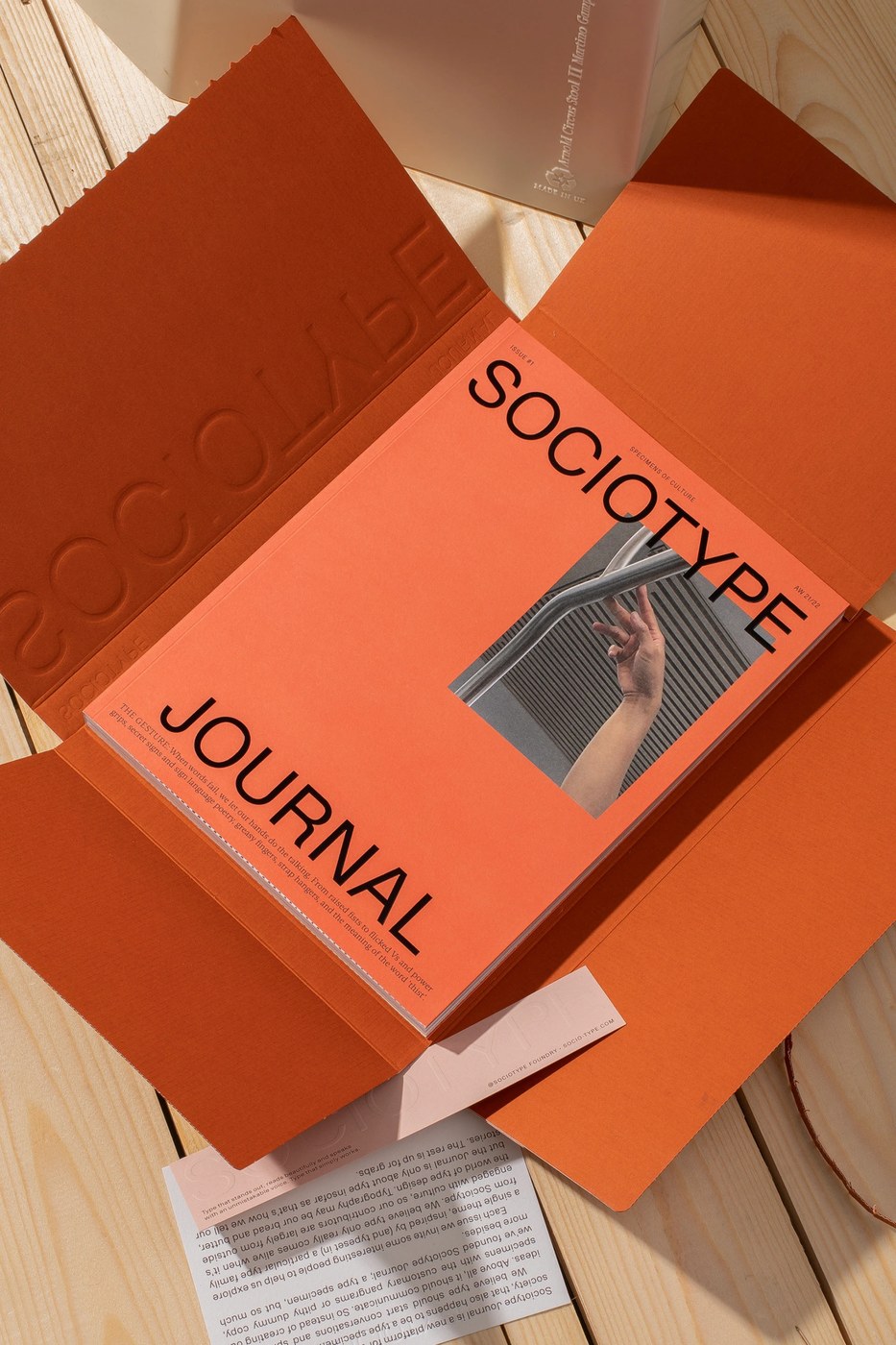
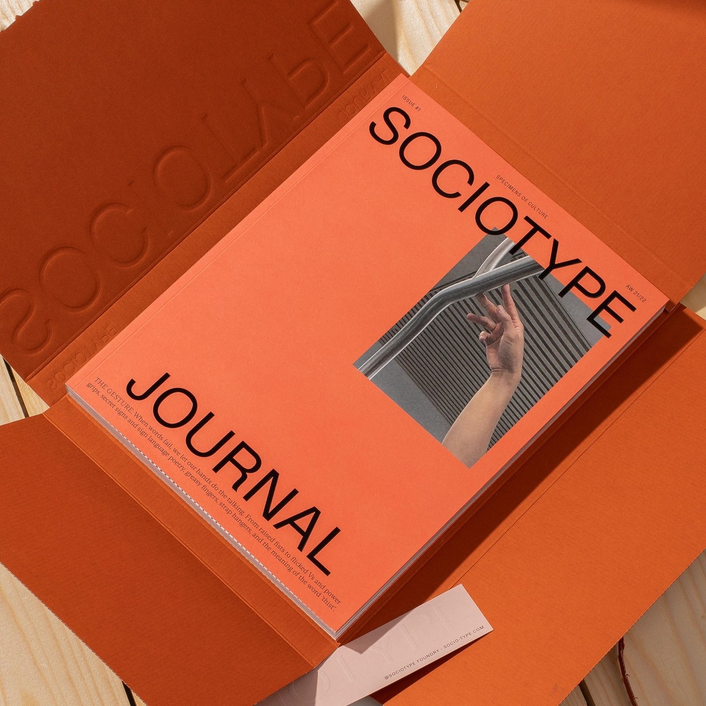
Sociotype Journal Issue 1 The Gesture by Sociotype Foundry
An exceptional study in type specimen publishing that pairs the high-contrast Gestura serif with archival cultural essays. Asymmetrical Swiss grids, section-sewn Fedrigoni FSC paper, and foil-embossed covers demonstrate how type foundries can push physical bookmaking beyond conventional catalogs.
View Feature
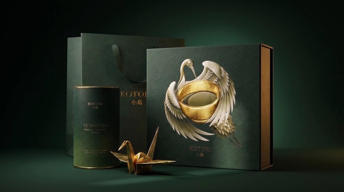
KOTORI Uji Matcha Ceremonial Gift Packaging by Valeriia Löffler
Combines meditative ritual pacing with tactile sumi-e linework and embossed gold foil on forest-green paper. The fan-out deckled-edge Washi paper ritual cards and silk-cradled tea vessels turn unboxing into a quiet physical ceremony.
View Feature
EllisDon Brand Identity by Underline Studio
Brings Swiss typographic discipline to heavy construction and infrastructure. A rigid geometric monogram anchors an expansive system scaling from high-durability job site safety gear and crane signage to dense, multi-column corporate stationery.
View Feature
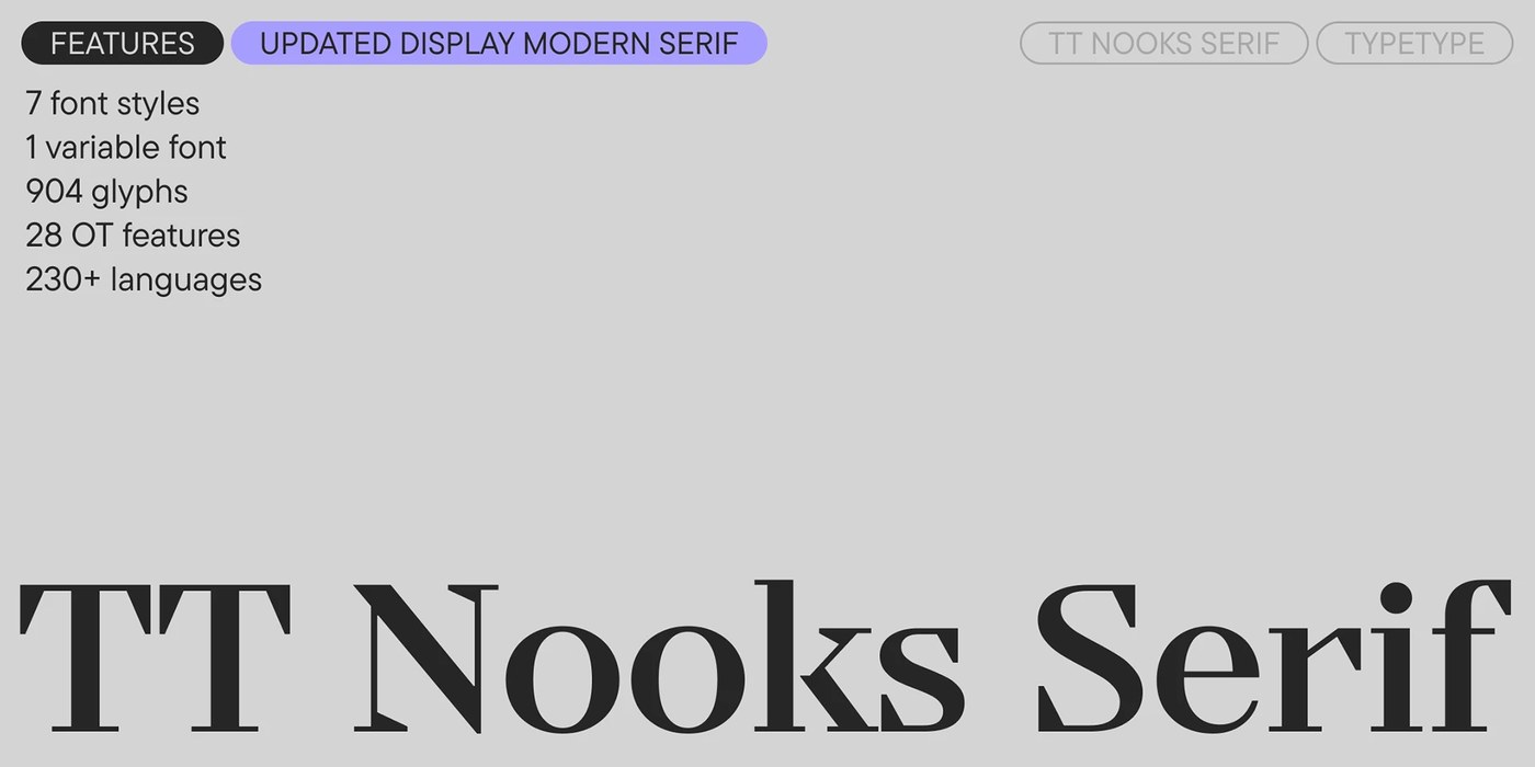
TT Nooks Serif Variable Font by TypeType Foundry
A variable serif balancing classical high-contrast stroke anatomy with seamless digital interpolation. Optical sizing behavior transitions effortlessly from razor-sharp monumental display titling to legible micro-caption footnotes.
View Feature
Eko Health UX/UI Ecosystem by Humbleteam
Bridges physical digital stethoscopes with real-time acoustic telemetry and clinical dashboards. Visualizes phonocardiogram waveforms with high clarity, pairing clinical precision with accessible patient-guided examination ergonomics.
View Feature
Wayfinding System in Silesian Museum by Aleksandra Krupa
Directly integrates environmental signage into the subterranean post-industrial architecture of Katowice. Raw concrete wall stencils, blackened matte steel totems, and minimalist pictograms navigate vast underground gallery spaces without decorative distraction.
View Feature
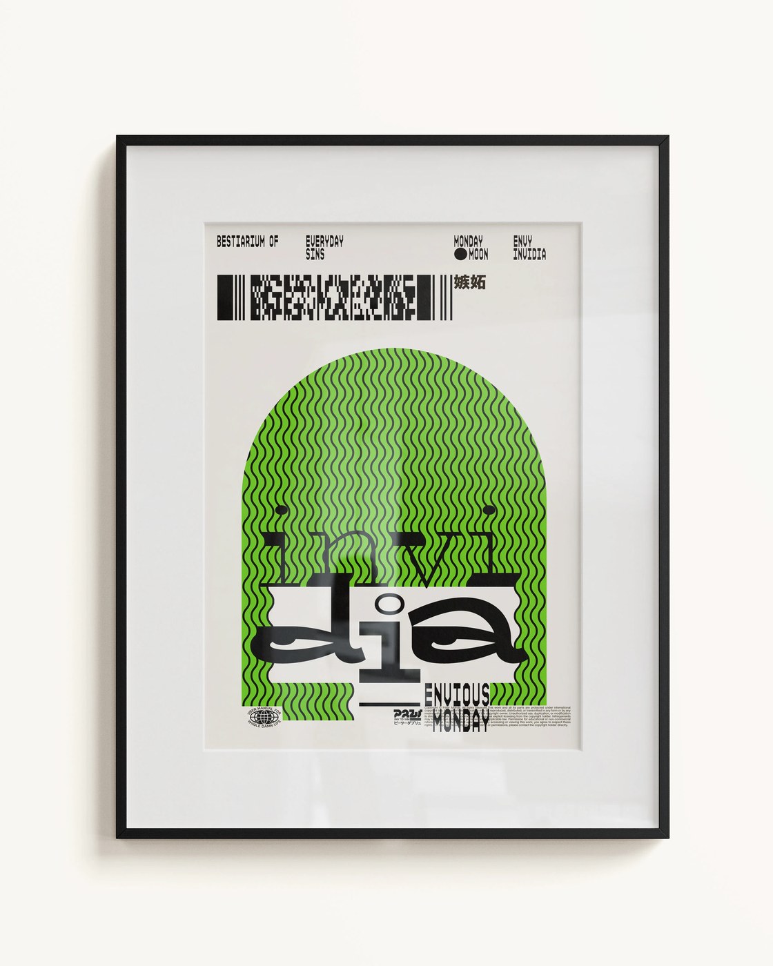
Bestiarium of Everyday Sins by Molnár Péter
Combines dark allegorical woodcut illustration with rigorous Swiss typographic margins and linen cloth hardcover binding. The clash of intricate grotesque linework and stark footnote typography evokes archival medieval manuscripts through a modern lens.
View Feature
Artífice Impares Wine Label Series by Dailos Pérez Studio
Frames experimental micro-parcel winemaking through tactile, textured paper substrates and numbered serial typographic systems. High-contrast typography and subtle blind debossing reflect the dialogue between viticultural tradition and modern cellar experimentation.
View Project
ED Montelure Display Serif by Emyself Design
An evocative display serif marked by elongated vertical ascenders, sharp bracketed serifs, and high stroke contrast. The typeface captures vintage European editorial warmth while maintaining geometric tension across large-scale headline compositions.
View Project
Issue No. 1 Collection of Four Zines by Anastasia Pestriakova
A multi-format publication exploring fragmented identity and memory through four physically distinct booklets united into a single portfolio object. Experimental grid pacing, raw risograph textures, and varied paper trims celebrate tactile print production.
View Project
Next week, we turn our attention to spatial identities and environmental graphic design, analyzing how signage and typographic architecture transform physical spaces.