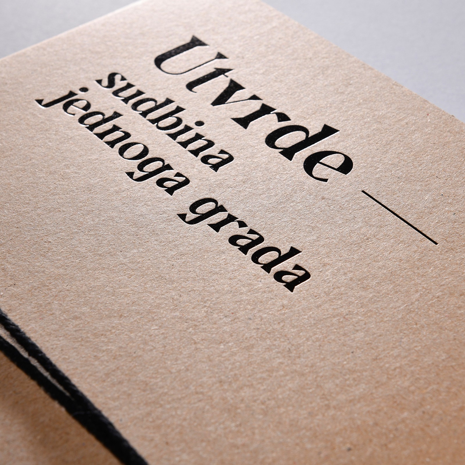
Editorial Design: Fortresses by Studio Tumpić/Prenc
Studio Tumpić/Prenc turned a scientific catalogue into a naval officer's file: editorial design in kraft paper, binding cord, and archival tabs.
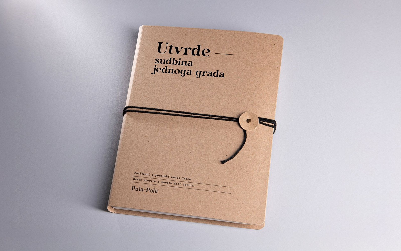
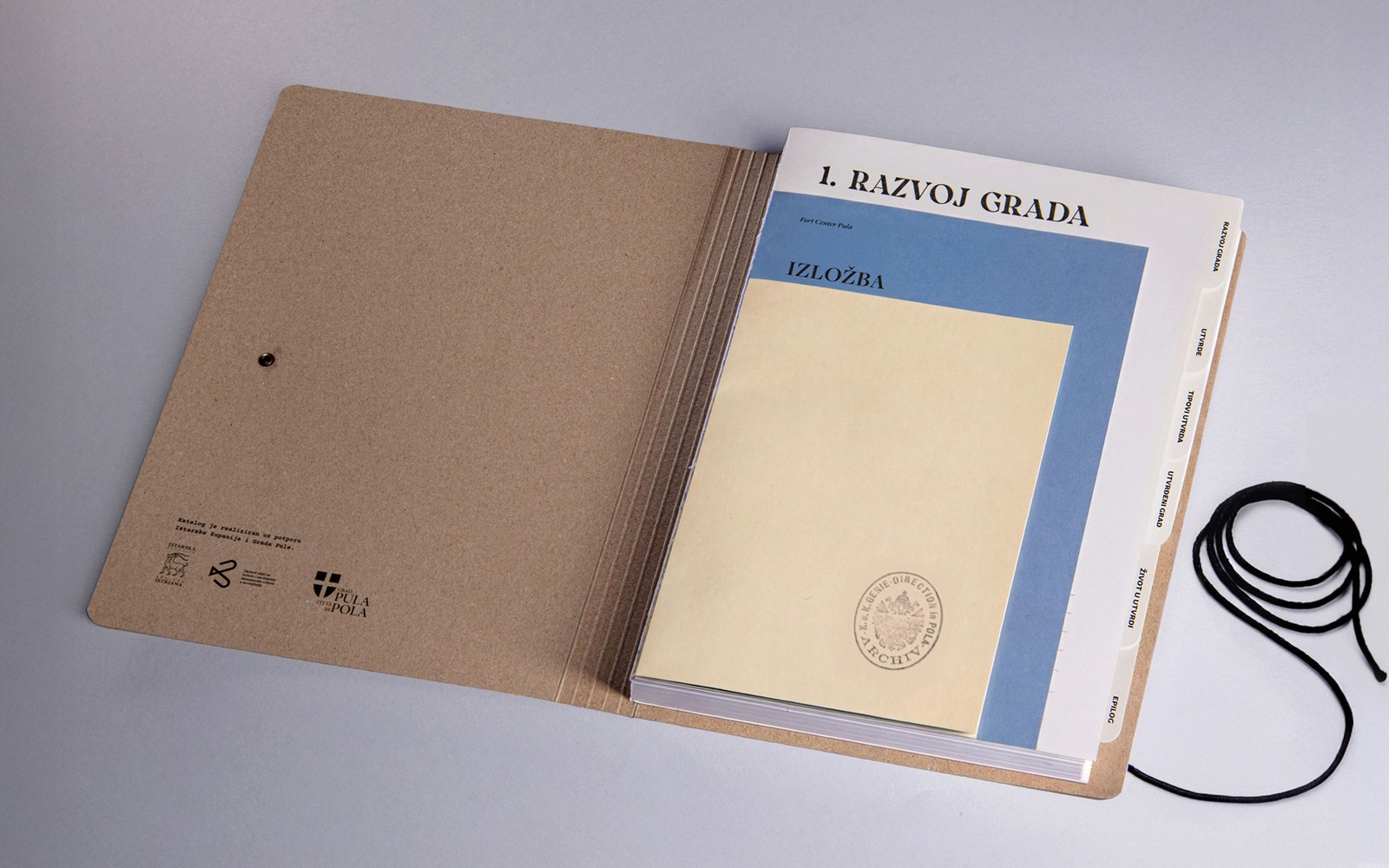
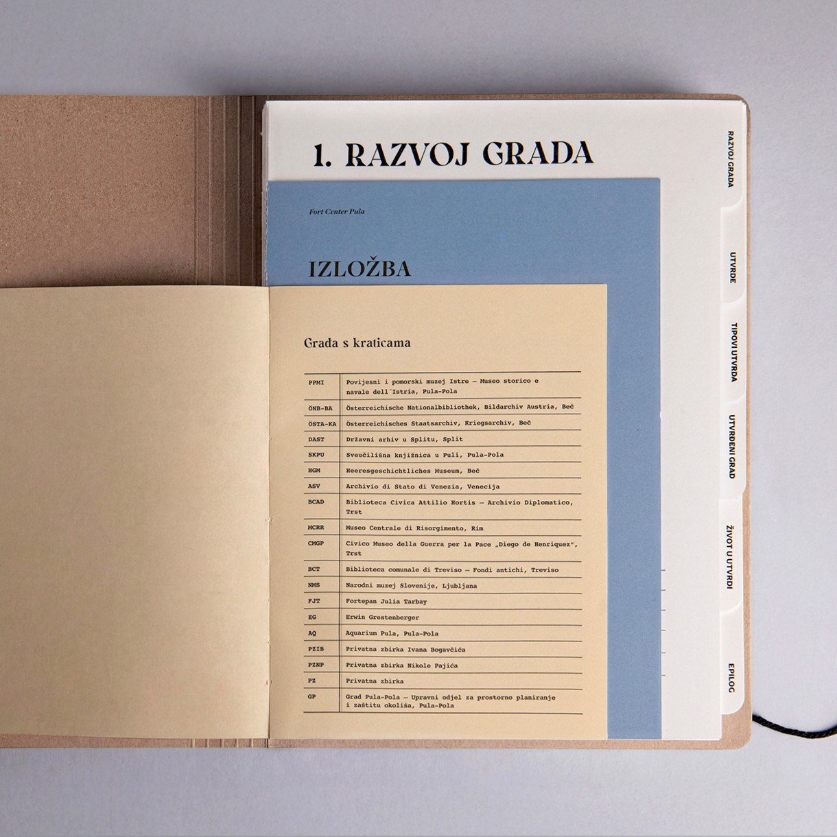
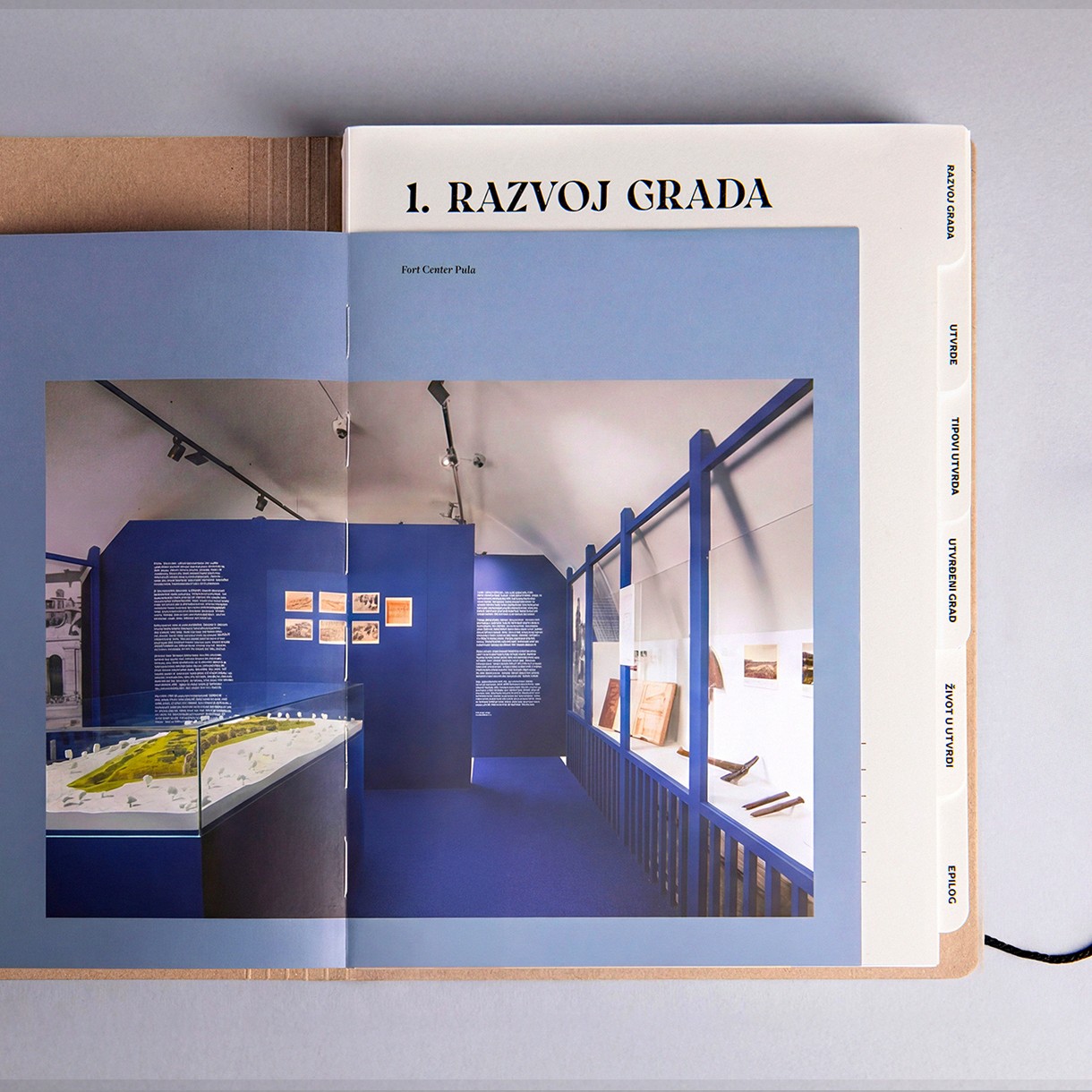
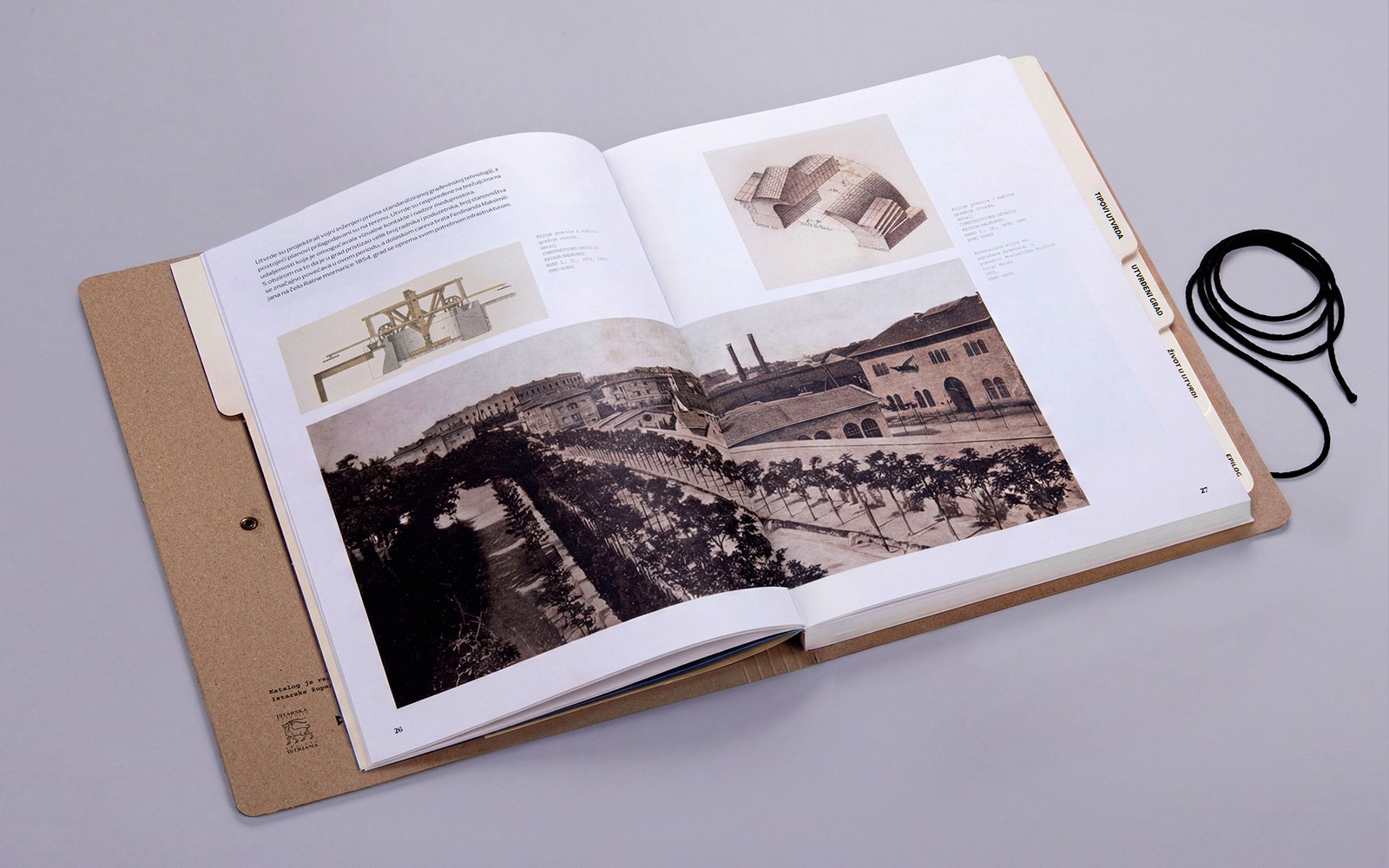
The book documents Pula's 19th and early 20th century fortification system for the Historical and Maritime Museum of Istria, and the studio let the source material set the form. Instead of flattening museum papers and archive photographs into a standard catalogue, the pages keep their variety: different formats, different tones, stacked like documents pulled from a drawer. Heavier tabbed dividers cut along the edge so the six sections read as file labels. Nothing about it wants to look new. The whole object is pitched as paperwork that gets handled, and the design leaves room for that handling to show.
Editorial design that is meant to be used
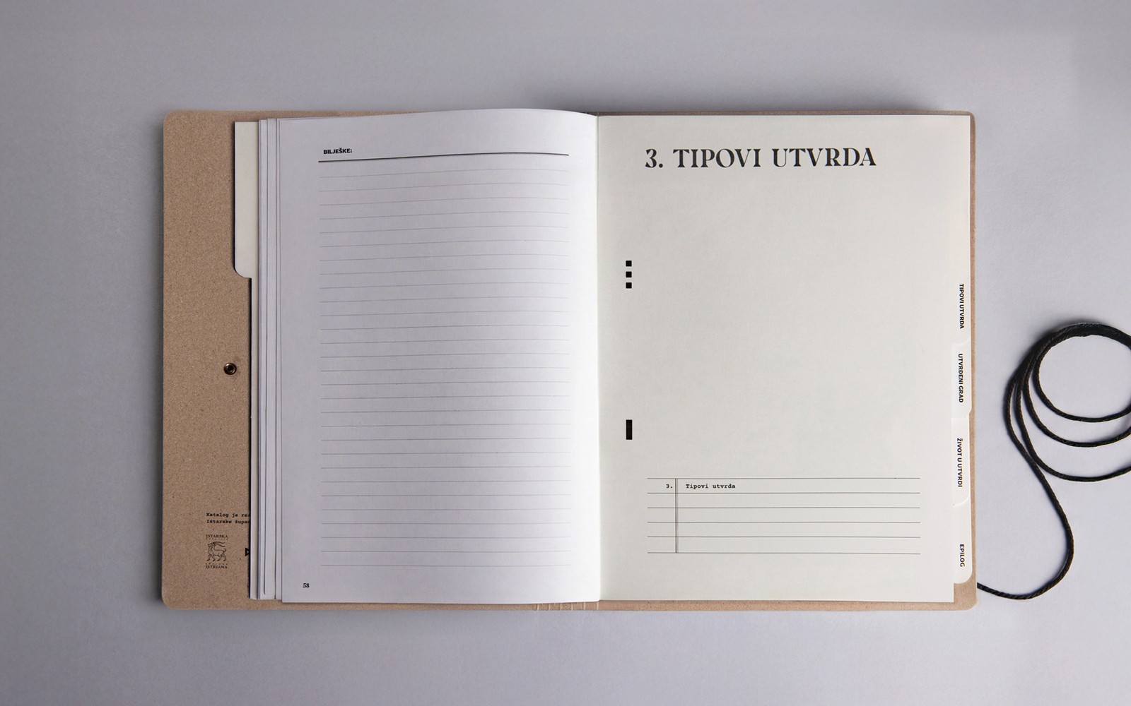
The typography plays the same archival game. The title and chapter openers are set in a high contrast serif, black on raw kraft, with the kind of sharp serifs that feel lifted from a 19th century military document. Against it sits a second voice: monospaced typewriter setting for the archive abbreviation lists, the colophon credits, and the small caption lines, plus small caps running along the tabbed dividers. The grid stays loose on purpose. Pages shift format from spread to spread, and the lined reader notes page, complete with its BILJEŠKE header, is printed right into the book as if waiting for a pencil.
Materially, the piece commits. Kraft paper covers close with a black binding cord and a paper disc button, and a metal eyelet sits on the front board like a file fastener. The dividers are heavier stock, the pages shift in tone from off white to pale blue, and the whole catalogue was conceived for active use: the studio's own description says it gradually takes on the character of a personal file through time and handling. The book is designed to age, and the wear is the point. That conviction just earned it a third place tie in the Books: Entire Package category at the 2026 PRINT Awards.
See more from Studio Tumpić/Prenc on their site.