Manta’s ingredient-first chocolate identity | Mindsparkle
Studio Tyrrell
Mindsparkle Mag

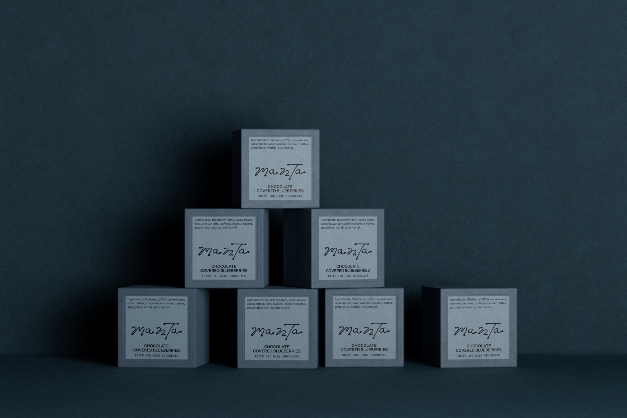
Manta’s chocolate packaging puts the ingredient list up front
At a time when many chocolate brands are quietly trimming their cocoa content in favour of cheaper fillers, Manta takes the opposite position: nutritionally dense ingredients and a promise never to use dairy, refined sugar or chemical additives. Studio Tyrrell built the brand identity around that tension — the almost ascetic purity of the recipe set against the rich, sensorial world of chocolate.
The studio organised the whole brand around what the chocolate is made of. The ingredient list moves to the front of every pack and is catalogued in a visual archive at point of sale, making dietary decisions easier for the people who scrutinise them most. Colour, texture and organic forms bring tactility back to the system, while a handmade logo — an imperfect gesture placed deliberately outside an otherwise rigorous packaging grid — holds the balance the identity is reaching for.
The result frames chocolate as a source of both nutrition and pleasure: at home in the category, yet sitting a step outside it. Studio Tyrrell’s work spanned brand strategy, visual identity, creative direction, packaging and digital design.