Branding Design: Auren Visual Identity by Nathalia Ultramar
Explore the serene branding design for Auren by Nathalia Ultramar. The identity pairs architectural typography with tactile stone textures.
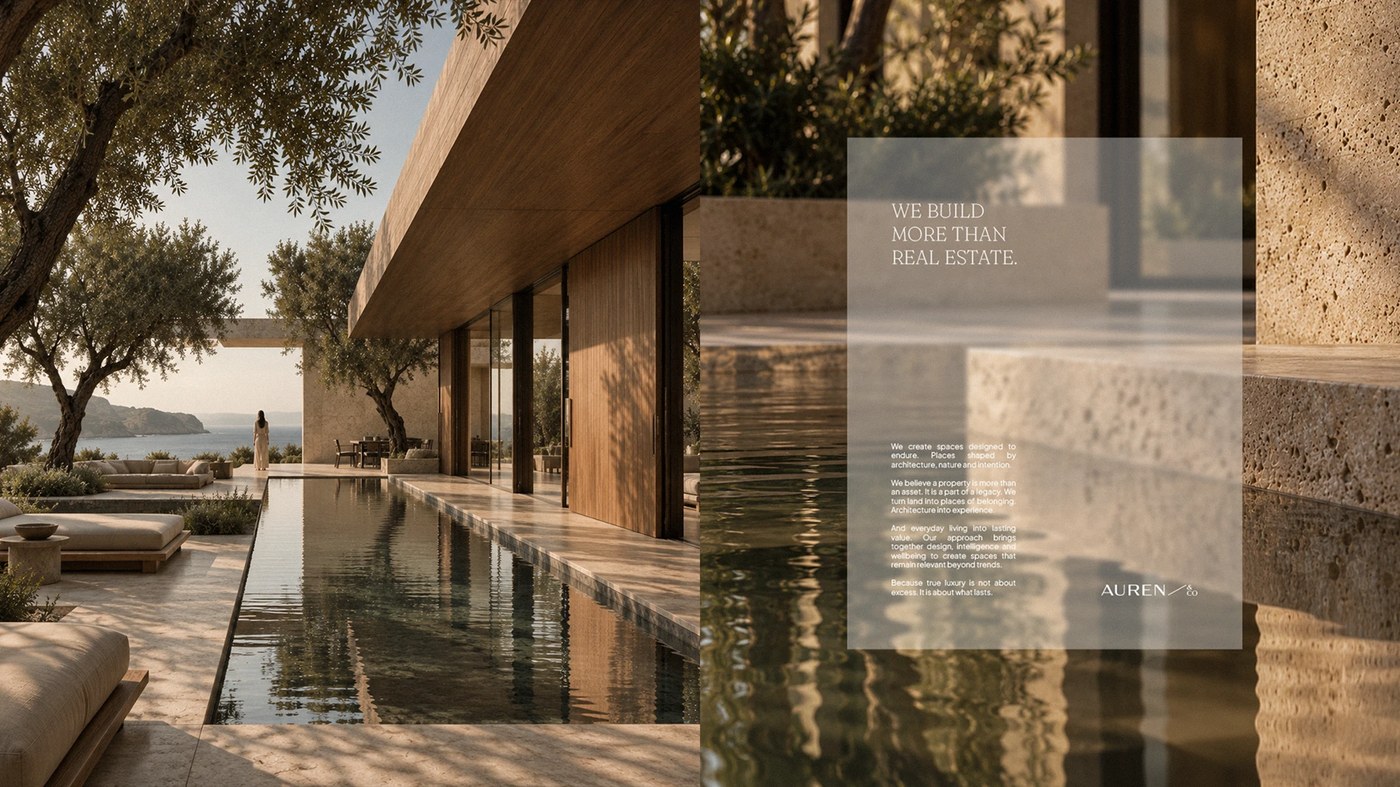
Nathalia Ultramar created a refined visual system for development firm Auren & Co. The company unites architectural development with dedicated wellness spaces. Auren treats property as an enduring legacy rather than a speculative asset. Ultramar shaped this distinct branding design around permanence and balance. The identity conveys clarity through balanced proportions and restrained compositions. Clean layouts establish visual tranquility across digital and print collateral. Natural earth tones evoke Mediterranean landscapes and coastal retreats. Warm grey palettes harmonize with organic materials and open horizons. Every design decision reinforces a quiet relationship between space and daily living. The resulting visual language communicates understated luxury without relying on excess.
The Auren Branding Design and Spatial Architecture
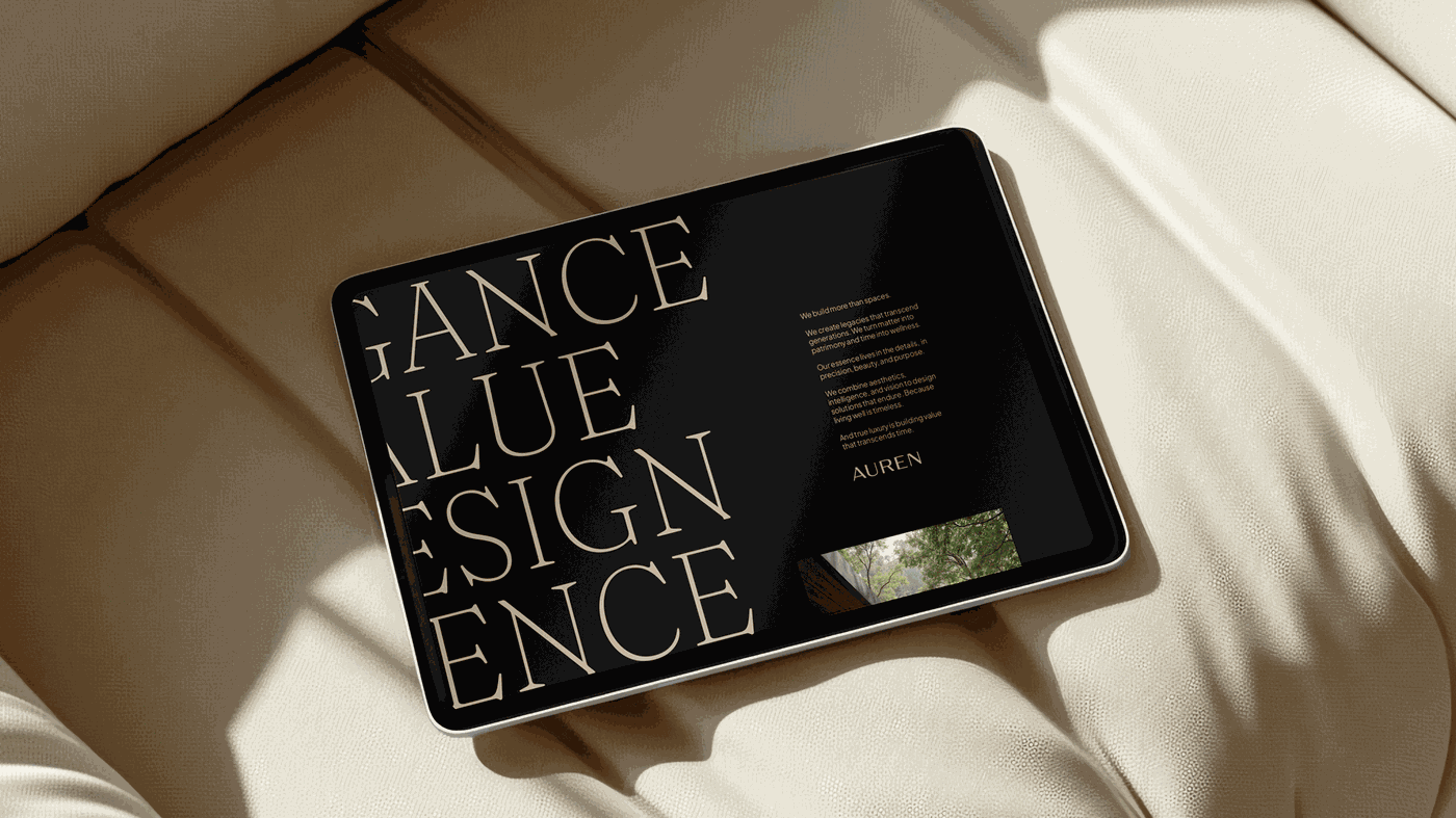
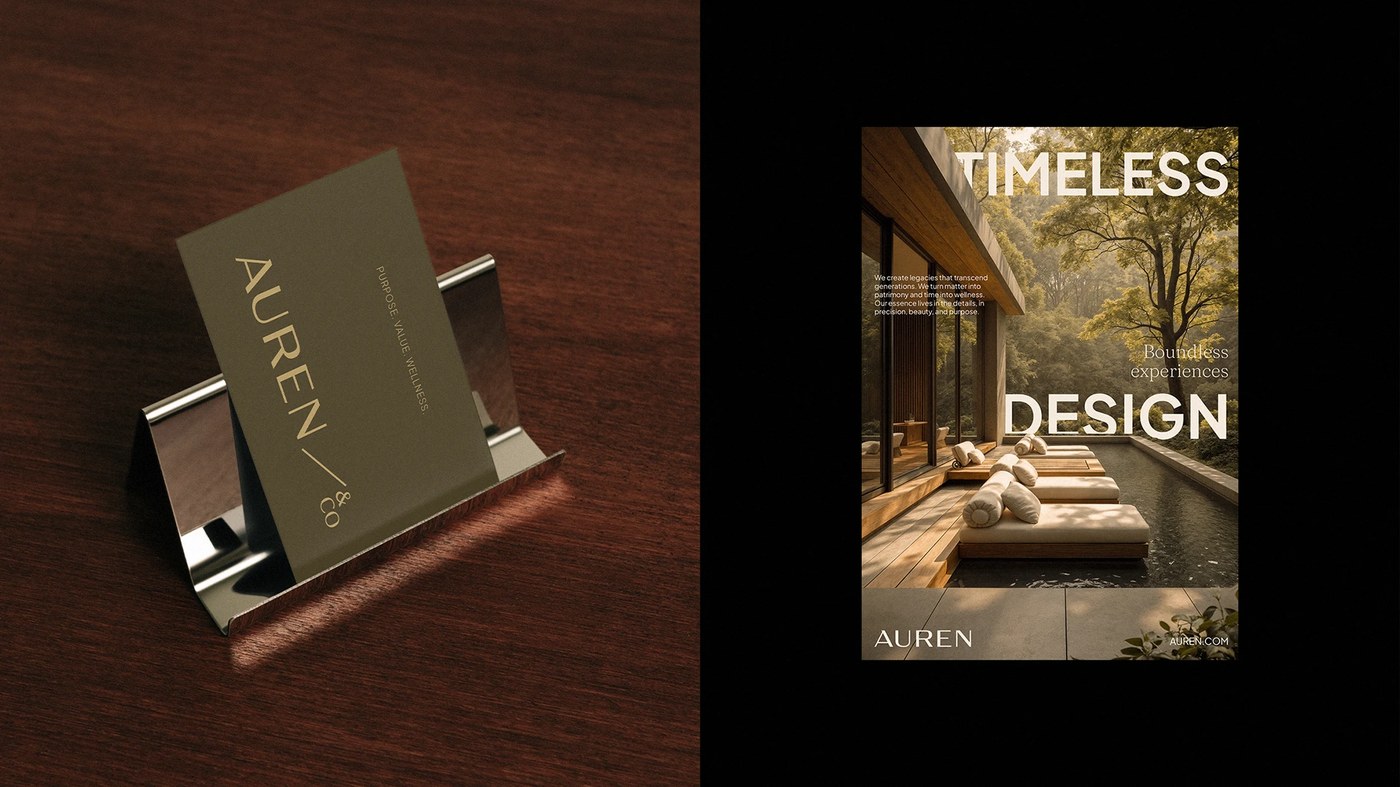
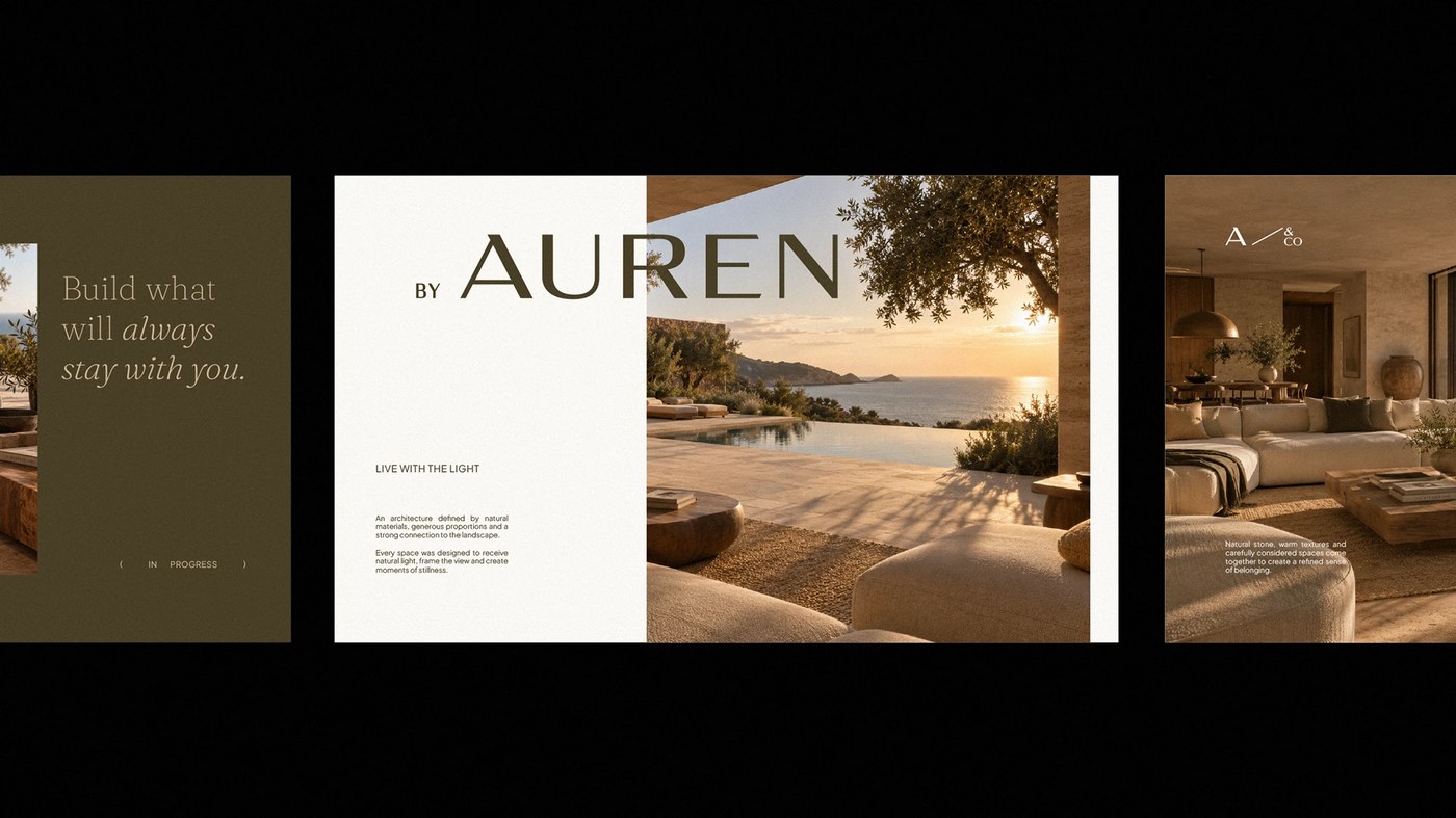
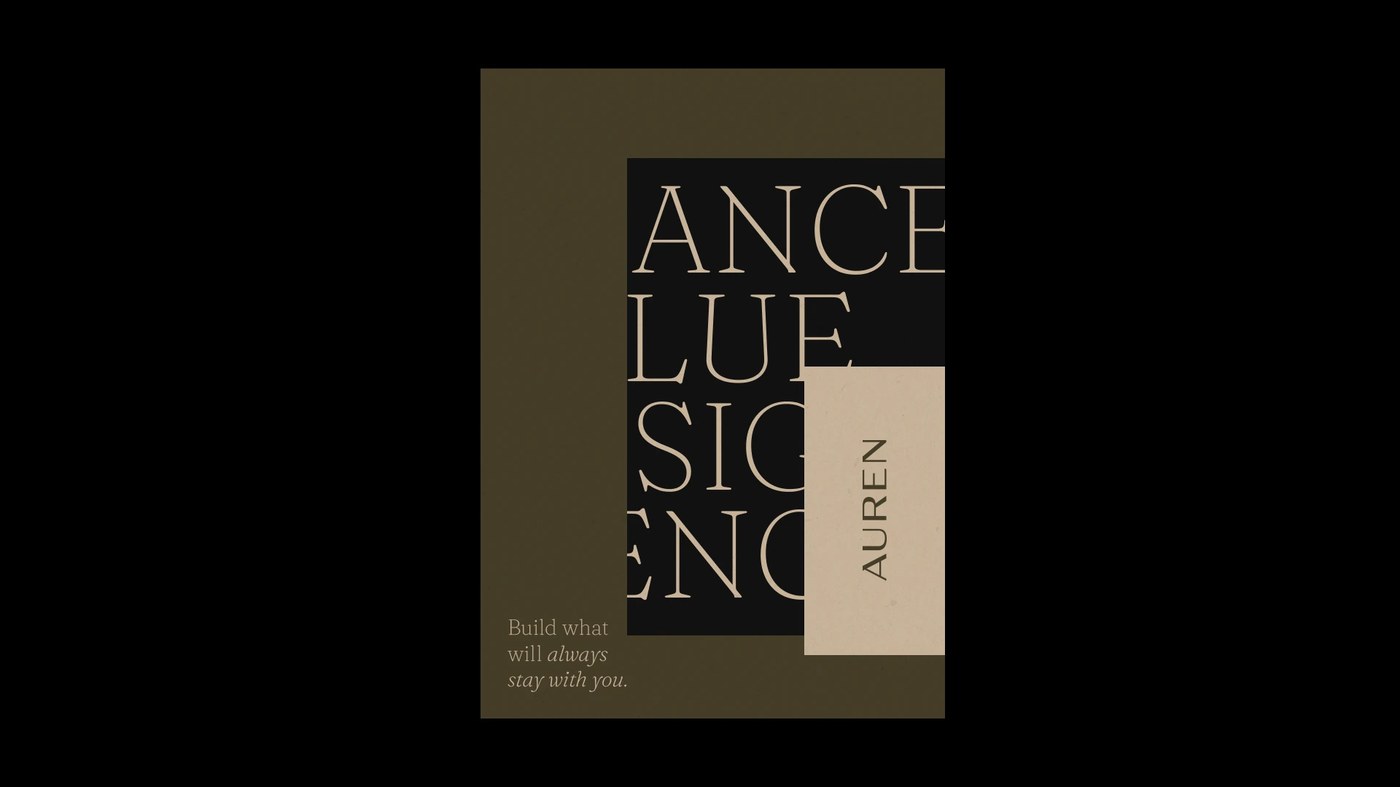
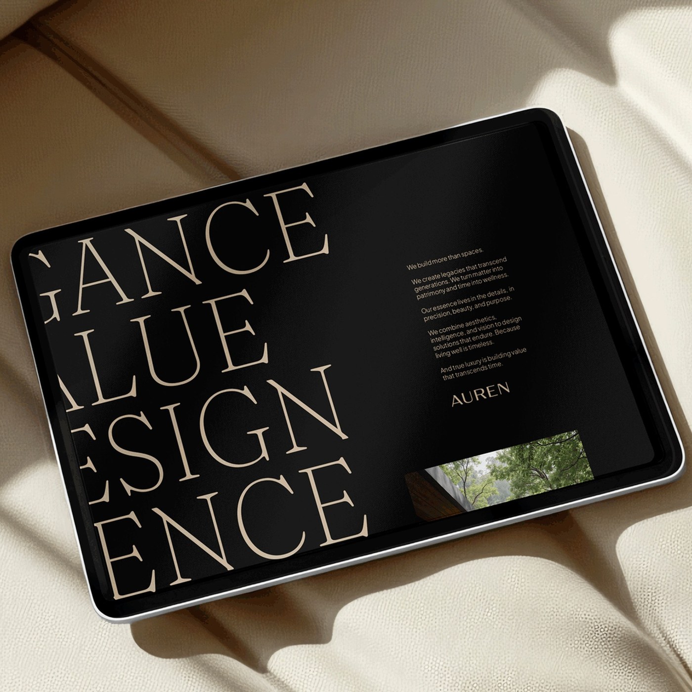
A customized sans-serif wordmark anchors the comprehensive branding design. The uppercase letterforms feature delicate incised strokes and open counters. High-contrast editorial serif typography provides sophisticated hierarchy for headlines. This typographic pairing balances structural authority with literary grace. Digital interfaces present spacious reading flows on tablet screens. Warm sand tones and deep olive fields frame architectural photography. Poster layouts utilize asymmetric columns and generous negative space. Slogans celebrate architectural stillness and enduring material value. Monospace details display project coordinates and catalog indices. Each layout maintains rigorous grid alignment across diverse formats.
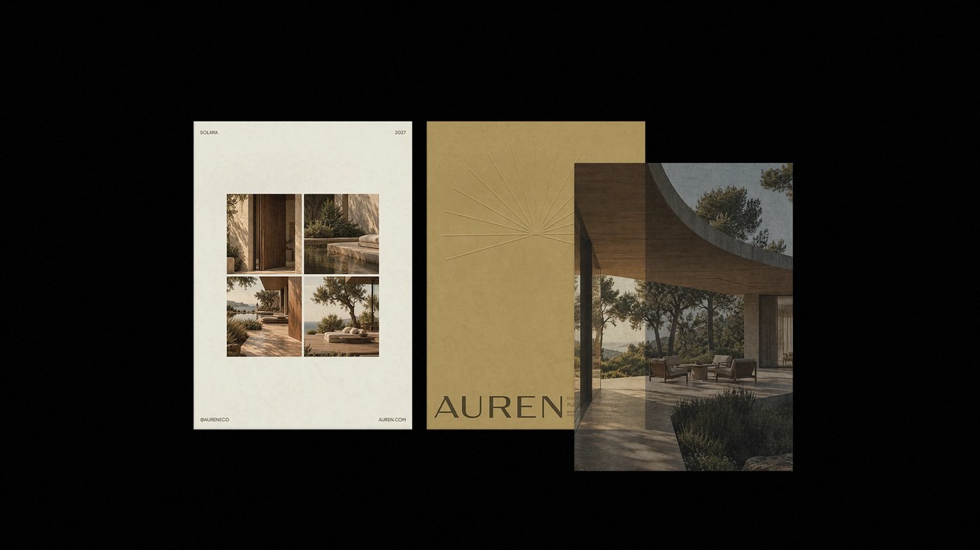
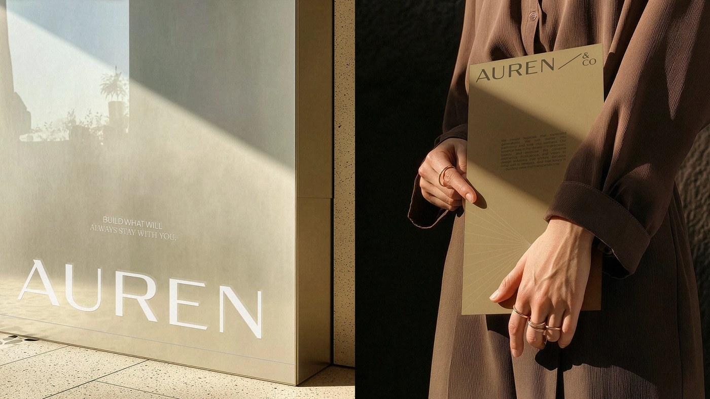
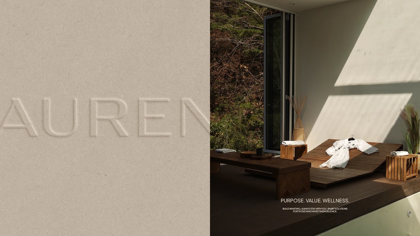
The branding design comes alive across tactile physical artifacts. The logotype is deeply debossed directly into raw limestone walls. Matte olive business cards rest on polished chrome desktop stands. Heavy mustard cardstock forms elegant corporate presentation folders. Printed publication covers combine sunray embossings with translucent vellum overlays. Dimensional entrance signs feature laser-cut letters on brushed metal boxes. These deliberate material choices echo travertine stone and warm plaster. Natural light casts sharp shadows across the debossed letterforms. This cohesive branding design proves that spatial identity thrives through architectural restraint. The system endures through disciplined typographic balance and honest craftsmanship.
See the full project by Nathalia Ultramar on Behance.