Minimalist Brutalism in the KæK Branding Design
KWIBA Agency and Gideon Phillip design a quiet, brutalist branding system with Nordic restraint for architecture studio KæK.
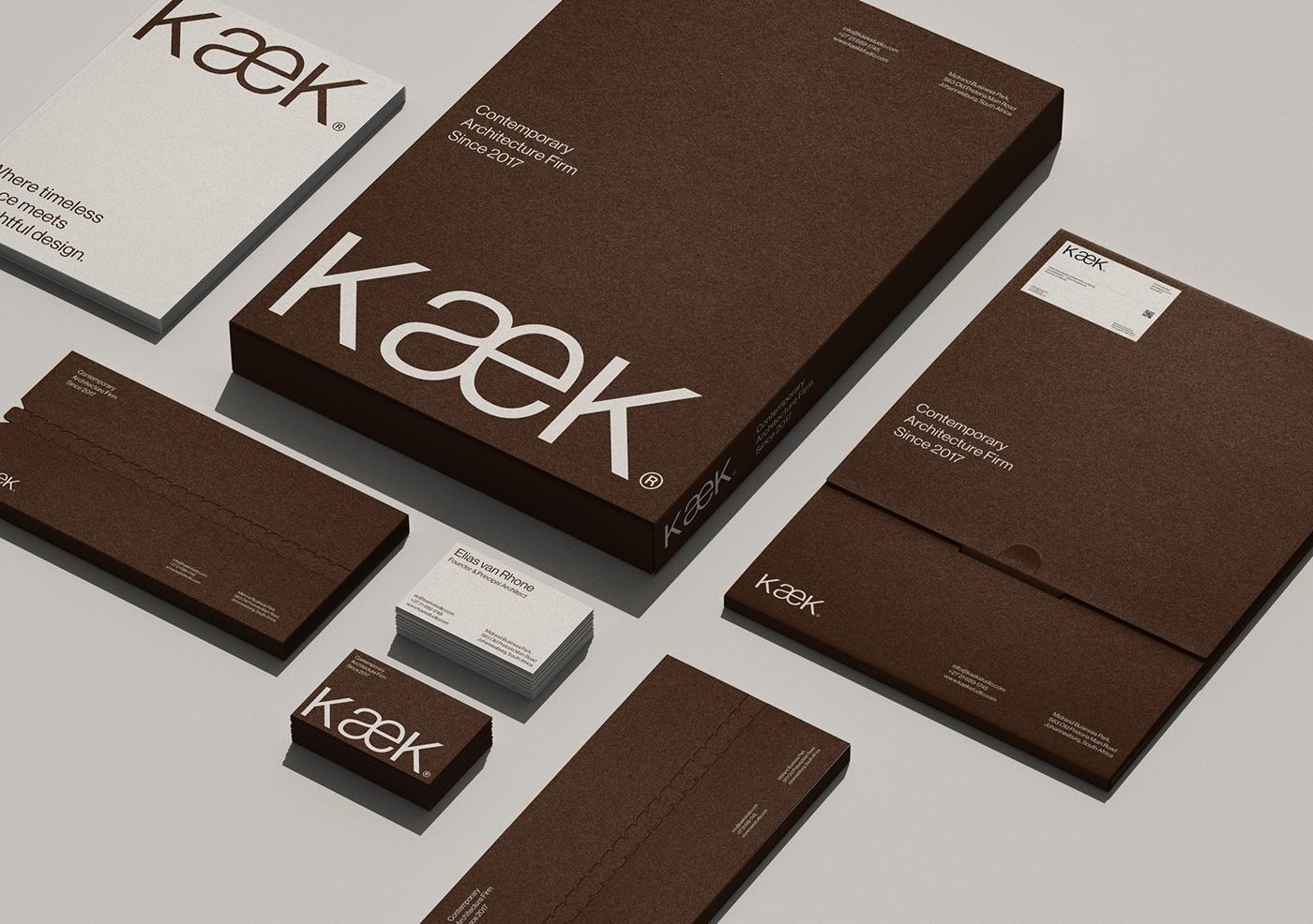
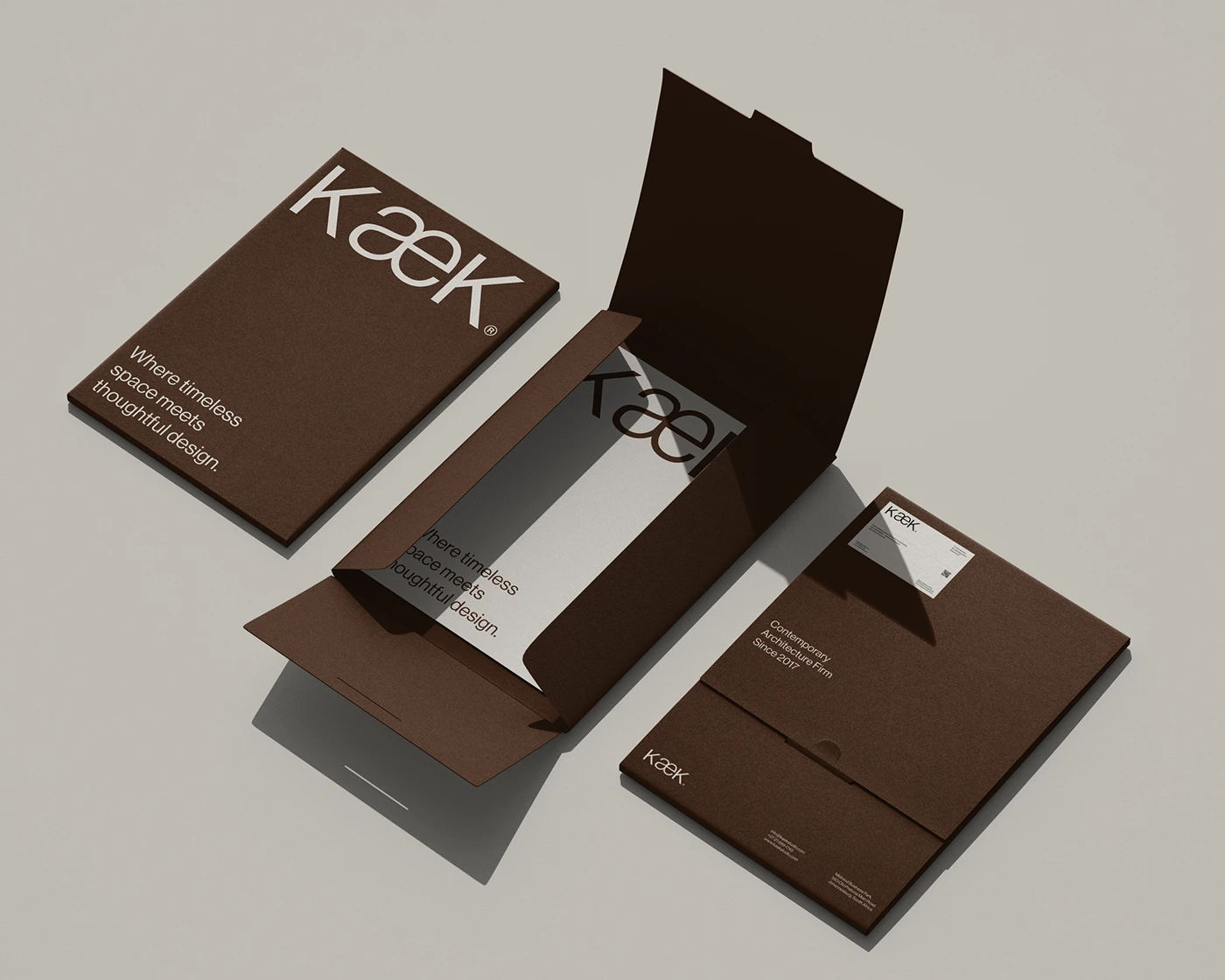
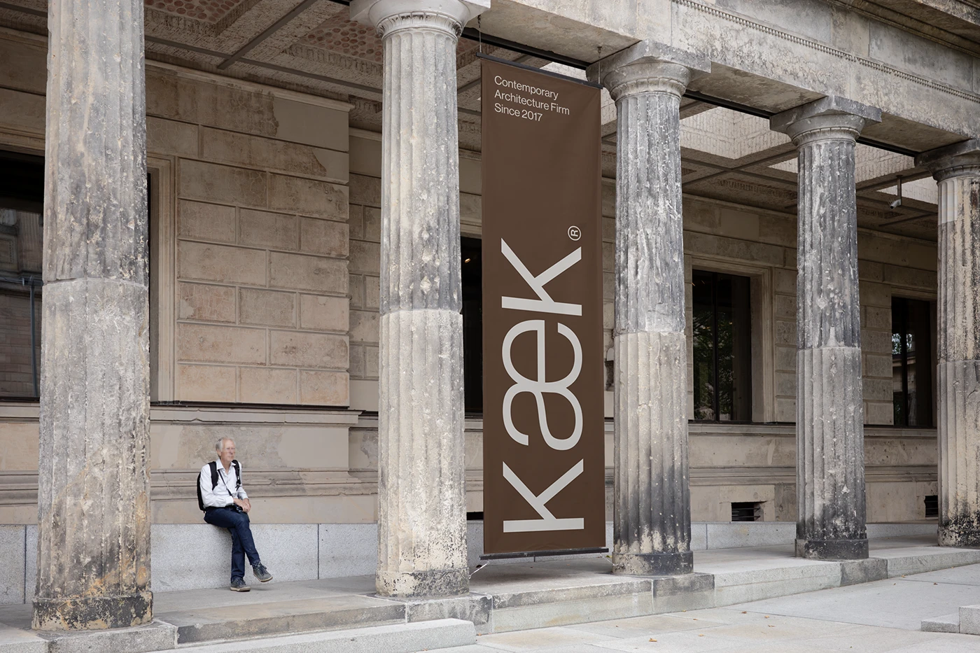
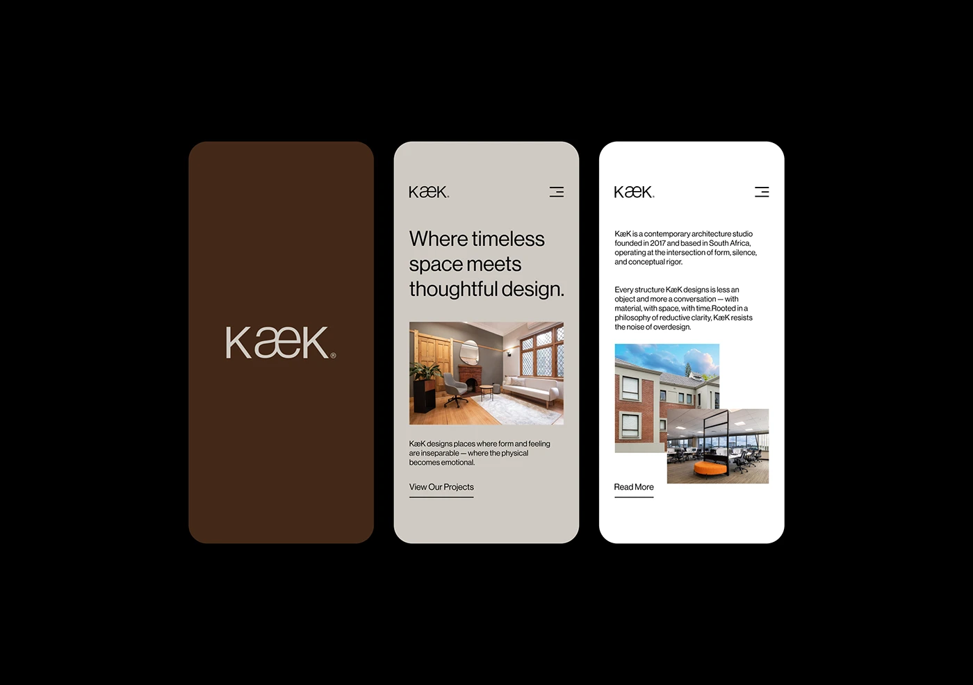
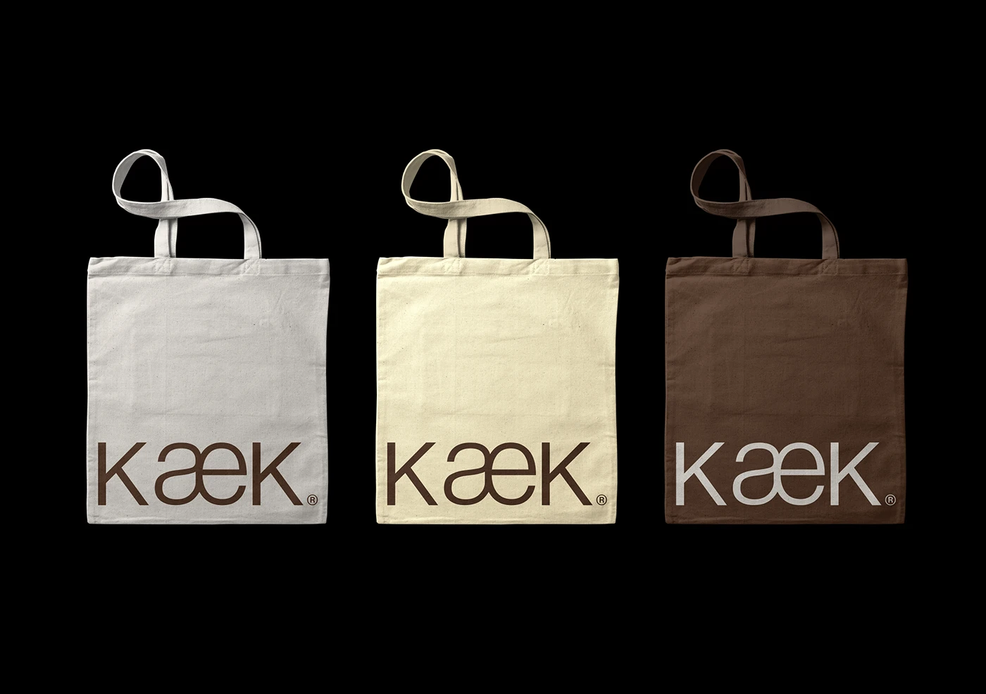
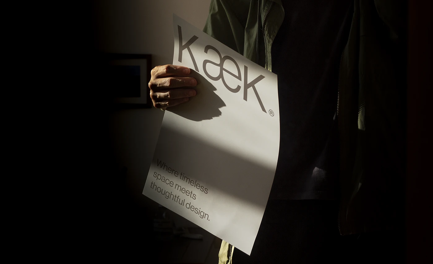
The project highlights a sculptural approach to contemporary corporate identity. The visual system aligns with the studio’s design philosophy of brutalist minimalism. By using raw textures and stark typographic layouts, the creative team reflects spatial rhythm. The color palette focuses on off-white, light gray, and deep charcoal. These choices evoke the feel of concrete massing and open space. The wordmark relies on simple geometry, mirroring the studio’s physical structure. This architectural branding establishes a sense of silence. It values mass over decoration. It rejects unnecessary design elements in favor of raw representation.
Brutalist Restraint in Architectural Branding
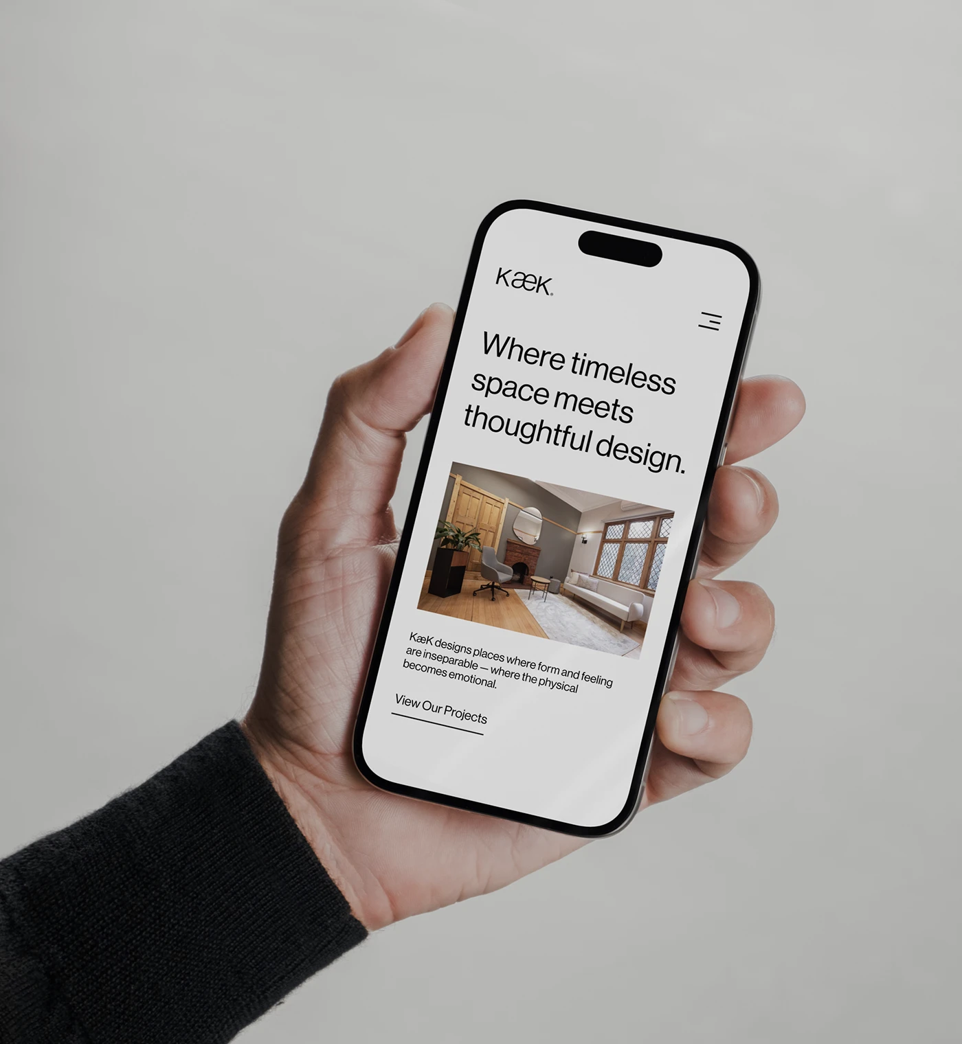
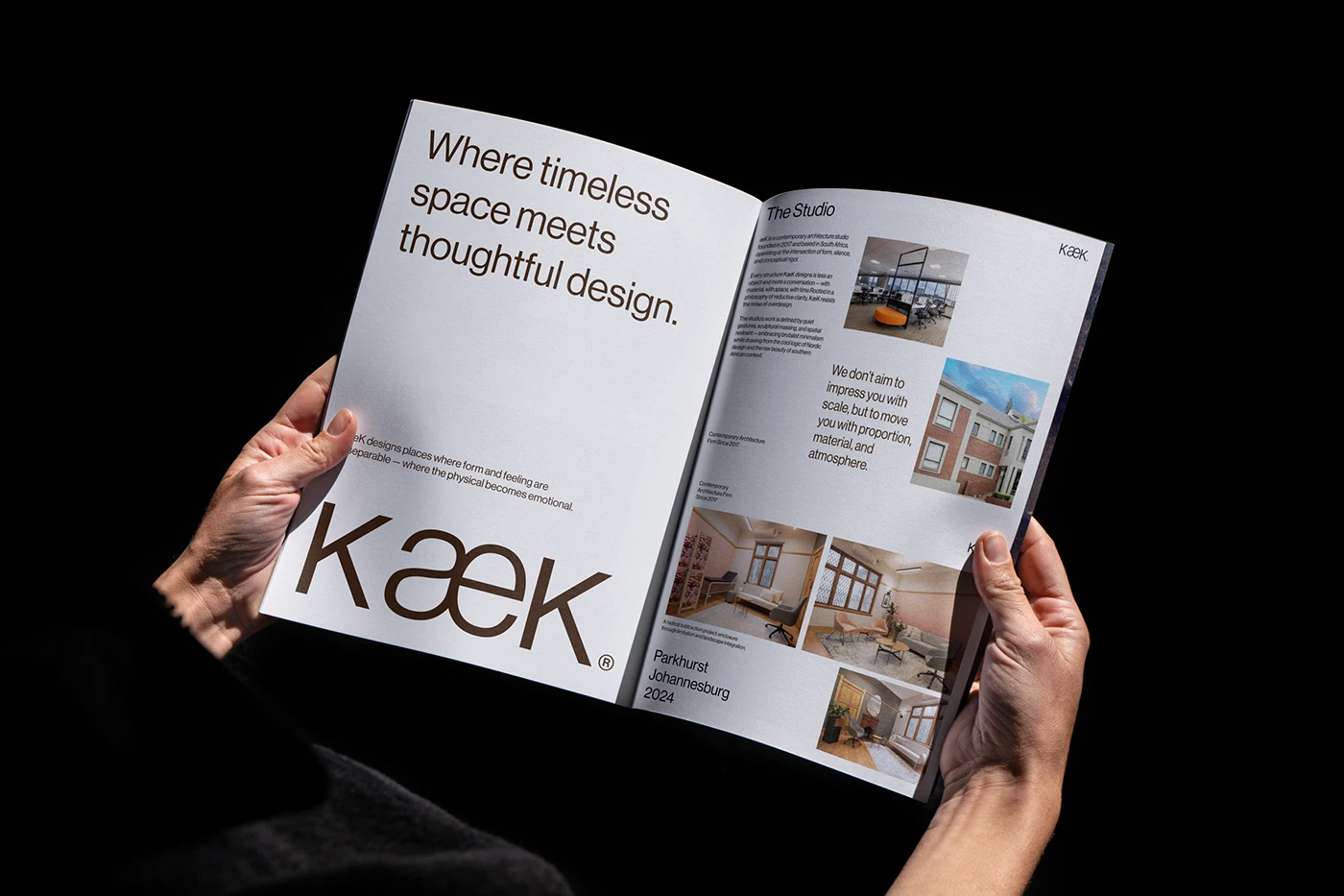
The team uses large scale contrasts and single accents to define the layout structure. In this branding process, KWIBA Agency and Gideon Phillip treat type as a physical block. The typography dominates the page, mimicking the weight of architectural stone. The grids are loose but structured. This allows the layout to breathe naturally. Information is categorized with strict hierarchy. This hierarchy guides the viewer through the spatial documentation. The designers shared the complete design documentation on the studio’s official portfolio website Behance for community review.
This visual system shows how a design system can capture structural philosophy. By avoiding loud decoration, the quiet branding establishes long-term credibility for the studio. The project proves that minimal assets can carry substantial weight. Every detail feels like a deliberate encounter. The final result is a system that feels found rather than manufactured, matching the studio’s buildings. This project sets a standard for architecture firms looking to simplify their identity. It is a masterclass in restrained visual communication and quiet branding design.