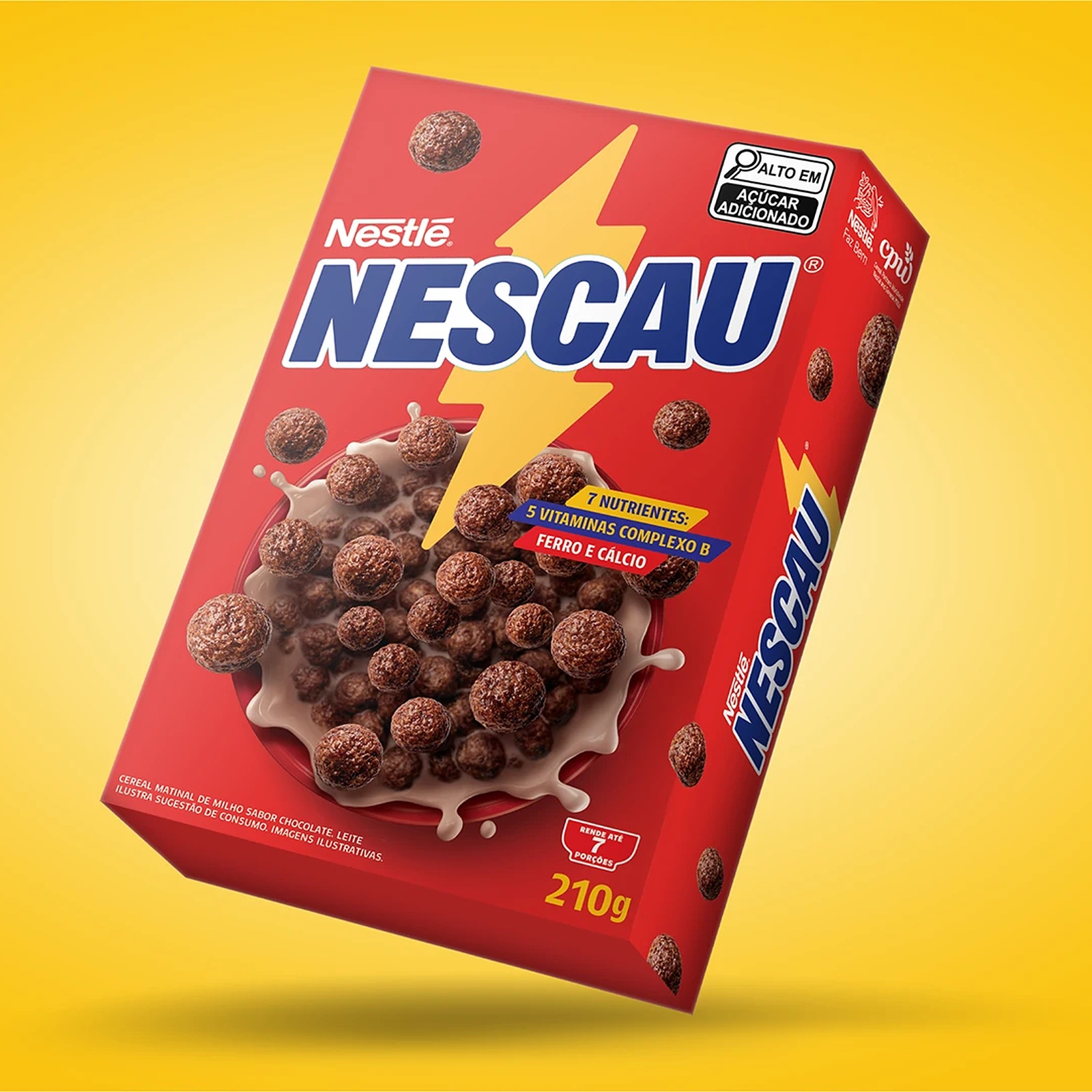
Nescau Display: Type Design by Plau Design
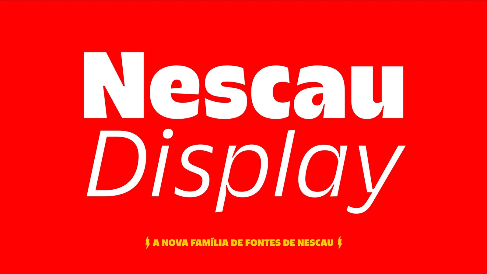
Plau Design teams up with FutureBrand São Paulo on Nescau Display, a custom type design system weaving lightning bolts into 36 styles.
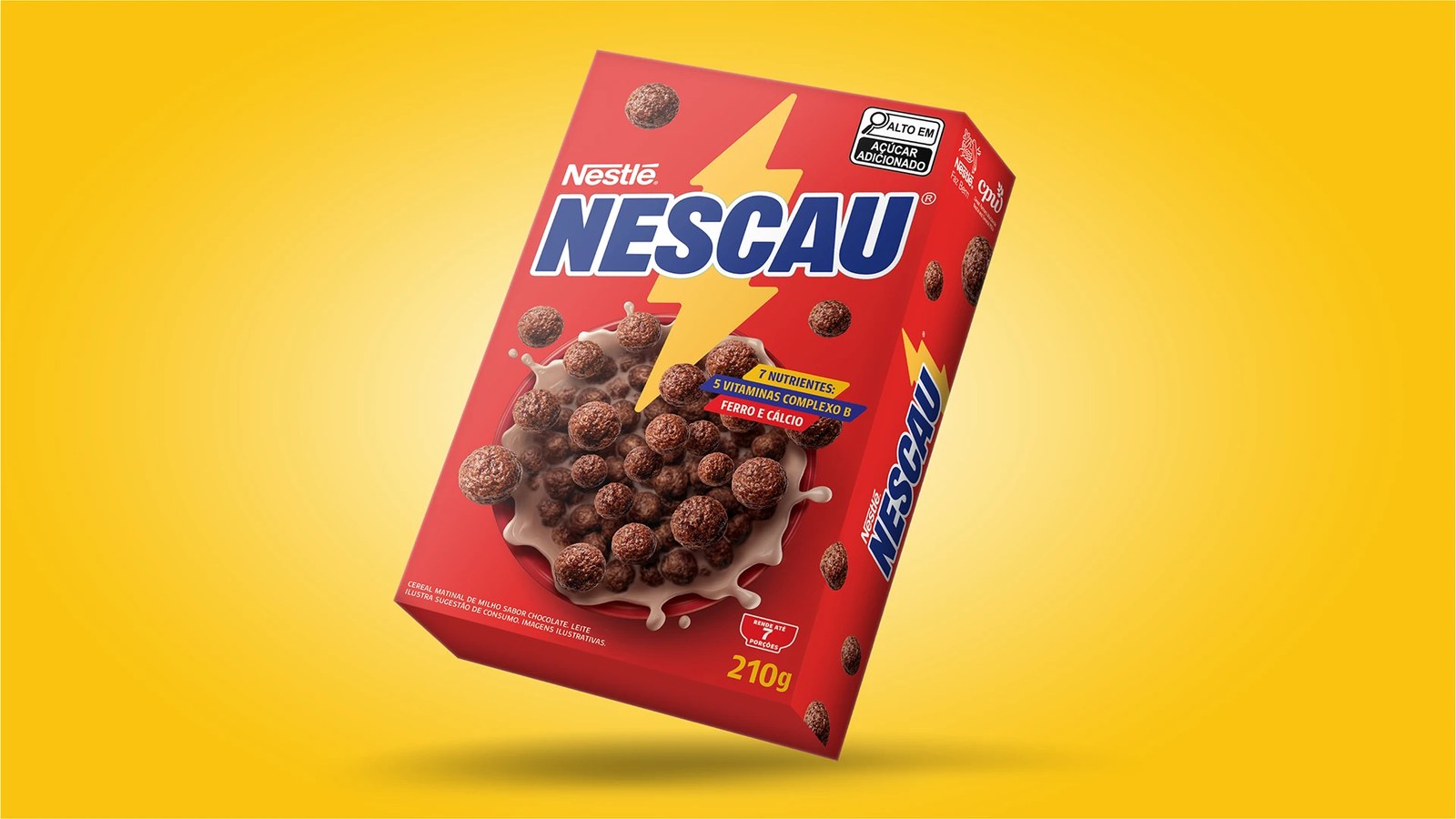
Every kid in Brazil knows that yellow lightning bolt. For over 90 years, Nestlé's Nescau has sat on kitchen tables across the country, tied to childhood sports, skate parks, and morning chocolate milk. When FutureBrand São Paulo set out to evolve the brand's visual identity, they brought in type foundry Plau Design — led on the project by Carlos Mignot, Rodrigo Saiani, and Lu Leitenperger — to redraw the core logotype and build a custom sans serif family from scratch. The brief was simple. Make the letters carry the voltage.
Translating a Lightning Bolt into Custom Type Design
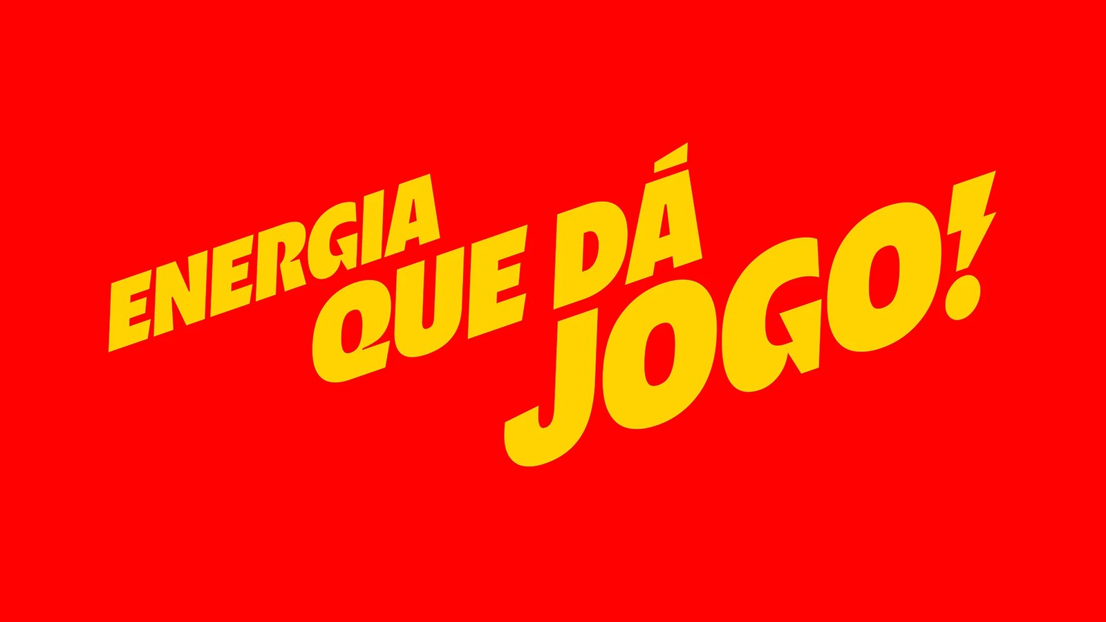
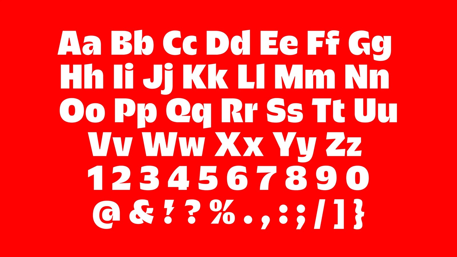
The details hide inside the glyphs. Instead of treating the lightning bolt as a separate sticker, Plau carved those sharp diagonal cuts directly into the anatomy of the type design. You can spot the notched bolt angles slicing through the crossbar of the uppercase G, the tail of the Q, the leg of the R, and the lowercase k, while the exclamation mark turns into a full lightning bolt. It could've felt too aggressive. To keep the voice warm, the team gave the bowls and terminals an open, almost smiling curve that softens all those sharp corners.
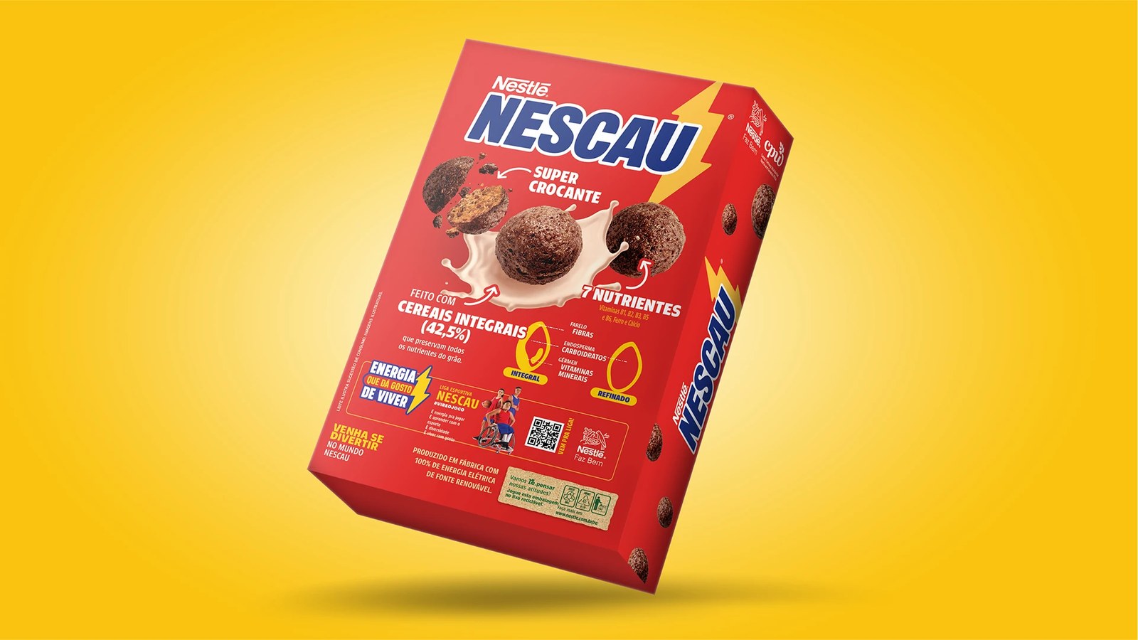
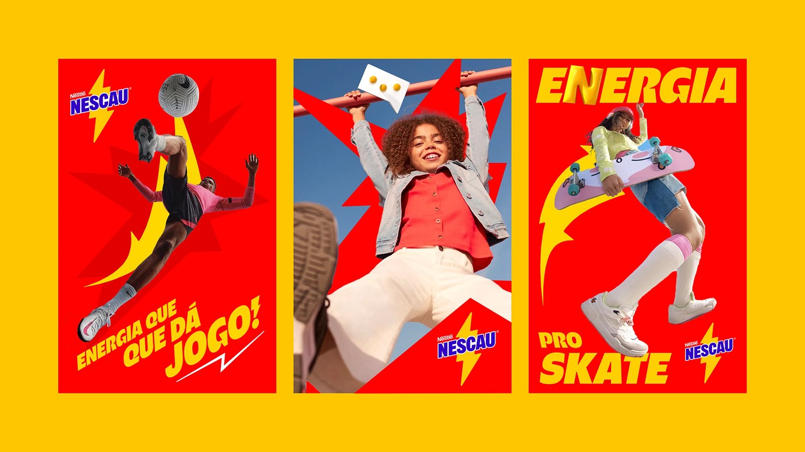
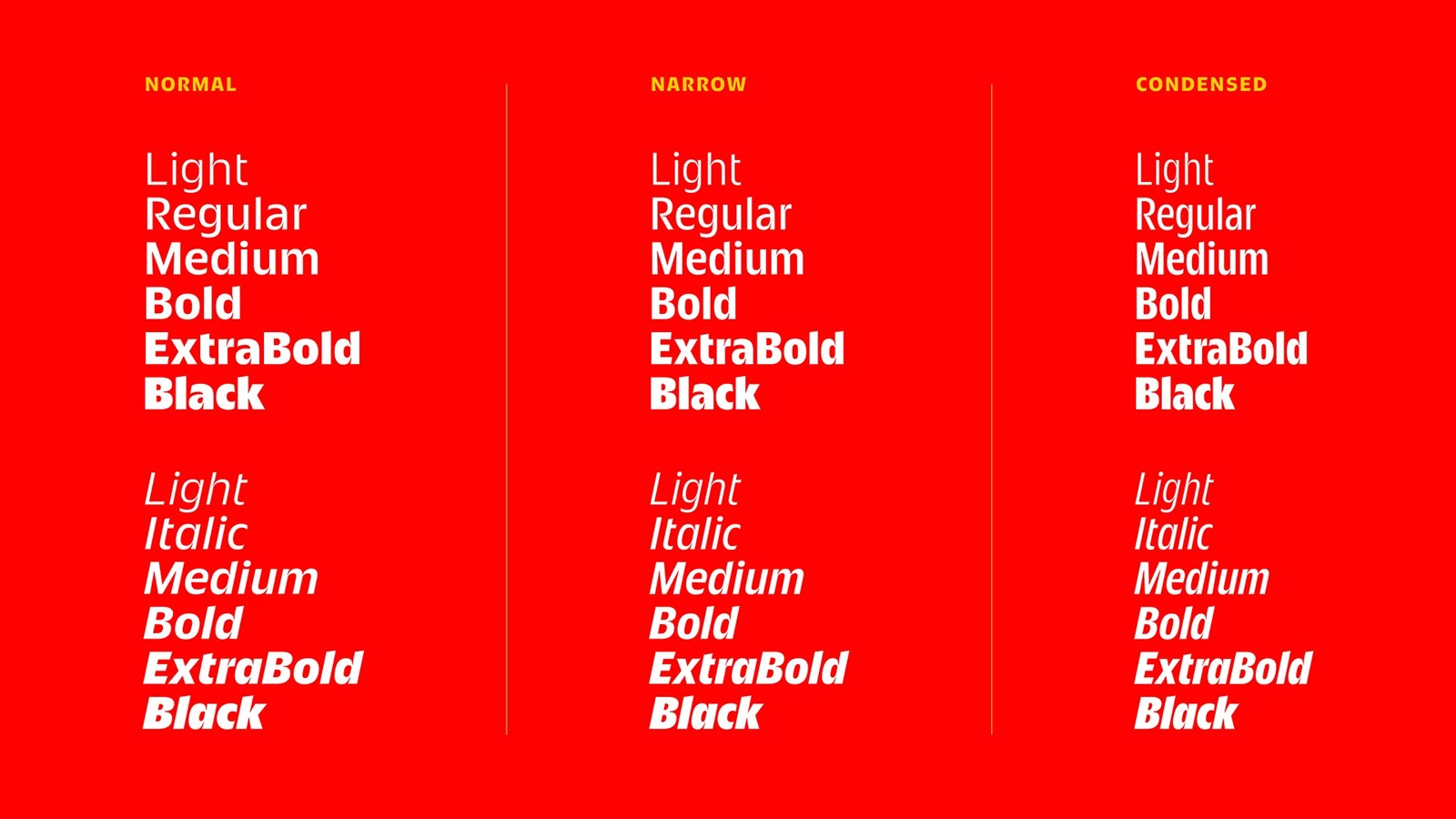
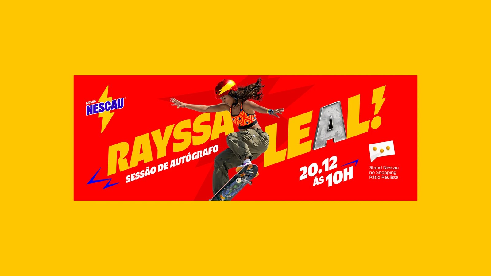
Range matters on a crowded cereal box. Plau built Nescau Display across six weights from Light to Black, each with matching italics, spanning three distinct widths: Normal, Narrow, and Condensed. That gives art directors 36 styles to play with. On the red-and-yellow campaign posters and the Rayssa Leal skateboarding autograph banner, the heavy Condensed caps slant upward in loud yellow headlines like "ENERGIA QUE DÁ JOGO!" with a concrete-textured letter A. Flip to the back of the 210g chocolate cereal box, and the Narrow weights pack whole-grain diagrams, vitamin badges, and Liga Esportiva Nescau copy into tight columns without losing a bit of punch.
See the full project by Plau Design on Behance.