Typography Design: Andscape Typeface by TwoPoints.Net
TwoPoints.Net created Andscape for ESPN and Disney. The custom typography design system spans 27 fonts with elastic horizontal lines.
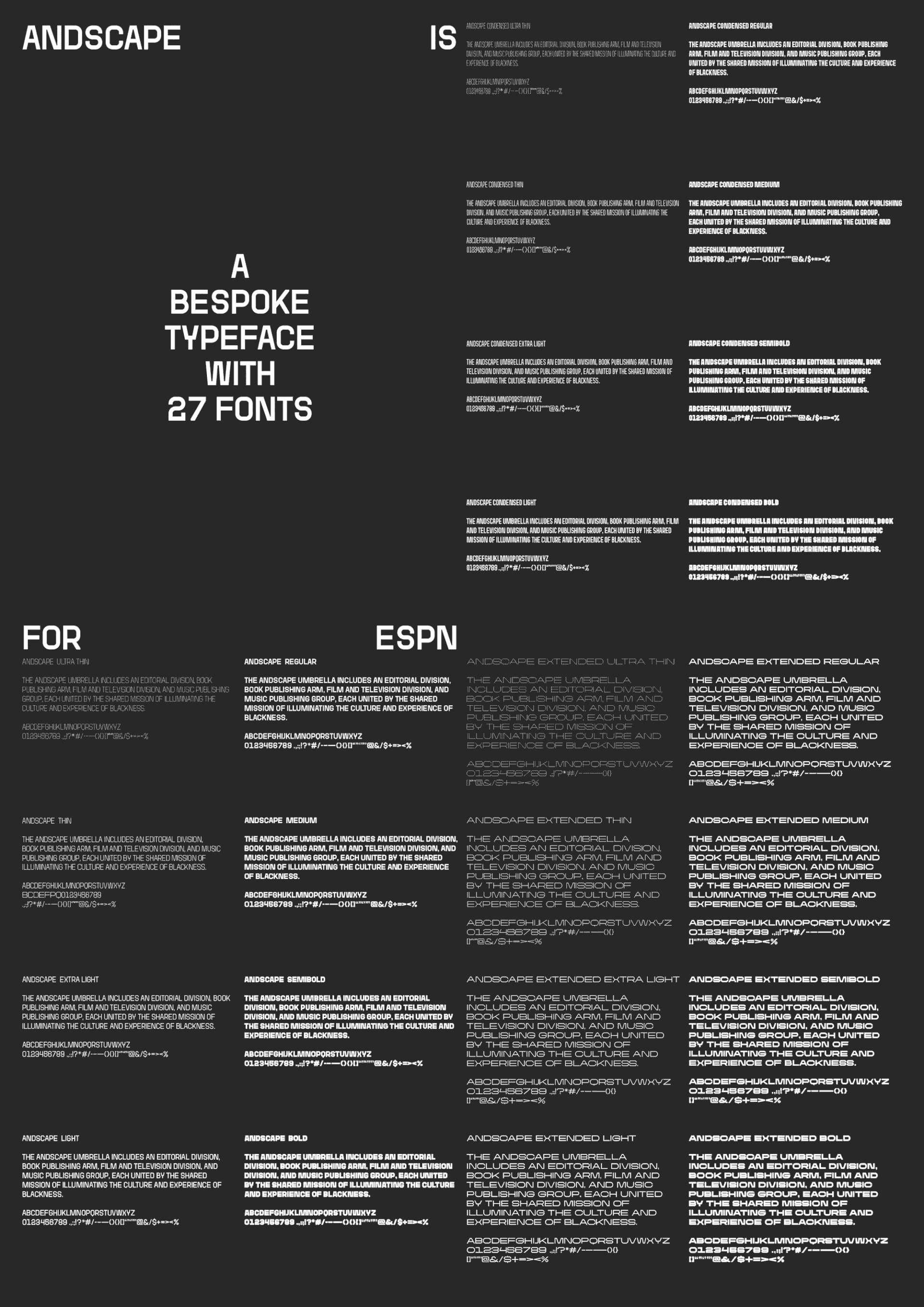
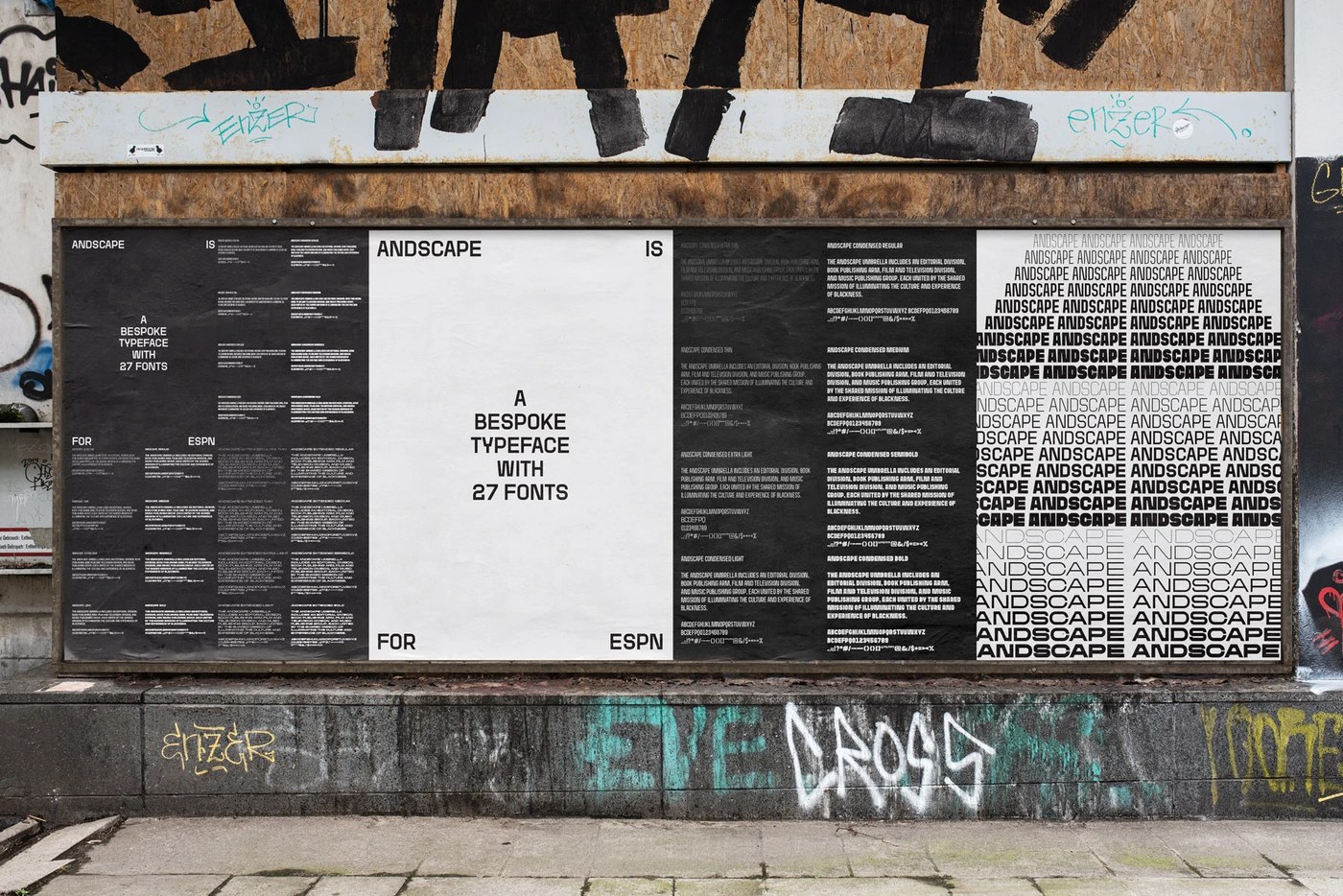
ESPN asked TwoPoints.Net to build a font for the Andscape group. The platform shares stories of Black life and culture. TwoPoints.Net drew 27 styles across three main widths. The family spans from Condensed to Extended cuts. Weights step from Ultra Thin to Extra Bold. Letters often warp when stretched across wide web banners. TwoPoints.Net solved this issue with built-in flat bars. Round and sharp letters carry straight lines. Horizontal segments stretch on a straight path. Shapes like A and O stretch wide without losing stroke balance. This trick keeps round curves from turning flat or thin. The letter strokes stay solid at any width. This smart layout choice keeps glyph lines clean in every spot.
Flexible letterforms and responsive typography design
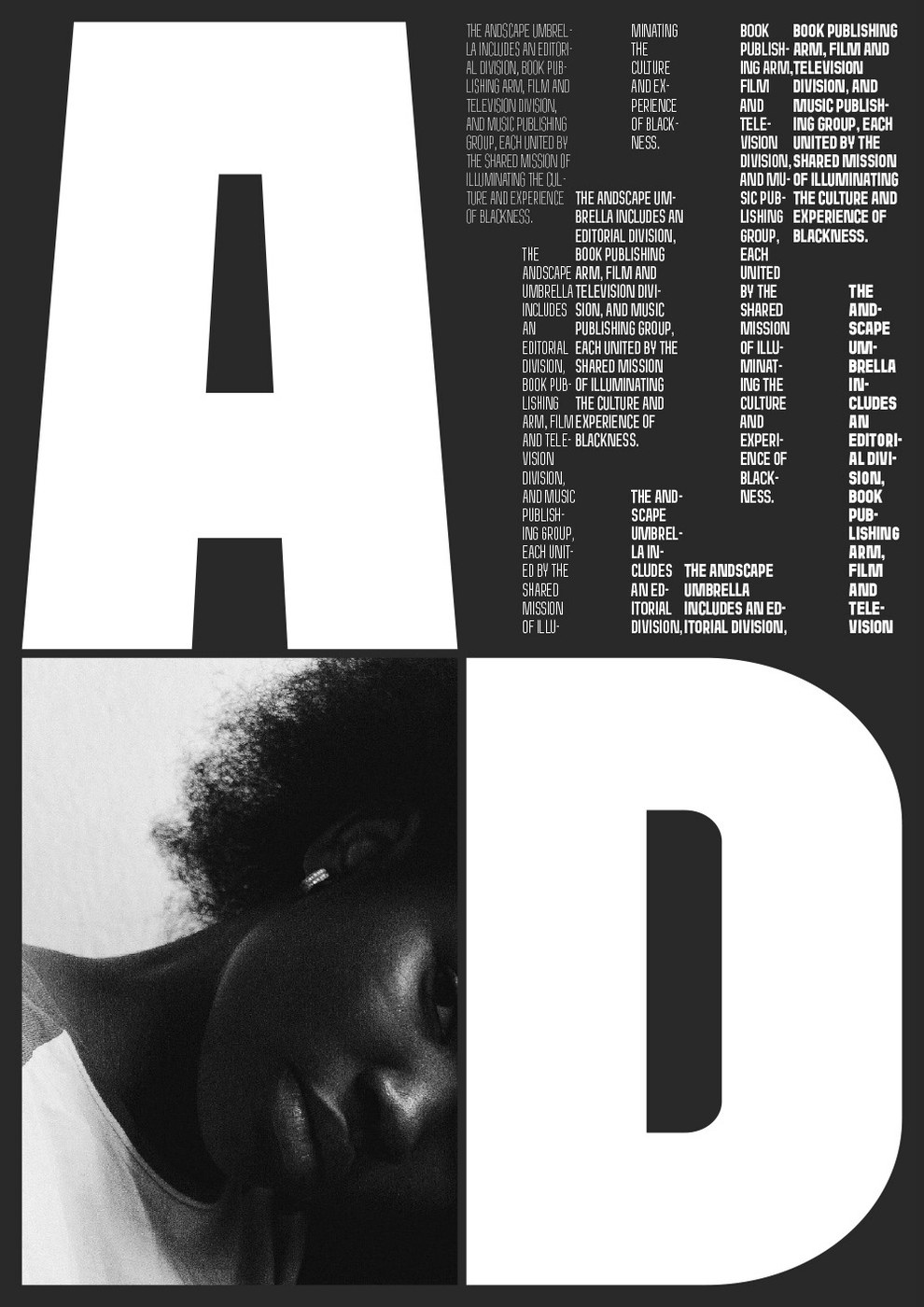
The font family forms a strict print grid. Specimen sheets pair giant titles with crisp text blocks. Bold typography design brings sharp rhythm to each printed poster. Narrow styles pack long words into tight vertical rows. Wide cuts stretch out across full outdoor boards. Close letter spacing gives bold titles a firm feel. Display cuts carry heavy ink weight across white sheets. Thin cuts bring light air to crowded index lines. Clean baselines align small text next to huge stems. The modular grid keeps complex text order neat and clear. Columns stay in line from the top down. Each glyph size does direct work on the page.
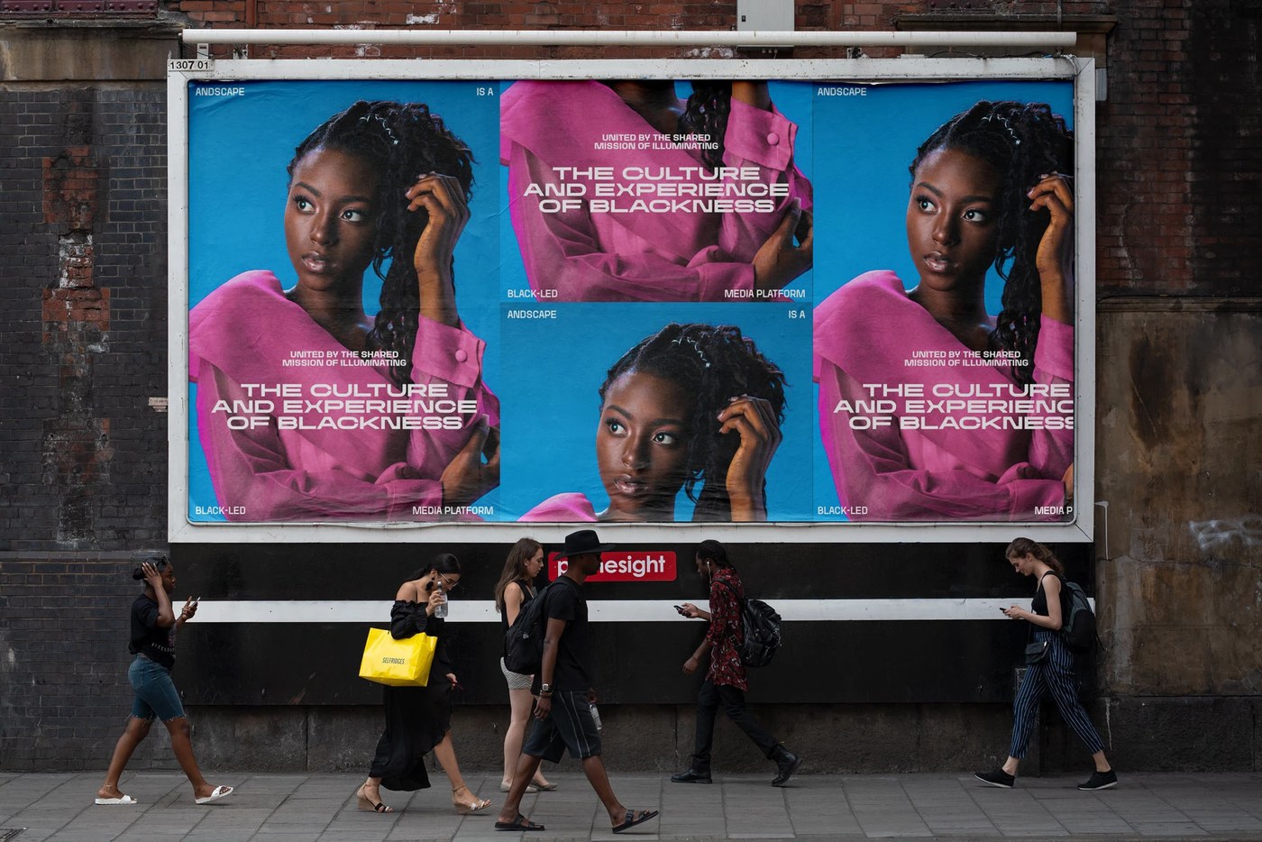
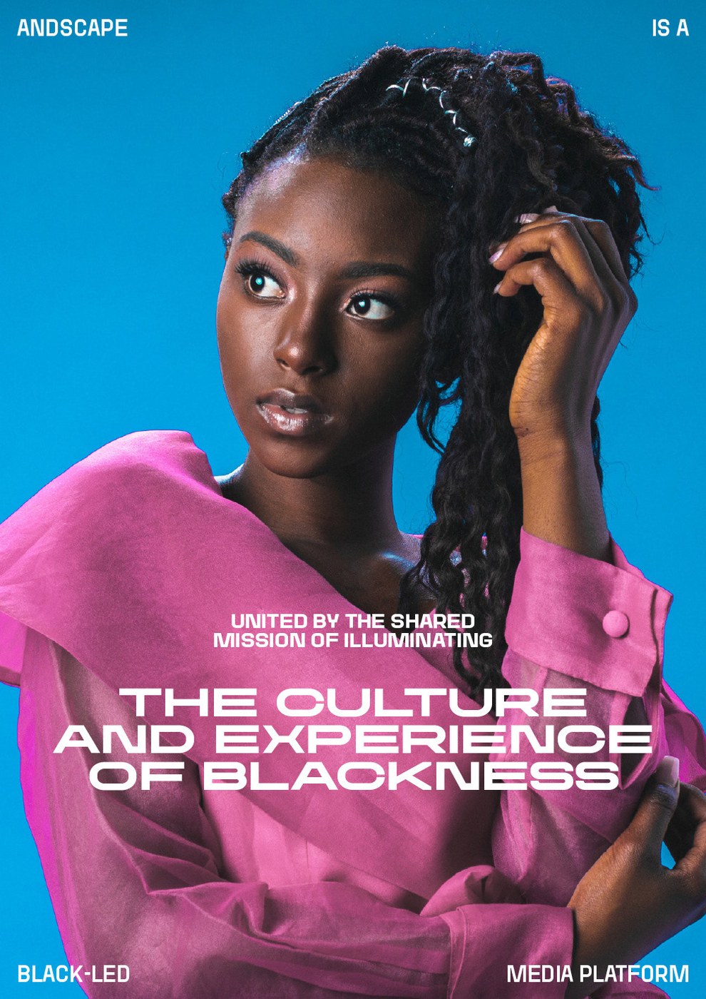
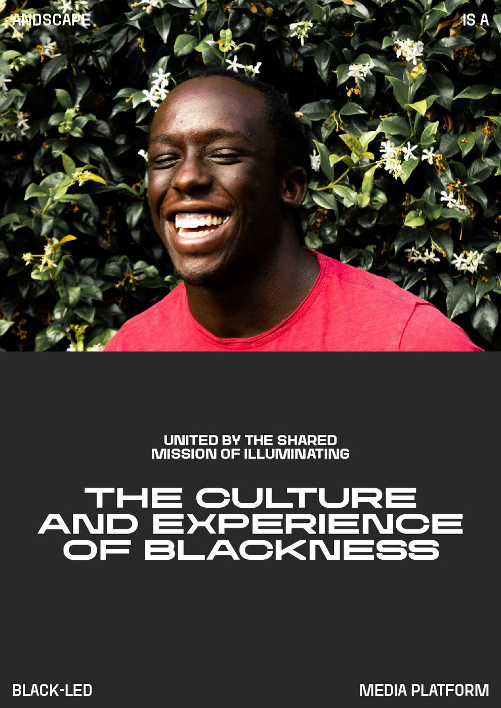
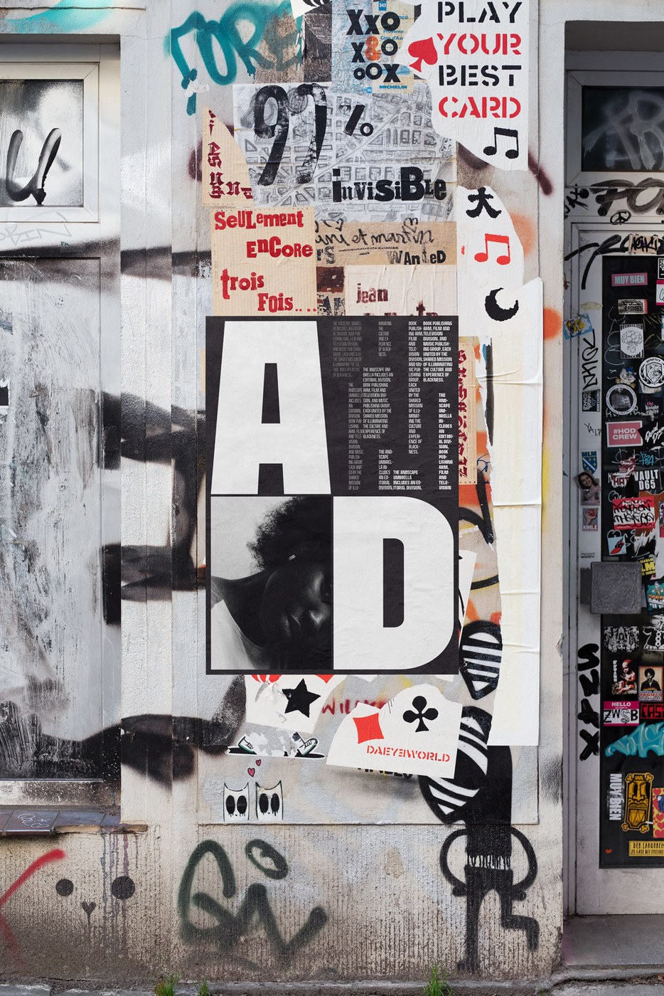
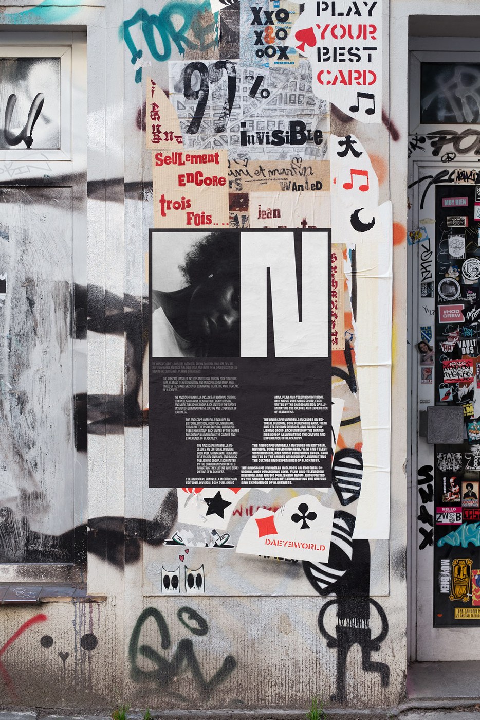
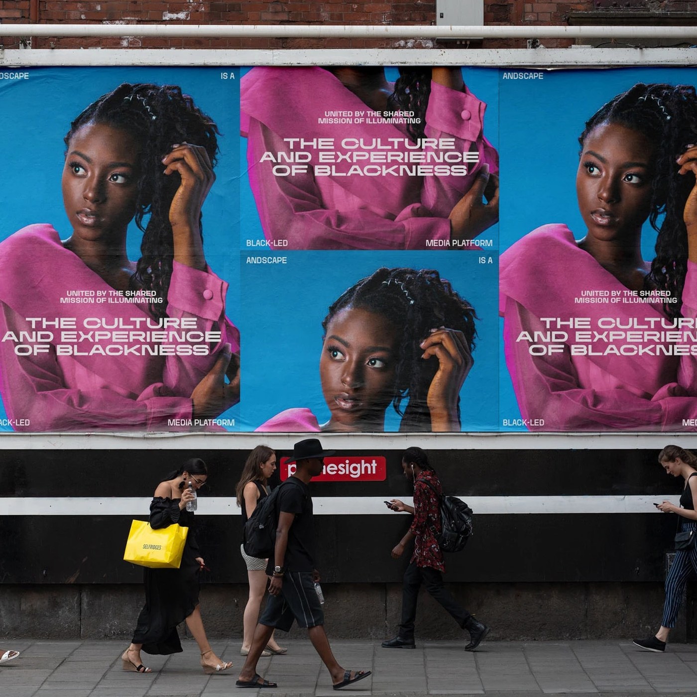
Real print jobs test the physical force of the letter shapes. Big posters hang on rough brick walls along city streets. Pedestrians walk past large boards on old brick walls. Street posters pair bright pink shirts with deep blue backdrops. White extended display words sit over clean portrait photos. Urban posters use giant letters to frame black-and-white portraits. Raw paper sheets and street paste sharpen the bold graphic print. The giant letters catch the eye from far down the block. Ink sits deep in the tooth of heavy paper. TwoPoints.Net shows how typography design helps modern media brands. The flexible font system runs well on paper and on screens.
See the full typography design project by TwoPoints.Net on Behance.