Architectural Brand Identity: E — T GROUP by iFRAME
Discover the architectural brand identity for E — T GROUP by iFRAME DESIGN STUDIO, featuring tectonic typography and archival project print systems.
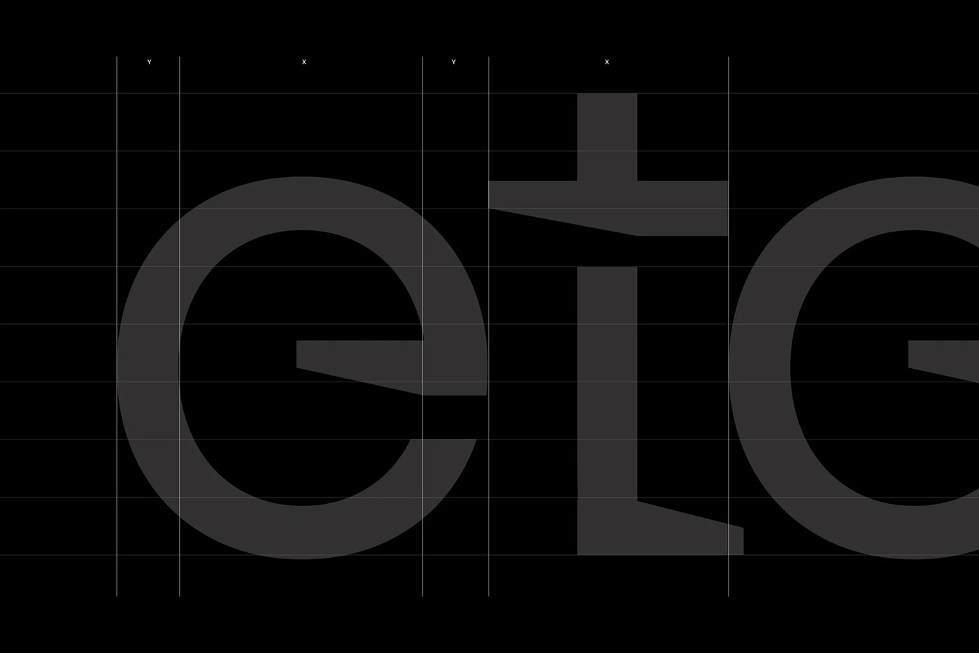
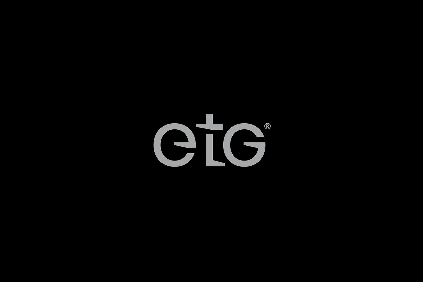
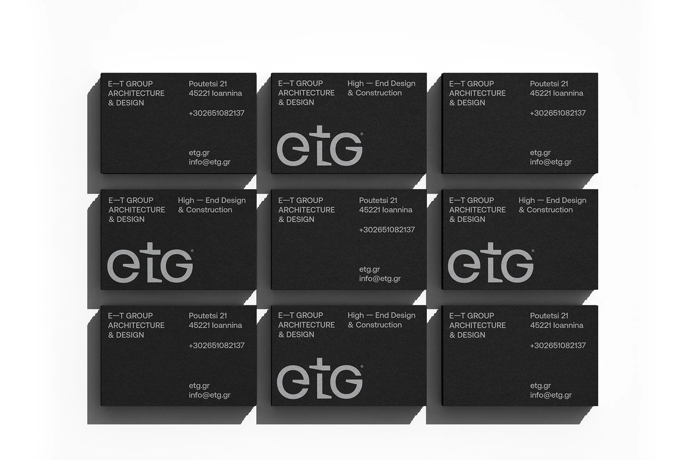
Athens-based practice iFRAME DESIGN STUDIO developed this architectural brand identity around custom typographic structures that mirror physical construction. Specializing in high-end residential and commercial developments, E — T GROUP required a visual language rooted in permanent spatial discipline rather than fleeting commercial trends. The designers constructed a bespoke wordmark where beam-and-column alignments and structural balance define the letterforms. The glyph geometry integrates subtle tectonic incisions and calculated stem widths, echoing the load-bearing logic of contemporary engineering. Generous negative space frames the typography, allowing the mark to command authority with quiet confidence across print surfaces and digital viewports.
Tectonic Structure and Architectural Brand Identity
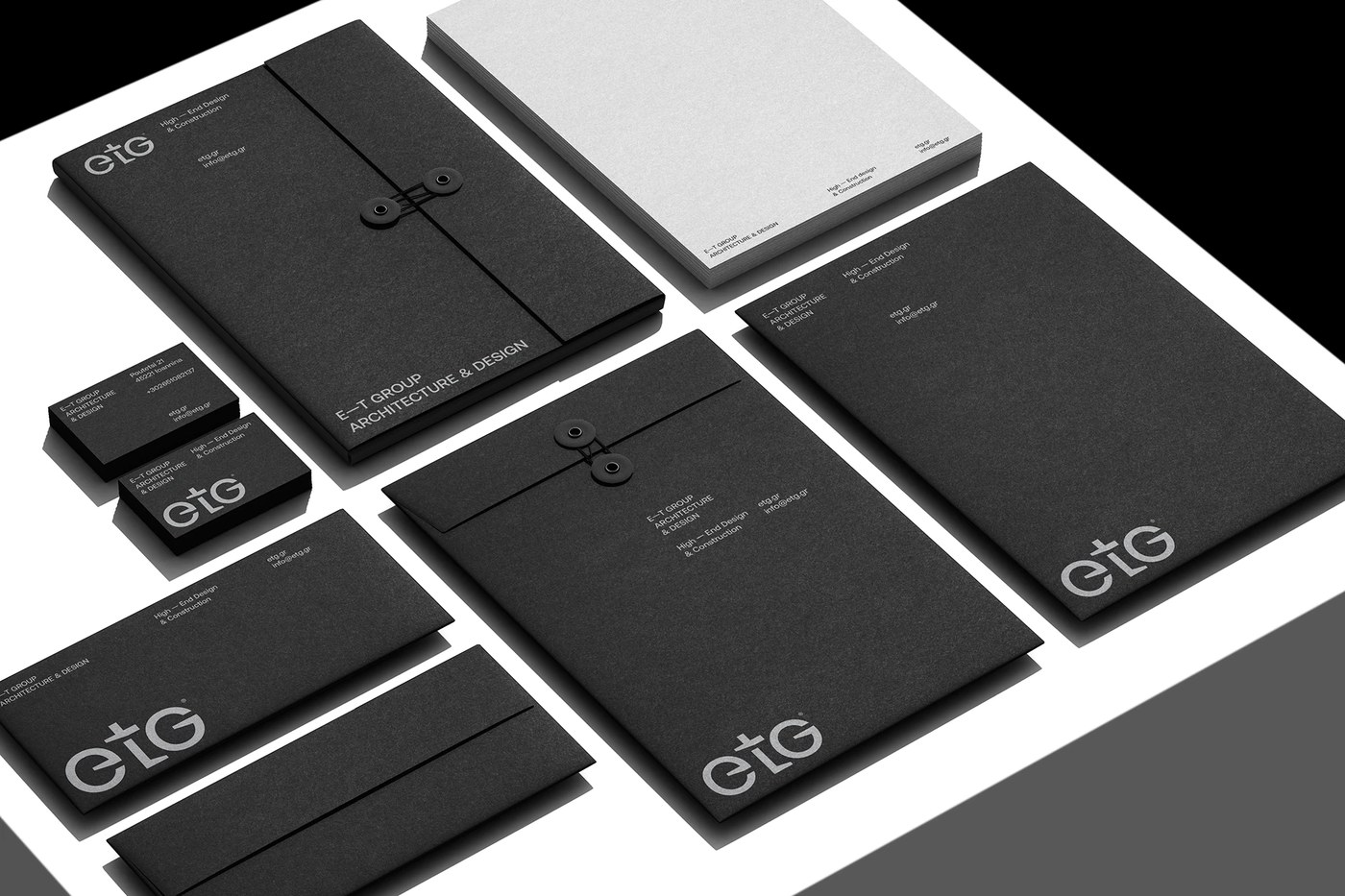
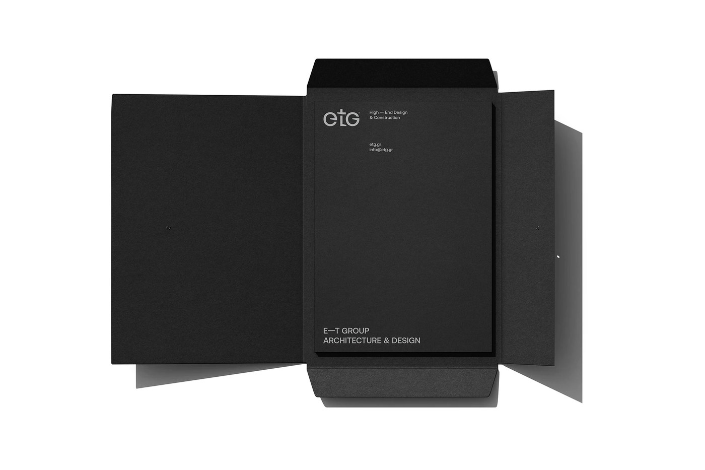
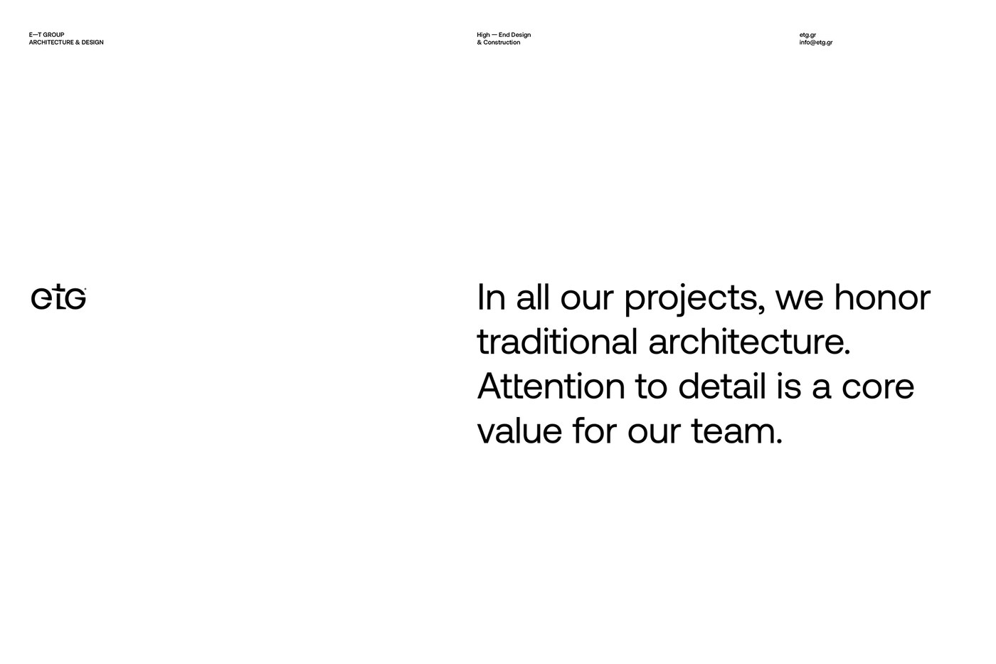
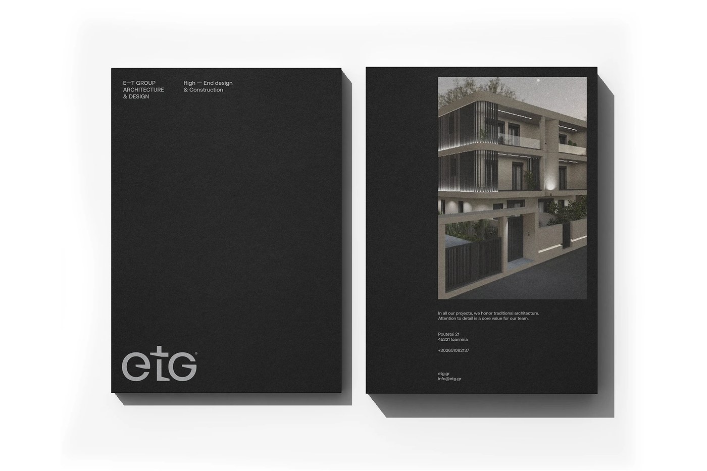
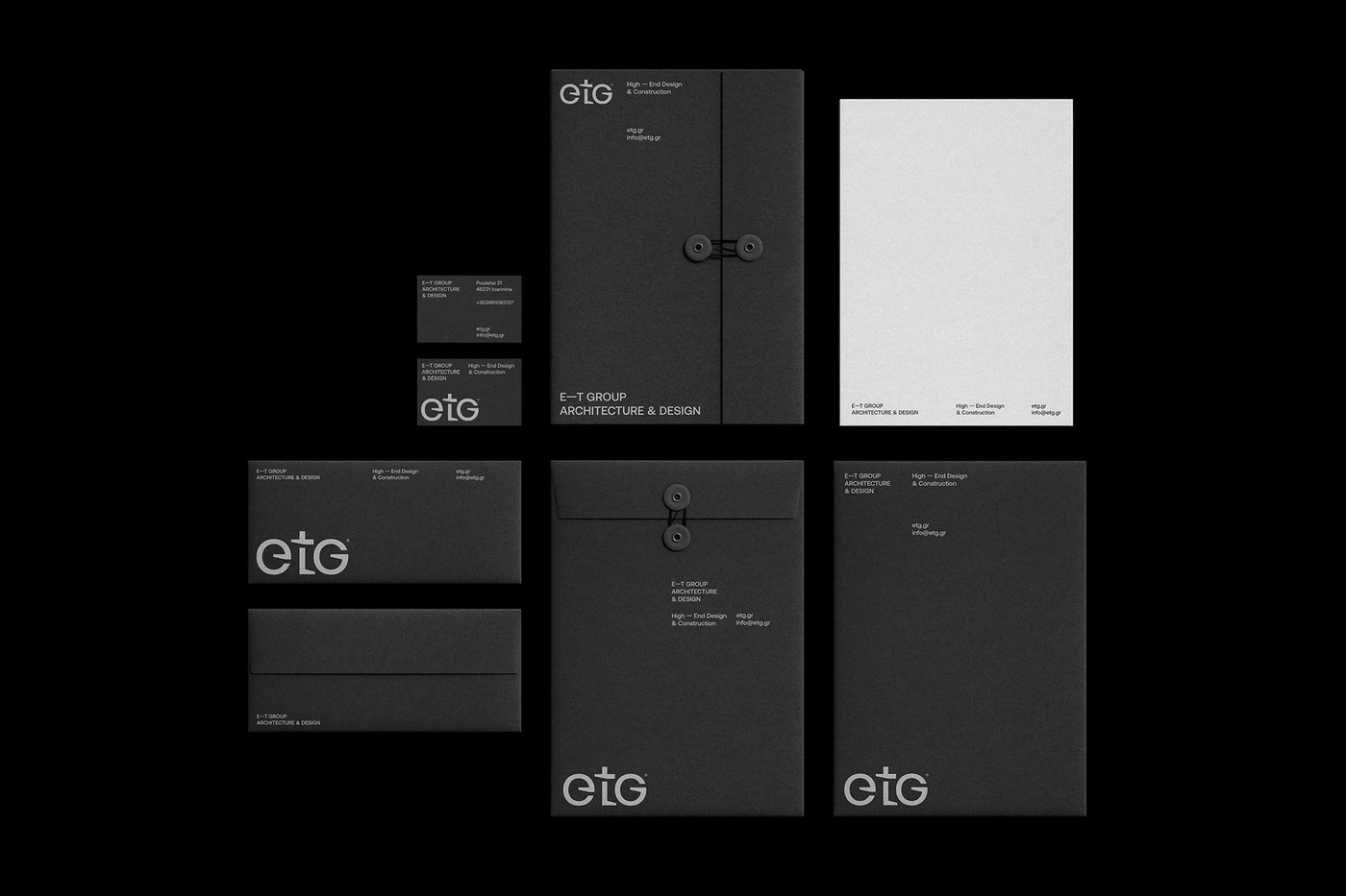
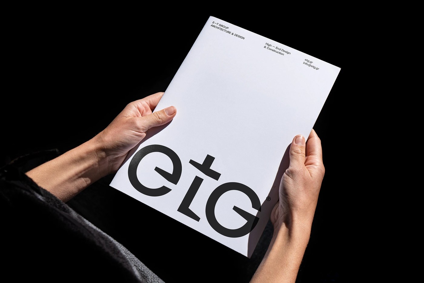
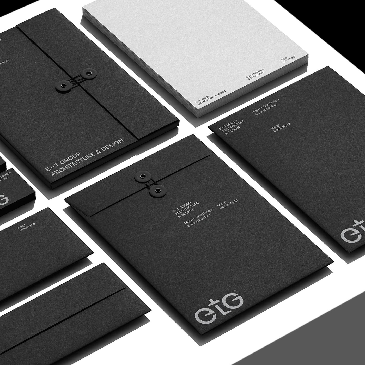
The architectural brand identity extends across presentation folders, bound technical project documentation, business cards, and correspondence sheets. Each format employs an architectural grid system derived from classical Swiss proportion. Pure deep black typography contrasts against crisp off-white and warm concrete grey paper stocks, avoiding arbitrary decorative flourishes. Micro-metadata, drawing index numbers, and floorplan references occupy strict perimeter coordinates, providing immediate functional clarity for clients and engineering contractors. The layout rhythm treats white space as an active architectural volume, organizing complex project data into balanced vertical hierarchies that reflect the firm's exacting spatial standards.
Every touchpoint reinforces the architectural brand identity through tactile uncoated paper stocks, deep blind debossed covers, and foil details. Beyond corporate stationery, the visual system adapts cleanly to building site hoardings, protective portfolio sleeves, and online project archives. Produced using Adobe InDesign and Illustrator, the identity proves that corporate architecture branding achieves its greatest impact through structural restraint. By translating physical engineering into typographic form, iFRAME DESIGN STUDIO created an enduring brand ecosystem that reflects the precision, craftsmanship, and structural integrity of high-end architectural practice.
See the full project by iFRAME DESIGN STUDIO.