Packaging Design for MI! Vietnamese Street Food
Discover how Caroline Lafon created a tactile packaging identity system for MI!, celebrating Vietnamese street food culture.
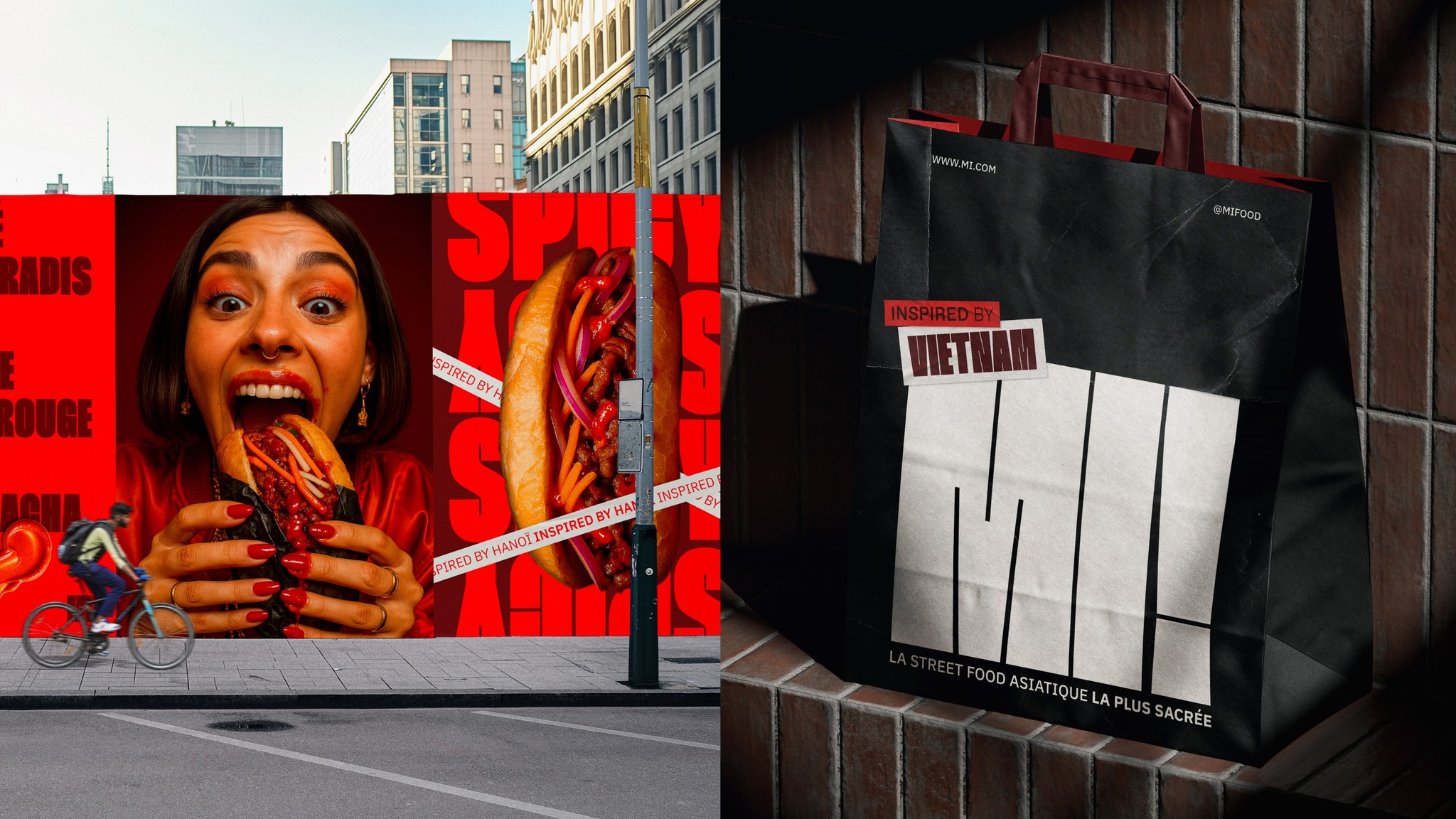
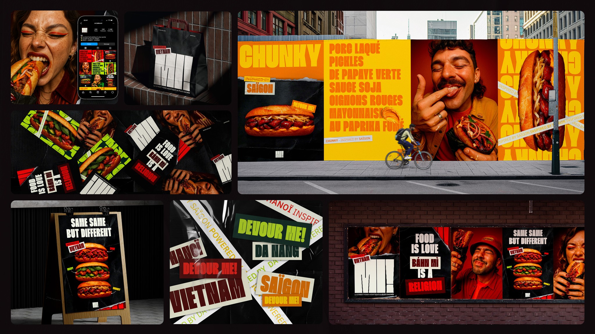
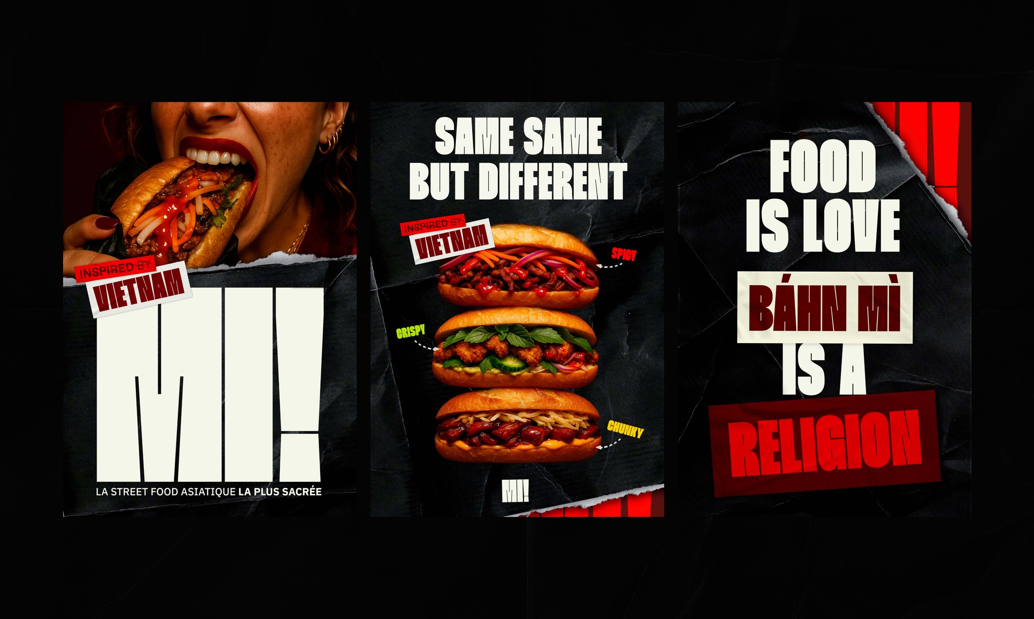
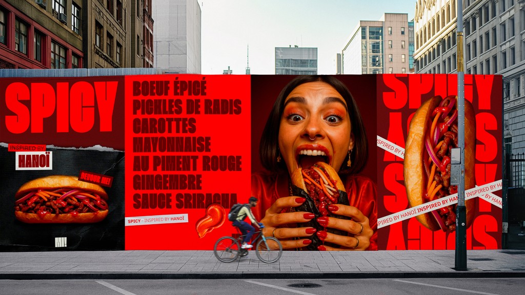
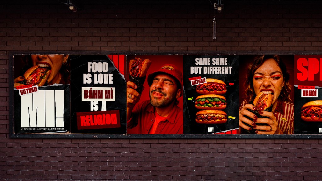
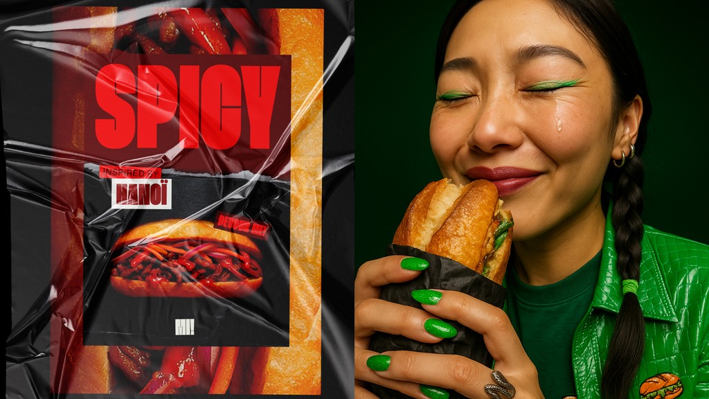
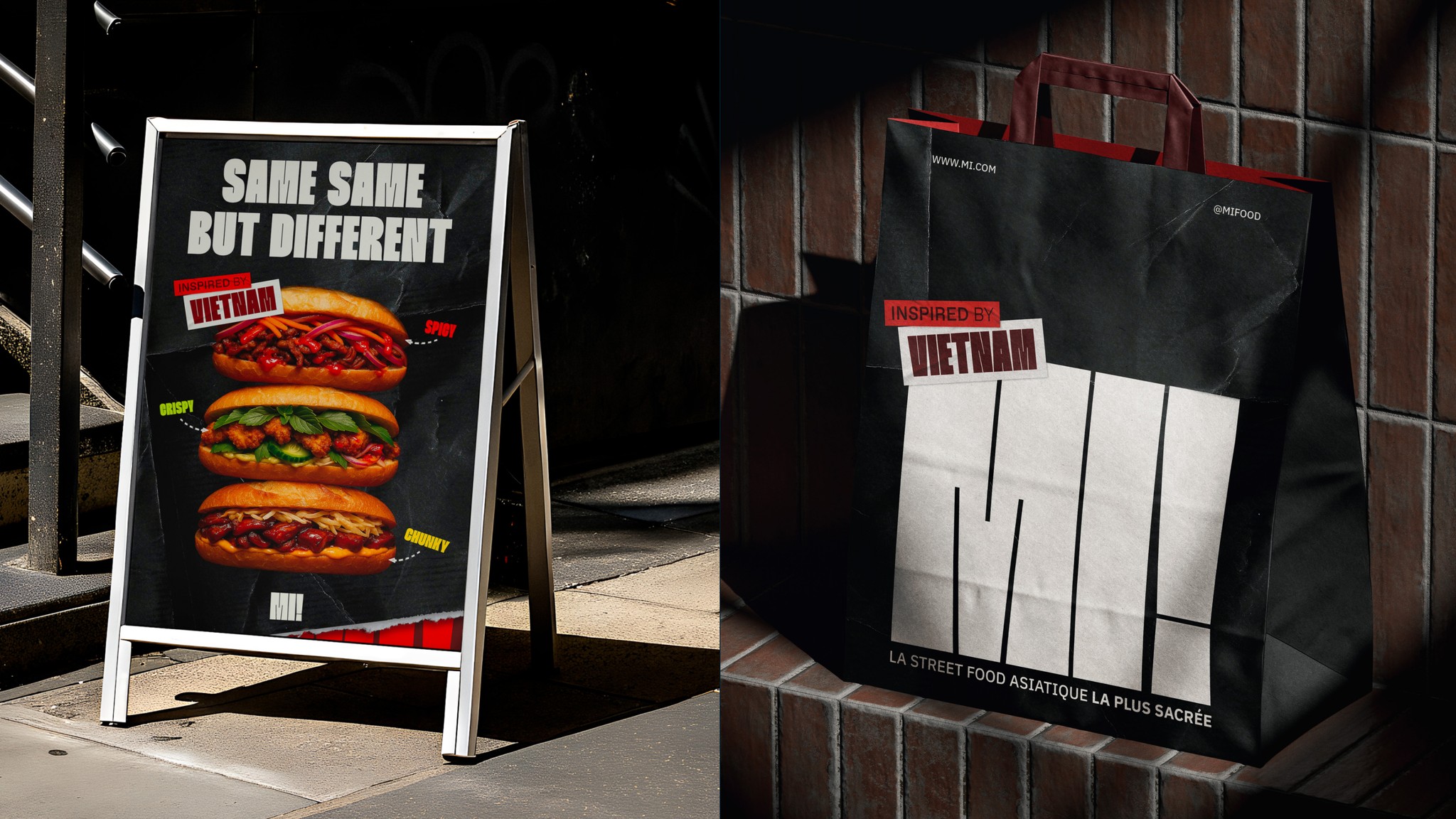
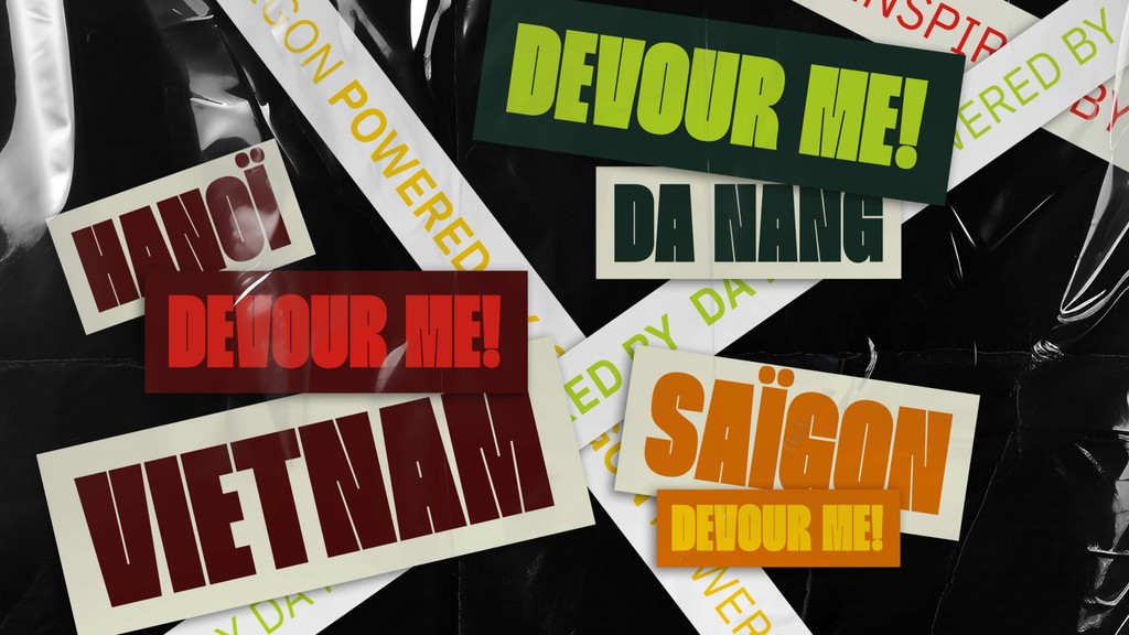
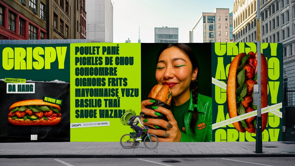
The visual identity for MI! grounds itself in Franco-Vietnamese culinary history. Designer Caroline Lafon built a bold brand around the iconic bánh mì sandwich. A custom logotype featuring exclamation punctuation establishes a energetic food voice. Solid color fields in warm red and toasted cream set up rich appetite appeal. The design avoids corporate fast food tropes. Thick sans-serif letterforms fill poster margins with clear optical weight. It creates sharp contrast against clean packaging backgrounds. Technical catalog numbers sit at the edges. They establish an organized grid across every printed asset. Secondary monospace type adds raw shop clarity to order tickets.
Tactile Brand Identity and Packaging Mechanics
Material choices drive the brand design across every touchpoint. The packaging collection includes greaseproof sandwich wraps, custom tape, and sturdy takeaway boxes. These items turn simple boxes into a unified visual system. High-density black typography prints onto unbleached paper stock. Raw paper fibers add real depth behind the graphics. Unvarnished surfaces highlight the physical texture of the materials. The layout uses horizontal grid lines. It organizes labels, order tickets, and takeout bags with sharp catalog order. Custom stamp marks add shop print details to the wrappers. The system stays flexible across different box sizes.
The identity translates street food roots into clear visual rules. Every container shape acts as a blank sheet for the wordmark. Modern packaging design can transform casual food concepts through simplicity. The work uses scale contrast instead of extra decor. It delivers a strong physical presence for the brand. Repeated graphic elements tie the printed pieces together. The result feels real and functional. Explore the complete project on the portfolio of Caroline Lafon.