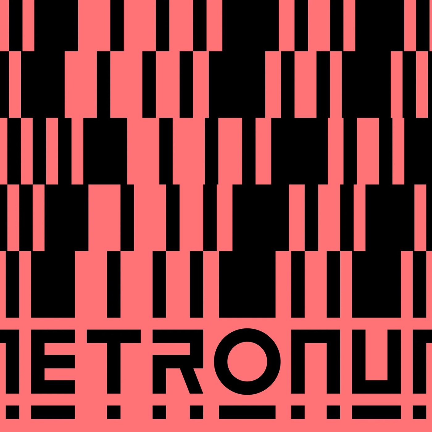
Branding Design: Le Metronum Visual System by Brand Brothers
Brand Brothers built a bold branding design for Le Metronum, a Toulouse music venue, using modular geometric patterns and custom type.
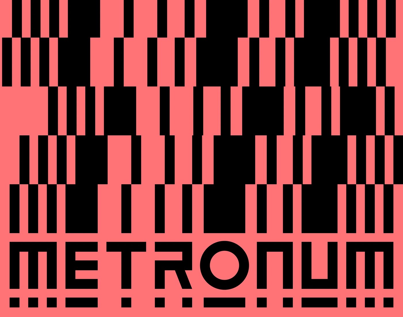
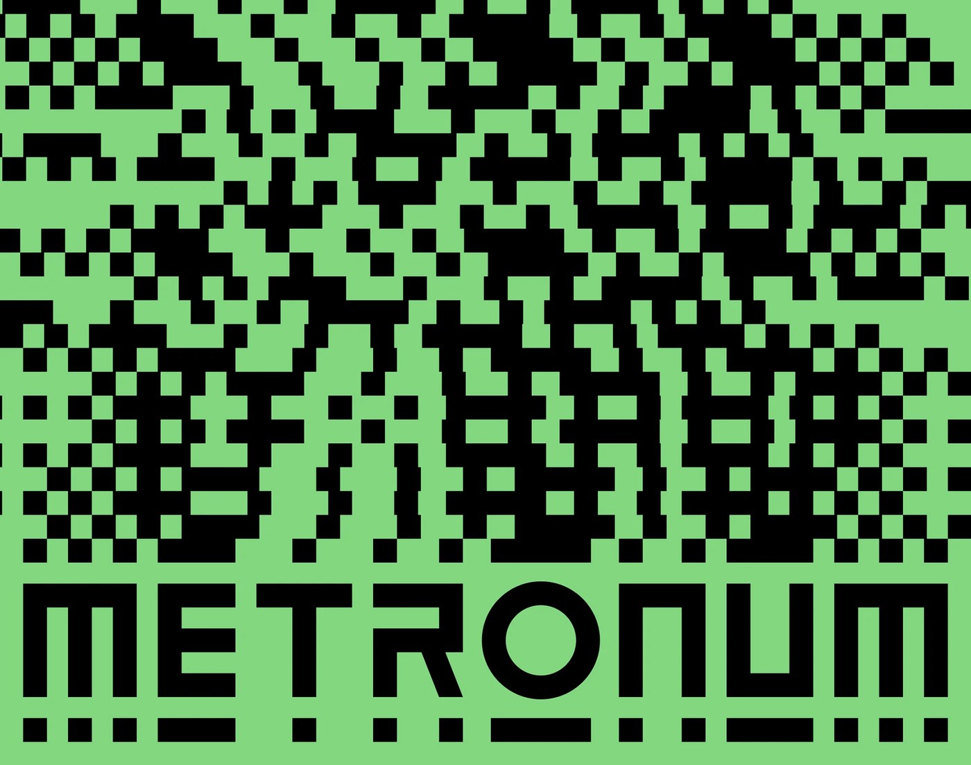
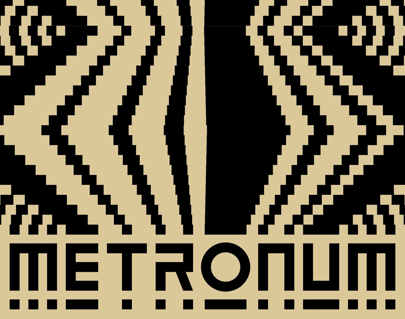
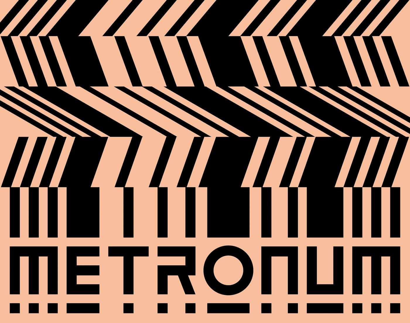
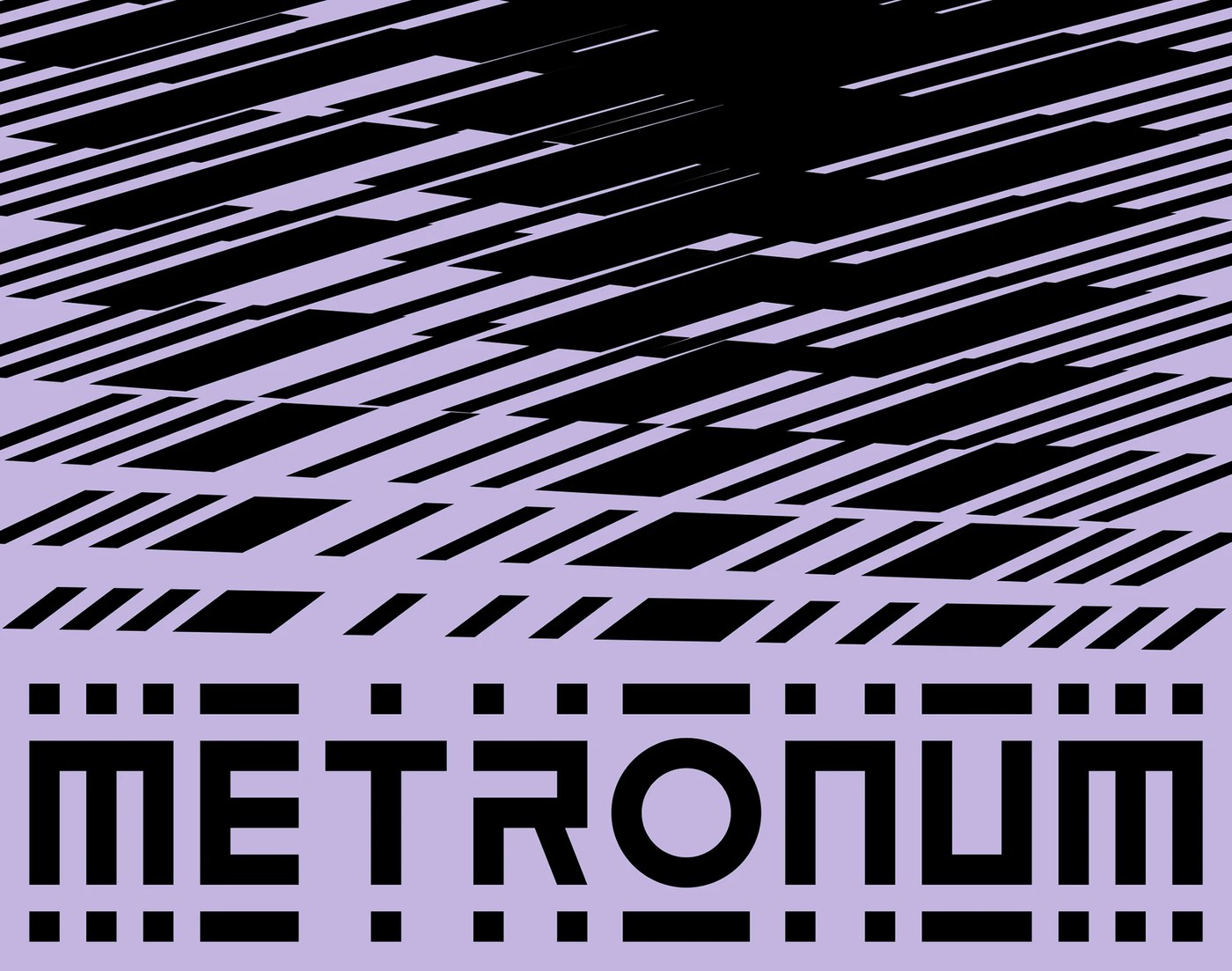
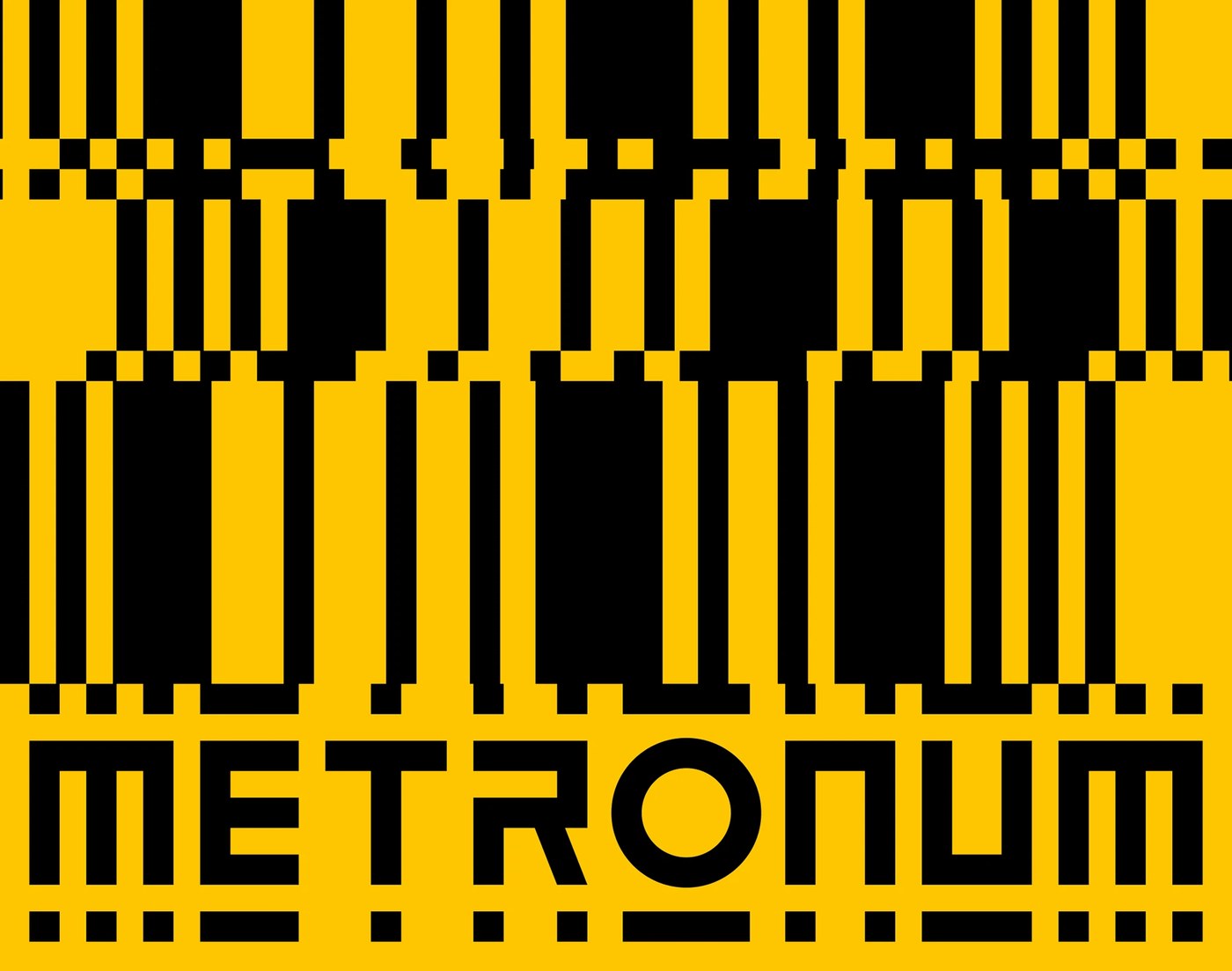
Le Metronum serves as a central hub for contemporary music in Toulouse, housing a 600-seat concert hall, rehearsal spaces, and recording rooms. In 2022, the venue refreshed its identity through a creative partnership. Hey Studio redrew the primary lettering mark, while Brand Brothers developed the overarching graphic system. The studio extracted a core visual grammar from the discontinuous line sitting beneath the logotype. This broken line expands into a generative pattern engine that mirrors sound frequencies and architectural acoustics. The team coupled this geometric rhythm with bright blocks of cobalt blue, lemon yellow, and deep red. Two distinct typefaces anchor the visual identity: Benoit Bodhuin’s rounded BallPill and Formagari’s condensed Malamocco. Together, these choices establish an energetic branding design that adapts to more than one hundred eclectic concerts each season.
Kinetic Patterns and Modular Branding Design
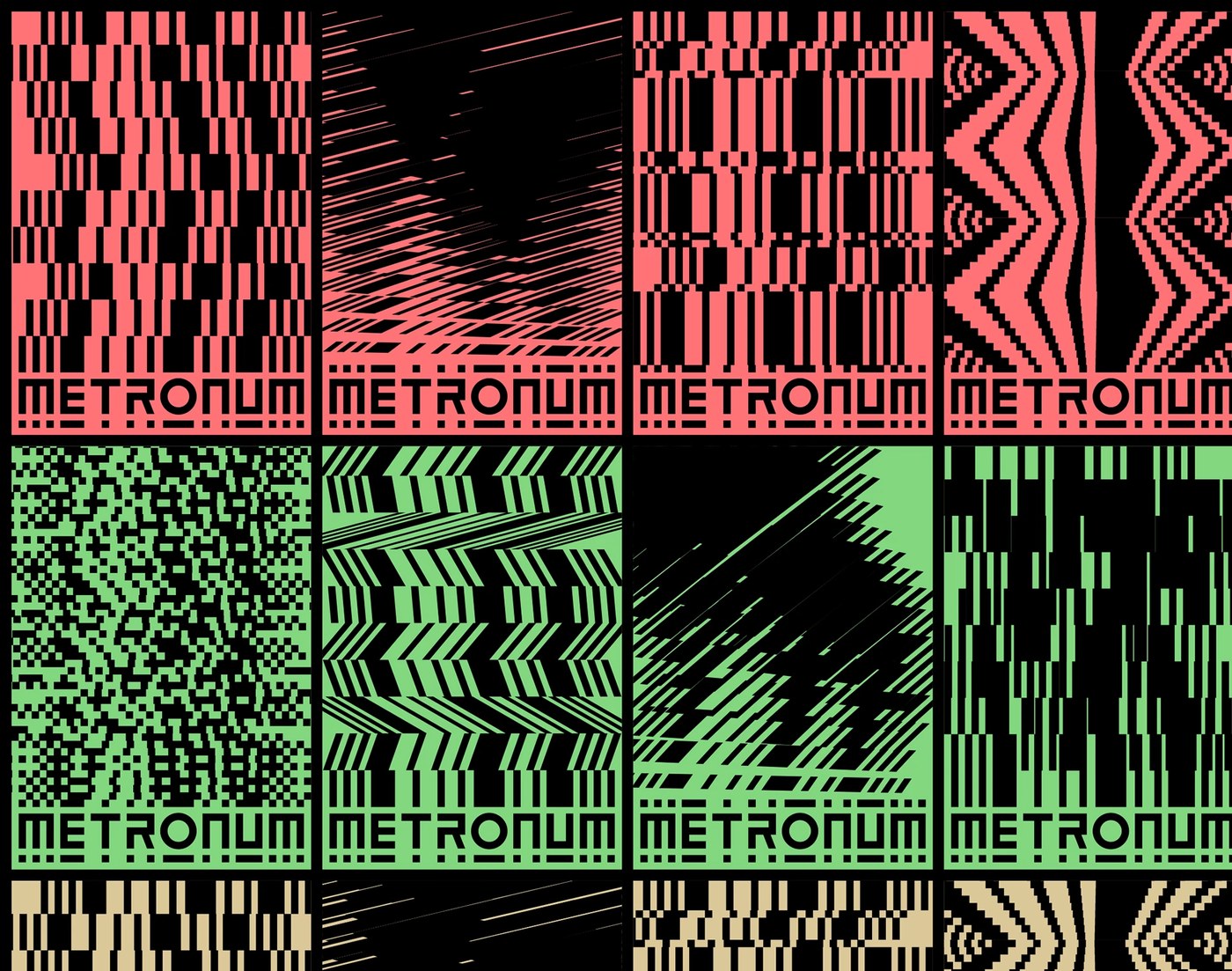
The event poster architectures demonstrate the structural flexibility of the layout grid. Brand Brothers divided the vertical format into modular typographic bands, allowing artist lineups and performance dates to shift with ease. High-contrast geometric shapes interact with oversized display headlines, creating stark optical tension across street walls. The alternating rhythms between BallPill and Malamocco keep complex festival bills legible from across a crowded room. Rigid margin structures frame dense ticket details, outlet badges, and partner marks along the bottom perimeter. This rigorous branding design provides the venue team with an open toolkit. The posters accommodate experimental jazz, heavy electronics, and indie rock without diluting the central character of the hall.
Physical venue applications extend the graphic system across tangible touchpoints in Toulouse. Coarse silkscreen inks bring raw texture to printed seasonal schedules and folding program brochures. Within the venue itself, the discontinuous line motif guides visitors through hall corridors, backstage access doors, and member access passes. Large-scale stage projections translate the modular geometry into rhythmic motion behind performers during live sets. Clean black and white typography balances the bright poster walls, grounding the concert hall in production reality. Brand Brothers proves that cultural branding design can remain expressive without sacrificing functional navigation. Every printed ticket, wristband, and digital schedule strengthens the communal pulse of the music space.
See the full project by Brand Brothers on Behance.